
-
- Map 1
-
- Map 2
-
- Map 3
After years of building tensions originating from the end of the Cold War and NATO’s expansion, Russian President Vladimir Putin launched a broad invasion on Ukraine on February 24, 2022. Russian military troops had surrounded Ukraine’s borders starting in late 2021, however, the attacks did not mobilize until recently. The conflict between Russia and Ukraine intensified when NATO offered Ukraine membership to join their western military alliance, in which Putin found that potential membership as a direct threat. Since that offer in 2008, tensions have continued to escalate as Ukraine’s borders have been surrounded by Russian troops, according to an article in the New York Times (Bilefsky, Pérez-Peña, Nagourney, 2022). Suffering, displacement and death have been the direct result of the Russian attacks on Ukrainians, while economic imbalances will have a further effect on the rest of the world. CNN’s editors published various maps to contextualize the tensions that led to the Russian invasion and to argue the magnitude of this international conflict.
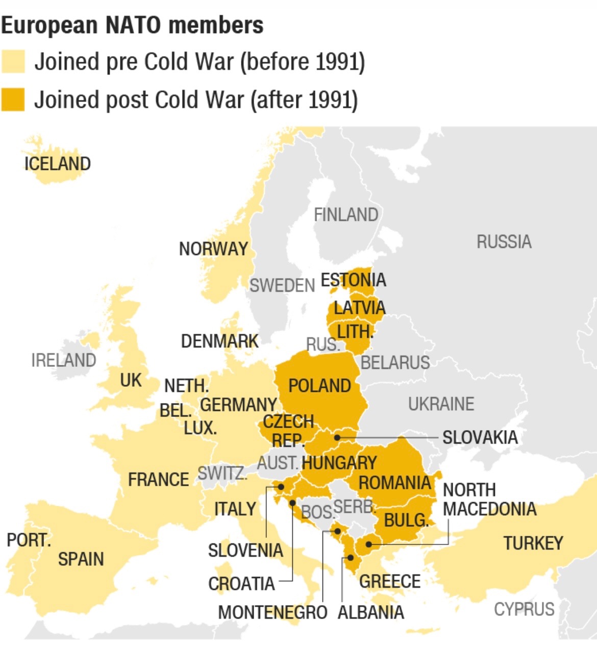
CNN’s article includes multiple pieces of visual rhetoric that actively map Russia’s ongoing invasion of Ukraine, starting with a map of European NATO members that joined before and after the Cold War in 1991. Using two different colors to shade the appropriate countries, viewers are able to discern the time period each Eastern country joined and where they are located spatially in relation to Russia. The neighboring countries of Ukraine and Belarus, are not shaded because they are not a member of NATO, thus providing the audience with further context to this conflict. This simple map clarifies the global positioning of each country in the former Eastern bloc from the Cold War era, and introduces viewers to where the tensions developed if they did not have much background knowledge. Because this is the first map shown in CNN’s article, it serves as a historical reference that viewers can rely on to learn which countries have been in alliance with the West pre Cold War, which countries became peacekeeping allies after the Cold War and which countries have no affiliation with the West. Countries such as Russia, Belarus, Ukraine, Georgia, Sweden, Finland, Switzerland, Austria and Ireland are shown as not being members of NATO, which could lead viewers to speculate if their absence in the international peacekeeping organization is because they want to remain isolated or disagree with its purpose. A potential consequence of this rhetorical visual is that it could lead its audience to make assumptions about each countries’ stance on international politics, meaning they could falsely label Georgia as being in support of Putin’s decision to invade Ukraine. Likewise, viewers could assume Austria wants to uphold an isolationist approach to foreign policy, when perhaps it never got a bid to join NATO in the first place. Besides that critique, this map situates the international conflict well and offers historical insight that explains how NATO membership was a catalyst of this invasion.
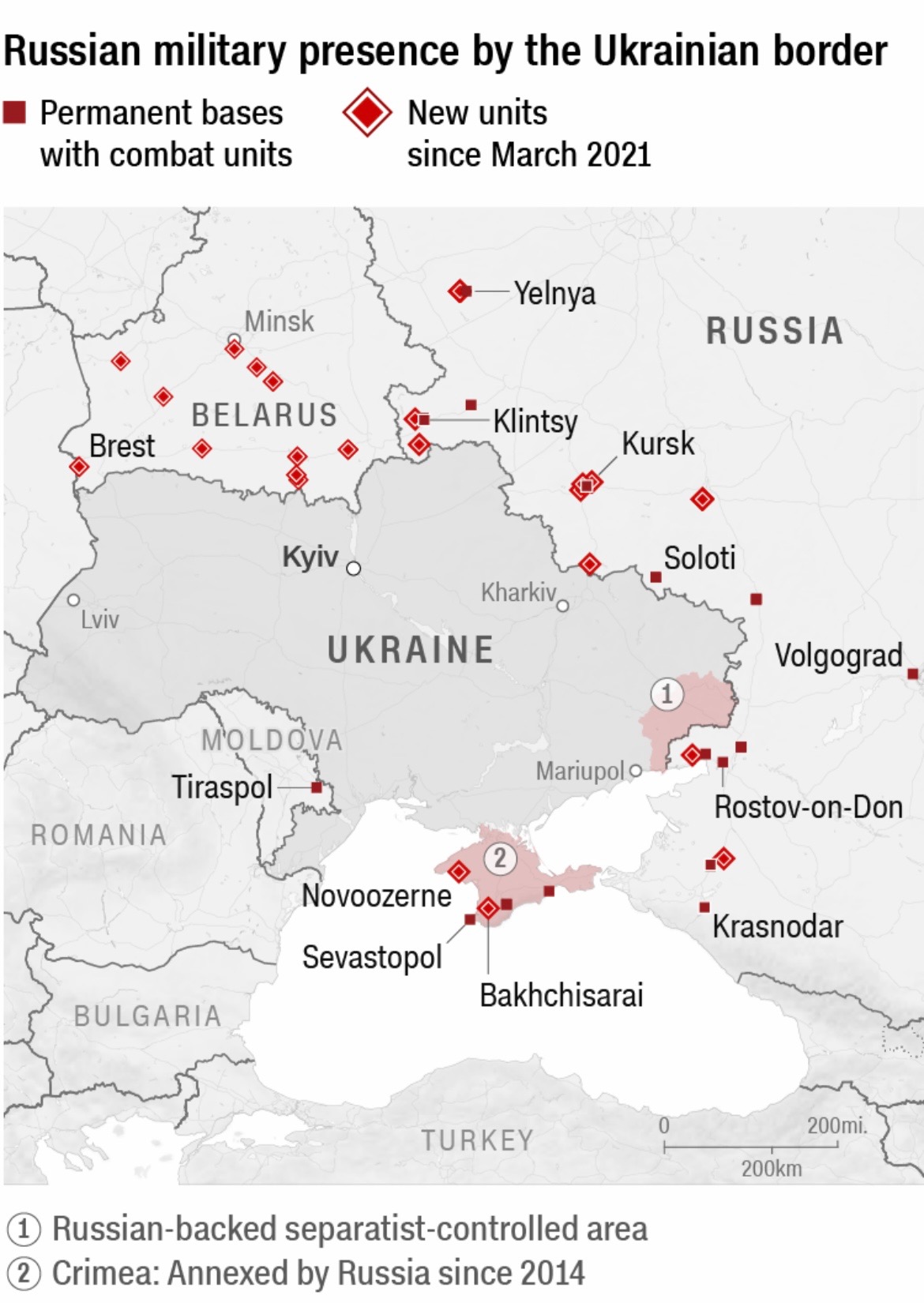
Furthermore, CNN editors created another piece of visual rhetoric to highlight the location and number of Russian military troops bordering Ukraine, dating back to March of 2021. This map is centralized around Ukraine, as a dark line is used to distinguish its border in relation to its surrounding countries. Red boxes signify the Russian military’s permanent bases with combat units, while red diamonds are used to show new units since March of 2021. Red is the sole color employed in this map, which creates a clear visual for its audience to recognize the escalation of Russia’s presence in Ukraine. This magnified projection of Ukraine works to demonstrate the severity of the conflict in Europe, particularly proving how intentional and forceful Putin’s military movement has been over the past year. One key takeaway from this map is how many new Russian units have been posted around Ukraine’s border in the last year as tensions between the two countries intensified. The CNN editors created this map to argue that Russia’s invasion did not happen overnight, but instead it was heavily calculated moves that led to the attacks.
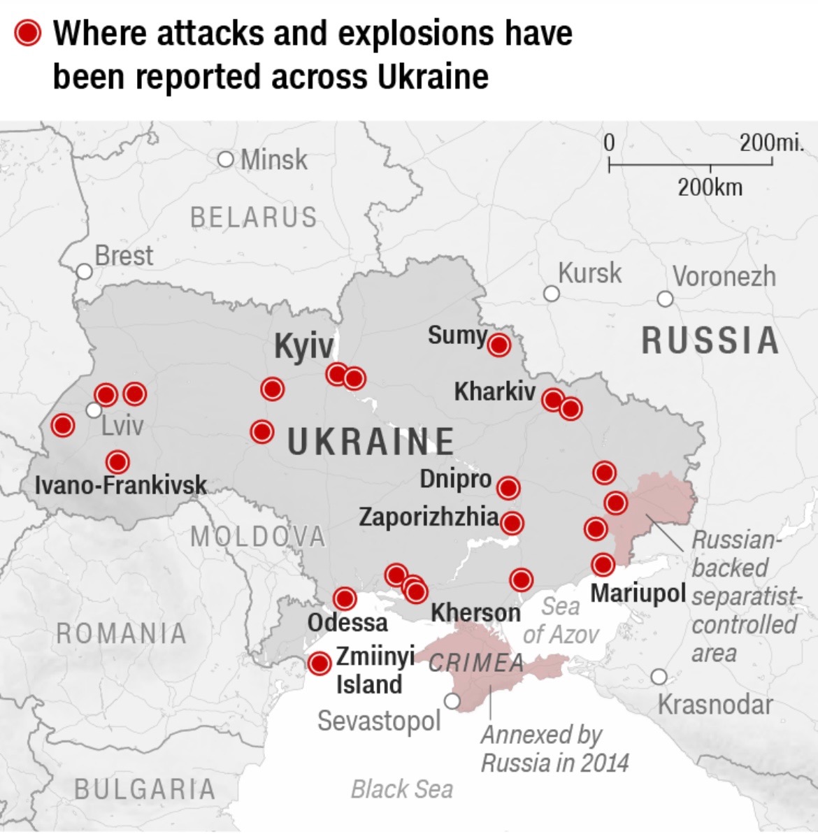
Lastly, CNN’s article offered a visual that located where the attacks and explosions were reported in the early hours of February 24, 2022. With red being the only color employed once again, red dots map where the attacks were concentrated in Ukraine. This map lists nine cities in Ukraine that endured attacks and explosions, specifically on the initial day of the Russian invasion. The editors of CNN published a visual that uses large dots and the color red to show the assault Ukraine withstood, and is continuing to face. Kyiv, which is a major city in Ukraine, is written in slightly larger font, perhaps arguing how Russia targeted a popular city to maximize destruction. However, this map could be more interactive if it offered viewers the chance to click on the location to learn about the damage done to that specific city. This map serves as an argument to show the abundance of attacks that occured in a matter of hours, asserting that Russia launched unprovoked violence on its neighboring country.
All three maps published by CNN editors argue the severity of Russia’s invasion of Ukraine, contextualizing the conflict, illustrating the inflamed tensions and highlighting the abundance of attacks. Each map takes place in a different time period, which aids viewers to understand the tension between Russia and Ukraine in its entirety. CNN’s maps work to contextualize Ukraine’s global position as being caught in the crossfires between the East and the West. Colors, font size and projection all work to support the editors’ argument, which show the audience what events led to the war in Europe.
A popular media source like CNN has substantial influence in the U.S., which means millions of Americans rely on its reporting to develop an understanding for what is happening around the world. Because CNN published a series of maps that provided visual context regarding the conflict between Russia and Ukraine, Americans were able to gain a sense of a global geographic imagination. Therefore, these maps function to connect us to the rest of the world and allow us to visually interact with the tensions abroad that we are incapable of seeing for ourselves. While Americans may feel isolated from the current conflict in Europe, these pieces of visual rhetoric can argue how severe and unwarranted the Russian attacks have been in Ukraine. Even though some of CNN’s maps may seem rather fundamental, they function to bridge the visual engagement gap between our experiences and other experiences, often including an embedded argument with what they want us to see.
Bibliography
Bilefsky, Dan, et al. “The Roots of the Ukraine War: How the Crisis Developed.” The New York Times, The New York Times, 10 Jan. 2022, https://www.nytimes.com/article/russia-ukraine-nato-europe.html.
CNN, Henrik Pettersson, Eliza Mackintosh, Dakin Andone, Natalie Croker and Sarah-Grace Mankarious. ‘Six Maps Explaining the Ukraine-Russia Conflict’. CNN, https://www.cnn.com/2022/02/24/europe/ukraine-visual-explainer-maps/index.html. Accessed 4 Mar. 2022.