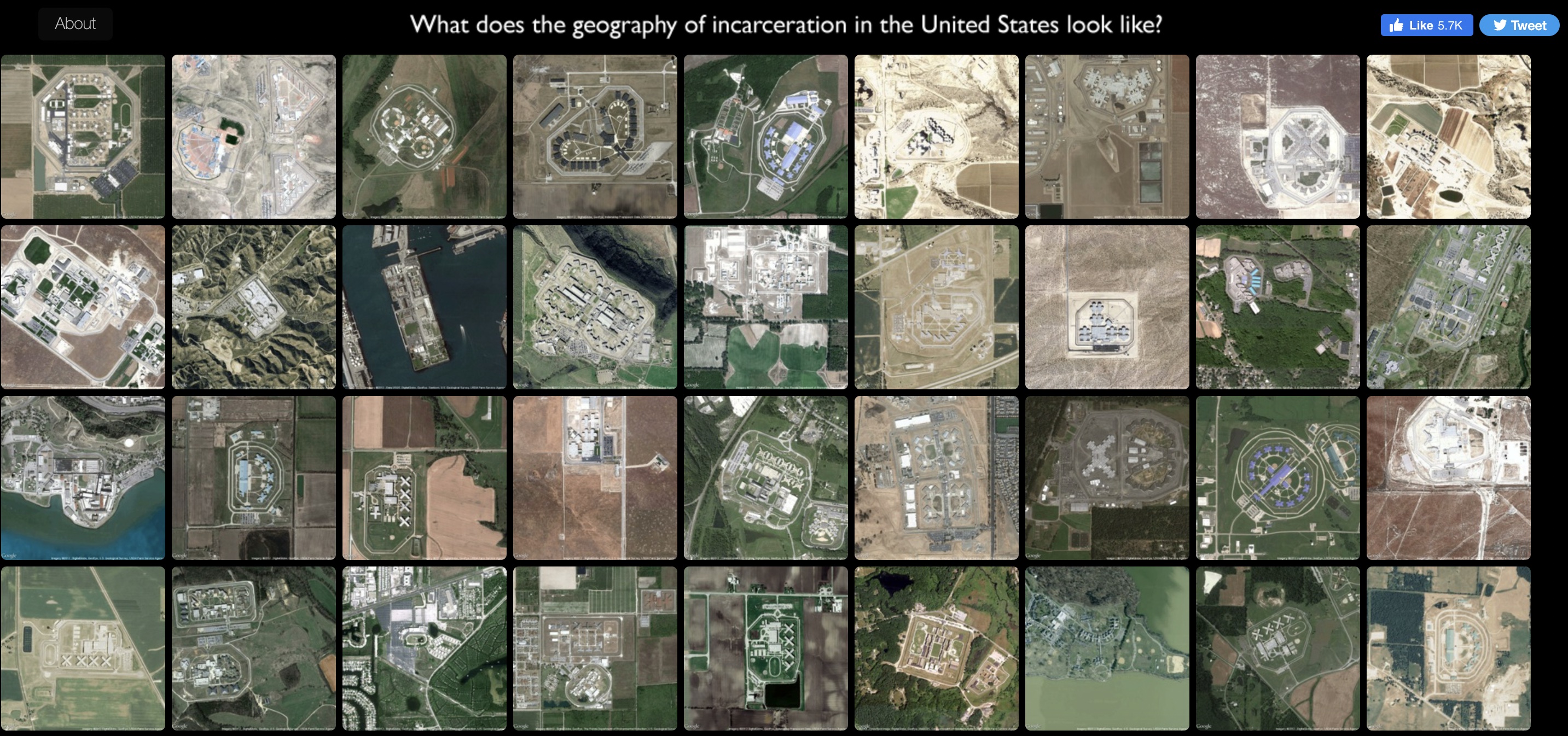
Prison Map, by Josh Begley, a student at NYU studying Interactive Telecommunications, created a collection of satellite images of prisons throughout the United States. Through his collection of photographs, Begley aims to answer the question, “what does the geography of incarceration look like in the United States?” Begley has created an atlas of satellite images that map out several prisons across the United States, looking beyond statistics and focusing more clearly on space and design. Begley uses these images to compare and contrast the architecture of prisons, showing viewers the true scale of incarceration in the United States.
-
Recent Posts
Recent Comments
- Matthew Lafortezza on Map of the Week: Redlining in Richmond
- Matthew Lafortezza on Map of the Week: Russian Military Control in Ukraine
- Evyn Magenbauer on Map of the Week: Spending Per Student, By School District – Our Tax Dollars & Education
- Evyn Magenbauer on Map of the Week: 2020 Presidential Election
- Julia Adams on Map of the Week: War on Ukraine
Archives
- May 2022
- April 2022
- March 2022
- February 2022
- November 2021
- October 2021
- September 2021
- May 2021
- April 2021
- March 2021
- February 2021
- May 2018
- April 2018
- March 2018
- February 2018
- December 2017
- November 2017
- October 2017
- September 2017
- May 2017
- April 2017
- March 2017
- February 2017
- December 2014
- November 2014
- October 2014
- April 2014
- March 2014
- February 2014
- December 2013
- November 2013
- October 2013
- September 2013
Categories
Meta