
https://arcgisportal.baltimorepolice.org/publiccrimemap/
Baltimore City was ranked number four for “the most dangerous cities in America” by CBS News in 2019, based on FBI data from the Uniform Crime Reporting Program. Growing up in Baltimore myself, I was privileged to not have had to experience this facet of Baltimore. Over the past few years, Baltimore City has become one of the most dangerous cities in the U.S., a title that breaks my heart and leaves Baltimoreans questioning the systems in place in our city and the leadership that has clearly failed our communities.
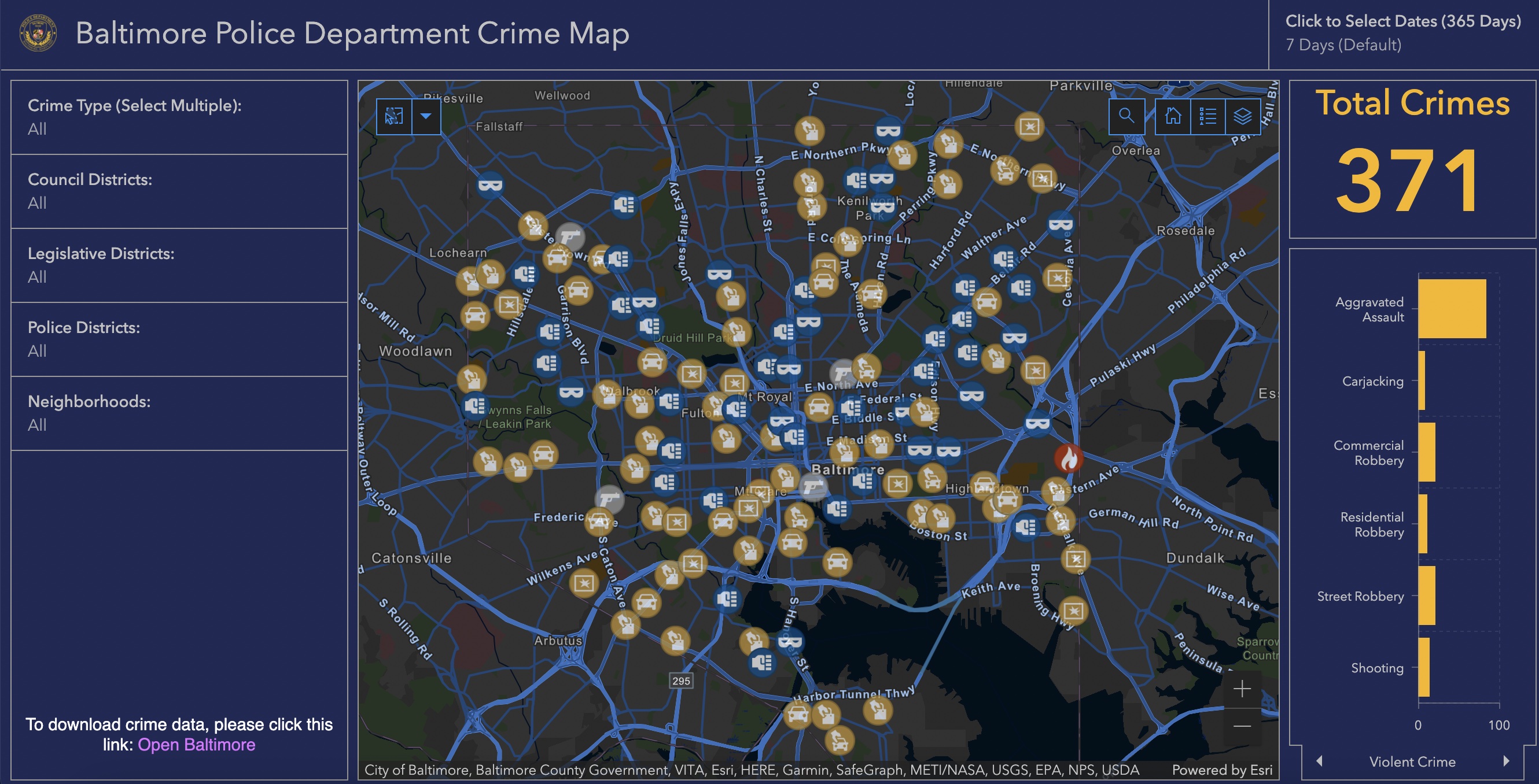
The map I chose to focus on for our “Mappenstance” blog project is the “Baltimore Police Department Crime Map” provided by both the City of Baltimore and the Baltimore City Police Department. The Baltimore Police Department has put together a crime map that provides an interactive way to pinpoint and learn about the violence that has consumed the city in the past few years. The Police Department utilized data based on the General Offense Reports which they obtained from the Baltimore Police Department’s Records Management System.
The interactive crime map houses data from the past 365 days and is updated each morning therefore, the data shown on the map is extremely accurate and up to date. Additionally, the map allows you to filter all crimes from the past 365 days, the past 28 days, or the past 7 days. The map also has a calendar that allows you to select specific days or weeks that you want to isolate and see the crimes that happened over a specific period. The map also highlights many different crimes, both violent crimes, and property crimes, counting the number of homicides, shootings, robberies, assaults, arson reports, larceny, and auto theft. If you choose to click on a crime on the map you will see the type of crime that was recorded, the location of the crime, the time and date it happened, the neighborhood, the police department that recorded it, and both the council and legislative district the area is associated within Baltimore. These specific settings on this map allow users to see where exactly these crimes took place and also highlight where the crimes are not taking place as often.
While this map clearly shows the immense amount of crime taking place in Baltimore City, I argue we have to think more deeply about why the Baltimore Police Department created this map and how this map aids their work. The map can quickly pinpoint high crime areas in Baltimore where repeated crimes are happening or violence is extremely higher than in other areas. In J.B. Harley’s Deconstructing the Map, the author discusses how maps can legitimize and express power. Mapping crime in this way allows the police to be more aware of the crime and to know where they need to have a larger presence in certain areas, pushing for more police power in neighborhoods. If we were to think about Denis Wood’s argument and the importance of thinking about the intention behind the use of this map, I think many would argue the police can use this as a tracking, policing, and powerful device. However, it is portrayed more as a useful tool to build an informed community at first glance. In Imagined Communities by Benedict Anderson, he discusses how mapping has become more political as many maps are now used for surveillance and surveying the population on the area the map focuses on. Throughout the U.S., many police departments have adopted the use of crime mapping. Crime maps are easy to interpret, making it even easier for police departments and other power groups to use these maps to surveil and observe individual people and neighborhoods. Additionally, Benedict Anderson discusses how maps are not abstract and they create real boundaries that have even more realistic consequences. This map has created a boundary that specifically focuses on Baltimore City, highlighting crime hot spots and the few areas where crime is significantly less. This map works to prove why Baltimore has been listed as one of the most dangerous cities in the U.S., making that claim even more realistic when basing it on the data.
Benedict Anderson also focuses his analysis on the connection between censuses and maps and how maps clearly identify why some groups are being tracked or let into the “census” and others are not. In this case, the higher crime in Baltimore City tends to be isolated in areas in the city where there are more minority communities, less access to adequate and safe schooling, and lower-income areas. However, none of this information would be identified directly on this map, so this perspective is only obtained through further research and examination into the areas highlighted. The map specifically chooses to highlight these vulnerable areas and the police department labels them as “high crime areas.” If you were to zoom into North Baltimore City between Falls Road and Charles Street on this map, there are almost no serious crimes being committed other than the occasional theft incident. Being from Baltimore, I know that this area is a predominantly white middle and upper-class neighborhood called Roland Park, bordered by two other wealthy and predominantly white neighborhoods, Guilford and Homeland. This is one of the only areas in Baltimore City where this map has little to no serious crimes taking place, begging us to identify the privilege of safety and how that ties into the predominant whiteness and wealth in this area. While this map focuses on high crime rates, it pushes viewers to question the safety, crime prevention tactics, and protection of neighborhoods that are clearly lacking.
The Baltimore City Crime Map shows how maps are productively reductive while also being problematic as this map lacks the context needed to fully understand the larger issues at hand. The map clearly shows the spatiality of crime in Baltimore and by simply glancing at the map, a viewer would easily be able to tell crime is an issue in this city, however, it leaves out a large part of the conversation. While these may not be considered silences on a map that clearly focuses on crime, if contextual information was shared more explicitly, this map would take on a new meaning of questioning systems of power, identifying places of violence caused by unrest and inequality, and could be a push for new policies and structures to empower these communities to rise above the violence and crime that has consumed them.
Works Cited
Anderson, Benedict. “Imagined Communities: Reflections On the Origin and Spread of Nationalism,” (1983), 1-185.
Fieldstadt, Elisha. “The Most Dangerous Cities in America, Ranked.” CBS News. CBS Interactive, November 9, 2020. https://www.cbsnews.com/pictures/the-most-dangerous-cities-in-america/.
Harley, J.B. “Deconstructing the Map,” (1989), 1-19.
Public Crime Map. City of Baltimore, https://arcgisportal.baltimorepolice.org/publiccrimemap/.
Wood, Denis. “The Power of Maps,” (1992), 4-27.
I think this is a really interesting you have found, especially considering that this map hits close to home for you being that you grew up Baltimore. One aspect of this map that I appreciate is how it allows viewers to filter the types of crimes committed in the Baltimore area, and it keeps its reports up to date. I think if the CBS map creators did not keep a piece of visual rhetoric like this up to date, they could risk falsely assigning meaning to Baltimore; meaning falsely labeling it as an extremely dangerous city even if that was not accurate anymore in 2022. In addition, I like how you dismantled this map’s silences regarding where the crimes are taking place. While a random viewer could glance at this map and see Baltimore is a crime heavy city, the map does not explain that these are vulnerable communities that do not have access to safe schooling, housing, protection and whose members are considered to be living in low-income areas.
interesting map* (I left out the word “map” in the first sentence above!)
I thought you did a great job analyzing this map and explaining how it can be seen as both reductive and problematic. I had a similar map, where I delved into the crime in Richmond. A theme of both of our maps is the lack of contextual information. While these maps are good because they rely on data that is factual and accurate, they can reinforce stereotypes and ultimately reproduce inequalities around neighborhoods and public spaces. I appreciate your connection to Imagined Communities by Benedict Anderson as both of our maps create boundaries that help power groups to monitor surveillance. Additionally, it “pushes viewers to question the safety, crime prevention tactics, and protection of neighborhoods that are clearly lacking.” which can benefit the city of Baltimore to help push for better policies, yet also frustrate Baltimore citizens and perplex them as to why not much is being done to prevent this.
This is such an interesting topic to analyze through a map, especially given your connection to Baltimore 🙂 This map has some really cool interactive features that allow you to further delve into the topic, which you noted in much detail above. You did a great job finding a deeper meaning of the privilege of safety, wealth, and predominate whiteness and offered a way that the map could better incorporate these themes, which was helpful.