Map of the Week: 2020 Presidential Election

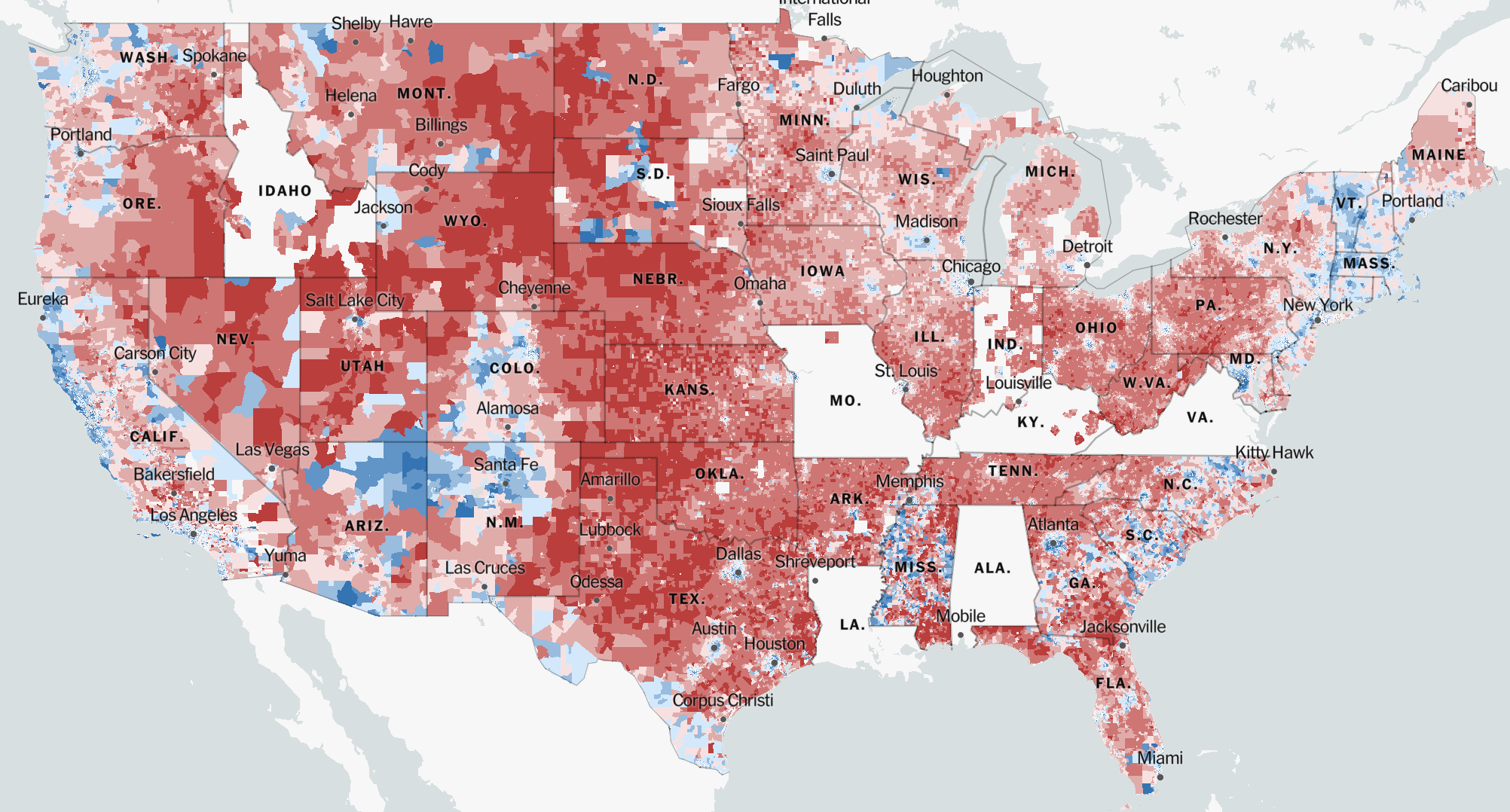
FIGURE 1: 2020 Presidential Election (Park et al., “An Extremely Detailed Map of the 2020 Election”)

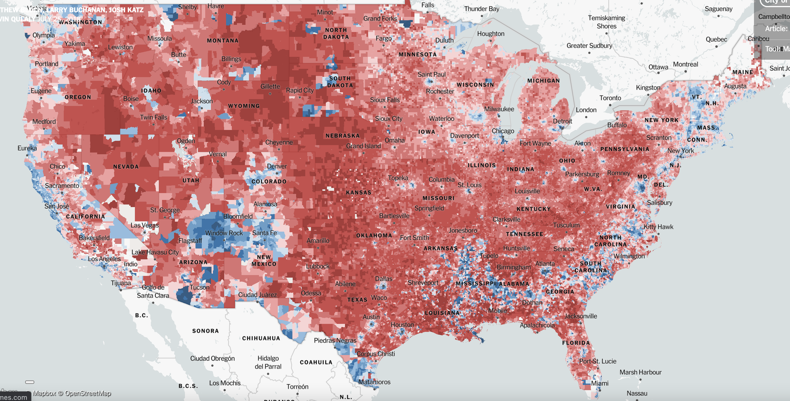
FIGURE 2: 2016 Presidential Election (Bloch et al., “An Extremely Detailed Map of the 2016 Presidential Election”)

To preface this blog post, I would like to note that I do not mean what I say to be taken as a political message. The background I provide on this topic is worded as such to allow for a deeper conveyance of my argument related to my map of the week and around the rhetoric of cartography.

The map I chose for my blog is a map of the 2020 election results (FIGURE 1). The map details data from “2,523 of 3,143 counties in 47 states, representing 89% of all votes cast” (Park et al., “An Extremely Detailed Map of the 2020 Election”). I chose this map to be my “map of the week” because I think political maps are great examples of the rhetoric behind cartography. Not only that, but I believe this map and my greater analysis complement the blog thread as American political maps offer additional avenues of analysis on the rhetorical weight of their standing. 

There are some states that have been omitted from the county breakdown on the 2020 election map due to the ways the states reported votes. Through the pandemic, some states didn’t report votes in ways that linked the votes to specific precincts in the state because of the widespread mail-in balloting, so the New York Times – which is the source that created the map – felt that country-specific data from those states could not reliably be mapped. Due to this issue, the visualizations of the map as a whole are affected by the omitted counties and states. I wanted to mention this because while my analysis will be on the context and mapping of the 2020 election, after digging around I found that the 2016 election map and 2020 election map are nearly identical from a visual standpoint. So, in an effort to get around the visual issue of the 2020 map’s omission of certain counties and states, for some of my overarching analytical points about the rhetoric of cartography, I will reference the New York Times’ detailed map of the 2016 election (FIGURE 2).

Before I continue, I would like to present a question to you that I would like you to keep in the back of your mind as you read on: In the ways maps visualize information, how might a [political] map display, or distort the prevalence of political tension in the represented society? 

With that question stated, I will now provide some historical context behind the map. On November 3, 2020, the United States presidential election between former Vice President Joe Biden (D) and incumbent President Donald Trump (R) was decided, in which Joe Biden was elected as the 46th President of the United States. His victory marked the history books as the fifth occurrence in the past 100 years where the incumbent president did not win their re-election campaign. This monumental election also logged the highest voter turnout by percentage since 1900 (Park, “2020 Voter Turnout Was the Highest the U.S. Has Seen in Over a Century”), in which Biden earned his victory by outscoring Trump in both the electoral vote category (Biden with 306 and Trump with 232) and popular vote category (Biden with 81.2 million and Trump with 74.2 million) (“Presidential Election, 2020”).

Following the deliverance of the votes of the Electoral College, a joint session of the Congress was scheduled to take place on January 6, 2021, in which one of the most unprecedented events in recent history occurred. A large mass of American citizens incited violence against the Government of the United States through an insurrectionist invasion of the United States Capitol building. This event was largely provoked by Trump, which contested one of the most important and central tenets of American democracy, the need for a peaceful transfer of power, and resulted in Trump’s [second] impeachment just one week before his term expired.

Through the course of Trump’s presidential term, he could easily be labeled as a norm-shattering president (for better or for worse). This is because a central theme in many past presidents’ rhetoric is that they contain strong elements of logos, which is a form of rhetorical persuasion that is centered around building strong logical arguments to gain appeal. However, with Trump, his rhetoric was more strongly aligned with the elements of ethos, which is a form of rhetorical persuasion that is centered around building a strong sense of status or authority to appeal to others. This can be seen through Trump’s strong visceral reactions on Twitter, in debates, and in speeches, and can also be understood through the continual maintenance of his “strongman persona” (Rowland, “The Rhetoric of Donald Trump”). Through this rhetoric, Trump was incredibly effective at reaching his intended audience and he gained powerful support from millions of Americans across the country. However, in doing so, millions of people also outspokenly opposed his rhetorical style because, to many, it felt un-presidential and intrinsically violent. As a result, Trump’s rhetoric arguably caused one of the most post-civil war hyper-partisan divides in our nation’s history. 

With the historical context now provided, I will conduct a brief cross-sectional analysis of the rhetoric of cartography in relation to the 2020 election map by referencing the studies of two prevalent scholars in this field of rhetorical cartography, Dennis Wood and J. B. Harley. 

In Wood’s book, The Power of Maps, he states how maps hold an “inherent indexicality to link the territory in question with what comes with it;” they have rhetorical lives (Wood and Fels, The Power of Maps). Wood goes on to explain how maps serve as ways to label politically based areas, in which the science of cartography is in contest with the foundational artistry of it. This is important to the visualization of the 2020 election map because the map shows an overwhelming portion of the United States coated in red to show Republican voters, and an underwhelming portion of the United States coated in blue to show Democratic voters. So, on the basis of territory, Trump won this election. However, on the basis of population, Biden won, which isn’t conveyed through the rhetoric of this map. This is because elections are decided by the populace, in which the most densely populated areas are cities that happen to take up small portions of geographically based territory.  Furthermore, on the premise that maps serve as ways to label politically based areas, American electoral maps have an innate history of aligning space with political alignment. This can become an issue for political maps because it curtails areas on the map in ways that divide territory on a centralized, partisan basis. This causes territory to be [mis]represented through the acclaimed totality of red or blue prevalence in the area, which further feeds into nationwide tensions of political division.

In Harley’s book, Deconstructing the Map, he states how maps convey tension as both scientific documents and as political and rhetorical engines. They can legitimize power and can create or enforce inequalities (Harley, “Deconstructing the Map”). This is an important argument made by Harley for my blog post because it can be related to the storming of the capital. During the course of the election, these types of maps were broadcasted nationwide, which, when visually interpreted, show overwhelming support for Trump as massive amounts of the nation’s terrain were doused in red. I would argue that, in many ways, the map’s visual distortion of political support for Trump on a spatialized basis served as a sort of ‘factual’ justification for the [ignominious] storming of the capitol building, in which many citizens felt the results of the election did not represent their perceived ‘reality’ of the nation’s support for Biden. To connect this back to my central argument, – which is that American political maps innately present issues of divisive partisanship through the usage of space as a means to visualize the political arrangement of the nation – Harley’s point on how maps can legitimize power through the conveyed tension as both scientific documents and as political and rhetorical engines is perfectly exemplified through my statement above. Maps historically serve a purpose as being scientific documents, and in our society science and fact tend to be considered as one of the same. Tensions can therefore rise when a map is used to represent political alignment, and in the case of this map, it does so in a way that does not adequately align with the processes of determination for which it is used to convey. This map was broadcasted nationwide and was used as a means to accurately convey information on the results of the presidential election, however, the event that it was used (i.e. the presidential election) for is decided on the populace’s vote count, to which space is not factored in. So, by using a map, space is granted a greater emphasis, which directly conflicts with the use case of the map by distorting the reality of partisanship in our nation as it frames nation support based more on spatial support than on populous support.


References:

Bloch, Matthew, Larry Buchanan, Josh Katz, and Kevin Quealy. “An Extremely Detailed Map of the 2016 Presidential Election.” The New York Times, July 25, 2018, sec. The Upshot. https://www.nytimes.com/interactive/2018/upshot/election-2016-voting-precinct-maps.html.

Harley, J B. “Deconstructing the Map.” Cartographica: The International Journal for Geographic Information and Geovisualization 26, no. 2 (June 1989): 1–20. https://doi.org/10.3138/E635-7827-1757-9T53.

Park, Alice, Charlie Smart, Rumsey Taylor, and Miles Watkins. “An Extremely Detailed Map of the 2020 Election.” The New York Times, February 2, 2021, sec. The Upshot. https://www.nytimes.com/interactive/2021/upshot/2020-election-map.html.

Park, Andrea. “2020 Voter Turnout Was the Highest the U.S. Has Seen in Over a Century.” Marie Claire Magazine, November 5, 2020. https://www.marieclaire.com/politics/a34589422/voter-turnout-2020/.

Ballotpedia. “Presidential Election, 2020,” n.d. https://ballotpedia.org/Presidential_election,_2020.

Rowland, Robert. “The Rhetoric of Donald Trump.” University Press of Kansas, n.d. https://kansaspress.ku.edu/978-0-7006-3196-4.html.

Wood, Denis, and John Fels. The Power of Maps. Mappings. New York: Guilford Press, 1992.

Posted in Uncategorized | 2 Comments

Atlas of the Week: World Atlas (Virginia)

This atlas represents Virginia and explicitly showcases the extent of the state. The majority of Virginia is forested land, dominated by mountain ranges that go through the state’s western half. It is interesting to note the number of rivers in the state, including the James, Potomac, Shenandoah, Rappahannock and York. The mapmaker’s utilization of color stood out to me, where the use of green showcases how much of Virginia is composed of mountains.

Reference:

“Maps of Virginia,” https://www.worldatlas.com/maps/united-states/virginia


Posted in Atlases of the Week | Comments Off on Atlas of the Week: World Atlas (Virginia)

Map of the Week: Richmond VA & Virginia Crime

Before leaving for college, my parents were worried about me moving to Richmond. Richmond was notorious for its crime, specifically its murder rate when they grew up. In 1985, Richmond had 93 murders with a murder rate of 41.9 killings committed per 100,000 residents. In 1995, Richmond had one of the highest murder counts in the United States, with 120 murders and 59.1 killings per 100,000 residents. Morgan Quitno Press, a research and publishing company, ranked Richmond as the ninth most dangerous city in the U.S in 2004. Over the next few years, Richmond’s status as a violent city declined steadily. By 2012, Richmond was longer in the ‘top’ 200 most dangerous cities. It was not until 2016 when Richmond witnessed another rise in homicides, with 61 murders reported, as The Richmond Times-Dispatch referred to as “the city’s deadliest year in a decade.”

When my parents and I arrived in Richmond, they were impressed by the suburbia and lack of danger. The map above displays the overall crime per 1,000 Richmond Metro residents. The map labels the “crime grades” by showing the safest places in green, the moderately secure areas in yellow and the most dangerous areas in red. The overall grade resulted in a C+, about the same as the average U.S. metro area. It is notable to highlight that the west part of the metro area appears to be the safest, while the city becomes more dangerous as you go more south. A silence of this map is that the rate of crime per resident may appear inflated when people visit the area during the day but do not live there. This skews the statistics as there are several retail establishments in the center of the metro area, which indicated on the map, is a hotspot for crime. These crimes are committed where few people live, as these take place on the street and are committed by visitors. Even people who live around that area would not be affected as much as the crime is not taking place in their neighborhoods, signaling that although they live in a red area, they are still safe. Something else that needs to be acknowledged is that the red spots on the map indicate areas where recreational areas are. People who live by these recreational areas would not be committing these crimes, but unfortunately, one may look at this map and decide not to live there. A map like this inadvertently reproduces inequalities around neighborhoods and public spaces, which can reaffirm stereotypes. That is why it is crucial not solely to base your opinion on one map. In this case, further examination and research are essential in avoiding giving into cliched notions regarding Richmond. 

It is interesting to look at the state of Virginia and compare its crime rates to Richmond. As of 2018, Virginia has the fourth lowest violent crime rate and thirteenth lowest property crime rate. The level of crime that circulates the state is notable, with Richmond appearing to occupy a solid amount of green area. The northeast part of Virginia appears to be the safest part of Virginia and the map earned an overall grade of an ‘A,’ indicating the rate of crime is much lower than the average U.S. state. A critique of this map is the lack of symbols and legends. The map is very straightforward and its colors are the main factor in representing its messages. The use of borders is notable, as it divides the map up into distinct sections and highlights the diversity of colors, or crime, amongst different areas. The map does a good job persuading its audience into highlighting how Virginia is a safe place to live, with Richmond appearing on the map to be an extremely safe area. I was a bit confused as to why Richmond received a ‘C+’ grade but appeared on the Virginia map in predominantly green color. In this case, I believe citizen cartography would help to demonstrate an interesting point-of-view of Richmond’s crime in relation to the state of Virginia’s crime. This would give a first-hand account of the matter, rather than relying on statistics that can reaffirm stereotypes. Critical cartography provides and creates knowledge for its audience, in which there is a whole political and rhetorical process that goes with it. Counter mapping also has its own political and rhetorical process, and like citizen cartography, it could be useful to address Richmond and Virginia’s crime from a different angle. That way, new voices could be brought in without the state telling you how to map, and it would honor voices who get shut out of maps. Maps shape our reality, and by producing maps that inadvertently reproduce inequalities, those in power benefit. With cartography becoming increasingly professionalized, counter mapping must challenge that. Overall, these maps offer a matter-of-fact approach to examining the crime in Richmond and Virginia. While I would not directly show these maps to my parents, they would notice its stereotype reaffirmations after dropping me off at school and seeing what Richmond was truly like.

References:

“The Safest and Most Dangerous Places in Richmond Metro, VA” https://crimegrade.org/safest-places-in-richmond-va-metro/

“The Safest and Most Dangerous Places in Richmond” https://crimegrade.org/safest-places-in-virginia/

Posted in Maps of the Week | 3 Comments

Map of the Week: BridgePark RVA

From the former capital of the Confederacy to redlining, the city of Richmond has a tangled past in regard to race relations. In 2012, Ted Elmore, a former partner at Hunton and Williams LLP,  created a project to reimagine the city of Richmond with the introduction of a two-mile bridge park. The nonprofit, BridgePark RVA is seeking to create a two-mile-long pedestrian and cycle urban connectivity greenway. The proposed greenway is being constructed in hopes of connecting the south and north side of the city. On either side of the bridge, the nonprofit is seeking to repurpose barren and unoccupied oversized vehicle spaces into active green spaces. Hopefully, these spaces will be utilized by all community members as places of gathering, learning, and relaxing. At the center of the project is the hope that communities will be reconnected to the city center, which was taken away from them due to a series of urbanization policies passed in the mid 20th century. In the 1950s legislators in Richmond passed a freeway construction plan that ripped through the predominantly black neighborhood of Jackson Ward. Homes, businesses, and churches were destroyed as the construction of Interstate 95 demolished everything in its path, which happened to be the center of a thriving black community at the time. It also displaced 10 percent of the black population in Richmond. Meanwhile, the interstate served white communities as it transported people to the predominantly white suburbs. 

Another legislation that came out of urbanization was redlining, which was the practice of refusing a loan or insurance to someone because they lived in an area deemed to be a poor financial risk. In the city of Richmond, it was no coincidence that predominantly black neighborhoods were redlined because of the belief by banks that such neighborhoods were “hazardous”. This institutionalized racism caused a divide in the city as neighborhoods were extremely segregated, consequently segregating the schools as well. Due to the impacts of redlining and other legislation in the city of Richmond, the south side of the city is disproportionately black. If you traverse across the river to a neighborhood on the south side, the life expectancy decreases significantly (Hayter). 

Since 2012, BridgePark RVA has been attempting to fix the institutional problems in the city of Richmond by working with an experienced team to identify solutions. The board of directors is led by Ted Elmore and consists of community leaders, artists, activists, and innovators. Additionally, the project has been involved in community engagement, gaining the perspectives of all sorts of people who live in Richmond. A 28-foot long model was created and shown in 21 different locations across the city. Several schools and students have worked with the team as well as more than 30 city departments and community organizations in an effort to have all voices heard, which did not happen in the mid 20th century (BridgePark). 

The map that I chose for my “Mappenstance” blog project is the official map on the BridgePark RVA website outlining the proposed plan for the project. There is no title on the map, nor are there any legends to give great detail. The map itself is fairly basic as it serves to illustrate the massive area of land that it hopes to convert into a green space which is marked by a sort of blue gradient. I think that this color choice is very interesting as I would’ve imagined utilizing green to associate with the greenspace that the project aims to create. Spatially, I think that the map does an excellent job at setting up the river in the dead center because it emphasizes the divide that needs to be fixed. However, I do think that choosing a stronger or brighter color to represent the Bridge Park plans would help to highlight how the project can connect the community in a more effective way. Additionally, I also think that it was unique how barebones of a map this is for such a massive project. The map leaves me with more unanswered questions than I arrived with, which I also think could be a ploy for community engagement so that people ask the questions of how it is going to work or what it will look like. However, for a nonprofit organization with such a large task at hand, I think that this is a very risky move to make.

There are also many silences within the map that are not necessarily addressed (Harley). For example, the context that I mentioned previously surrounding the city of Richmond is crucial to understanding why the project needs to happen, yet there is no hint of this. While this case is very fascinating, a lack of context is not unique to mapping in general. Maps like this remind us of how crucial context is to see the map from a different perspective. I think that an interactive map would be incredibly effective at identifying the problems and solutions in one place. For example, the map could be layered with a redlined map of Richmond and a map of Richmond’s economic breakdown by neighborhood today. This way, the map becomes sort of a counter-map that challenges the state legislation that shaped the city. Instead of allowing the state legislature to dictate what the city currently looks like, the map has the ability to use this to its advantage by taking the information and directing it in a positive direction that reimagines the city of Richmond. 

Works Cited 

BridgePark, RVA. “Bridgepark.” BridgePark, 2022, https://www.bridgeparkrva.com/

Harley, J. B. “Deconstructing the Map.” The Map Reader, 2011, pp. 56–64., https://doi.org/10.1002/9780470979587.ch8

HAYTER, JULIAN MAXWELL. Dream Is Lost: Voting Rights and the Politics of Race in Richmond, Virginia. UNIV PR OF KENTUCKY, 2019.

Posted in Maps of the Week | 1 Comment

Link of the Week: Wired’s Bay Area Commute Maps

https://www.wired.com/2015/08/pretty-maps-bay-area-hellish-commutes/ 

This is a blog by Wired that illustrates the Bay Area commute using a series of interactive maps. There are 3.3 million Bay Area residents who commute to 110,000 different areas. The maps were done by Alasdair Rae and the blog is written by Greg Miller who published it in 2015.


Posted in Uncategorized | Comments Off on Link of the Week: Wired’s Bay Area Commute Maps

Atlas of the Week: CDC on Heart Disease and Stroke

https://www.cdc.gov/dhdsp/maps/atlas/index.htm 

This is an interactive Atlas by the CDC that charts Heart Disease and Stroke in the US. Users can create custom-level maps based on race, gender, and ethnicity to show the risk of heart disease or stroke. There are also tables and data sources available.


Posted in Atlases of the Week | Comments Off on Atlas of the Week: CDC on Heart Disease and Stroke

Atlas of the Week: USDA Food Access

http://www.ers.usda.gov/data-products/food-access-research-atlas/go-to-the-atlas/

This atlas covers the topic of food access research.  I was initially interested in basing my final project on this topic, so I wanted to cover it in my atlas selection.  The atlas allows users to type in a location and determine how accessible supermarkets are for low-income residents.  The accessibility of these supermarkets range from ones that are only a few miles away to ones that require vehicle access.

Posted in Uncategorized | Comments Off on Atlas of the Week: USDA Food Access

Map of the Week: Redlining in Richmond


The “Residential Security Map for Richmond” that I have selected shows the levels of residential security in Richmond, Virginia in 1937. The map rates the risks of various neighborhoods for the purpose of real estate investment. This map is a visual example of how cities in Richmond were redlined in the 1930s. Redlining is a practice that makes it challenging or impossible for people in specific areas to acquire mortgage financing and therefore become homeowners. Redlining allowed for native-born white families to be a priority in receiving both public and private money, resulting in black and immigrant families to be left with little to no access to that money. This map is still relevant today because redlining practices from this time have had a lasting effect on current neighborhoods (Mapping Inequality).

In the 1930s, federal officials deemed black neighborhoods as “risky” by using the color red to mark these areas on maps. This allowed bankers to deny mortgages and investments in redlined neighborhoods. Living in redlined neighborhoods made it extremely difficult for potential home buyers to receive mortgages or any sort of credit in these red areas. The underinvestment of these areas resulted in fewer trees and parks and no protection for any trees and parks that might be found. More paved surfaces and industrial sites were built as a result (Formerly Redlined).

In our class discussion on J.B. Harley’s writing of “Deconstructing the Map,” we talked about the idea that all maps have a message and that they all engage with social and political issues. We said that all maps make an argument. Taking this into consideration while looking at the “Mapping Inequality” map that I chose, I can see how redlining has affected Richmond’s residential areas. Due to redlining, formerly poor communities in Richmond experience hotter summers because of the lack of trees that are planted in these areas. These areas are up to 12 degrees warmer in the summer. The disadvantages of living in a neighborhood that does not have access to greenery include a lack of opportunity to exercise, play, inhale clean air, enjoy shade, and grow food. Heat-related illnesses are therefore more common in poorer neighborhoods (Travers).

Looking at the map, we can see that there is a key that tells us what each color means. The colors are scaled from “best” (green) to “hazardous” (red). As our eyes move inward on the map, we can see that the “hazardous” neighborhoods are located at the heart of the city. These neighborhoods are next to each other. This indicates segregation in housing because those who want to live in nicer areas live by each other. The green and blue areas are almost all furthest from the red areas. The blue and green areas are more on the outskirts of the city. They are located more north on the map, away from the industrial and commercial areas.

This map provides us with a visual representation of the disparities between poorer and more affluent neighborhoods. This is a straightforward map that effectively shows redlining in Richmond. The map allows us to see how big of an issue redlining is and how geographically concentrated the issue is. We mainly see the “hazardous” color in one area of the map. This suggests that we only show concern for those who occupy the “hazardous” space or those who are near it. Both sources that I referenced emphasize the fact that latinx and black residents are far more common in redlined areas than white residents. One reason why I chose this map was because the people who reside in redlined neighborhoods make a low income yet are subjected to a poor living environment that is bound to cause health related issues. The lack of greenery in redlined areas is likely to make residents’ doctor bills skyrocket, putting them in a constant cycle of owing money and not being able to afford to move up to a neighborhood with less hazardous living conditions (Travers).

In our class discussion on “Deconstructing the Map,” we also discussed how maps legitimize potentially problematic aspects of power. We can see how redlined neighborhoods are neglected because of the lack of greenery within them. The more affluent neighborhoods are tended to and cared for by the city because they possess an ideal image that the city wants to maintain. Residents of these neighborhoods except the maintenance habits that the city provides. Our class then talked about how maps are authoritative and that we let them legitimize a lot of problems as a result of this. This is evident in the “Residential Security Map for Richmond” map because redlining a neighborhood labels the communities that occupy them as ‘poor.’ Redlining creates both financial and health related barriers that single out occupants of “hazardous” neighborhoods from the rest of the community. Although redlining itself has subsided, we still live with the aftereffects. In Julia Travers’ article, we can see how gentrification, among other things, has almost become a new form of redlining. Less affluent neighborhoods are involuntarily being taken on as projects in an effort to revamp the appearance of these neighborhoods for the good of the city (Travers). For the most part, this map legitimizes the status of those who occupy space in downtown Richmond as ‘poor.’ This map forces us to reflect on the diversity of occupants that live in Richmond and how the areas that they reside in directly affect the ways that they are treated.


Works Cited

“Formerly Redlined Areas of Richmond Are Going Green.” Chesapeake Bay Foundation, www.cbf.org/blogs/save-the-bay/2020/09/formerly-redlined-areas-of-richmond-are-going-green.html.

Deconstructing the Map, by J. B. Harley, vol. 26, 2004, pp. 1–15.

“Mapping Inequality.” Digital Scholarship Lab, https://dsl.richmond.edu/panorama/redlining/#loc=12/37.549/-77.545&city=richmond-va&area=C4&text=intro

Travers, Julia. “A Tree Grows in Richmond: Southside Moves from Redlining to Greening.” Progressive.org, 11 Mar. 2021, https://progressive.org/latest/from-redlining-to-greening-travers-210311/

Posted in Uncategorized | 1 Comment

Atlas of the Week: Antarctica Without Ice

https://gisgeography.com/antarctica-map-satellite-image/

This is a collection of maps regarding data collection in Antartica. The atlas includes Antartica without cloud cover, Antartica without ice, maps of research stations, mapping ozone holes, a historical map documenting explorations, and other maps. The “Antartica without ice” map fascinated me not only because it’s a way of tracking climate change, but also because Antaractic ice serves as a time capsule for the Earth. For example, tree fossils found in Antartica match living trees in Australia, giving credence to the tectonic plate theory. This is a great example of how mapping data can be used to educate in ways that written pieces may not be able to. The visual rhetoric of the maps in this atlas capture the reader’s attention. The comparision between historical maps and modern ones is also valuable as it shows how cartography has changed over the past 100 years.

Posted in Atlases of the Week | Comments Off on Atlas of the Week: Antarctica Without Ice

Map of the Week: NUKEMAP

Screenshot of NUKEMAP, shows the damage that an 800kt bomb would do if dropped on Richmond, VA.

NUKEMAP in action

Some individuals have the power to launch nuclear strikes with the ability to wipe out a parcel of land the size of Texas, Alex Wellerstein has NUKEMAP. NUKEMAP is a one man project that Wellerstein built just over ten years ago that allows users to drop theoretical bombs on real world locations, with the program calculating statistics such as deaths, fallout, and injuries. Users can either select from a list of provided real-world weapons or they can create their own bomb by specifying the yield in kilotons. Wellerstein’s data hasn’t been updated to reflect Russia’s invasion of Ukraine yet, but I’d be willing to guess that searches related to Russian bombs have skyrocketed. According to Wellerstein, “pretty much every nation with an outgoing internet connection has had at least one visitor to NUKEMAP, which is a little amazing and overwhelming, even more so since NUKEMAP is in English (obviously there are ways to translate websites on the fly, but it’s an obvious impediment)” (Wellerstein, Alex). NUKEMAP reports 38 million unique visits to the site and over 220 million bombs detonated so it’s not exactly a niche program (Wellerstein, Alex). 

Even with such a brief introduction, it’s not hard to see how some people could be concerned that someone built a tool that accurately measures the results from nuclear blasts, especially considering Wellerstein has “crude nuclear terrorist weapon” as a preset that users can select (“Restricted Data: The Nuclear Secrecy Blog”). Wellerstein, ever the gentleman, has aggregated some of the data from his program but has protections in place to protect privacy. While there is data on which bombs and locations are popular, Wellerstein states the program is not capable of telling “who nukes who” (“Restricted Data: The Nuclear Secrecy Blog”). 

While NUKEMAP is certainly an amazing tool, it’s only one of the latest nuclear weapons maps. For example, the Future of Life Institute has created a map showing all 1100 National Security Archives’ declassified nuclear targets (“Declassified US Nuclear Targets”). Going back further in history, we are brought back to the Cuban Missile Crisis where two men had the power to potentially annihilate a significant swath of multiple countries’ populations. CNN reports of a secret ‘doomsday’ map detailing potential Cuban targets if the conflict led to nuclear strikes. Kennedy’s brother, Robert, had this to say about possible nuclear warfare: “… a surprise attack would erode if not destroy the moral position of the United States throughout the world” (“Thom Patterson, CNN.”). Although this author does not believe the United States is a moral nation, he can agree that nuclear warfare would indeed further damage the crumbling moral position of the world’s bastion of democracy. 

Shows the target nuclear strikes as dots. There are multiple in almost every country east of Germany.

Cold War era nuclear maps and NUKEMAP used to be quite different tools used by wholly different kinds of people. Cold War maps, at the time, were used by regular people and governments alike to determine what kinds of threats and damage they would face if tensions escalated. NUKEMAP, until Russia’s invasion of Ukraine, seems to have been used by people who were bored with some morbid curiosity and a little time on their hands. Now, however, NUKEMAP is being used as a tool just as the Cold War era maps were, for people to calculate the damages of what they believe are imminent nuclear strikes. NUKEMAP has the capability of being used as a protest tool as well thanks to the map’s powerful visual rhetoric. When a bomb is dropped on a location, the user is able to see the casualties and injuries shoot up as numerical figures and a circle appears showing the bomb’s secondary effects like radioactive fallout. The map could be used to illustrate the destructive potential of even small nuclear bombs. Given that the subject of nuclear war is often talked about in the abstract, far removed from the human element, the visuals of the map make a greater impact than words.

Looking deeper into the rhetoric of the NUKEMAP, it’s clear that Wellerstein intended to make his mapping tool user-friendly with no frills. However, no map can simply be a map. To dive into the rhetoric of cartography, we begin by examining Wellerstein’s sources. Luckily, rather than using a government or corporate source for Wellerstein’s map, he used OpenStreetMap. OpenStreetMap is an open source mapping tool focused on local knowledge and community driven members that contribute to the project to ensure that it’s functioning properly (“OpenStreetMap”). While there obviously could still be issues with open source mapping, there is considerably less risk of inaccuracies than government or corporate maps, both because of the types of people that open source mapping attracts and simply the nature of crowdsourcing.There are some pitfalls of open source mapping, however, given the nature of the concept. The goal of open source mapping is to gain as many contributors as possible, as to eliminate potential inaccuracies. An open source tool could potentially be overwhelmed with false data by hostile actors given the right circumstances.  A wise man once said “the world is not in your books and maps. It’s out there” (Tolkien, J. R. R. ). Fortunately for us, open source mapping is the closest most of us can get to experiencing that. 

NUKEMAP allows users to explore the effects of nuclear weapons without the obvious danger of being near the real thing. For example, if someone was worried that Washington, DC would be the target of a nuclear bomb, they could input their data and see the results. Let’s say they wanted to visualize what would happen if DC was struck by a crude nuclear weapon with a yield of 100 tons. Wellerstein’s advanced options give users the choice to explore specific PSI explosions, the effects of airburst and surface blast explosions, and the probability of burns. In other words, NUKEMAP is as close as you would ever want to get to the real thing.

Wellerstein’s mapping tool is markedly different from the Nuclear War Atlas of 1982 published by the Society for Human Exploration (Victoriaville, Québec). The maps included in the Atlas bear striking similarities to Wellerstein’s project in the sense that the maps contained in the Atlas detail potential outcomes of nuclear strikes. However, the details included in each map are rather chilling and much more detailed than Wellerstein’s data on the aftermath of nuclear strikes. Take for example Map 13, the Sea of Cancer, which shows a projection that most of the United States will be fully irradiated if nuclear war begins (“The Nuclear War Atlas” ). For another example, direct your attention to Map 12, the Nuclear Poison Gas Cloud, in which the Atlas details that there would be no possibility of peaceful atomic power in a nuclear war (“The Nuclear War Atlas” ). That advice from 1982 seems to hold true over 40 years later as Russia has made it clear that nuclear weapons are not off the table during their invasion of Ukraine, having already captured Chernobyl (although not permanently). 

Multiple descriptions of post-nuclear scenarios such as air contamination, pollution, ect

All in all, Wellerstein’s mapping tool is a more advanced 21st century version of Cold War projection maps. Wellerstein’s map may have a fun flare to it but the nature of his work is as serious as the bombs that he maps. Crowdsourcing has changed the way we make maps, this fact is indisputable. No longer do people have to rely on their governments or corporations to make maps with no guarantee of accuracy. Crowdsourcing may have its issues, but it has democratized cartography and the rhetoric surrounding it, making the subject incredibly more accessible.  This map is a reminder that in the digital age, bombs are just pixels on a screen until you’re the target. 


Citation

“Declassified US Nuclear Targets.” n.d. Future of Life Institute. Accessed March 23, 2022. https://futureoflife.org/background/us-nuclear-targets/#nukemap.

“OpenStreetMap.” 2019. OpenStreetMap. 2019. https://www.openstreetmap.org/about.

“Restricted Data: The Nuclear Secrecy Blog.” n.d. Restricted Data: The Nuclear Secrecy Blog. Accessed March 23, 2022. http://blog.nuclearsecrecy.com/.

“The Nuclear War Atlas” n.d. Collections.lib.uwm.edu. Accessed March 23, 2022. https://collections.lib.uwm.edu/digital/collection/agdm/id/15370.

Thom Patterson, CNN. 2018. “How the Kennedys Handled the Cuban Missile Crisis.” CNN. April 6, 2018. https://www.cnn.com/2018/04/06/us/jfk-cuban-missile-crisis-map-auction/index.html.

Tolkien, J. R. R. 2012. The Hobbit. London, England: HarperCollins.

Wellerstein, Alex. 2006. “NUKEMAP by Alex Wellerstein.” Nuclearsecrecy.com. 2006. https://nuclearsecrecy.com/nukemap/.

Posted in Maps of the Week | Tagged , , , | Comments Off on Map of the Week: NUKEMAP