
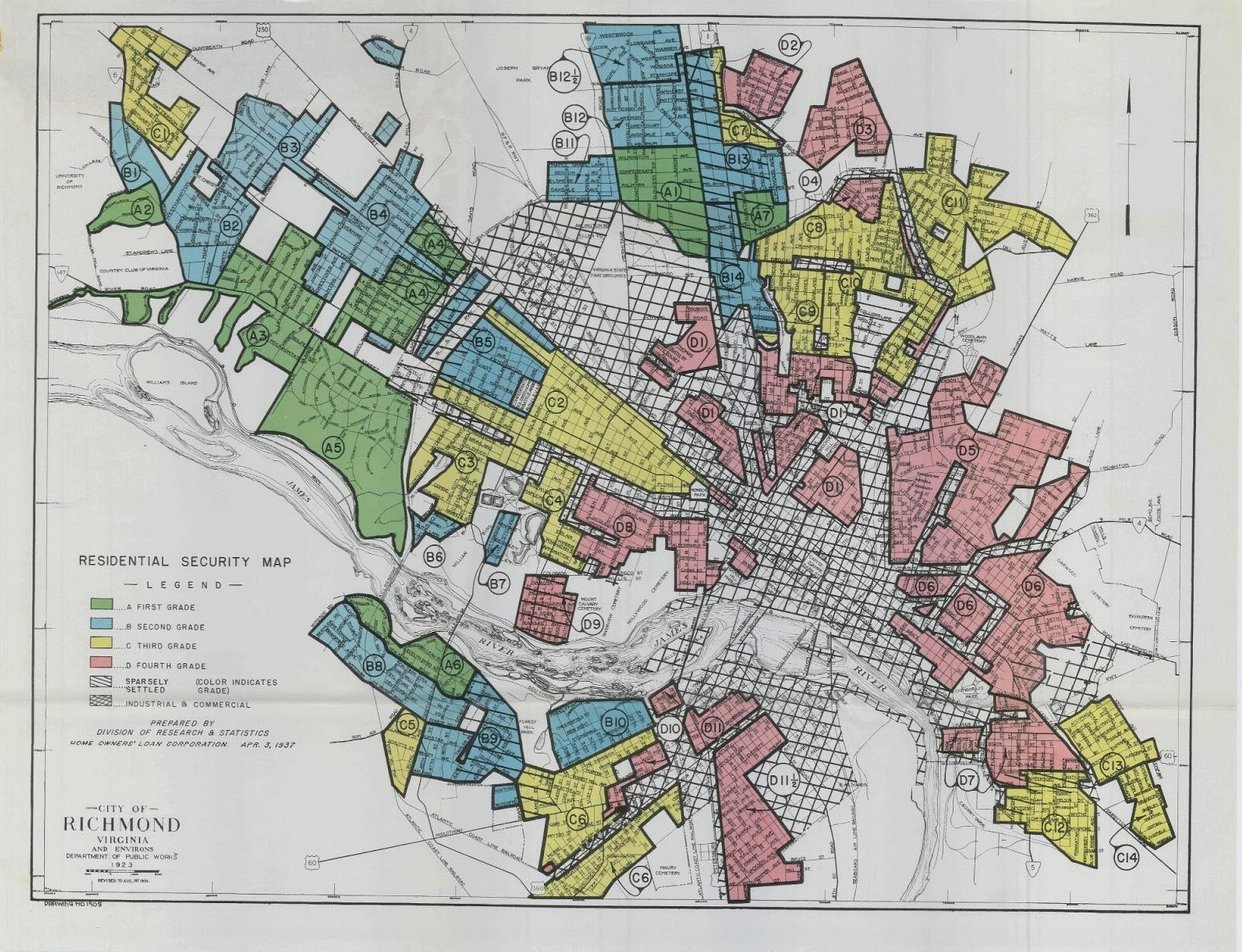
The “Residential Security Map for Richmond” that I have selected shows the levels of residential security in Richmond, Virginia in 1937. The map rates the risks of various neighborhoods for the purpose of real estate investment. This map is a visual example of how cities in Richmond were redlined in the 1930s. Redlining is a practice that makes it challenging or impossible for people in specific areas to acquire mortgage financing and therefore become homeowners. Redlining allowed for native-born white families to be a priority in receiving both public and private money, resulting in black and immigrant families to be left with little to no access to that money. This map is still relevant today because redlining practices from this time have had a lasting effect on current neighborhoods (Mapping Inequality).
In the 1930s, federal officials deemed black neighborhoods as “risky” by using the color red to mark these areas on maps. This allowed bankers to deny mortgages and investments in redlined neighborhoods. Living in redlined neighborhoods made it extremely difficult for potential home buyers to receive mortgages or any sort of credit in these red areas. The underinvestment of these areas resulted in fewer trees and parks and no protection for any trees and parks that might be found. More paved surfaces and industrial sites were built as a result (Formerly Redlined).
In our class discussion on J.B. Harley’s writing of “Deconstructing the Map,” we talked about the idea that all maps have a message and that they all engage with social and political issues. We said that all maps make an argument. Taking this into consideration while looking at the “Mapping Inequality” map that I chose, I can see how redlining has affected Richmond’s residential areas. Due to redlining, formerly poor communities in Richmond experience hotter summers because of the lack of trees that are planted in these areas. These areas are up to 12 degrees warmer in the summer. The disadvantages of living in a neighborhood that does not have access to greenery include a lack of opportunity to exercise, play, inhale clean air, enjoy shade, and grow food. Heat-related illnesses are therefore more common in poorer neighborhoods (Travers).
Looking at the map, we can see that there is a key that tells us what each color means. The colors are scaled from “best” (green) to “hazardous” (red). As our eyes move inward on the map, we can see that the “hazardous” neighborhoods are located at the heart of the city. These neighborhoods are next to each other. This indicates segregation in housing because those who want to live in nicer areas live by each other. The green and blue areas are almost all furthest from the red areas. The blue and green areas are more on the outskirts of the city. They are located more north on the map, away from the industrial and commercial areas.
This map provides us with a visual representation of the disparities between poorer and more affluent neighborhoods. This is a straightforward map that effectively shows redlining in Richmond. The map allows us to see how big of an issue redlining is and how geographically concentrated the issue is. We mainly see the “hazardous” color in one area of the map. This suggests that we only show concern for those who occupy the “hazardous” space or those who are near it. Both sources that I referenced emphasize the fact that latinx and black residents are far more common in redlined areas than white residents. One reason why I chose this map was because the people who reside in redlined neighborhoods make a low income yet are subjected to a poor living environment that is bound to cause health related issues. The lack of greenery in redlined areas is likely to make residents’ doctor bills skyrocket, putting them in a constant cycle of owing money and not being able to afford to move up to a neighborhood with less hazardous living conditions (Travers).
In our class discussion on “Deconstructing the Map,” we also discussed how maps legitimize potentially problematic aspects of power. We can see how redlined neighborhoods are neglected because of the lack of greenery within them. The more affluent neighborhoods are tended to and cared for by the city because they possess an ideal image that the city wants to maintain. Residents of these neighborhoods except the maintenance habits that the city provides. Our class then talked about how maps are authoritative and that we let them legitimize a lot of problems as a result of this. This is evident in the “Residential Security Map for Richmond” map because redlining a neighborhood labels the communities that occupy them as ‘poor.’ Redlining creates both financial and health related barriers that single out occupants of “hazardous” neighborhoods from the rest of the community. Although redlining itself has subsided, we still live with the aftereffects. In Julia Travers’ article, we can see how gentrification, among other things, has almost become a new form of redlining. Less affluent neighborhoods are involuntarily being taken on as projects in an effort to revamp the appearance of these neighborhoods for the good of the city (Travers). For the most part, this map legitimizes the status of those who occupy space in downtown Richmond as ‘poor.’ This map forces us to reflect on the diversity of occupants that live in Richmond and how the areas that they reside in directly affect the ways that they are treated.
Works Cited
“Formerly Redlined Areas of Richmond Are Going Green.” Chesapeake Bay Foundation, www.cbf.org/blogs/save-the-bay/2020/09/formerly-redlined-areas-of-richmond-are-going-green.html.
Deconstructing the Map, by J. B. Harley, vol. 26, 2004, pp. 1–15.
“Mapping Inequality.” Digital Scholarship Lab, https://dsl.richmond.edu/panorama/redlining/#loc=12/37.549/-77.545&city=richmond-va&area=C4&text=intro
Travers, Julia. “A Tree Grows in Richmond: Southside Moves from Redlining to Greening.” Progressive.org, 11 Mar. 2021, https://progressive.org/latest/from-redlining-to-greening-travers-210311/
I thought this blog entry was very interesting because through some of my coursework in other classes I have also studied historical redlining in the US. The Home Owners Loan Coalition (HOLC) was a huge proponent in creating these maps emerging out of President Franklin D. Roosevelt’s New Deal. I thought your analysis on the color grading of the map was spot on. It really enforced systematic maltreatment and the implications of these maps has even resulted in longstanding, widespread oppression to this day. While race was unfortunately the most prominent factor in the HOLC grading system, what I found through my studies is that HOLC’s grading also disfavored the “less desirable whites,” that being “White” immigrants of demographics not fully integrated at the time (i.e., Jewish, Irish, Italian, etc.). I thought this was very interesting because it intersects a hierarchy of grading based on an intersectionality of class and race. This historical event is essential to study, so great job including this into the blog thread.