
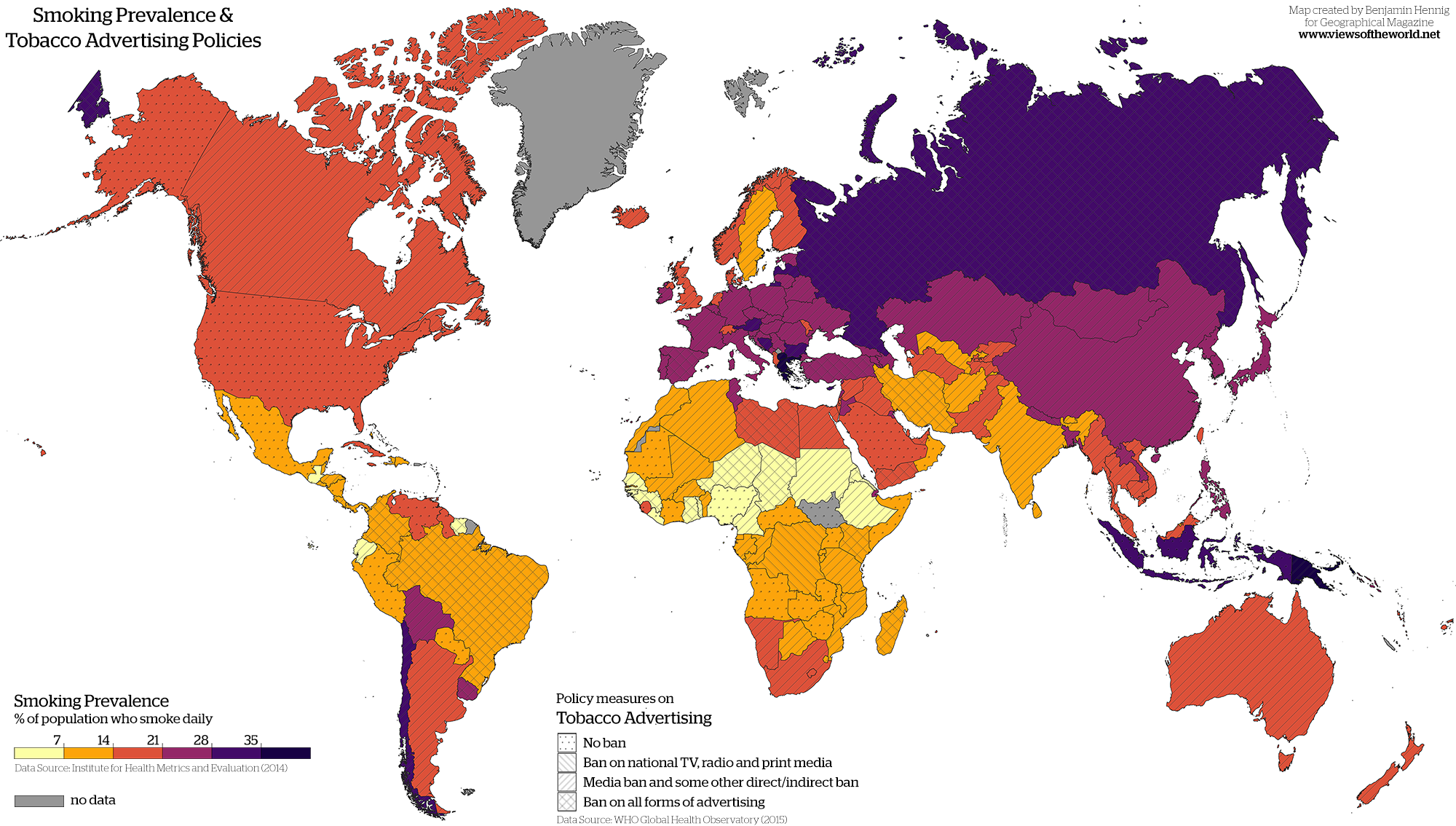
Smoking tobacco has been a major pastime in certain societies all over the world. Whether that be for financial gain or social practice or both, most if not all countries have been affected by the production of cigarettes. As research has expanded, many countries have put bans on the advertising of tobacco products. These bans range from TV, radio and print media and escalate upward. A website named “Views of the World” presents a map that illustrates both smoking prevalence and tobacco advertising policies for the entire world. This site is run by a geographer named Benjamin Hennig, and his maps “investigate social and spatial inequalities, humanity’s impact on Earth, global sustainability and the development of concepts for analyzing, visualizing and mapping these issues.” This particular map of Hennig’s makes a provocative comparison on tobacco use and tobacco advertising. Creating this view is both informative and critical because it gives us an insight into how other countries deal with tobacco advertising, and the impacts that these variables have on the popularity of tobacco in the world.
When initially looking at this map, it is easy to see that most countries have some sort of ban on tobacco advertising. For the United States, there is no ban whatsoever on any advertising. This is interesting because they are also not near the high percentage of smoking prevalence compared to other countries. The author might be implying that the US has a strong health communication system and that citizens had been made properly aware that the use of tobacco and smoking cigarettes is not healthy. It would seem likely that with this scientific information and study that the United States would put some sort of ban in place, but they do not, which is likely due to the fact that it is a key part of the nation’s economy. Without these products in circulation, the United States would lose a lot of money and global power.
On the other hand, the highest percentages of smoking prevalence seem to be in Europe and parts of Asia, where there are a lot of strict bans on advertising. Russia, which traverses Europe and Asia, is a compelling example where there is a complete ban on advertising, but the rates of smoking tobacco are extremely high. This particular fact is not highlighted or exaggerated in the map, which keeps the continuity of the entire illustration. Asia is one of the leading growers of tobacco , which might be an explanation for the high use. However, this particular map does not show when these bans were put in place, but they might have been a result of the high percentage of smokers. Hennig might have used this as a tactic to persuade map audiences that advertising might not have an effect on the percentage of the population that smokes. Creating this structure in the map might have also crowded the map and potentially loses the main argument. If these details were put in, the map might not be as interesting because it could provide a possible argument.
In the continent of Africa, there is varying information. There are several countries that have low numbers in this area, which might act as a counter argument to the United States. With this data, Hennig might be showing that it does not matter what bans you have on advertising, and that countries with more access to these drugs will have higher percentages. South Sudan does not have any data reported for their smoking prevalence, which is intriguing because according to The Tobacco Atlas, “more than 6000 children (10-14) years old and 533000 adults (15+ years old) continue to use tobacco each day.” Either Hennig did not research this area heavily enough or he purposely left it out to disregard the problem that is ongoing in South Sudan. Leaving out critical information about a country that has an obvious problem with tobacco is vital when analyzing this map.
This map provides very important information about the current state of the world regarding tobacco use and advertisement. Rhetorically speaking this map could tweak some things to provide a more inclusive picture, and talk about certain facts pertaining to countries with particular problems . These “silences” speak volumes for certain countries, where there needs to be changes and reforms. While some countries have no bans in place for advertising tobacco products, there are several warnings on packages that strongly don’t suggest the use of them. For others, it gives us an insight to the inner workings of governments such as the United States, and their lackluster regulation of this drug due to its importance in the economy. I believe this map and organization provided the audience with clear and concise data, like most maps do. These comparisons help us spatialize activities like tobacco use for us to appreciate the comparisons.
Works Cited:
Hennig, B., 2019. Smoke and mirrors: Smoking Prevalence and Tobacco Advertising Policies. [online] Views of the World. Available at: <https://www.viewsoftheworld.net/?p=5721> [Accessed 9 March 2022].
Hennig, B., n.d. About m. [online] Views of the World. Available at: <https://www.viewsoftheworld.net/?page_id=631> [Accessed 9 March 2022].
Shahbandeh, M., 2022. World tobacco production by country | Statista. [online] Statista. Available at: <https://www.statista.com/statistics/261173/leading-countries-in-tobacco-production/> [Accessed 9 March 2022].
Tobacco Atlas. 2022. South Sudan – Tobacco Atlas. [online] Available at: <https://tobaccoatlas.org/country/south-sudan/> [Accessed 9 March 2022].
I first want to start by saying I really enjoyed and appreciated the map Smoking Prevalence and Tobacco Advertising Policies. The topic of tobacco usage, in general, is one that is important to address, but also one that, in my opinion, has begun to be overlooked once again as the usage of vaping has emerged. This societal issue is one that is so important to not only address but teach about, so that individuals, susceptible to ads and marketing tactics can be aware of the subconscious manipulation they are under. The analysis between the smoking rates in the US vs Europe and some parts of Asia was especially interesting to me as it seems to not correlate. I found Johnny’s explanation and analysis of this part of the map to be particularly illuminating as he touched on how the reason for this may be because of the US communication systems. The thought that the map could also be used to prove that advertising does not affect smoking usage was interesting. This is something that I just always believed to go hand and hand but after seeing the map, I am second-guessing my previous assumption. In total, I think this map was an excellent choice and the visual in conjunction with Johnny’s analysis created a well-thought-out and influential blog post that could benefit many.
I think that you chose a really important topic to look at. Tobacco use is still extremely relevant in our world today as it has taken on new, technological forms. It is interesting to see that most countries have implemented some form of ban on tobacco advertising yet the U.S. has not. You do, however, tell us that these other countries have significantly higher smoking prevalences than that of the U.S., which raises the question of why? This immediately makes me think about the informative advertisements I used to see on TV while growing up, which broadcasted the message of how bad smoking is for you. This also makes me think about the D.A.R.E. initiative and the other ways that the U.S discourages the use of tobacco and other drugs.