Team Map Presentation: Atlas of Diseases

Tuesday, November 5, 2013

Atlas of Diseases: World Distribution of Spirochetal Diseases

Created in 1950, this map was included in the set of maps released by the American Geographical Society in conjunction with U.S Armed Forces and various international pharmaceutical corporations to catalog where the disease such as polio, starvation, and malaria, are and where they could spread. The head of the project was scientist Dr. Jacques May, who was himself named by Newsweek Magazine as The Map Doctor. This map embodied ‘medical geography’ which was a type of cartographic style that sought to show the connection between the geographical location of disease and the prevailing features of the surrounding environment.

In itself, the map is extremely scientific using heavy amounts of information (right hand corner with detailed definitions of the diseases, their latin names, etc.) and other comparative data in the remaining 3 corners. However, the ‘scientificness’ is countered by the choices reflected within the map, for example, with projection, the map uses a Briesemeister projection which is an equal area projection, with the only point free of distortion at the center of the map —Africa. Centralizing on Africa and the rest of the third world, focuses the reader’s attention on them and the epidemic that has spread and its potential to spread even more. The use of photography is also essential to how the map creates rhetoric because the pictures are able to create a distinct boundary between the Northern ‘cleaner’ hemisphere and the infected Southern hemisphere.

This map —compared to other maps, has no clear indication of a bias because of its scientific nature, yet is a concrete example of the United State’s exertion of power because it may not directly catalog economic or military power, but it is able to show how vast America’s knowledge is. The knowledge and resources that are available to the United States’ is a reflection of how far their sphere of influence reaches.

Kim D’Agostini and Jonathan Quenard

Posted in Uncategorized | Tagged , , | Comments Off on Team Map Presentation: Atlas of Diseases

Map of the Week: Not Just Any Map of Richmond, VA

I was a nonbeliever. I’ll admit it.

I recall that Dennis Wood mentioned in his book, The Power of Maps that he intended to keep as many maps as he could for 30 days, yet Wood had to give up after 20 days because the number became too overwhelming (34). My thought was: that’s a no brainer. I mean the man has a PhD in Geography – of course he has maps casually lying around. Could the average Joe really be expected to have access to so many? I even challenged the notion of finding a map that’s sole purpose wasn’t to serve as “a way-finding aid” (Schulten). Lo and behold, my theory was disproved at the one place I did not imagine finding a map – but with that being said, maybe I should have known better.

Don’t get me wrong; walking around at the RVA street art festival I enjoyed not being able to take more than a couple of steps without seeing a mind blowing piece that made a statement and considering the large amount of works that was impressive. All of the works of art were artistically unconventional, however, they seemed to belong together. Then I stumbled upon that one piece, which rocked my notion of works belonging to a specialized niche.

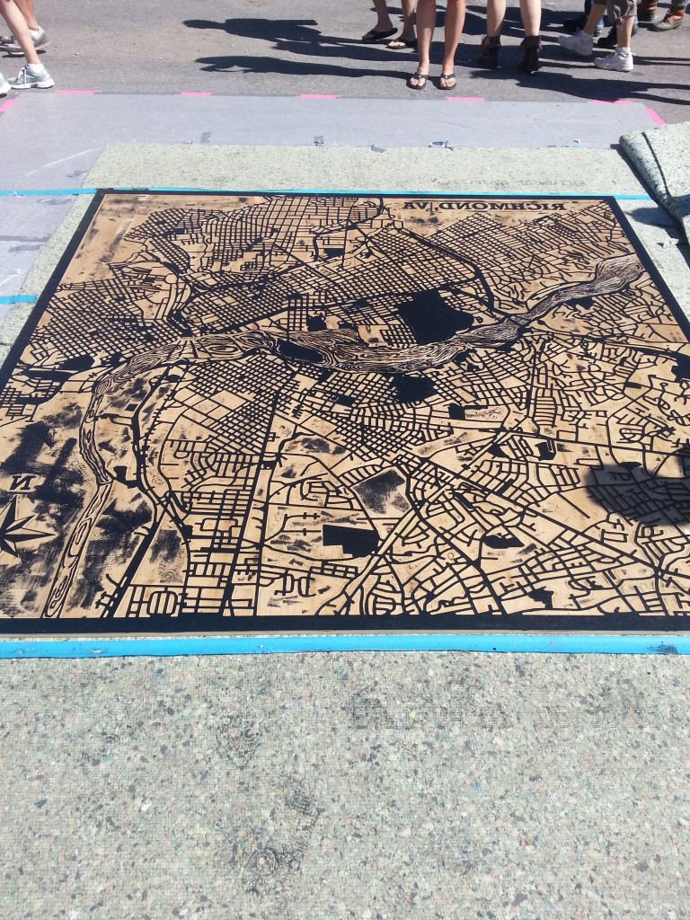
Image 1: Photograph taken at the RVA Street Art Festival on September 14, 2013.

My initial reaction to the map shown above (image 1) was: Really?  This break from my class work on maps isn’t working out so well. After I recovered from my minor lapse of despair, I was able to admire the work for what it was. I wasn’t sure what had captured my attention most: the idea that a map could be art or that art could be a map. The awareness between the two is vital because a greater appreciation of cartography is gained from understanding the context of art development. At the same time, it’s refreshing to see innovating techniques of art incorporated into cartography.

Background

The magnified map (approximately 6’ by 6’) of the city of Richmond was done by Studio Two Three, a non-profit print shop. The steam rolling print served to commemorate the city for hosting the RVA street art festival. The attention to detail and preservation of the city in appearance reflects the pride the residents of Richmond have in their city. People from all facets of life took part in the making of the map. A total of 10 interns helped out in the process, most of them are students at Virginia Commonwealth University (VCU) and some of them are artists actually working in the Richmond area. Pertaining to the technical aspect, I later learned that collaboration occurred amongst GIS Mappers and cartographers to determine the initial map design and geographic boundaries. The actual map image (image 2 seen by clicking on the link below) came about with assistance from graphic designers and then was CNCed at Tektonics Design Group. The hand carving of the wood cuts took approximately 24 hours. And the general public was able to literally carve their names into history by participating in the hand carving of the James River at an event called First Fridays in which the city of Richmond hosts activities for the community.  Once that was completed, the work got inked up and was rolled out at the street art festival using steamrollers (Rich). So not only does the map serve as a visual representation of a community linked together through the arteries of the city but it is an example of the city coming together to form a personal community as well.

Steamrolled RVA map

Map as Art

There is a saying about the fluidity of life coming full circle. And this steam rolling print map of Richmond serves as an example. It’s a remake of a very old school technique that scientifically dates back to 25,000 to 4,100 BCE. Since man has been surrounded by nature, he discovered the necessity to distinguish natural elements and used the land before him to serve as a medium. Ever since there have been examples of prehistoric art with cartographic elements such as hills, rivers, and settlements. The earliest signs of humanity’s cartographic observance of the world can be traced down to rock paintings (pictographs) and rock engravings (petroglyphs) just like the ones shown below (“Prehistorical Cartography”).

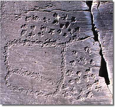
Image 3 is of a petrogliph from Borno in Valcamonica, Italy. Dated to be from the Bronze age anywhere from 6000 -700 BCE.

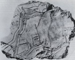
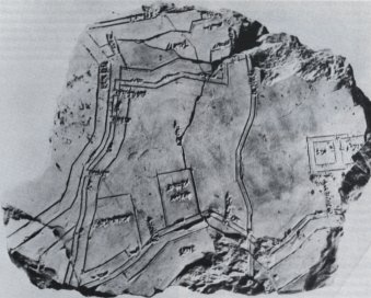
Image 4 is of the Hilprecht Collection that is located at the Friederich – Schiller-University, Jena (date unknown).

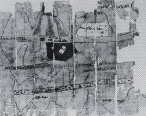
Image 5 is a map of the Wadi al-Hammamat goldmines from around 1500 – 1085 BCE.

I consider the images shown above similar to the style of the Richmond steam rolled map because they all represent a period of time where humanity uses the most sophisticated technology accessible to embody its surroundings. The canvas started out as rock shifted to plaster and wood, and six thousand years later these natural mediums have withstood the test of time. If anything has changed (aside from technology), it is the importance of precision in our everyday world.

Over time, society has developed the need to rely on details (as can be seen through image 6). The rock paintings descent throughout the years establishes a sense of direction (literally and in convention) and demonstrates an increasing awareness of the environment. An initial impression of the world is based on the primary senses of seeing and touching. Afterwards, there is an organized foundation revolving around spatiality, perception of a reality, and exploration that flourishes. Maintaining a balance between the chaos of orientation and artistic expression requires a scientific edge to tie both elements together. This will factor into the difference between being an expressionist with a drawing of an individual’s take on the world and providing a useable map that respectfully serves as a reflection of a vision. The creator of a map takes his or her abstraction of the world and grounds it with universal symbols, scales, and logic.

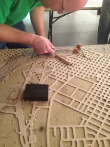
Image 6: Both this photograph and steamrolled RVA map were provided by Michelle Rich. This image shows a person working on the wood cut aspect of the map.

Art as Map

My second reaction: does anyone have a mirror? For some reason, I could not wrap my mind around how I was supposed to locate anything on the map. Seeing how I had recently moved to the city of Richmond, and served as witness to numerous maps I should have been able to easily identify places. However, if it weren’t for the label on top of the map, I would be completely lost to the most basic information such as the region the map was showing. Suddenly, the realization of how easily my perception can be altered crept into my mind. Art forces viewers to look at reality through the lens of an alternate universe and so does this map. The viewer is used to reading things from left to right and all of the sudden has to hone in on the littlest details to understand the placement of landmarks. I found it amusing that if I covered the compass of the original map and the label, then I would have not even known the map was reversed. However, the simple understanding of knowing the map was “different” was enough to mess with my mind. I feel that the public can get so caught up with a map varying in projection, text, and other elements that the “bigger picture” is lost to all the noise around it.

Summary

It all started with a smooth wooden surface. A utensil was used to peel away layers and created dimensions that materialized the artists’ vision into a physical reality that could be admired. Even though the art piece is clearly a map, the process in making the map parallels the work put forth into making a map.

  • First, this wood cut technique can be traced down through the span of time alongside the development of cartography. This shows that time does not require change, but encourages enhancements to an art form for the better. In the world of cartography, new developments in equipment allow for a hidden chest of knowledge to be exposed.
  • Second, the combination of old school methods (as well as medium) and modern day technology reflects how society builds up from past experiences. For example, when creating a map what is the initial step? To consult currently existing maps. Places may have changed and require alterations, on the other hand places may have stayed the same and those features are kept. No matter what technology is at hand, a cartographer will always refer to basic skills and make calls accordingly.
  • Lastly, the visual appearance of a map has results that vary. Many factors come into play: there is a scientific and human component that stresses accuracy, the pressure of combining numerous truths to make one reality, and receptiveness of its audience. Despite all these obstacles, a map’s purpose is ultimately to guide the user to some sort of finish line (literally or metaphorically speaking), nevertheless the Richmond map itself is the finish line for the Richmond community. It says this is what we have accomplished together as a united front.

To acknowledge a map as “a way-finding aid” is a nice place to start. However, there is so much more beneath the surface. A map can and should be used for other means such as displaying how far society has come, the capabilities of its people, and conveying a sense of belonging.

Marissa Nino

Works Cited:

Prehistorical Cartography. Tutorials in the History of Cartography. Web. 29 Oct. 2013.

Rich, Michelle. Personal interview. 14 Sept. 2013.

Schulten, Susan. The Graphic Foundations of American History. Mapping the Nation (2012): 1-40. Web. 1 Sept. 2013.

Wood, Dennis. The Power of Maps. New York: The Guilford Press, 1992. Print.

Posted in Maps of the Week | 2 Comments

Team Map Presentation Tuesday November 5th: “National Atlas of USA: Exports and Imports

Nothing can condense and visualize data and information quite like a map can. Maps are most often used and primarily designed to create a visual portrayal of space and location, to let you know where things are, where you are, how to get somewhere, etc. But maps can do so much more. You could spend hours scanning elaborate reports and piles of spreadsheets and data on American international trade and you would comprehend about the same amount of information as taking a brief glance over United States Exports and Imports (1970).

This map was featured in a comprehensive atlas of United States characteristics and patterns called the National Atlas of the United States of America, developed and compounded by the U.S. Geological Survey (USGS). The National Atlas was ordered and designed in 1970 “to be of practical use to decision makers in government and business, and for planners and research scholars…to visualize country-wide distributional patterns and relationships between environmental phenomena and human activities.” This specific map was to be a portrayal of United States international trade through imports and exports to countries around the world. The majority of the information produced by the USGS is typically scientific and topographical so this economic depiction of the U.S. was an anomaly from their usual work.

The map along with the atlas was released at a very significant time in America’s economic history. It was still the heart of the Cold War and America was competing with USSR as economic superpowers. The reigns of presidents John F. Kennedy and Lyndon Johnson in the 60’s had brought about massive increases in government spending and economic expansion. The late 60’s also brought increased U.S. presence in Vietnam to contain the spread of communism.

Containing communism was only half of it though, as America was promoting the expansion of capitalism throughout the world, which relied on free international trade. The map is similar to a mapping of the spread of American capitalism and America’s economic presence through out the world. This sort of economic influence that the United States establish globally was an alternative way to spread western ideologies and contain communism. Their presence their was not had military forces, but a form of soft power, that established their power in an area without using military and force. The arrows protruding from the United States depicting the imports and exports with each nation are like tentacles, reaching out and grabbing these nations, pulling them closer and dragging them under its sphere of influence. The large pie charts used in the space of country to show the distribution of imports and exports are very prevalent near western and central Europe, the Middle East, and Central Asia look to create a wall around soviet Russia, symbolizing the United States policy of containment to cease the expansion of communism. This battle of soft power was how the majority of the Cold War occurred.

This map is an excellent portrayal of how the United States used soft power during the cold war to contain communism and expand capitalism, establishing presences in nations around the world using alternative methods.

David Ruffini and Joe Walderman

Posted in Uncategorized | Tagged , , , | Comments Off on Team Map Presentation Tuesday November 5th: “National Atlas of USA: Exports and Imports

Atlas of Prejudice: Mapping Stereotypes

Brought to you by the maker of Map of Stereotypes we give you Atlas of Prejudice: Mapping Stereotypes. This week’s Atlas of the Week is created by graphic artist Yanko Tsvetkov, which includes a collection of his famous provocative maps. His goal to satirize the tendencies of human nature leads to the analysis of socially accepted norms. Pieces of cartographic creations carrying a new side of the social debate. Some even say that this is a match made in social scientific heaven, others just appreciate its humor! Either way don’t miss out and check it out!

http://alphadesigner.com/mapping-stereotypes/

Posted in Atlases of the Week | 1 Comment

Atlas of the Week 8(November 4-10)


A black and white map that displays the discovery of the routes to “Pike’s Peak” demands the audience to place themselves in the historical setting of this map. With labels such as “British Territory” representing the modern time Canada and “Indian Territory” as Oklahoma, the map is a snapshot of the United States at one point in history, specifically the year 1898 as the description claims. Though many familiar states are represented on this map, there are also those that are missing according to the United States today. While it may not be in the cartographer’s primary intention, maps tend to record a time in history that reflects the values, politics, and events of the time period.

Grace Chang

Source: Boatwright Memorial Library Maps & Atlases


Posted in Uncategorized | Comments Off on Atlas of the Week 8(November 4-10)

Map of the Week: The World According to the United States of America


The World According to the United States of America

“Ultimately, the map presents us with the reality we know as differentiated from the reality we see and hear and feel” (Wood 6).  This quote from Denis Wood’s, The Power of Maps, accurately describes the nature of the map,  ”The World According to the US”. Bombarded with U.S. stereotypes about the world, this map is produced from personal knowledge rather than experience. As shamefully humorous as the labels can be at first, a deeper examination of the map reveals the mapmaker’s unequivocal intention of exploiting the reality of an average American’s stereotype about the world. Rather than attempting to mask its purpose, the mapmaker presents to the world a satirical piece of rhetoric filled with derogatory labels with which Americans may find themselves agreeing. By revealing to the world what would otherwise go unnoticed, the mapmaker urges the audience to acknowledge the wrong and to hopefully adopt a more open-minded attitude toward viewing the world.

To clarify his motive for creating this map, the mapmaker rids the map of all “scientific” labels such as cities, geographical landmarks, or even country names. A huge chunk of land identified as China today is labeled “Evil Communists” on this map. Four arrows that point to the Korean peninsula, Japan, Taiwan, and the Philippines state “we say they are our friends”. Historical knowledge becomes an essential component to examining the roots of these labels. The United Kingdom, according to this map is America’s “New Best Friend”. Great Britain has consistently (and sometimes ironically) been a source of aid and co-dependence from as early as WWII until today. “Ironic” might be an appropriate term because, while America tried its best to cut ties with its former association back in the Colonization days, the connection between the two countries only strengthened throughout history. Great Britain and the U.S. saw eye to eye on international affairs as well as on economic and political values. The overlap in many aspects allowed the two countries to stand together through both World Wars, the Korean War, the Persian Gulf War, and the war in Afghanistan. Identifying with the same democratic ideals, the two countries together founded the North Atlantic Treaty Organization, (an intergovernmental military alliance) and later joined many of the same international organizations. Together, the two nations have formed a relatively stable relationship that an American would consider the U.K. today as one of America’s “best friends”. While there may be some truth behind the blunt and ludicrous labels, China’s label, “Evil Communist”, is a subjective reflection of the Americans’ negative feelings projected towards communism and any countries remotely associated with the idea, during the Cold War. While U.S. strived to contain any sign of Communism, China became one of the focal nations of containment. Perceiving communism as an extremely dangerous concept, Americans were led to equate communistic countries with words such as “evil”, as stated on the map. Part of the U.S. efforts in containing communism in China were the alliances that formed with countries surrounding the communistic China. The mapmaker labeled the Korean peninsula, Japan, Taiwan, and the Philippines as “we say they are our friends” since much U.S aid was offered to these countries in order to prevent them from becoming Communists. Each label of this satirical map is a simplistic version of the American impression of each nation. Some carry a certain degree of truth while others ignorantly objectify the labeled countries.

This map may contain some deeply embedded history, but it also exerts a great degree of ignorance through its display and its omission. According to Harley on “Maps and Power”, maps exert social or political implications through their omissions. This effect is labeled as the “silence of the map”. The most explicit silence of this map would be the total exemption of Antarctica. This deliberate decision is a political statement that aligns with America’s belief of superiority over other nations. It also indicates America’s alleged power to exclude an existing country from the map, suggesting that its existence is not important. While the omission of a nation might exert “silence” within this map, the labels of Greenland and South America objectify them as nothing more than their representative production or resource. Through these labels, the cartographer is creating awareness of the stereotypes that Americans tend to hold against the world and insinuating that such a biased way of looking at the world is an offense and a limitation to our knowledge. By bringing to the audience’s attention what they inherently believe, the mapmaker is able to satirize the display of stereotypical materials to alert the degree of ignorance held by most Americans.

In this map, the mapmaker utilizes the role of satire to present to the American public the wrong that is embedded in their collective thought. The humor that reflects the audience’s absurd way of viewing the world helps to guide them into reconsidering the stereotypical and reprehensible nature of their way of thinking. “The Map of the Week” rightly goes to a map that is capable of speaking more powerfully than words can in convincing the American public of its sense of ignorance. This very map captures the very essence of Americans’ ignorance in international affairs and foreign relations.

Grace Chang

Source: http://s.mound.free.fr/moundpages/steve/usageog.gif

Posted in Maps of the Week | Tagged , , | 1 Comment

Map of the Week: Map of Stereotypes

Borat, Chili con Carne and Soccer Moms: these are just a few of the labels that graphic designer Yanko Tsvetkov uses to distinguish parts of the known world. At first glance, these obscene, bright colored words take its readers aback with the audacity of the map’s creator to publish such a provocative map. They temporarily blind the audience into thinking that this piece of cartography has no credibility. Having created this map in 2009 as a part of his book, Atlas of Prejudice, Tsvetkov, going by the pseudonym alpha-designer, describes his work as “cartographic caricatures ridiculing the worst excesses of human bigotry and narrow-mindedness” (atlasofprejudice.com). But as we examine why the map has come to be, it is clear that Tsvetkov uses rhetorical symbolism (stereotypes) to begin the conversation about social conventions and cartography.

Tsvetkov uses a Mercator projection, a widely accepted and familiar depiction of the world. It slightly emphasizes the size of the northern hemisphere of the globe, while many argue that it does not reciprocate the same generosity to  the southern hemisphere. However, it is not the projection that deems this map the focus of this week’s blog, but the author’s choice to marry two concepts that are hardly seen together: satire and cartography. He has pointed out the anomalies of stereotypes and maps: because of their ability to shape public opinion, they are often believed as the truth.

Every map has its silences, whether it be the lack of a representation of the wandering tribes of the jungles in the National maps of Peru, or the sea monsters used as distractions in the early stages of cartography –a way of saying, “we don’t know what’s out there but here’s a dragon!” All of these examples show how a map cannot share the full account of what is going on around the world. And yet despite that knowledge, people see maps as scientific constructions;  they see maps as truths. On the surface,  words such as ‘Commies”, “Uncle Allah”, and “Borat” all are tributes to popular culture’s depiction of the world, an obvious commentary on the skewed social norm. It can also be pointing out a flaw in the science of cartography, that even though it tries to be as scientific as possible, that maps, like stereotypes, are actually products of social construction.

Social construction is the idea that a map is based on the reality that is socially accepted at the time. This is directly speaking to how a map is a product of its time, meaning it lives within the context that was surrounding it at its creation. Stereotypes work in a similar manner,   therefore there is a duality that is presented within this map. It brings out the point that people would rather believe what is shown to them, rather than question its motives. This is often the case with cartography. Due to the switch after WWII, when cartography became a “science,” once a map has been published analysis stops when it should just begin. Tsvetkov is trying to say that just like stereotypes, our blind acceptance of maps is a fault that should be mocked.

However, the map also demonstrates how its power is within its ability to create rhetoric, not by showing the reader what to think, but instead giving them ideas to think about. For example, although it is not clear what viewpoint the cartographer used to establish his stereotypes, one could easily argue that it is a western viewpoint, or more specifically an American view of the world since the United States of America is seen as the “civilized world.” Now the question that comes to mind is why did he choose America to be the civilized nation? Wouldn’t it make more sense if the author centralized it with Bulgaria, the country he was living in at the time of the publication of the map? Perhaps the author is trying to emphasize that no matter where one is in the world, the power of America –whether it be social, economic or military- is felt like an ever present shadow lurking behind the corner

It is clear that the Map of Stereotypes has achieved its goal of sparking conversation. Tsvetkov’s creative and crude representation of the world has managed to mock the idea of social norms. Yet, what is surprising is  the method of delivery of his message. By choosing to publish a map, he shows the similarities of map and stereotype, proving that they are both social constructions and products of their time.

Kim D’Agostini

Source: http://www.theguardian.com/artanddesign/2012/feb/17/stereotype-maps-tsvetkov


Posted in Maps of the Week | Tagged , , | 3 Comments

Team Map Presentation, October 31 National System of Interstate and Defense Highways, 1958

Source: http://www.loc.gov/item/2011593044

The roots of promotional road mapping date back to the 1920s when societies first began to convert from railroads to automobiles as their main means of transportation. As stated in Akerman’s reading, automobiles were infeasible to the majority of Americans until about 1908. Since 1908, the number of families who owned automobiles practically quadrupled in numbers by the late 1950s. The expansion of automobile ownership went hand-in-hand with the necessity of an organized highway system and the indispensability of road maps. Regardless, the concept of a national highway system was ignored for decades until Eisenhower entered office in 1953. Eisenhower, who would later be known as the “Father of the Interstate System” witnessed firsthand the importance of a connected highway system for both domestic and international reasons. In 1919, Eisenhower accompanied the Army’s first transcontinental motor convoy from Washington D.C. to San Francisco; this convoy would inspire Eisenhower to create a National Interstate and Defense Highway System when he realized the current poor road conditions. He believed the national highway system would not only allow efficient mobility for families and workers who commute, but also for the military and its heavyweight equipment across the country. In World War II, Eisenhower recognized the German’s autobahn highway system as an advantage for the Germans because they had multiple means of transportation. With just railroads, attackers could bomb a railroad line, disrupting the entire railroad system for days at a time. Highways would also serve as an accessible evacuation route for cities in case of a nuclear attack, a common fear among Americans due to the Cold War.

The 1950s launched the Cold War into full force as well as the emergence of suburban towns across the country. Towns like Levittown began industrializing, which created a colossal demand for automobiles to commute from the suburbs to cities. This caused social class segregation between the suburban and urban areas because only certain families could afford to transport with a family-owned automobile. There were many advocates for this national defense highway system, but many opposed it because of its costliness and believed it would hurt the economy. In actuality, dozens of industries benefited by providing goods for the construction of it like lumber, paint, rubber, etc. The defense highway system boosted productivity, alleviated unprecedented automobile traffic, and has earned the title of being “the greatest public works project in history.”

After the National Interstate and Defense Highways Act of 1956 was signed by Eisenhower, there was a need for a map to display the vision of such a massive project. There is where one of the main proponents of the National highway system AAA, came into play. With the organization being around for half a century it established credibility for holding the public’s best interests at heart. This is shown through education programs enacted in schools, providing service to stranded motorists, legally taking action to seemingly unjust laws, and making available touring information open to the public. Eisenhower wanted to launch the United States into a secure future where all the people would have access to the splendors of the country by solely having ten fingers make contact with a steering wheel and therefore granting endless opportunities. But like any visionary there are obstacles that are imposed, and Eisenhower couldn’t oversee every detail. This resulted in a committee of men each with his own interests at heart having to come together to make a national highway, while simultaneously balancing each state’s values. The attempt to appease the states can be conveyed by the physical establishment of the veins of the interstate that seem to have been ensured passage in each state at least twice. Whether the concept is highlighted through the tension amongst revealing and concealing or Newton’s third law of motion, there seems to be an unspoken side along with every visible story. Such hidden details brought up in class were:

·         Waterways

·         Names of states and the country on the map

·         Accuracy of cities along the interstate routes

·         Cities once well known are no longer on map

·          Values

In conclusion, as scientific, innocent, and unbiased as a map may seem there is sufficient evidence to support the claim from Dr. Salisbury that “every map is a lie,” each in its own particular way.


Marissa Nino and Vanessa Kowalski


Posted in Uncategorized | Tagged , , , , , | 1 Comment

Atlas of the Week 7(October 28- November 3): Strange Maps: An Atlas of Cartographic Curiosities

“Strange Maps an Atlas of Cartographic Curiosities” by Frank Jacobs is an atlas that looks at the world in a different and more innovative way. Some maps that are included are: “What if Germany won WWII?” and “Maps Depicting the Moon.”

This atlas breaks the mold of traditional cartography and allows the viewer to see the world in a unique and fascinating way.

-Zach Halaschak

Posted in Atlases of the Week | Comments Off on Atlas of the Week 7(October 28- November 3): Strange Maps: An Atlas of Cartographic Curiosities

Map of the Week 7(October 28- November 3): Cold War Confrontation

The peak of the Cold War was a powder keg waiting to detonate. Two vying factions on two ideological poles were both competing for world power and dominance and in the eyes of both the United States and the Soviet Union there could be only one victor. During this turbulent time a variety of means were used to portray and also shape the outcome of the ensuing power struggle between the US and USSR. Maps have throughout history been used to further political agendas and every map made is inevitably shaped by factors such as selectivity, projection, iconography, color, size, and context. The map displayed is no different. It, in conjunction with other maps, played a critical role in shaping the public perceptions and responses to the war and still today plays a critical role in understanding the underlying power dynamics of that turbulent time in American history.

One of the most striking features of this map is its unique projection of the world. By choosing this projection the cartographer made the United States and the Soviet Union seem larger and looming over much of the world. It is important to note that by emphasizing the two world super powers at the time, the cartographer deemphasizes the rest of the world in the eyes of the audience. Another important choice was making the oceans the middle point in the map. By putting a physical divide between the United States and the Soviet Union the viewer gets the sense of very real division and fissure. In the context of the Cold War, this divide adds to the aura of West vs. East, Capitalism vs. Communism, and US vs. USSR. Although this projection creates a clear division it also makes the two powers seem closer than a typical Mercator projection would – it gives the sense of an impending showdown.

When making this map the cartographer chose to only plot points of military and strategic purposes. Noted cartographer Denis Wood describes “selection” as crucial to understanding what a map ultimately conveys. So by selecting to only include military power this map depicts the Cold War only in terms of military power. There are also certain inherent “silences” in this map, which exist by not including other forms of power such as diplomatic or economic power. According to John Brian Harley “Silence on maps…enshrines self-fulfilling prophecies about the geography of power.” This is crucial to understanding the audience’s interpretation from a map with such profound silences. The map is covered on both sides by little purple and blue squares that signify military bases. These squares are clustered throughout the core and periphery of each super power. In addition to the squares on both sides, the map also shows US Strategic Air Command bases, the US Navy fleet, as well as US Intercontinental Ballistic Missile bases. It is clear by the sheer amount of plotted data that each side of the cold war was very powerful and had a strong military presence to counter the other, but again, the silences and lack of other forms of power leave the map as quite one-sided.

Physical shapes, color, and design are also crucial in interpreting the cartographer’s perspective and agenda. By having miniature explosions denote the  “Cold War Points of Conflict” the cartographer is alluding once more to the use of military force and confrontation. Another important aspect of this map is the color selection. The only parts of the map that are not gray are the two competing powers – everything else is pushed to the wayside by shading it a uniform color. The effect of color and shape on a map may seem minimal but the latent intentions of these selections play directly into the audience’s interpretation of the map.

This map shows a very important rift that existed in the world during the Cold war. By choice and selectivity the cartographer created a unique map which presented the cold war in the light of overt military posturing. The most crucial aspect to understanding the shortcomings of this map is to understand that the Cold War itself was not simply an outright military confrontation. The cartographer who designed this map portrayed just one side to such a complex and multifaceted tension that existed during the Cold War. By doing so the Cold War is reduced to a seemingly “winnable” competition of which side had more military power, but in reality there exists an enormous amount of factors (social, political, economic) that, if included, would no doubt alter the simple US vs. USSR military paradigm that the map portrays.

-Zach Halaschak

Posted in Maps of the Week | Comments Off on Map of the Week 7(October 28- November 3): Cold War Confrontation