
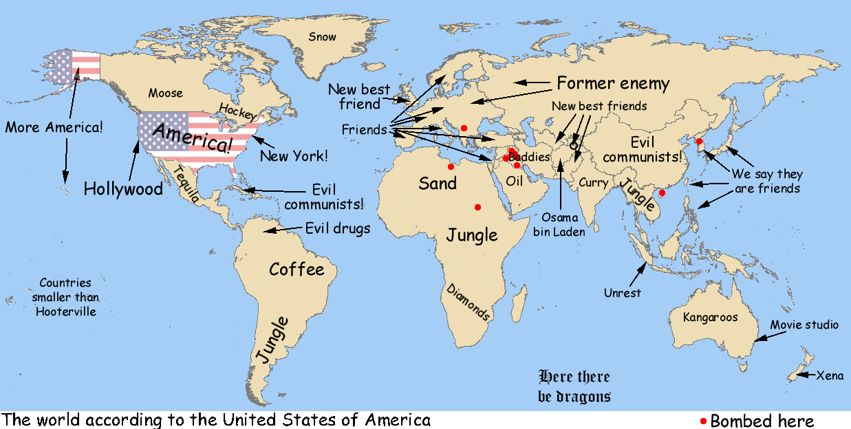
The World According to the United States of America
“Ultimately, the map presents us with the reality we know as differentiated from the reality we see and hear and feel” (Wood 6). This quote from Denis Wood’s, The Power of Maps, accurately describes the nature of the map, ”The World According to the US”. Bombarded with U.S. stereotypes about the world, this map is produced from personal knowledge rather than experience. As shamefully humorous as the labels can be at first, a deeper examination of the map reveals the mapmaker’s unequivocal intention of exploiting the reality of an average American’s stereotype about the world. Rather than attempting to mask its purpose, the mapmaker presents to the world a satirical piece of rhetoric filled with derogatory labels with which Americans may find themselves agreeing. By revealing to the world what would otherwise go unnoticed, the mapmaker urges the audience to acknowledge the wrong and to hopefully adopt a more open-minded attitude toward viewing the world.
To clarify his motive for creating this map, the mapmaker rids the map of all “scientific” labels such as cities, geographical landmarks, or even country names. A huge chunk of land identified as China today is labeled “Evil Communists” on this map. Four arrows that point to the Korean peninsula, Japan, Taiwan, and the Philippines state “we say they are our friends”. Historical knowledge becomes an essential component to examining the roots of these labels. The United Kingdom, according to this map is America’s “New Best Friend”. Great Britain has consistently (and sometimes ironically) been a source of aid and co-dependence from as early as WWII until today. “Ironic” might be an appropriate term because, while America tried its best to cut ties with its former association back in the Colonization days, the connection between the two countries only strengthened throughout history. Great Britain and the U.S. saw eye to eye on international affairs as well as on economic and political values. The overlap in many aspects allowed the two countries to stand together through both World Wars, the Korean War, the Persian Gulf War, and the war in Afghanistan. Identifying with the same democratic ideals, the two countries together founded the North Atlantic Treaty Organization, (an intergovernmental military alliance) and later joined many of the same international organizations. Together, the two nations have formed a relatively stable relationship that an American would consider the U.K. today as one of America’s “best friends”. While there may be some truth behind the blunt and ludicrous labels, China’s label, “Evil Communist”, is a subjective reflection of the Americans’ negative feelings projected towards communism and any countries remotely associated with the idea, during the Cold War. While U.S. strived to contain any sign of Communism, China became one of the focal nations of containment. Perceiving communism as an extremely dangerous concept, Americans were led to equate communistic countries with words such as “evil”, as stated on the map. Part of the U.S. efforts in containing communism in China were the alliances that formed with countries surrounding the communistic China. The mapmaker labeled the Korean peninsula, Japan, Taiwan, and the Philippines as “we say they are our friends” since much U.S aid was offered to these countries in order to prevent them from becoming Communists. Each label of this satirical map is a simplistic version of the American impression of each nation. Some carry a certain degree of truth while others ignorantly objectify the labeled countries.
This map may contain some deeply embedded history, but it also exerts a great degree of ignorance through its display and its omission. According to Harley on “Maps and Power”, maps exert social or political implications through their omissions. This effect is labeled as the “silence of the map”. The most explicit silence of this map would be the total exemption of Antarctica. This deliberate decision is a political statement that aligns with America’s belief of superiority over other nations. It also indicates America’s alleged power to exclude an existing country from the map, suggesting that its existence is not important. While the omission of a nation might exert “silence” within this map, the labels of Greenland and South America objectify them as nothing more than their representative production or resource. Through these labels, the cartographer is creating awareness of the stereotypes that Americans tend to hold against the world and insinuating that such a biased way of looking at the world is an offense and a limitation to our knowledge. By bringing to the audience’s attention what they inherently believe, the mapmaker is able to satirize the display of stereotypical materials to alert the degree of ignorance held by most Americans.
In this map, the mapmaker utilizes the role of satire to present to the American public the wrong that is embedded in their collective thought. The humor that reflects the audience’s absurd way of viewing the world helps to guide them into reconsidering the stereotypical and reprehensible nature of their way of thinking. “The Map of the Week” rightly goes to a map that is capable of speaking more powerfully than words can in convincing the American public of its sense of ignorance. This very map captures the very essence of Americans’ ignorance in international affairs and foreign relations.
Grace Chang
Source: http://s.mound.free.fr/moundpages/steve/usageog.gif
This map of the week caught my attention due to its shocking humor and rawness. A glimpse was all I needed to notice the map’s lack of seriousness and its abundance of irony. Grace’s explanations for the choices made in the making of the map and her rhetorical analysis made it particularly interesting.
She explains thoroughly how some of the stereotypes have come to stick with Americans. History plays a role in understanding the labels on the map and shows some authenticity, and I agree with Grace when she notes that it most importantly highlights ignorance through omission.
I liked how the omissions or the “silences” in this map stand out. Simultaneously, they actually work in favor of the goal of the map. As we have noticed in class, omissions usually tend to be seen negatively. Concealing scientific factors takes away from a true picture of our world and creates biases that can be used for propaganda. On the other hand, these omissions here are meant to show the viewer the extent of American public ignorance. For example, as Grace pointed out, the absence of Antarctica suggests America’s superiority over other nations. Antarctica has been left out deliberately by the mapmaker as a rhetorical choice to depict the idea that America has the power to choose how significant areas of the world are and if they even deserve to be signaled on the world map. In other words, the decision to leave out a continent supports the notion of American condescending attitude.
I believe that the ultimate goal of this map is not only to provide for a good laugh, but to stimulate Americans to change their attitude towards the rest of the world. The mapmaker is poking them rather explicitly and pushing towards increased awareness.
In short, “The World According to the United States of America” is a great pick up from Grace as it ties in well with our class. Using humor, this map makes the powerful statement that Americans view the world in a limited and insensitive way but especially challenges the viewer into reevaluating those ways of picturing the world. To go further, evaluating the map’s effect over the public in the long run would be interesting. Surely, the distribution of the map would need to be highly effective, but insightful answers may arise. Would the concerns or the humor prevail?
Could the average American’s world knowledge improve by the simple use of a map?