
 Nothing can condense and visualize data and information quite like a map can. Maps are most often used and primarily designed to create a visual portrayal of space and location, to let you know where things are, where you are, how to get somewhere, etc. But maps can do so much more. You could spend hours scanning elaborate reports and piles of spreadsheets and data on American international trade and you would comprehend about the same amount of information as taking a brief glance over United States Exports and Imports (1970).
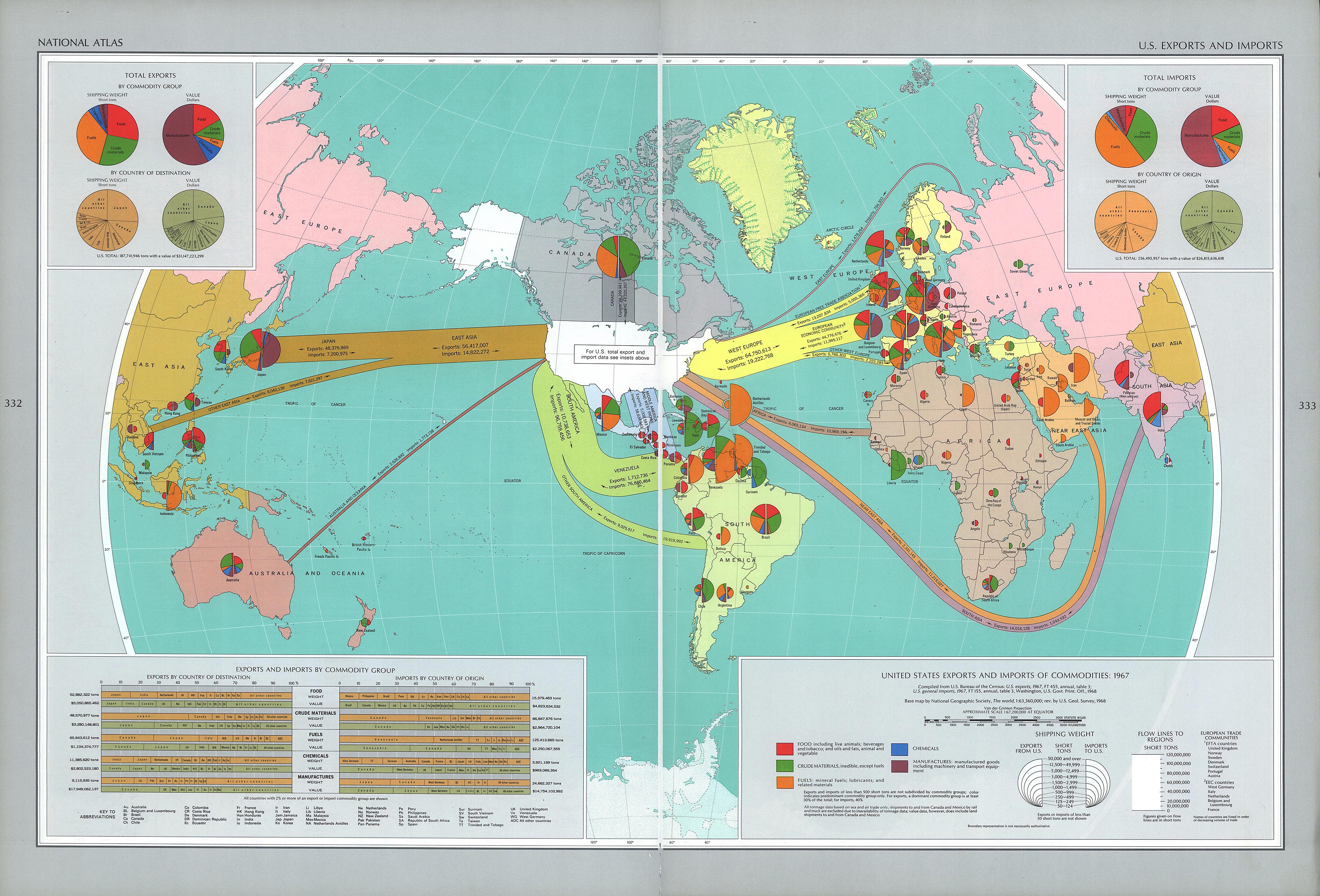
This map was featured in a comprehensive atlas of United States characteristics and patterns called the National Atlas of the United States of America, developed and compounded by the U.S. Geological Survey (USGS). The National Atlas was ordered and designed in 1970 “to be of practical use to decision makers in government and business, and for planners and research scholars…to visualize country-wide distributional patterns and relationships between environmental phenomena and human activities.” This specific map was to be a portrayal of United States international trade through imports and exports to countries around the world. The majority of the information produced by the USGS is typically scientific and topographical so this economic depiction of the U.S. was an anomaly from their usual work.
The map along with the atlas was released at a very significant time in America’s economic history. It was still the heart of the Cold War and America was competing with USSR as economic superpowers. The reigns of presidents John F. Kennedy and Lyndon Johnson in the 60’s had brought about massive increases in government spending and economic expansion. The late 60’s also brought increased U.S. presence in Vietnam to contain the spread of communism.
Containing communism was only half of it though, as America was promoting the expansion of capitalism throughout the world, which relied on free international trade. The map is similar to a mapping of the spread of American capitalism and America’s economic presence through out the world. This sort of economic influence that the United States establish globally was an alternative way to spread western ideologies and contain communism. Their presence their was not had military forces, but a form of soft power, that established their power in an area without using military and force. The arrows protruding from the United States depicting the imports and exports with each nation are like tentacles, reaching out and grabbing these nations, pulling them closer and dragging them under its sphere of influence. The large pie charts used in the space of country to show the distribution of imports and exports are very prevalent near western and central Europe, the Middle East, and Central Asia look to create a wall around soviet Russia, symbolizing the United States policy of containment to cease the expansion of communism. This battle of soft power was how the majority of the Cold War occurred.
This map is an excellent portrayal of how the United States used soft power during the cold war to contain communism and expand capitalism, establishing presences in nations around the world using alternative methods.
David Ruffini and Joe Walderman