
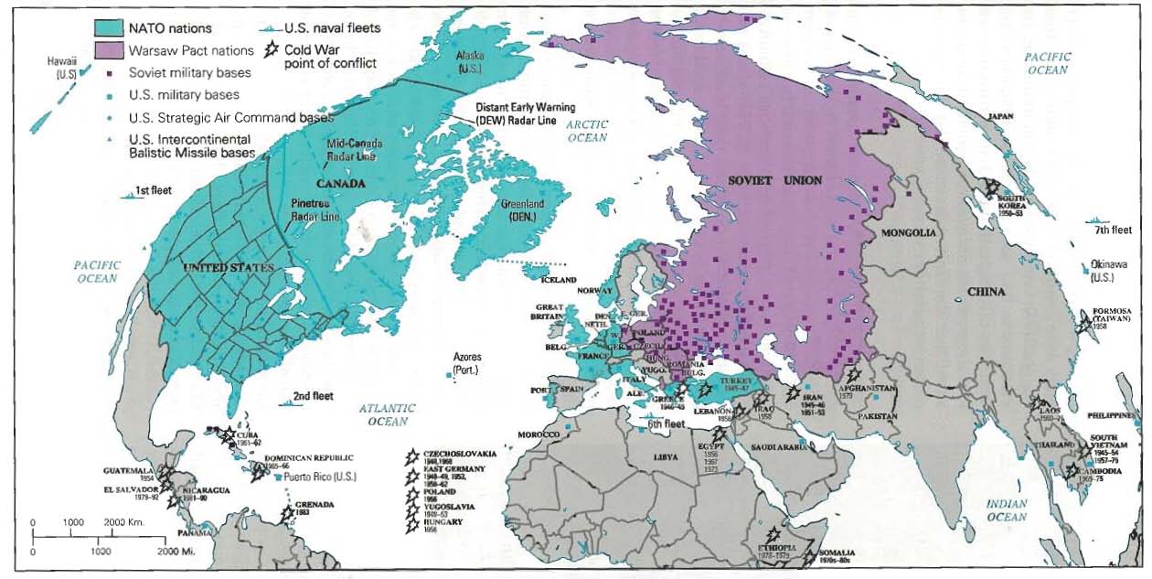
The peak of the Cold War was a powder keg waiting to detonate. Two vying factions on two ideological poles were both competing for world power and dominance and in the eyes of both the United States and the Soviet Union there could be only one victor. During this turbulent time a variety of means were used to portray and also shape the outcome of the ensuing power struggle between the US and USSR. Maps have throughout history been used to further political agendas and every map made is inevitably shaped by factors such as selectivity, projection, iconography, color, size, and context. The map displayed is no different. It, in conjunction with other maps, played a critical role in shaping the public perceptions and responses to the war and still today plays a critical role in understanding the underlying power dynamics of that turbulent time in American history.
One of the most striking features of this map is its unique projection of the world. By choosing this projection the cartographer made the United States and the Soviet Union seem larger and looming over much of the world. It is important to note that by emphasizing the two world super powers at the time, the cartographer deemphasizes the rest of the world in the eyes of the audience. Another important choice was making the oceans the middle point in the map. By putting a physical divide between the United States and the Soviet Union the viewer gets the sense of very real division and fissure. In the context of the Cold War, this divide adds to the aura of West vs. East, Capitalism vs. Communism, and US vs. USSR. Although this projection creates a clear division it also makes the two powers seem closer than a typical Mercator projection would – it gives the sense of an impending showdown.
When making this map the cartographer chose to only plot points of military and strategic purposes. Noted cartographer Denis Wood describes “selection” as crucial to understanding what a map ultimately conveys. So by selecting to only include military power this map depicts the Cold War only in terms of military power. There are also certain inherent “silences” in this map, which exist by not including other forms of power such as diplomatic or economic power. According to John Brian Harley “Silence on maps…enshrines self-fulfilling prophecies about the geography of power.” This is crucial to understanding the audience’s interpretation from a map with such profound silences. The map is covered on both sides by little purple and blue squares that signify military bases. These squares are clustered throughout the core and periphery of each super power. In addition to the squares on both sides, the map also shows US Strategic Air Command bases, the US Navy fleet, as well as US Intercontinental Ballistic Missile bases. It is clear by the sheer amount of plotted data that each side of the cold war was very powerful and had a strong military presence to counter the other, but again, the silences and lack of other forms of power leave the map as quite one-sided.
Physical shapes, color, and design are also crucial in interpreting the cartographer’s perspective and agenda. By having miniature explosions denote the “Cold War Points of Conflict” the cartographer is alluding once more to the use of military force and confrontation. Another important aspect of this map is the color selection. The only parts of the map that are not gray are the two competing powers – everything else is pushed to the wayside by shading it a uniform color. The effect of color and shape on a map may seem minimal but the latent intentions of these selections play directly into the audience’s interpretation of the map.
This map shows a very important rift that existed in the world during the Cold war. By choice and selectivity the cartographer created a unique map which presented the cold war in the light of overt military posturing. The most crucial aspect to understanding the shortcomings of this map is to understand that the Cold War itself was not simply an outright military confrontation. The cartographer who designed this map portrayed just one side to such a complex and multifaceted tension that existed during the Cold War. By doing so the Cold War is reduced to a seemingly “winnable” competition of which side had more military power, but in reality there exists an enormous amount of factors (social, political, economic) that, if included, would no doubt alter the simple US vs. USSR military paradigm that the map portrays.
-Zach Halaschak