Atlas of Neurological Diseases Around the World

This Atlas is unlike anything that I have ever seen before in that it is made up of maps that compare the number of cases and severity of neurological diseases around the world, along with the number of people in each country that are available to readily treat neurological issues. Along with the maps are many charts comparing the findings of these studies in different ways and paragraphs explaining the statistics behind the graphs and maps. Unsurprisingly, the more developed countries tend to have more doctors and drugs to treat these diseases than the developing countries. I found this atlas particularly interesting because when psychological research is done, the results are not normally published with maps as an aid. It is exciting to see maps making their way into a new field of study and being an effective way of displaying the data.

Atlas of the Week Citation: Dua, Tarun, World Health Organization. Programme for Neurological Diseases and Neuroscience, World Federation of Neurology, and World Health Organization. Department of Mental Health and Substance Abuse. 2004. Atlas: Country resources for neurological disorders 2004 : Results of a collaborative study of the world health organization and the world federation of neurology. Geneva: Programme for Neurological Diseases and Neuroscience, Department of Mental Health and Substance Abuse, World Health Organization.

Posted in Atlases of the Week | Tagged , , | Comments Off on Atlas of Neurological Diseases Around the World

How to Destroy Almost Half of the World

Is it possible to destroy almost half the planet based off only one criterion? Nate Silver of the 538 blog does just that with his map that excludes the countries in the lowest 5% of the GDP. By taking all of these countries off of the world map, 43% of the world’s population also disappears. The top countries include Zimbabwe (with the lowest GDP: spending only about $55 per person annually), both of the Congos, and Liberia, among many more. The list includes a total of 81 countries to be taken out. There is power that comes with having a high GDP even when the population of a country is small, which is shown through many aspects in this map, including not only the exclusion of certain countries but the distortion of the map and, furthermore, the way Silver describes it in his accompanying article.

Power is a central factor in any map, and there are many interests that must be considered. Nate Silver, the cartographer of this map and is a famous political writer and statistician, chose to put Africa in the center of the map, where most of the countries were ‘destroyed’. He did this knowing it would draw attention to the amount of land that completely disappears. This is considered by J.B. Harley in his book Maps, Knowledge, and Power to be a silence in a map. This silence, he says, reveals the author’s true intention by what is excluded. Had Silver put Africa and the adjoining Middle East off to the side of the map, the focus would have been taken off of them and the destroyed land would be less absorbing. The distortion looks to be somewhere between the Peters and the Mercator Projections, so the land is not equal area nor are the exact shapes of countries preserved. The orientation is no different than a majority of maps because the author wanted people to recognize the (so-called) normal parameters so when countries were taken out, the map people expect to see is different for only one reason.

Nate Silver criticizes other people in his article but fails to include the downfalls of his map. As Denis Wood would say, all maps are inherently biased, but some of the decisions Silver made may make the map more biased than it ought to be. According to his accompanying article, he chose which countries to destroy by going down the list of lowest per capita GDP’s, abolishing the countries as he went. At one point, he had to skip Indonesia because “they didn’t fit into the budget”. How could he decide to leave a country out? This could skew the number of countries that fit into this lowest five percent GDP. Had he included Indonesia, which is a fairly large country, many smaller countries probably wouldn’t have been included. The number would not be 81 countries but would instead be quite a bit lower than that. This small deletion completely changes what will be viewed by the audience. Although the difference between 70 and 80 may not seem quite that large, many of the countries after Indonesia were part of the Middle East, which, as discussed above, is part of the focus of this map. Indonesia, although it is large, is located in the bottom right and would not be as noticeable if destroyed. To make his point, the cartographer had to take out as many countries as possible to intrigue the audience and make them see this as a bigger problem than it truly is.

Ultimately, Silver is trying to make a point about global warming. Jim Manzi, a conservative commentator, wrote an article against a House bill aimed at helping and preventing climate change that global warming will “reduce global GDP by ‘only’ 5 percent one hundred years hence”. The cartographer is opposed to this viewpoint, and illustrating through this map that if 5% of the global GDP is taken away, this makes a huge impact on the shape of our Earth. Underneath this, he may also be questioning the way we value different places around the world. GDP seems to be a good way of placing numerical value on a particular country and its worth. However, if so many large countries have such a low GDP, does that mean the residents in those countries are not as important as large countries with a high GDP? By defining a country’s worth using its GDP, we are rendering many people inferior when in reality we all are sharing the Earth’s limited resources. Inequalities are really just social constructions we make to try to understand a world that will never truly be understood. The cartographer shows this through the map and supporting statistics without stating it outright.

Lastly, in the article, Silver has a satirical tone. He calls the 11.7 million citizens of Zimbabwe greedy bastards for consuming .0196% of the world’s resources as an example. It is an effective way to make the audience rethink the way they think about poverty and social constructions we create. This radical map goes to challenge the accepted ways of thinking and challenge the power that countries with higher GDPs have.

The map in conjunction with the article proves that even if “only” 5% of the GDP is taken from the Earth, this is a large chunk of people that would not be included. By literally wiping people off the map, Silver illustrates the true impact losing 5% would have. Even if global warming reduces the global GDP only 5% in the next one hundred years, this can have a large impact on the global population. The type of distortion used and the countries the cartographer chooses to “destroy” reveal some of the deeper values and underlying motives that are not stated in the article. All of this aside, it still makes for a pretty cool map!

Lauren McRae

Map Citation: Downie, James. “What Makes up 5% of the World’s GDP?” Foreign Policy. July 7, 2009. Accessed September 22, 2014.

Accompanying Article Link: http://fivethirtyeight.com/features/how-to-destroy-almost-half-planet-for/

Posted in Maps of the Week | Tagged , , , , , | Comments Off on How to Destroy Almost Half of the World

Phaidon Atlas of Contemporary World Architecture + Blog Curation


This week’s atlas of the week, brought to you by Phaidon contains some of the foremost works of contemporary architecture grouped by location. In this arrangement, we are able to have a spacial aid to our understanding of regional and cultural canons in architecture. Far simpler still, the ability to draw lines of clear cultural dichotomy or identify the blurred cacophony of cultural diffusion makes an architectural atlas incredibly useful in understanding the world of building. You can pick up a copy at the oversize books collection in the 2nd basement level of Boatwright Library.

The Phaidon Atlas of Contemporary Architecture: Comprehensive Edition. London: Phaidon Press, 2004.

And on to the blog…

Well, its not exactly a blog, but:

http://www.washingtonpost.com/blogs/worldviews/wp/2014/01/13/40-more-maps-that-explain-the-world/

This collection of maps (40 of them) serves to break down all ventures of data into easily readable information. It is informative, accessible, and worth a look (I recommend the airline flight map at the very end).

Posted in Atlases of the Week | 1 Comment

The West-Indies

Map of the West Indies

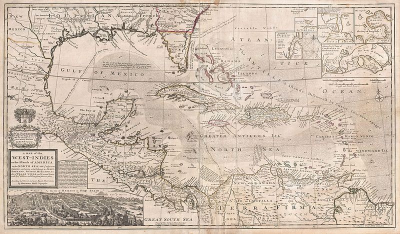
An ever reaching expansion of the European powers, the West-Indies hosted some of the most lucrative trade of its time. With England, France, Holland, Spain, and others vying for a share of the new world, cartography held a critical component in negotiation, investment, and politics. Even as Herman Moll’s 1732 map of the “Newest and most Exact Observations” came to fruition, thousands of ships navigated the Caribbean.¹ Notably tobacco, cotton, indigo, then eventually sugar gripped the agrarian markets of the many islands of the tropics. In fact, Moll’s map stems from the “golden age” of the Caribbean market, but from the later 18th century “silver age”.² Although Florida has yet to break its image of a fattened saw, we witness the power of information as European authorities flaunted it. The imperialism of the time shines through this map, and its existence is remnant of a great arms race among world powers.

Though clean and well produced, Moll’s work invokes a somewhat chaotic system of labeling and packing information into the map. From his cozy abode in London, Moll gained credibility from his ability to inscribe land claims, ports, routes, shoals, depths, currents, and winds in addition to the many established points of settlement. A well- forged relationship with explorer and pirate William Dampier largely produced the lexicon from which Moll worked. Without records from explorers like Dampier, Moll and other cartographers would not enjoy the information on which their maps rely. Even the common routes and tendencies of the Spanish treasure fleet appear for our viewing pleasure.³ Notably, some of the earliest chartings of the ocean itself manifest within this map. As this map’s publication coincides with Moll’s death, we might assume it is a culmination of his expertise.⁴ Drawing from years of artistic, scientific, and cultural energy, Moll reminds us that his profession integrates myriad finely tuned crafts—crafts applicable to any interests academic, economic, or political.

In his competence, we respect the emphases of the cartographer. Attention to motherlands marked by the only colored portions of the map display a clear variety of foreign interests. Remnant of a race to acquire distant lands, somewhat sporadic coverage reveals a tension between governments in a tightly knit realm. Sea travel necessitates frequent stops, and a preponderance of international interaction both might force governments together and apart. Thus, a special note must be made of Spain and England. Moll clearly devotes much of his carte blanche to information on the Spaniards. As the great rivalry of these nations dominated political affairs, Moll’s selection of detail likely caters to the interest in actionable intelligence on behalf of the British people. No British importer wants to run across the Armada at sea…but a pirate might! In fairness, the other nations of the Caribbean are also clearly marked, with a second magnitude of prevalence from much unloved France. One unconcealed aspect—European interest abroad was peaking, and definitive boundaries were in high contention.

Perhaps more intriguing than the map’s politics, Moll provides topographic, oceanographic and meteorologic data within his work. Although this visually pleases, these aspects provide important functionality on the page. Navigating an ocean riddled with shallows and sporadic islands creates barricaded waters with variable currents. Finding a path of least resistance then seems equally important as arriving at the proper destinations. After all, what might seem a circuitous route up the Florida coast presents a favorable route back to Europe rather than taking a direct, but dangerously rocky route through the Bahamas. In the nautical profession of the day, extra time at sea could mean spoiled goods or even dehydration. But on the other side, a well established route might also run traffic aside the Map’s favored ports and locations.  Sea travel aside, terra firma hosts a wide array of mountains, rivers, cities, mines, and forts. With so much economic value at stake, most locations seem thoroughly vetted. Despite all the surrounding politics and nationalities, the region’s spirit remains a vivid picture abroad—a unified West-Indies.

This map not only reflects what Moll knew about the area, but it substantiates the European attitude toward interests abroad. Ultimately, this map is a trophy. The economic war games played by the Western world manifest themselves in the West-Indies. We glimpse the pride felt by territories abroad; and, stamped right next to the coat of arms, a dedication of all the information entailed as if the map was the key to world power.


¹- Moll, Herman. “A Map of the West-Indies.” Map. Wikimedia. Accessed September 23, 2014. http://commons.wikimedia.org.

²- S SMITH, “Sugar Trade: 17th-19th Centuries”. In Reader’s Guide to British History, edited by D. M. Loades. London: Routledge, 2003.

³- Hasty, William. “Piracy and the Production of Knowledge in the Travels of William Dampier, C.1679–1688.” Journal of Historical Geography 37, no. 1 (2011): 40-54. doi:10.1016/j.jhg.2010.08.017.

⁴-“Herman Moll.” Geographicus. Accessed September 23, 2014. http://www.geographicus.com/mm5/cartographers/moll.txt.

Posted in Maps of the Week | Comments Off on The West-Indies

Digital Mapping: North Korea Prison Camps

Our presentation focused on the process of digital mapping, specifically Google Maps.  There are particularly compelling images of North Korea Prison Camps that were discovered through Google Maps and displayed on a website called FreeKorea.

Prison Camps in North Korea are a lot more prevalent than one might think. The Committee for Human Rights in North Korea has made many startling estimations regarding prison camps in North Korea: 120,000 people are currently imprisoned and over 400,000 people have died from starvation, disease, torture and execution.  North Korea’s political corruptness is demonstrated through the fact that anywhere from 600,000-2.5 million people have died from starvation, while the government continues to filter a lot of money to military and luxuries for officials and high-ranking members.[i]  The discovery of these prison camps was a result of satellite images captured for Google Maps and the technology surrounding digital mapping.

Digital Mapping is not a new development.  Beginning in the 1970’s the government sent out satellites to collect images; however, the information collected from these satellites was not provided to the public.  Google Maps was launched in 2004, which marked the beginning of public accessibility to satellite images taken of the earth.  The GeoEye-1 is one of the satellites that Google uses to collect images.  This satellite was released in 2008 and a more updated satellite, the GeoEye-2, was released in 2011.  What is really interesting about these satellites is that they are funded by the National Geospatial-Intelligence Agency.  Google, a private corporation, is dependent on the government for funding of these satellites. Additionally, the government receives images of a higher resolution than what is distributed to Google from the satellites.[ii]  This demonstrates that the government still has some control over the actions of Google, even though it is a private corporation.  The government involvement in the process influences the subjectivity of Google Maps.

These images draw the line between photographs and maps. On one hand, the objective pictures from the GeoEye-1 and other cameras are indisputable. On the other hand, a level of subjectivity is addressed whenever a new place is photographed. Our class had a great discussion about this phenomenon. Another part of digital maps is the level of radical thought applied. This is more specific to the maps on FreeKorea.us. These maps have been thoroughly labeled and written about in detail. Although they do not display the radical means by which a cartographer like William Bunge might use, these maps address the social tension versus the social construction of the photographs. It is as if these maps are being provided in order to tell us how unfair it is to be a prisoner in these camps. The cartographer, or, in this case, labeler, asks the audience to imagine themselves in an oppressive place like this. It brings back memories of German concentration camps during WWII. This appeal to, specifically, Americans, brings us to the final point of American Exceptionalism. The cartographer appeals to our pathos asking us to do something about these terrible places. The detailed, and frankly brutal, descriptions of camp life and these maps demonstrate exceptional American practices – an ability to help North Koreans if we only knew what was happening.

These satellite photos and ability to see over the walls we are not suppose to bring up the question of morality and whether this should be considered spying. The class also debated about whether these practices should be legal or not. As to a conclusion about ethicality of digital mapping – there are convincing arguments for both sides.

Sources:

http://freekorea.us

http://beta.slashdot.org/story/84087

http://mashable.com/2012/08/22/google-maps-facts/#gallery/10-behind-the-scenes-facts-about-google-maps/5220b716b589e403da0027d8

http://www.wired.com/2008/10/geoeye-1-super/


[i] “North Korea’s Largest Concentration Camps on Google Earth,” One Free Korea, http://freekorea.us/camps/

[ii] “Google’s Super Satellite Captures First Image,” Wired, http://www.wired.com/2008/10/geoeye-1-super/


Posted in Uncategorized | Comments Off on Digital Mapping: North Korea Prison Camps

Failed States Index Map Presentation

Failed States Index Map

The failed states index map is a fairly modern map that relies on massive data sets to determine the stability and sustainability of each country in our world. This powerful map was put together by the independent, nonpartisan, non-profit research and educational organization known as the Fund for Peace. The Fund for Peace created the map as a tool for policy and decision makers to use when making important decisions concerning foreign policy. The map was published in 2005 and has been updated annually, which makes it extremely unique from the maps presented previously in our class. Unlike previous maps, the failed states index demonstrates progress in a more fluid manner and also incorporates interactive features that allow the user to be more immersed in the content of the map. Furthermore, with the massive data sets that are used to create this map, the failed states index has the power to make extremely bold arguments. To say that a state has failed is one of the most powerful and influential claims that can be made at the international stage.

During our class discussion, it was concluded that this map had a significant outlook to the future of cartography based on its many progressive aspects. The technological aspects of this map outline a basis for a new age mapping. We decided this map to be different from others we have studied in the class because it is updated annually, and therefore, a more useful map. However, after some class discussion their were some issues with the failed states index that were important to notice when determining the function of the map. Although there were massive data sets to backup their claims, many of the “indicators” used to determine the level of stability of a state seemed very difficult to quantify. The class brought up an important point that some of the data might be flawed due to its originally qualitative rather than quantitive nature.

Best,

Jill & Santiago

Posted in Uncategorized | Comments Off on Failed States Index Map Presentation

Strange Maps are Cool

http://bigthink.com/blogs/strange-maps

The link above will take you to a nicely built blog that analyzes “strange maps.” The blog contains some interesting maps, but even more importantly holds some great analysis on each map that is posted on the blog. The blog has gained great attention over time and the author’s “US States Renamed For Countries With Similar GDPs” map, which is post 131 on the blog, has been viewed more than 587,000 times. The wide variety of maps on the blog truly capture the range of maps out in the world and their capability to represent spaces in various ways. Take a look at Frank Jacobs’ blog, it really is a great way to get familiar with some interesting maps.

Sincerely,

Santiago Espinosa

Posted in Uncategorized | Comments Off on Strange Maps are Cool

Atlas of Science Online

http://scimaps.org/atlas/maps

Follow the link above to the Atlas of Science Online. This atlas contains maps and figures of all different types that are meant to express not only the power of maps themselves, but the power of scientific information. Although throughout the atlas I found traditional maps, more interestingly, there were very unconventional maps that completely abstracted the world. In some cases, the maps in this atlas even challenge the way we view at scientific information and how it can be presented. For example, the first section of the fourth part of the atlas contains extremely abstract maps of the world titled “Cosmographia World Map” and even maps that describe “the structure of science.” This is a very unique atlas and serves as an excellent example of the unique ability maps have of abstracting spaces and ideas into more simplified forms. I really recommend taking a look at the atlas it is not very long and it holds some very interesting maps that push the limits of cartography.

Sincerely,

Santiago Espinosa

Posted in Uncategorized | Comments Off on Atlas of Science Online

Atlas of the Week: “Atlapedia”

http://www.atlapedia.com/

     For my “Atlas of the Week” I decided to give an honorable mention to the online atlas called Atlapedia. This atlas not only allows one to access both physical and political maps of each country in the world, but also facts about each country ranging from climate to religion to modern history. This atlas’s versatility is what makes it an invaluable resource when researching different countries around the world both from a mapping and informational perspective. Atlapedia is definitely worth taking a look at and hey– you might just learn something new.

Brian Dowd

Posted in Uncategorized | Comments Off on Atlas of the Week: “Atlapedia”

Map of the Week: “U.S. Military Troops and Bases Around the World” — What Our Class Map Could Have Looked Like? An Analysis of the Selectivity and Choices in Cartography

In 2002, Hugh d’Andrade and Bob Wing created a map about “U.S. Military Troops and Bases Around the World.” Not much is known about either of these authors. However, through an analysis of their map, it can be assumed that they were politically liberal and disapproved of American military intervention. This map was produced to warn against the expansion of the United States international military power that occurred after September 11, 2001 (Dufour 1).  To further this interest, d’Andrade and Wing created this map as a piece of propaganda that would scare the public and show the excessive nature of the United States international military power. Our class has created a similar map depicting United States international military power during the period of 1950-2013. However, we used different data to project a separate set of interests and ideals. Through the use of color and writing, the “U.S. Military Troops and Bases Around the World” map is able to succeed in its intention while additionally revealing how our class map potentially could have looked, in the year 2002, if we followed a similar approach with a similar set of interests. Continue reading

Posted in Uncategorized | 1 Comment