
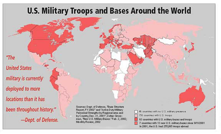
In 2002, Hugh d’Andrade and Bob Wing created a map about “U.S. Military Troops and Bases Around the World.” Not much is known about either of these authors. However, through an analysis of their map, it can be assumed that they were politically liberal and disapproved of American military intervention. This map was produced to warn against the expansion of the United States international military power that occurred after September 11, 2001 (Dufour 1). To further this interest, d’Andrade and Wing created this map as a piece of propaganda that would scare the public and show the excessive nature of the United States international military power. Our class has created a similar map depicting United States international military power during the period of 1950-2013. However, we used different data to project a separate set of interests and ideals. Through the use of color and writing, the “U.S. Military Troops and Bases Around the World” map is able to succeed in its intention while additionally revealing how our class map potentially could have looked, in the year 2002, if we followed a similar approach with a similar set of interests.
Before diving into a deep analysis of the “U.S. Military Troops and Bases Around the World” map, it is important to understand the time period in which this map was created. During this period in 2002, the devastation and fear of 9/11 was still oozing and bleeding from the public. As a result, public opinion began to move towards retaliation as a way to protect the United States and enact vengeance in the Middle East. However, d’Andrade and Wing move against this tide and use fear to sway the public the opposite way. In the reality that their map creates, the expansion of United States international military power is not a product of nationalism or protecting the country post 9/11, but instead is a disease that is spreading and infecting the world.
In order to understand how the “U.S. Military Troops and Bases Around the World” map is able to create this reality, one should look no further than the map’s use of the color red in both its varying shades and its prevalence all around the world. The shades of red move from darker to lighter based upon whether the United States has military bases and troops, just troops, or no military presence at all. The authors also include red and white striped sections to highlight where the United States has added military bases since 2001. The question then arises: why use the color red? Blue, green, and yellow could all serve the same physical purpose on the map. However, they would not serve the same interests as the color red. My interpretation is that red is used to represent the United States military power. The prominence of this military power is then used to scare the public about the reach and significance of this United States military power. This interpretation makes sense both historically and contextually. Historically, red was used in mapping during the Cold War to represent the Soviet Union and its power through the spread of Communism. D’Andrade and Wing followed this example and used red to scare the reader of their map about the expansion of United States international military power. In the all-powerful words of the omnipotent Denis Wood, maps “…embody the interests of their authors, indeed, are the interests of their authors in map form” (Wood 71). This map creates a sense of fear within its reader and then exploits this sense of fear to further its interests.
In addition to using the color red to scare the public, d’Andrade and Wing also use writing on their map to increase both the fear the map imparts on the reader and the map’s credibility to the reader. Denis Wood identifies language as having the power of “…identifying, explaining, elaborating, crediting, cautioning” (Wood 122). However, I would like to add one more thing to this list—credibility. There are two spots on this map where words are exploited to both enhance the credibility and scare the reader of this map. The first of these spots occurs on the left side of the map where it says, in bold red letters, that “The United States military is currently deployed to more locations than it has been throughout history.” The authors add this statement to scare the reader and reinforce their map’s interests against the expansion of the United States’ international military power. In addition to this, the authors include that this quote comes from the Department of Defense, giving the quote more credibility and therefore more power in the readers mind. In order to increase this sense of credibility within the map, the authors then include the citation saying that the data in this map came from the Department of Defense. While this data may have been objective to begin with, listing numbers and figures only, it becomes subjective through the interpretation and exploitation of d’Andrade and Wing. These authors spin the data to give it political implications that reflect their ideologies regarding peace and anti-interventionism. While the map uses written words to help enhance its credibility and scare the reader, it also makes certain choices that further its interests, the same choices that we decided to avoid in our class map.

When constructing our class map on the expansion of the United States international military power across the world from 1950-2013, we had to make decisions as to how to display our data in the most clear and unbiased way possible. However, it is important to clarify that we were unable to make our map fully unbiased. As is the case with the data set used in the creation of the map on “U.S. Military Troops and Bases Around the World,” there are gaps in the data that lead to interpretations and selections needing to be made. As a result of this, both our map and d’Andrade’s and Wing’s map include map silences and highlight different aspects that further their interests. One option that d’Andrade and Wing use that we decided against was shading. In making this decision, we argued that shading would cause certain countries that are larger to appear to be more significant than smaller countries based purely off of landmass. An example of this is how the entire country of Russia being shaded looks more important than France being shaded, despite them representing the same thing. However, while this would be a problem in our class map, it is used effectively in this map to portray the United States military power covering all aspects of each country and therefore taking over the world. If this map was created using our method of expanding and contracting dots, than the United States military power would not look as all-encompassing. This reflects how the way in which data is interpreted, analyzed, and reflected upon influences the creation of a map and the interests that is portrays. The exploitation of Department of Defense data and polymerization of it into map form gives the data a level of power and political weight that allows it to live a rhetorical life through its influence and impact on its readers.
Through analyzing this map it becomes apparent not only how d’Andrade and Wing made specific choices and decisions in order to further their interests and purposes for making this map, but also how our map may have looked if we took a similar approach. While our map would use different data and have a different color gradient, it would still argue the importance of larger countries over smaller countries based on landmass if we used this style. However, the map on “U.S. Military Troops and Bases Around the World” is very much a map of its time. Even though many believed in gaining retribution for 9/11, this map reflects the counter argument based on the fears of the expansion of United States international military power and the subsequent overextension of that could occur from this expansion. Through the use of the color red—a color with strong ties to the fear and infection of Communism during the Cold War—as well as the use of writing on the map to increase its credibility, this map is able to not only serve its purpose as a peace propaganda map, but is also able to lend weight to the power and political significance of Department of Defense data. Also, by comparing this map of the United States international military power in 2002 to our map of the United States international military power in 2002, we can better understand how the decisions that go into the creation of a map can alter its perception and ultimately the interest and ideals that it argues.
Brian Dowd
Works Cited
D’Andrade, Hugh, and Bob Wing. “U.S. Troops and Military Bases Around the World.” Anunews. N.p., n.d. Web. 8 Apr. 2014. <http://www.anunews.net/blog/wp- content/uploads/2012/07/aa-American-empire-map-of-bases-around-world.jpg>.
Dufour, Jules. “The Worldwide Network of US Military Bases.” Global Research. N.p., 10 Apr. 2007. Web. 8 Apr. 2014. <http://www.globalresearch.ca/the-worldwide- network-of-us-military-bases/5564>.
Wood, Denis. The Power of Maps (New York: Guilford Press, 1992), 71,122.
Really nice job here Brian! I thought you did an excellent job articulating your argument that Hugh d’Andrade and Bob Wing’s map is politically charged, and that they intended for their map to be used for social change. I think that you picked the right aspects of the map to make your argument as compelling as it could be. For example, you ask the question, “why use the color red? ” and then you go on to explain how red has been historically associated with mapping the territory, or expansion, of the United States’ enemies. This is a good point because it points out that the map’s authors were not trying to shine a positive light on U.S. military expansion. You also picked up on the idea that cartographers often try to increase a a map’s credibility to prove their points. Furthermore, by comparing the cartographic choices our class made to the cartographic choices Hugh d’Andrade and Bob Wing made, you effectively suggest that their intentions truly were political. looking at the map now, I would love to know if they had to deal with any of the issues we had to deal with like blanks in data,etc. If they did deal with blanks in data, I think that highlighting these blanks would have even further invoked a sense of fear from the map’s audience.
Overall great job!