Map of the Week: “Europe from Moscow”


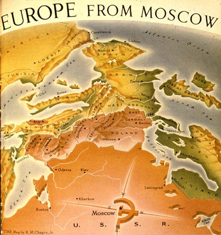
The bold orange and unorthodox perspective immediately draws the viewer in. This is exactly what the cartographer, R.M. Chapin Jr. intended, when he published, “Europe from Moscow,” in a March 1952 issue of Time Magazine. R.M. Chapin Jr. was a prominent Cold War cartographer who worked for Time Magazine. At the time this map was published, Time had well over 700,000 subscribers, giving its wide audience weekly access to all kinds of maps depicting America’s global role in the world. By publishing a map like this in a well-known American magazine, Chapin Jr. was trying to invoke a sense of fear in the American public. By using vivid colors, that clearly put the United States and the Soviet Union against each other, he is able to convey the political tensions that existed between the United States and the U.S.S.R. during the Cold War. This map exemplifies the way American cartographers played on the fears of the American public during the Cold War era.

This map was published in 1952, during the height of McCarthyism and the Second Red Scare in America. At this moment in history the United States and Soviet Russia were engaged in the early stages of the Cold War. With the Second World War behind them, and Europe devastated and in ruins, many European countries were vulnerable and susceptible to the influence of these emerging superpowers. With the United States and the U.S.S.R. vying for power and influence, Europe became a highly contested battleground.

Upon first glance at the map you feel uncomfortable. Chapin Jr. strays away from a traditional projection such as the Peters or the Mercator. The map is not oriented in a normal fashion, we are not used to seeing maps that aren’t centered on a continent or a pole. This is a stark reminder that direction and orientation are just rhetorical strategies used by cartographers. Chapin Jr. was drawing on a novel perspective that other cartographers had been using in popular magazines and newspapers since early World War II. These cartographers had been experimenting with non-traditional perspectives and orientations in order to convey their views. During World War II and the Cold War maps had evolved into more than just merely showing geographic information. Prominent cartographers such as Richard Edes Harrison were using maps to make statements and invoke emotions out of the viewers. More than anything else, cartographers used these maps as way to get the audience to reflect on what was going on in the world and to get the average American to think about what needed to be done. These maps propelled Americans into the global world of politics. This is exactly what Chapin Jr. was trying to do with this map.

Upon further observation we are immediately drawn to the bottom of the map, in which a big orange U.S.S.R. is jutting outwards into Europe. The cartographer uses the color orange because it is a bold color that really grabs the audience’s attention and is similar to the traditional red often associated with Communism. In addition to the U.S.S.R. being orange, all of the Soviet satellite countries are also colored orange which gives the impression that the U.S.S.R.’s control penetrates deep into Eastern Europe. The Western European countries are colored green and yellow and serve as a strong juxtaposition to the orange of the Soviet satellite nations. I believe the cartographer chose to color these countries green and yellow to emphasize their freedom and Western-like economies. Chapin Jr., being a political cartographer rather than a scientific one, was not looking for scientific nuance but rather a very accessible argument about the influence and geographic relationship between Europe and the U.S.S.R.  His simple yet effective use of color really helps to illuminate the geographical and political tensions that existed in Europe during this time period.

The title of the map, “Europe from Moscow,” is short and simple but serves an important rhetorical purpose. It conveys to the audience that Soviet Russia has one goal and that is to spread Communism across all of Europe.  The way the map is formatted makes it look like Soviet Russia is already advancing through Europe, with a sea of orange following close behind. This made it seem as if it was almost inevitable that Europe would fall to Communism, which was a very alarming thought. Chapin Jr. chose a very simple and evocative pictographic map that was very common during this time period, especially in Time. These maps made it very easy for the audience to understand what the cartographer was trying to convey and to comprehend the overall message. The Cold War conflict specifically lent itself to this type of map because it was an, “us,” versus “them,” conflict. It was easy to portray the U.S.S.R. as the aggressor and make it out to be the enemy. Through Chapin Jr.’s strategic use, of a simple yet startling map, he is able to further polarize the American public, and put the U.S.S.R. directly against the United States.

Another captivating facet from the map is the compass located at the bottom near the center of the U.S.S.R. Instead of a regular compass, the cartographer chose to make a compass out of the traditional Soviet hammer and sickle symbol.  The lines coming out from the compass are unsettling. They appear to be sharp and straight just like swords. It conveys the feeling that Soviet Russia is invincible and not afraid to fight to anyone that gets in its way of spreading Communism. In addition to the compass, another noteworthy feature of this map is the absence of the United States. Without the United States in the picture it seems as if there is nothing stopping the U.S.S.R. from taking over all of Europe, which again is very intimidating. This map reflects a propaganda map in its aesthetics. Chapin Jr. creates a map that defies the traditional standards of maps and provides the audience with a distorted view of reality. It appears as if Soviet Russia is going to easily take over all of Europe and in fact is already on its way to doing so. Chapin Jr. intended to persuade Americans to take a stand against Communism in Europe and ultimately around the world. The fact that there were parts of Europe still green and yellow gave Americans hope that all was not lost.

Denis Wood, a prominent cartographer, can shed light on the idea that there is no such thing as completely objective cartography. All cartographers are inherently biased. However it’s not that Chapin Jr. was biased, although he certainly was, it was more the era he was mapping in. The Cold War provided a platform for this type of polarizing cartography. Americans were unsure of what the future held and how to react to all of this conflict. This provided an avenue for a cartographer such as Chapin Jr., to create a map that persuaded Americans that Soviet Russia was on its way to taking over all of Europe. It was up to the United States of America to prevent this from happening.  Chapin Jr. successfully conveys the danger of the spread of Communism throughout Europe, and America’s responsibility, as a country built on the principles of freedom, equality, and liberty, to stop it.


Posted in Uncategorized | Tagged , , , | Comments Off on Map of the Week: “Europe from Moscow”

Atlas of the Week: The Palgrave Concise Historical Atlas of The Cold War


http://www.hist.asu.ru/faculty/cafedrs/library/Atlas_Cold_War.pdf

This atlas covers the whole span of the Cold War. Each map is simple yet able to convey a certain Cold War theme. The maps are viewer friendly and historical background is provided which helps place each map in history. This atlas focuses on all regions of the world rather than just the United States and the U.S.S.R., which makes it very unique. The reader truly gets a sense of the effect the Cold War had on all parts of the world, not just Europe or Asia, which makes this atlas truly invaluable.

Posted in Uncategorized | Comments Off on Atlas of the Week: The Palgrave Concise Historical Atlas of The Cold War

Map of the Week: Distance to the Nearest McDonald’s


Have you ever wondered just how vast the number of McDonald’s restaurants there are in the United States? The map I chose shows this particular set of data at only one specific time. With maps like this, there generally isn’t much to critique. However, this map says a lot about our nation as whole, especially in relation to demographics.

The map shows how far a specific location is from a McDonald’s. I find this to be both confusing and misleading, and would reword the title of the map as “McDonald’s Locations across the United States”. The map is very simple in its design, and lays out much like a population map of the United States would. Many population maps of United States are just pictures taken from space at night, which show all of the lights from towns and cities across the nation. I believe in order to model this type of map, the mapmaker chose to depict the McDonald’s locations with bright lights. Of course, the more McDonald’s locations there are in an area, the higher the population must be.

The main purpose of this map is to show just how huge the McDonald’s franchise really is. The map shows thousands of locations spread out across the U.S. The franchise has grown significantly since its boom in the 1950’s, and today they are one of the highest grossing franchises in the world.

This map easily depicts population centers in the United States. First of all, you couldn’t use any other franchise other than McDonald’s to clearly show populated areas of our nation. The franchise has grown so large, that just about every town has a location of its own. The American East and Midwest are lit up with locations, while the Great Plains and Rocky Mountain regions are much sparser in regards to number of McDonalds’. The number of small towns in places such as Eastern Kansas and Nebraska must vastly decrease as you move west into Wyoming, Montana, Colorado, etc. I find the quick cutoff very interesting, as I can’t quite figure out why settlers hundreds of years ago decided to skip over most of the western part of the country. The West Coast is also well lit, especially in the larger metropolitan areas of Los Angeles, San Diego, Bay Area, and Seattle.

This map shines a spotlight on the population/demographics of our nation, while showing the vastness of the McDonald’s franchise. I found it to be intriguing because instead of just showing the population centers of the U.S. lit up, as many maps before it have done, this mapmaker took a different approach to this by showing the locations of the largest fast food franchise in the country. Knowing only that the mapmaker used just one set of data in the present time period, you would think that the map would be rather boring and not much to look at. This map, however, intrigues its audience by using a business that just everyone has been a client to at one time or another: McDonald’s. Audiences to this map would primarily be the public. It would most likely be seen as a form of propaganda to them, showing health defects such as obesity are the cause of such a dependence on fast food. Though the map doesn’t flat out say this, it is implied. The map isn’t well decorated, but it doesn’t need to be. It gets its message across in a clear and interesting manner.


Posted in Maps of the Week | 1 Comment

Lunar Wall Mosaic

Since its birth, our society has been captivated by the celestial beings which stood far beyond our reach of understanding and technology until the 1600s. With Galileo’s invention of the telescope, the science of astronomy took a major leap forward – and with it lunar mapping. Over the next century, the field of selenography expanded as techniques for mapping the moon become more advanced and astronomists created maps that included the moon’s detailed surface, its longitude and latitude, and, by the 1700s, a full coordinated system. Photography of the moon, although low quality, was first introduced by J.W. Draper in 1840 (Wilford. 427). The 20th century saw the greatest progress in lunar mapping, especially during the Space Race between the United States and the Soviet Union during the Cold War era.

In class, we looked at a rather abstract map of the moon titled “USAF lunar wall mosaic.” We discussed how this map, though it may seem simple and straightforward, carries political and military connotations that contextualize this 1962 documentation of the moon. The moon, though over 200,000 miles from Earth, became a major focus of the United States and the Soviet Union during the Cold War era. The Space Race, which involved lots of funding being directed towards NASA and defense agencies, was simply another area in which each superpower sought to establish its political supremacy through technological and scientific superiority. The map was created by US Air Force Aeronautical Chart Information Center, direct evidence that this project was driven by the government’s political interests, which were more militarily than scientifically focused in 1962. We also noticed that the map’s interests were related to its physical attributes, particularly how it is a mosaic of photos rather than one full picture or, like most maps, drawing of the moon. This map is an actual mosaic as it takes tiny pieces of the moon and brings it into one full photo. Although it may appear that only having pieces of pictures makes the U.S. seem less knowledgeable about the moon, this actually is able to emphasize all the specific details because they are able to have the most detailed understanding on the moon’s surface. Looking closely you can see that every feature of the moon is clearly labeled. The United States was able to gain a sense of ownership, putting them ahead in the Space Race, by creating the first fully label map of the moon.

-Ellen Silka and Josie Garcia


“USAF Lunar Wall Mosaic : LEM-1B. | Library of Congress.” USAF Lunar Wall Mosaic : LEM-1B. | Library of Congress. Accessed November 04, 2014. http://www.loc.gov/item/00561368/


Wilford, John Noble. “Extraterrestrial Mapping: The Moon.” In The Mapmakers, 426-45. New York: Knopf, 1981.

Posted in Uncategorized | Comments Off on

World Distribution of Spirochetal Diseases Presentation

      This map was part of a series of maps in the Atlas of Disease, produced in 1950 by Dr. Jacques May. This map in particular was produced in 1955, a couple of years after President Truman’s introduction of the “Point Four Program”, which strove to bring “scientific advances and industrial progress” to underdeveloped areas. Of course, Truman asserted that “The United States is pre-eminent among nations in the development of industrial and scientific techniques.” Created by the American Geographical Society with funding from the U.S. Government and pharmaceutical industry, this map shows both political and commercial interests, even though it was “designed primarily as a tool of research.” Commercially, pharmaceutical companies saw great opportunity where there was sickness, as sick people would need medicine. Politically, it played a role in defining the powers of the Cold War. During this period of rapid decolonization, many countries in Africa were becoming independent, introducing a new force into the bipolar world of the Cold War. These countries were quickly categorized as the Third World. This map plays a role in defining these Third World countries as states that are disease-ridden and needing of American aid. It also defines the First World countries as clean and disease-free. Another important aspect to remember is the Briesemeister projection that was created specifically for this series of maps, which puts special emphasis on how disease-covered Africa is. We brought all of these points up in our discussion.

During our class discussion, we were able to touch on many important ideas and influences surrounding this map.  Starting with the history of the map and the background of its creation, we then asked the class to brainstorm some ideas and interpretations of the Atlas of Disease.  One interesting topic raised involved the sponsors of the creation of this Atlas, namely the Office of Naval Research and pharmaceutical companies such as Upjohn and Pfizer. This led to comments about the influence of these companies and how it affects the creation and presentation of a map depicting disease and illness around the world.  Another key topic brought up during class was that of the depiction of the Third World, and how elements of the map such as photography, color, and projection portray the afflicted countries as suffering and helpless without American intervention and aid.  Finally, we wrapped up our conversation with a connection to the political climate of the time, noting that such a detailed and densely packed map conveys the Cold War era desire for as much information about foreign countries as possible–a desire satisfied by the growing scientific nature of maps.

Bibliography:

Barney, Timothy. “Diagnosing the Third World: The “Map Doctor” and the Spatialized Discourses of Disease and Development in the Cold War.” Quarterly Journal of Speech 100, no. 1 (March 26, 2014): 1-doi:10.1080/00335630.2014.887215.

Posted in Uncategorized | 1 Comment

“National Atlas of USA: Exports and Imports” (1970)

“National Atlas of the United States of America: Exports and Imports” map of 1970 comes from the National Atlas of the United States of America, which was developed by The U.S. Geological Survey. The National Atlas of the United States of America was developed for many different people with many different interest including: agriculture, worldly affairs, economics, socio-cultural, climate and history to name a few.

Although at first glance the map appears to be purely informational it contains multiple political interests, which portray Cold War era propaganda. First it is worth noting that the United States is attempting to portray itself as the center of international trade in order to show its importance in the market economy. Furthermore, the maps use of arrows and tables show that the United States traded with nearly every single country, even those bordering the USSR, but they did not trade with the USSR. This is reflective of Cold War tensions particularly the containment policy utilized by the United States in response to Eisenhower’s Domino Theory. It is also worth noting that: “A symbiotic relationship formed between post war [WWII] U.S. global strategy and oil”. The mass amount of oil trade the United States had with a plethora of countries in the middle east as well as Venezuela shows how the United States believed that: “Controlling oil helped the United States contain the Soviet Union”.

The United States captures the attention of the audience. It is dead center of the map and is the only nation on the map that is white. In contrast, the USSR is completely neglected. Not only is it cut off on both sides of the map, but there are also charts that cover up even more of the USSR. the cartographer clearly wanted to direct attention away from the USSR and toward the US. Amongst all that neglected space is just one small pie chart. The USSR is portrayed as completely insignificant, as opposed to the US and every other nation the US does business with. The map serves as a weapon of United States imperialism in that it empowers the US economically. This map exemplifies the United States’ use of soft power in order to grow as an empire. The map shows only the US’s relations with other nations and not the relations among other nations with each other. The United States’ influence through worldwide economic relations empowers them as a nation, more fittingly, as an empire.

By Luke Perda and David Link.

Posted in Uncategorized | Comments Off on “National Atlas of USA: Exports and Imports” (1970)

Atlas of the Week: World War II European Theater

http://www.westpoint.edu/history/SitePages/WWII%20European%20Theater.aspx

This atlas gives a wide range of maps pertaining to World War II.  There are maps ranging from battle grounds and plans of offensive attacks to maps showing winter camp grounds and futures campaigns for the armies.  The atlas is from United States Department of History and the maps are very detailed and provide a lot of information for their readers.  The site also has endless information about the history of WWII and the many strategies and plans the United States had.

Posted in Atlases of the Week | 1 Comment

Map of the Week: Hitler’s Map of South America

Have we ever wondered what WWII would have been like if South America was involved?  This map was created sometime in the late 1930s or the early 1940s and depicts a Nazi plan to invade South America.  The cartographers, however, were likely not German and the map is probably a British forgery.  Nonetheless, this map was still played a pivotal part in World War II and was an influential resource for the Americans.  Right away my attention was caught with the new names and larger regions on South America and the lines going around and through the country. There is also a German phrase on the bottom right portion of the map is translated to say “Air transport network of the United States of South America main lines” which telling the audience that this map had an aerial purpose.  Given the context of the time period and the complexity of the map, I think America should have been alarmed about the preparedness of a potential German invasion.

Hitler’s viewpoints were outlandish and absurd, so his depiction of South America during World War II shouldn’t come as a complete surprise.  However people during this time really thought Hitler could take over the world, and given the likelihood that this map is a British forgery only further tells us that this plan was realistic idea in the eyes of many. The cartographers consolidated the thirteen countries of South America into five different regions: Neuspanien, Guyana, Chile, Argentinien, and Brasilien.  This plan was similar to Hitler’s plan of taking over Europe.  Separating countries into larger regions would have made it easier for a Nazi invasion.

The Neuspanien (New Spain) region is not named after a South American country like the other regions which tells us that this region is different from the rest.  The cartographers may have done this because Hitler recognized Spain’s region not as one they wanted to take over.  The Nazi’s viewed Spain as a loose ally in the war, and the aerial routes into and coming out of Neuspanien would support that premise.  The Neuspanien region also has an important geographical location in context to the war because it is below the United States and positioned in between them and Europe.  However this map makes invading and taking over a country look easy.  The map assumes that all the aerial routes are open and that the Nazi’s can easily take over these places.  Hitler perceived the world to be catered to his wishes, meaning that he thought invasion and takeover were just going to happen if they made a plan an executed.  Too many important events in the world had occurred for a man and his army to just shape the world as they wished.

The aerial routes illustrate that Hitler and his government have a plan of attack in South America and they show the German influence and power in the world.  This was a time where air travel was advancing rapidly and the geographic imagination of many people were being displayed. The routes show how the German’s and their allies will be able to travel and transport supplies in South America.  The Germans would be able to move easily within the country, making them ready to fight and expand their empire.  The map has many routes going along the coast of each region, with only a few routes that travel horizontally through the continent.  This tells us that the Germans could move within South America but that they would try to avoid conflict by traveling on the coast of the continent.  Those routes would also make it easier to travel to different continents like North America and Europe.

This release of this map influenced FDR’s decision for the United States to enter the War.  FDR saw that Hitler wanted to invade South America and he saw their preparation level with a map of air travel routes already in place. He knew that South America could be a very important player in the war due to its geographical location. When he revealed the map in a speech he said, “That map, my friends, makes clear the Nazi design not only against South America but against the United States as well.”  This obviously alarmed the public right away.  They now had visual evidence of a Nazi invasion and public sentiment changed regarding the war. This was an important thing for FDR to say because he knew that there would be an emotional factor for Americans now.  Seeing a planned invasion so close to United States borders, with the possibility of the invasion moving into the US, frightened many Americans.  Seeing the atrocities happening in Europe, Americans knew they needed the keep the US safe.  FDR was gaining the public support he need and it ultimately helped him intervene in the war.

This map still remains an important artifact from WWII.  This unconventional map showed us a possible Nazi plan of invasion of South America.  The map’s aerial routes were advanced and show the Nazi’s were prepared and meant business.  The map also heightened the American sentiment which helped FDR decide to enter the war.  The vital role that this map played in WWII only further tell us how important maps can be.

Posted in Maps of the Week | 2 Comments

Atlas of the Week: Global Carbon Atlas

http://www.globalcarbonatlas.org/?q=en/content/welcome-carbon-atlas

The atlas of the week is a very interactive and informative atlas about global carbon uses.  It allows the user to get an interactive look at the carbon fluxes resulting from human activities and natural processes. The Global Carbon Atlas has three main focuses; outreach, emissions, and research. When you click on the outreach button, you are able to look out an animated “carbon story” either from the past, present, or future. It takes you on an adventure that also feeds you information along the way. When you click on the emission button, a map of carbon emissions around the world is shown. You are then allowed to choose what type of emission you want to specify in and what region as well. The research page not only gives you information found through large research, but it also allows you to create you own map based on the research and data given. The Global Carbon Atlas is a easy and fun way to learn about our environment’s past, present, and future.

Posted in Uncategorized | Comments Off on Atlas of the Week: Global Carbon Atlas

Map of the Week: Slave Trade from Africa to the Americas 1650-1860

This map of the week, unfortunately not a cheerful one, is a map of the slave trade from Africa to the Americas from 1650 to 1860. This was during a time that the Atlantic Slave Trade route was the most successful trade route. The Triangular Trade Route was a trade route comprising enslaved African Americans who were shipped to Europe and the Americas. This map, however, only focuses on the trade between Africa and the Americas. It erases a lot of other important information so that it can highlight the important relationship between Africa and the Americas at this time. For the purpose of this map, Europe is only given one arrow that points in the direction of Europe, to remind the reader that there were still slaves being sent there. As we can see, the Americas, especially South America, were a dominant force in this slave trade. Because of its pictographic nature, this map is able to show the importance of the slave trade at this time, but more so the dehumanization of the people being traded at this time.

The labeling of only a few coastal cities in America shows the dominance of trade during this time. In North America the only cities labeled are New York, Richmond, Charleston, and New Orleans.These cities are chosen purposefully and strategically by the cartographer. Because these were the major trading ports they appear to be the major cities of America. The lack of any other cities being labeled makes it seem as if no other cities exist—the United States is only defined by its trading ports. This representation of North America at this time creates a perception of a trade dominant world..

The map not only shows trade between the Americas and Africa during this time, but it more importantly equates the slaves to natural resources, or goods—as if they were objects, not people. An important part of the Triangular Trade were the goods traded, such as tobacco, coffee, cotton, sugar, mining, and rice. These goods are labeled on the map, but are not, however, shown actually being traded. There is a key in the bottom left corner that labels each good. These symbols are on the coasts of North and South America. They are not shown being traded,however. When you look at the map, the only “things” being shown traded are humans. We would not know this, however, if it were not for the title that told us that the goods traded are actually slaves. The cartographer portrays the slaves to be goods, such as tobacco, rice, etc. The one directional arrows give the appearance of the Americas ripping Africa of their resources and not giving them anything else in return. Although the nature of this map allows the reader to see all of the trade routes, and imagine the slaves on them, it lacks a key idea. It is unable to show the personal effects of the slave trade on these slaves. We are not able to grasp the idea, from this map, that the people traveling on these routes are suffering immensely.

Another significance of the arrows in the map are the connectedness they give Africa to the Americas. The strikingly red arrows completely cover the Atlantic Ocean and create the image that Africa and the Americas are connected through their slave trade—a pretty scary thought.

Giving quantitative information on the map allows the reader to get a sense of the vast amount of people that were actually enslaved and traded, as if they were goods. You will notice the bold black blocks labeled with a number. These numbers tell the amount of slaves being sent to that specific location. Some of the numbers are startling. It also allows us to take note of which countries were in most use of the slaves. We are able to learn that South America and Central America combined used more than 20 times the amount of slaves that North America did. Also, since Europe is not shown on this map, we are left to imagine how many slaves were traded there. This map highlights the idea that the slave trade was predominantly a trans-American movement that was instilled across the entire continent .

Some of the most important parts of this map are the bits that are not actually shown on the map—the things left out, or the silences of the map. For example, the slave trade began in the 1500s, not 1650, so we can ask ourselves why did the cartographer of this map choose to leave out a whole entire century? Another thing to note is the fact that only the “Major Slave Trade Routes” are labeled on this map. How many more were there? This map not only uses its specific labeling and use of symbol as a way to show the dominance of the slave trade during this time, but it also uses its lack of information as a tool.

The use of a map as a representation of slavery, or more specifically the slave trade, has its strengths and weaknesses. It is able to display the quantity and movement of the slaves at this time. It lacks, however, the ability to interpret the human aspect of the trade. The cartographer seems to equate the human slaves to objects, or goods. If it were not for the title, we would not know that the arrows drawn across the ocean are actually representing humans being shipped. This lack of detail adds to the dehumanization of the slaves.

Posted in Uncategorized | Comments Off on Map of the Week: Slave Trade from Africa to the Americas 1650-1860