
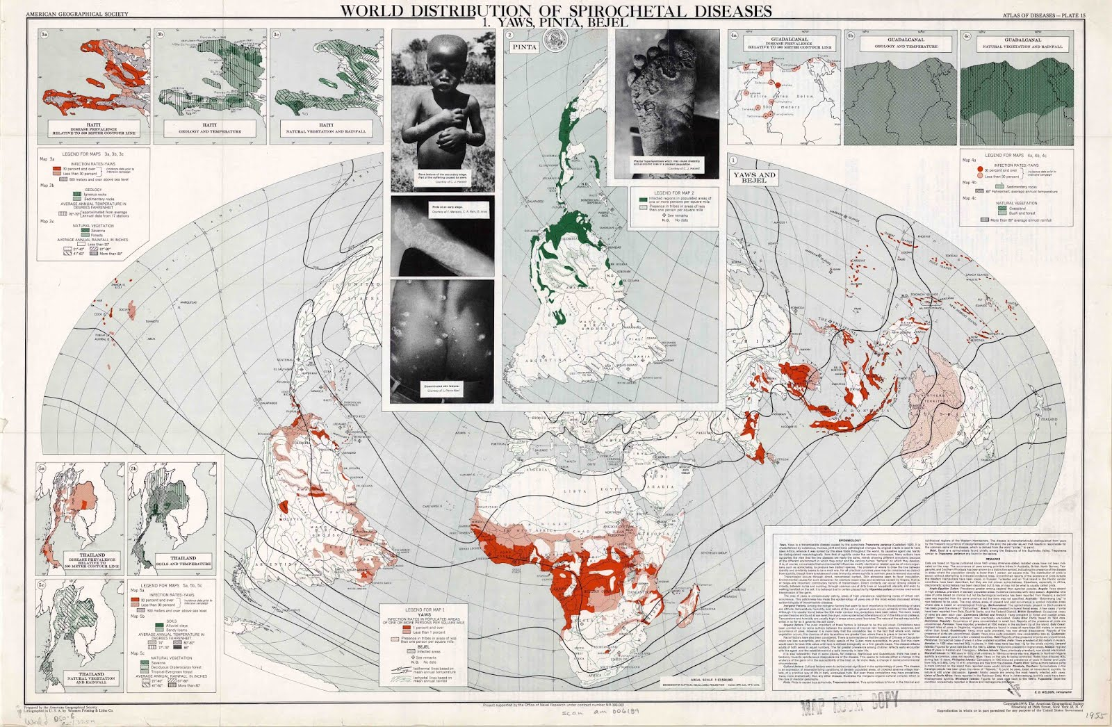
This map was part of a series of maps in the Atlas of Disease, produced in 1950 by Dr. Jacques May. This map in particular was produced in 1955, a couple of years after President Truman’s introduction of the “Point Four Program”, which strove to bring “scientific advances and industrial progress” to underdeveloped areas. Of course, Truman asserted that “The United States is pre-eminent among nations in the development of industrial and scientific techniques.” Created by the American Geographical Society with funding from the U.S. Government and pharmaceutical industry, this map shows both political and commercial interests, even though it was “designed primarily as a tool of research.” Commercially, pharmaceutical companies saw great opportunity where there was sickness, as sick people would need medicine. Politically, it played a role in defining the powers of the Cold War. During this period of rapid decolonization, many countries in Africa were becoming independent, introducing a new force into the bipolar world of the Cold War. These countries were quickly categorized as the Third World. This map plays a role in defining these Third World countries as states that are disease-ridden and needing of American aid. It also defines the First World countries as clean and disease-free. Another important aspect to remember is the Briesemeister projection that was created specifically for this series of maps, which puts special emphasis on how disease-covered Africa is. We brought all of these points up in our discussion.
During our class discussion, we were able to touch on many important ideas and influences surrounding this map. Starting with the history of the map and the background of its creation, we then asked the class to brainstorm some ideas and interpretations of the Atlas of Disease. One interesting topic raised involved the sponsors of the creation of this Atlas, namely the Office of Naval Research and pharmaceutical companies such as Upjohn and Pfizer. This led to comments about the influence of these companies and how it affects the creation and presentation of a map depicting disease and illness around the world. Another key topic brought up during class was that of the depiction of the Third World, and how elements of the map such as photography, color, and projection portray the afflicted countries as suffering and helpless without American intervention and aid. Finally, we wrapped up our conversation with a connection to the political climate of the time, noting that such a detailed and densely packed map conveys the Cold War era desire for as much information about foreign countries as possible–a desire satisfied by the growing scientific nature of maps.
Bibliography:
Barney, Timothy. “Diagnosing the Third World: The “Map Doctor” and the Spatialized Discourses of Disease and Development in the Cold War.” Quarterly Journal of Speech 100, no. 1 (March 26, 2014): 1-doi:10.1080/00335630.2014.887215.
Very interesting map. This is certainly noteworthy and relevant in light of what has been going on with the Ebola outbreak. It’s interesting how the United States is almost completely blocked off from the map, it’s a good choice by the cartographer because medical technology in the U.S. significantly limits the number of spirochete diseases. I also think this map can be related to the “Gulag Slavery” map with its use of captions and photos. This brings an element of reality to the map and helps viewers realize the severity of the issue.