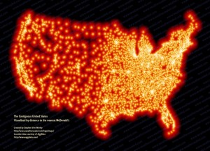
Have you ever wondered just how vast the number of McDonald’s restaurants there are in the United States? The map I chose shows this particular set of data at only one specific time. With maps like this, there generally isn’t much to critique. However, this map says a lot about our nation as whole, especially in relation to demographics.
The map shows how far a specific location is from a McDonald’s. I find this to be both confusing and misleading, and would reword the title of the map as “McDonald’s Locations across the United States”. The map is very simple in its design, and lays out much like a population map of the United States would. Many population maps of United States are just pictures taken from space at night, which show all of the lights from towns and cities across the nation. I believe in order to model this type of map, the mapmaker chose to depict the McDonald’s locations with bright lights. Of course, the more McDonald’s locations there are in an area, the higher the population must be.
The main purpose of this map is to show just how huge the McDonald’s franchise really is. The map shows thousands of locations spread out across the U.S. The franchise has grown significantly since its boom in the 1950’s, and today they are one of the highest grossing franchises in the world.
This map easily depicts population centers in the United States. First of all, you couldn’t use any other franchise other than McDonald’s to clearly show populated areas of our nation. The franchise has grown so large, that just about every town has a location of its own. The American East and Midwest are lit up with locations, while the Great Plains and Rocky Mountain regions are much sparser in regards to number of McDonalds’. The number of small towns in places such as Eastern Kansas and Nebraska must vastly decrease as you move west into Wyoming, Montana, Colorado, etc. I find the quick cutoff very interesting, as I can’t quite figure out why settlers hundreds of years ago decided to skip over most of the western part of the country. The West Coast is also well lit, especially in the larger metropolitan areas of Los Angeles, San Diego, Bay Area, and Seattle.
This map shines a spotlight on the population/demographics of our nation, while showing the vastness of the McDonald’s franchise. I found it to be intriguing because instead of just showing the population centers of the U.S. lit up, as many maps before it have done, this mapmaker took a different approach to this by showing the locations of the largest fast food franchise in the country. Knowing only that the mapmaker used just one set of data in the present time period, you would think that the map would be rather boring and not much to look at. This map, however, intrigues its audience by using a business that just everyone has been a client to at one time or another: McDonald’s. Audiences to this map would primarily be the public. It would most likely be seen as a form of propaganda to them, showing health defects such as obesity are the cause of such a dependence on fast food. Though the map doesn’t flat out say this, it is implied. The map isn’t well decorated, but it doesn’t need to be. It gets its message across in a clear and interesting manner.


What an interesting map! Although I agree that this map shines McDonald’s in a bad light, I’m not sure if the only reason for this is obesity. An orangey red is the only color in the map, and it is incredibly bright, almost inescapable. Since red symbolizes evil, the sheer amount of red on the map could symbolize McDonald’s “taking over” America, as well as large chain stores as a whole hurting small businesses across the country. A nearly perfect outline of the United States is created by the dots, giving the impression that McDonald’s has become America – it is no longer possible for small businesses to thrive because chains like McDonald’s are everywhere. This is especially true in cities, where McDonald’s swallows them in white from having so many locations. The western side of the United States, however, shows some breathing room. I agree with you that it is odd that so few McDonald’s are in the western half compared to the eastern half, although this is probably due to the decreased number of people living in the western half of the country, besides the West Coast. Overall, you had an interesting analysis for a very interesting map! Good job!