Strange Maps and Strange Cities

With the stress of midterms and projects looming over the student body this past week, I felt it was best to take a break from studying and go looking for something fun in preparation for a much needed week without classes. I found just what I was looking for on the Strange Maps blog. If it’s a map and it’s eclectic, strange, or just plain weird you might just find it here.  From current political topics to the fantastical world of J.R.R. Tolkien’s Middle Earth, this site has it all. Author Frank Jacobs provides a lighthearted and thoughtful analysis of maps collected from books, everyday objects, and, of course, the internet. In addition, after a perilous trip through the maze-like lower levels of the lib (the Boatwright Memorial Library for all you non-Spiders), risking both caffeine headache and sleep deprivation, I dug up The Unfathomable City: A New Orleans Atlas. Covering New Orleans’ rich history and recent difficulties, this beautifully illustrated atlas provides deep insights into the country’s most unique city. With a map of Carnival parade routes you can even begin to plan an epic visit for Mardi Gras next year! So take a break from conjugating verbs and pulling all nighters and unwind with some strange maps and dreams of jazz and gumbo.  Enjoy!

-Cathryn F.

Solnit, Rebecca, and Rebecca Snedeker. Unfathomable City a New Orleans Atlas. Berkeley (Calif.), University of California Press, 2013.

unfathomable-city-a-new-orleans-atlas

http://bigthink.com/articles?blog=strange-maps

Posted in Atlases of the Week | Comments Off on Strange Maps and Strange Cities

Outline of Post-War New World Order

FYS Map

This map was created by Maurice Gomberg in 1941 to predict a “New World Moral Order” after the conclusion of World War II. This map is broken up into two parts: the visual and the written. The visual component of the map illustrates the breakdown of the new world powers in the new world order their influences on the territories that they patrol and protect. The written part is a detailed breakdown of the rules established under this new world order and the actual governing bodies that would possess all of the real power. The written part, broken down into 41 points, essentially acts as a constitution for the world. The written part shows the United States’, U.S.S.R’s, and British Commonwealth’s place and relationships in the world. In addition, the map sets up international law under the “World League of Nationalities” which is a much more powerful form of the United Nations. It also creates “Demilitarized Independent Republics” which do not have armies and are therefore less powerful then the United States, U.S.S.R, and the British Commonwealth. Some of the later points in the constitution detail punishment for the parties responsible in the war, which places Germany, Italy, and Japan in quarantine zones. This punishment includes the expulsion of people of these ethnicities from other nations as well as areas captured by axis powers, such as the Rhineland, who could cause problems if not put into isolation. The quarantine zones would be used to shape the people within them into eventual transition back into “The Family of Nations”. In particular, point 29 shows how the World League of Nations” oversees repartitions and education of the people inside these zones. To prevent another catastrophe, industry and economy has been nationalized so that the new government can control all aspects of society. Gomberg seems to indicate that if this new “Order” is put into place the problems of Nationalism and colonialism that were seen during World War II would not occur.

One of the most important parts of the analysis that showed in our presentation was the rhetorical critique of the map. We showed how the United States’ blue swaths of color in the Pacific Ocean are larger than necessary which influences the perception of the reader. Secondly, FDR’s quote in the lower left which describes a new moral order points toward the validity of the map and its author.

In the class discussion, we discussed the aspects of the map that related to our readings and the rhetoric behind maps. We discussed how the Ural Mountains and the Burma road were specifically included and not silenced like many other features. It was brought up that the Burma road was quite important in the Sino-Japanese War as a supply line. We looked at the possible motives behind placing this road and mountain range there. For instance, we discussed how the Ural Mountains acted as an indicator of the creeping advancement of the U.S.S.R into Western Europe, possibly showing Gomberg’s opinion on communist advancements. Finally, we discussed the aspects that Gomberg got right and wrong in the post war era. The students discussed how he got the influence of the major nations correct, but incorrectly predicted the power of an international governing body and necessity of demilitarized zones worldwide.

Reference:

Gomberg, Maurice. “Outline of the Post-War New World Order Map.” Philadelphia, 1942.

Posted in Uncategorized | Comments Off on Outline of Post-War New World Order

CIA: Country Profile of Afghanistan

2012 Afghanistan Country Profile

The United States Department of Defense has appropriated nearly $3.7 trillion since 2001 for the wars in Afghanistan and Iraq (Crawford, 2016). To effectively conduct military operations, reason stands that the United States invests heavily in its intelligence capabilities. One way in which the Central Intelligence Agency provides intelligence is through cartography. By knowing a nation’s geographical space and context, the CIA can better understand its perception of the threats it faces. In the CIA’s declassified cartographic profile of Afghanistan, the agency’s usage of codes, such as iconic, linguistic, spatial, temporal, and presentational codes, helps the audience understand the author’s perspective on the nation, which may conflict with the perspectives of others (CIA, 2016).

The CIA’s profile of Afghanistan contains various, detailed contextual information that creates the perception of a highly accurate and factual map for the audience. After all, the U.S. military commanders, who make decisions based on intelligence such as this profile from the CIA, expect the utmost accuracy in its intelligence information to gain operational superiority on the battlefield. Therefore, the CIA uses many iconic codes in its Afghanistan country profile to create the perception of an indispensably high quality map for the military operators. To steal from Denis Wood’s terminology, the various symbols displayed for different roads, canals, and other infrastructure such as airports highlight a symbolic operation as well as a schematic operation (Wood, 1993). In other words, the different symbols for a “minor road” versus a “provincial road” signify unique degrees of overall representation (CIA, 2016). This representational technique gives the intended audience of this map the ability to identify which areas have a greater capacity to conduct military operations per Afghanistan’s present infrastructure as identified by the CIA. Thus, with the CIA’s use of iconic codes, it creates a perception that its map is qualified for use by military decision-makers. However, Afghani residents may very well disagree with this map’s quality because the CIA might subconsciously, through a lack of intelligence gathering, or deliberately, with an intent to persuade, withhold information deemed operationally significant.

This map additionally contains numerous linguistic codes in English. The CIA’s linguistic identification for cities, regions, and ethnic groups, showcases the original intent of this map to serve as an intelligence resource for the United States military; the military commanders likely cannot understand the local dialect. While the military may favor and appreciate these linguistic codes, the various ethnolinguistic groups in Afghanistan could view these codes as an oversimplification of relevant information in the context of military operations. The military may identify a specific village as one thing in English, for instance, but the local road signs, if any, could display an entirely different name for the village, which may adversely affect military operational success.

Furthermore, the other maps and data surrounding the central geographic and political map imbue a spatial or tectonic relationship for the audience to relate specific external information to the information contained within the central map; the ethnolinguistic groups, population density, rainfall, and poppy cultivation maps help the audience understand perhaps why more contextual iconic symbols are displayed in the northeastern region of the map. Yet, these maps and data, once again, are very subjective. Whereas the CIA would like to convey to the military an element of significance for the ethnolinguistic groups, population density, rainfall, and poppy cultivation, others may argue against its relative significance. For example, the CIA may believe in a correlation between ethnolinguistic groups and Taliban support or poppy cultivation and Taliban financing (the poppy plant may produce opium that could be used for money to purchase weapons). However, the individuals generalized among these groups may be staunchly anti-Taliban or cultivate poppy for their own sustenance and economic wellbeing.

Moreover, the perceived quality for this map, as viewed by the intended audience, correlates to the maps recency of subjectively included data. Specifically, the timeline on the left provides historical pretext leading up to and during the war in a temporal aspect that the military can factor in its decision-making. The time in the context of military operations aides the intended audience’s ability to understand broader geopolitical sensitivities and implications for its potential actions. One must understand, however, that the information included in this timeline solely exists based on what the CIA deems relevant. Whereas the United States may perceive its operations assisting a faction of the Afghani people against the Soviet invasion in 1979 as beneficial, the Afghani people may view further U.S. actions as an illegal extension of imperialist, influential ambitions despite American rhetoric.

The CIA’s presentation of information and geographical space also reflects the necessity of the intelligence gatherers to convey as much information (although subjective) as possible to the operational commanders. For example, the map contains a timeline on the left, demographic information on the top, additional demographic, climate, and natural information on the right, a detailed key on the bottom, and an overarching central, geopolitical map. While the military may perceive this profile to be accurate, informative, and high quality, the map’s size cannot realistically include every relevant piece of information. Evidently, the map may omit crucial data in the eyes of other audiences.

Since the physical constraints of this map as well as the subjective biases of the CIA limit the scope of this profile of Afghanistan, the Afghani people and geopolitical rivals, among others, may easily perceive this information in an entirely different view. Therefore, both the intended and current audiences of this declassified profile must take these alternative viewpoints into consideration. Clearly, the CIA’s map can lead current audiences to rhetorically infer various contextual significations that otherwise stray from the agency’s original intent or from the intended audiences’ perception of the information. However, in context, this profile seeks to market like an advertisement for specific courses of military action. The established relationship of trust between military decision-makers and the CIA may impede the military’s ability to make more informative decisions. Perhaps the military did in fact misunderstand various contextual data because, despite invading nearly two decades ago, U.S. forces remain in the country. Ultimately, any individual who views this profile must account for the fact that the CIA constructed this profile with its own unique interpretation of Afghanistan for a specific military audience. The data and information contained within this profile reflects a bias and motivations not completely understood by those outside of the CIA. Audiences therefore may argue the CIA’s conveyance of facts and make their own conclusions from the rhetorical displays of this profile from their own unique perspectives outside of the contained information. A map cannot possibly be accurate for any audience due to its physical and contextual restraints and the inherent biases of the map-maker to neglect including information either subconsciously or deliberately.


References

Central Intelligence Agency. 2016. «2012 Afghanistan Country Profile». Flickr. Yahoo! https://www.flickr.com/photos/ciagov/30249978823/in/album-72157674854391962/.

Crawford,  Neta C &  . 2016. « US Budgetary Costs of Wars through 2016: $4.79 Trillion and Counting ». US Budgetary Costs of Wars through 2016: $4.79 Trillion and Counting. http://watson.brown.edu/costsofwar/files/cow/imce/papers/2016/Costs%20of%20War%20through%202016%20FINAL%20final%20v2.pdf

Wood, Denis & Fels, John. 1993. The power of maps. London: Routledge.

Posted in Uncategorized | 2 Comments

Traveling Through Time: an Atlas of London

https://www.old-maps.co.uk/#/Map/531500/181500/12/101107

Old-maps.com may seem like an unprofessional source for getting accurate maps of anything with any credibility. However, the services offered in this Atlas for city maps, of not only London (as linked above), is absolutely astounding. This online Atlas allows the user to pull up maps of just about any town in England dating from the late 19th to just before the 21st century. Over a hundred years worth of city maps at your fingertips, making this Atlas a very worthwhile link to check oout.

http://www.bigmapblog.com/

On a similar note the bigmap blog is a great resource for finding and learning some basic information behind some unique historical maps. For anyone interested in getting better acquainted with the latest trends in historical mapping this is a great place to start.

Posted in Atlases of the Week | Comments Off on Traveling Through Time: an Atlas of London

Hiding Revolutionary Sparks under an Imperial basket

Map of the Week Western ocean

The Western world as seen by the most powerful nation on earth. In February of 1775 such a chart was published by Robert Sayer, in London, depicting the countries surrounding the Western Ocean. As a map from London, it is oriented around the British Empire and its inferior rivals in colonizing the new world. In early 1775 the British would still have assumed themselves to maintain full control of their American colonies and as such to treat them as worth only of a cursory indication of coastal territory. In fact, most countries and regions are labeled this way, such as Barbary in Africa, which included multiple established kingdoms, or even France and Spain, major European powers. Another explanation for vague labeling of the American colonies may be that the British may not have wanted to justify the individual colonies or their bodies of government at a time when these colonies were toying with the notion of becoming independent and self-governed states. Regardless of intention, evidence of the British superiority is seen in the subtle details across the map, from only labeling coasts to the fact that the map only encompasses territory in which the British held considerable sway. This British sense superiority and confidence is palpable even at a time when these English imperialists would be shaken to the core by the American Revolution. This juxtaposition of imperial power and revolutionary liberation qualifies this Western map as the official Map of the Week.

English superiority, a main theme in this map, is expressed in the way the rest of the world, including rival powers, are only labeled with coastal areas and port cities.  As a growing empire, the British would have most likely been interested in the coasts for strategic bases for the imperial navy as well as places to conduct trade in order to enrich the kingdom. As a publisher of maritime charts, Sayer would have been influenced to tailor his maps for maritime purposes. As a result, this projection gives no indication that in the American colonies, the revolutionary sparks were starting to catch all across the east coast. The viewers of this map would have been by the American Revolution occurring to upend British imperialism. Because as Wood said in chapter 2 of the Power of Maps, maps simultaneously reflect as well as construct the history which they represent (Wood, 28-47). Meaning that in the unthreatening portrayal of the colonies the British people would have assumed the colonies were unthreatening to the British rule.

Just as some places can be misrepresented, others can be left out entirely from a map such as on this particular map: Spanish and Portuguese colonies in South America, Africa and the east where the British had little influence at the time. The places prominently displayed are North America, the coasts of West Africa and the Caribbean. All of the prominent the British’ colonies at the time (New World Encyclopedia). From this representation of the “world” the British appear to dominate territory across the map, even in the way colonies are labeled. At the time, every British subject would remember the Hundred Years War with France leading to the acquisition of Canada. This would have been a great source of national pride boldly highlighted by the map. National pride King George would have used to retain his imperial power as well as to inspire his subjects about the prospects for expanding British power and influence across the world.

This map is at the same time deceiving, yet very telling of the world and its political environment at the time. It downplays the 13 colonies as just coastal settlements identical to British colonies on the African coasts used only for trade. This entirely misses the underlying turmoil inside the colonies that would lead to the American Revolution and secession from the British. At the same time the map does not directly lie about any of the colonies or nations. However, as Wood explains in chapter 4, lying in cartography occurs when a map is taken at face value neglecting the fact that all maps have authors. Once we remember the author we can see how by not outlining any of the colonies or nations, Sayer is leading us to interpret that territory in a specific way (Wood, 70-94). In this instance to interpret England as the most powerful nation which the reader will as maps are the unsuspected betrayers to our trust. Identical to an Empire, maps are simply lies made by a few individuals which define the truth for the rest of the people of this world.

Bibliography:

  •  Woods, Denis. 1992. The Power of Maps. New York: Guilford Press.
  • Contributors, New World Encyclopedia. 2016. British Empire. 12 20. Accessed 02 23, 2017. http://www.newworldencyclopedia.org/p/index.php?title=British_Empire&oldid=1002046.
Posted in Maps of the Week | 1 Comment

USSR Energy Atlas and Some Interesting Facts about Soviet Mapping

https://www.cia.gov/library/readingroom/docs/DOC_0000292326.pdf

https://www.cia.gov/library/readingroom/docs/DOC_0000609108.pdf

https://www.cia.gov/library/center-for-the-study-of-intelligence/kent-csi/vol10no2/html/v10i2a04p_0001.htm

The first link at the top of the post regards the actual Atlas itself, which is something I stumbled upon that is also part of the CIA database regarding the USSR’s Energy Sources. It’s worth taking a look and seeing how the United States interpreted and responded to the Soviet Union’s energy efforts. A lot of the information is listed in charts or graphs, but there are a good deal of cool maps as well.

I also included a link for “The Soviet Atlas as a Source” (second) and its synopsis (third), a very interesting CIA Intelligence Study into Soviet cartography. What interested me most about this is how the CIA noted the “cartographic excellence” of these compendiums and how the United States possesses nothing comparable. It goes to show that, despite the quasi “race” for technological advancement between the Soviet Union and United States in the Cold War, there existed an appreciation for the other side. After all, they were two of the most influential nations of the 20th Century, so they had to be doing something right.

-Bryan C. Carapucci

Posted in Atlases of the Week | Comments Off on USSR Energy Atlas and Some Interesting Facts about Soviet Mapping

“Operation SQUARE DEAL, 9 April 1960” and the CIA’s U2 Program

Operation Square Deal CIA U2 Map

The map I have chosen may not look like much, but its details and the rich history behind it help give appreciation and meaning to the U2 program. (And no, this is not a map of Bono’s U2 world tour or anything like that.) Getting an insight into one of the countless clandestine, Cold War-era CIA missions is a great privilege. Before discussing the intricacies of this map, however, it is necessary to understand the context of these U2 operations and what these developments meant for the trajectory of the United States. For this, I will be referencing “The CIA and the U-2 Program, 1954-1974,” a declassified internal CIA report.  While this report has been declassified since the 1990s, the map in question only became open to the public in 2013, over twenty years later.

A comprehensive program aimed at reconnaissance worldwide was launched by the CIA in 1956, utilizing the new technology of the U2 plane. Reaching altitudes of 70,000 feet, this plane could often travel very far while still evading enemy radar detections and taking detailed pictures from above. Pilots were even required to wear spacesuits while riding. Launched during the Eisenhower administration, these maneuvers helped put the United States “on top” because the technology was unrivaled even by the Soviets. “Operation Square Deal” in 9 April 1960 was the last successful mission against the Soviet Bloc before the anti-Soviet recon program was ceased following a U2 plane being shot down by Soviet missiles. Former Soviet Premier Nikita Khrushchev noted in his memoirs that, but for an error, the 9 April plane would have promptly been shot down. Now that some of the map’s history is put into perspective, a deeper analysis of its details, silences, and implications can be conducted.

“Operation Square Deal” appears very plain due to its lack of color and overall simplicity, though this visage really just masks its strategic approach and shows how a map can mislead its readers. From first glance, you can clearly tell the direction/trajectory of the plane, which departs from Peshawar, Pakistan and lands in Zahedan, Iran. The bottom half of the map is shaded while the U.S.S.R. is not, which could be intentional. Soviet cities along the path of the U2 likely represent the key points of interest for the mission, as every city listed in the U.S.S.R. is directly in the plane’s trajectory and most in the bottom half are not. In the bottom left of the map is a line representing scale in both kilometers and miles. The decision to include the bodies of water and their names on the upper half of the map is an important decision of the CIA cartographers that could be interpreted differently depending on the reader. For the targeted audience of CIA members and U2 pilots, these inclusions would probably just serve as notable geographic reference points, while a civilian reader may not see them as strategically.

While this map appears rather innocuous, there is undoubtedly more than meets the eye, chiefly concerning implication and intent. It resonates an aura of science and veracity, offsetting the obvious bias ingrained within its confines due to its being a direct production of the U.S. government. Photography from such high altitudes tends to mask the conscious decision of what is being shown with the unconscious scientific truthfulness that tends to be associated with these pictures. This form of cartography seems less likely to manipulate than a hand-drawn map because technology seems to separate itself from human folly and prejudice. Despite this, the map itself is not a photograph from a U2 plane so it does not intend to be a perfect representation of this Asian sub-region. Instead it focuses on borders and significant landmarks pertaining to the mission. The U.S.S.R. is centered and positioned in such a way that it immediately catches the eye with its larger font and spacing between letters. Its representation is meant to be daunting, as its reality is a direct threat to the mission path and objective. The vast expanse surrounding the Soviet Socialist Republics and lack of cities labeled in this region – including China – seems to indicate an “all or nothing” approach relating to the clandestine nature of the mission at hand. It is truly deep within enemy territory, even if it is tens of thousands of feet in the sky, implying the importance of sticking to the mission at hand – pure espionage.

The establishment of the United States as a global power is a crucial detail reflected in this depiction of U2 routes. The plane, and likewise the country it represented, were capable of winding around and maneuvering the great deal of the region with ease, certainly not allowing any overarching confinement from the USSR. The delineation of Pakistan and Iran as the takeoff and landing zones, respectively, helps shed light on the relations these countries had with the United States at the time this was drawn. An American military base had to be present in both countries simply due to the gravity of the U2 program missions – no pun intended – and their highly classified nature. It is now quite evident that the U2 plane was used not just in these areas, but throughout the Middle East. Whether this was predominately during periods of conflict or simply to stay up to date on British and French activities is debatable, however the “all-seeing eye” of the U2 plane was and in many ways still is a vestige of US containment of Communism. This anti-Soviet movement dominated US policy from Truman throughout the Cold War and helped amass a great deal of tension between the “Western world” and its rivals.

The US government has used a wide variety of methods within this map itself to portray a fight against the evil and inferior Communist ideology and the US effort of spreading peace worldwide. This map cynically portrays Communist nations and their prevalence and in turn displays both the threat to Western democracy and the fortitude that democracy has shown. Maps have an often overlooked yet incredibly important power in advancing a state’s strength and agenda through the (perhaps photographic) lens of reality, which certainly influences the reader and calls for reaction or sentiment in often unexpected ways.

Bibliography

Gregory W. Pedlow and Donald E. Welzenbach, “The CIA and the U-2 Program, 1954-1974” (Central Intelligence Agency, 1998).

“Synopsis: The CIA and the U-2 Program” (Central Intelligence Agency, last modified March 19, 2007).


-Bryan C. Carapucci

Posted in Maps of the Week | 1 Comment

Atlas of the Week: Canadian Rail Atlas

Considering I wrote about airplanes for my map of the week, I thought it would be fitting to look at trains for my atlas. The Canadian Rail Atlas is a comprehensive look at Canada’s near 45,000 kilometer rail system. The atlas features a user friendly interface that allows you to view and differentiate between Class 1, shortline, tourist, commuter and intercity passenger railways, and identify features such as mile posts, passenger stations and rail crossings. It also represents changes and developments in Canada’s rail sector, making it a useful asset if you ever need to know anything about Canada’s railways.

Canadian Rail Atlas

As for my blog post, I found mine in the Map Lab section of the Wired website. It is traditionally curated by Greg Miller and Betsy Mason, and they curate blog posts and articles about mapping and how it correlates and intersects with technology. Specifically, I was fascinated by Greg Miller’s post “Spy Agency Maps Show How the Arctic is Heating Up.” There are many other great articles so I highly recommend taking a look around.

Map Lab

Posted in Uncategorized | Comments Off on Atlas of the Week: Canadian Rail Atlas

Map of the Week: The World’s Busiest Airports

the world's busiest airports

We all have the typical image of an airport: crowded, loud, chaotic. A place where everybody’s in a rush to get where they’re going and many people get lost in the confusion. This observation is typical of most, if not all, commercial airports, but imagine if Richmond’s airport had twice, three times, or even four times as many passengers flowing through its terminals. That kind of passenger density wouldn’t even come near the busiest airports in the world.

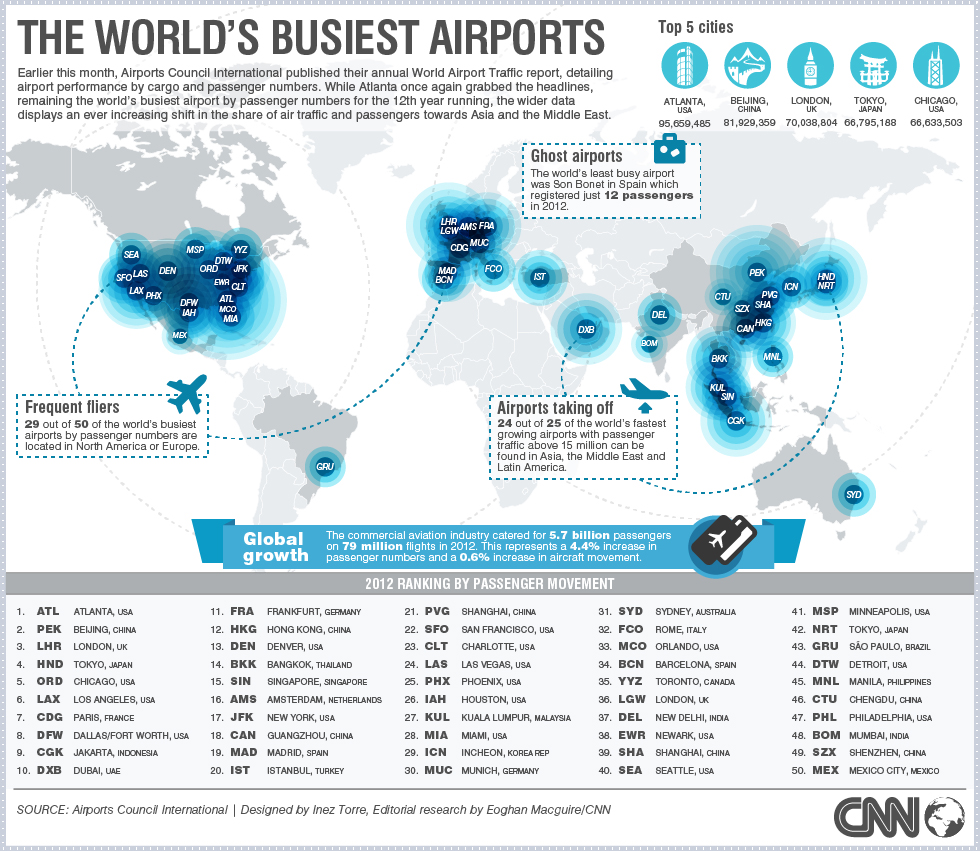
Suitably, the chaos of the map matches the chaos of the image of an airport. The map is cacophonous, with the many dots representing the airports overlapping each other to the point that the only distinguishing factor is the three letter acronym for each, of which many people are unfamiliar with. The five most visited airports are, in decreasing value, Atlanta with 95 million passengers, Beijing with 82 million, London with 70 million, and Tokyo and Chicago with roughly 67 million each, and yet there isn’t any visual element to make these more prominent on the actual map; instead, a small infographic is placed at the header to display these statistics. There are other, similar supplementary elements on this map, such as three ‘fun fact’ boxes with what the mapmakers believe are relevant, interesting statistics; a list of the fifty busiest airports in the world; a paragraph in the header giving the context of the map; and a footer that displays the extent of commercial aviation in a given year. I will identify and evaluate these supplements, visual elements, and statistics in detail later on, which will help to answer this general question: what do these values signify for global business, tourism, and political trends? Moreover, my initial question led to many others: Does this map represent any of this? By extension, how does this map portray the developing world? Can we draw any conclusions or inferences as a result? If there’s valuable information we cannot draw from this map, can we find other information to supplement it?

At first glance, the visual component of the map leaves much to be desired. Most of the significant information rests in the ‘Top 5’ figures in the top right corner, or the list of the 50 busiest airports situated at the bottom of the map. Many of the circles representing the map, though they vary in size to represent their influence, overlap with others. In doing so, the map fails to differentiate between any of the airports, so that it is impossible to immediately tell which airports are the busiest without further inspection. There’s a critical reason for this: the concentration of the airports in a limited geographic area. Areas such as the United States, Europe, and Asia comprise the bulk of airplane travel, leaving Latin America and Africa particularly sparse. In fact, the map points out that “29 out of 50 of the world’s busiest airports by passenger numbers are located in North America or Europe.” It’s worth noting that nine of the ten largest economies in the world are in North America, Asia, and Europe. Therefore, we would assume there would be higher business based travel across these three continents. Furthermore, the nations of North America and Europe carry greater income per capita than any other region on the earth, and so their citizens are more apt, willing, and able to travel by airplane. Thus, the assumption is that, when evaluating the locations of the busiest airports, they can be seen as an indicator for economic power and wealth.

That viewpoint does not always make sense, though. Why should an individual airport such as Atlanta elicit so much passenger density and frequency? Are there some airports we’re surprised are smaller than others? For instance, would you expect the Jakarta, Indonesia international airport to be busier than the Denver’s? Would you expect Denver’s to be busier than JFK in New York City? These questions would have more to do with our expectations and perceptions of economic power. We would expect New York City to be a powerful entity in the realm of aviation because of our knowledge of it as an economic capital. However, what that perspective does not take into account is the location. Denver is located halfway across the United States, thus making it optimal for stopover and direct flights to cities in the inland of the United States. Similarly, Jakarta is in the heart of Asia, where not only is there massive population, including 250 million in Indonesia alone, but it’s between the economic superpowers of Japan, South Korea, China, Singapore, India, and Australia. Simply put, our perception of the world and its significant regions have been shaped by social construction, causing us to lose sight of some of the variables that would influence human migration. Our busiest airports are not just influenced by business, but also tourism, diplomacy, finance, location relative to other nations, and simply population size. Yet there is not a statistic breaking down the purpose of air travel, only the end result.

Despite this breakdown, there is still some the map has us infer about the developing world, as those airports that would have been found in developing nations are absent. Also, there is no visual data on which airports are growing and at which rates, a detail that would have been beneficial if the map’s intention was to highlight the the aviation industry’s growth into new regions. Regardless, the map gives a small nod to developing nations with the statistic that “24 out of 25 of the world’s fastest growing airports with passenger traffic above 15 million can be found in Asia, the Middle East, and Latin America.” Why would the mapmakers decide to include this statistic? Because if an airport in a city is growing, that could serve as an indicator that the finance and business sectors of the respective city are developing. As it stands, nations like China, India, Brazil, Myanmar, and Bangladesh are seeing high rates of economic growth and development that correspond with the increased travel through their airports. In a way, then, mapmakers used this statistic to point out the progress of the developing world. The mapmakers thus reaffirm the use of maps as a political tool, as maps continue to display a certain image of the world. For one, we are seeing the relative strength of Western civilization, and immediately infer prosperity in those regions. In contrast, in the empty regions of Africa and South America, they are mostly empty, and thus denote poverty and lower economic development. While this is not a pointed, intentionally hostile decision, it leaves any observer of the map to ignore the prospects of a developing nation. The inclusion of the statistics of the developing world are thus made necessary.

Therefore, it cannot be said there was a practical intention for this map, be it to portray why passengers are traveling or how these transportation hubs are growing. Rather, as it is from the news agency CNN and made to be a visually appealing graphic, it carries a purpose more towards entertaining the general public. The map does so by displaying the presently immense, wide scale of aviation, and alludes to both the industries humble past and potential for the future. For instance, in the header explaining the data of the map, the mapmakers note that “the wider data displays an ever increasing shift in the star of air traffic and passengers towards Asia and the Middle East.” There is effective depiction of the developing world without detracting from the central purpose of the map, as they imply growth in the future of aviation in new regions. As for the present strength of the aviation industry, the map makes it known that “the commercial aviation industry catered for 5.7 billion passengers on 79 million flights in 2012,” of which represent “a 4.4% increase in passenger numbers and a 0.6% increase in aircraft movement.” The map represents and industry that is growing, an industry synonymous with human innovation and progress. It only made sense that they made a nod to the developing world, and while that could have been more pronounced, it remained fitting to the central purpose of the map.

Posted in Uncategorized | 3 Comments

Map Link and Atlas

Map Link:
https://makingmaps.net/

During the first half of this course we’ve been studying maps intensively. We’ve even made a few maps of our own, however we have never studied how to make maps. For those interested in taking map making to a deeper level here’s a blog to a build your map making skills! The blog labels itself as a DIY, so it’s a little like Pintrest but for map enthusiasts!

Map Atlas:
http://www.atlas.mouton-content.com/
Most atlases contain collections of maps that lead, however this atlas is made up of audio recordings of different dialects. Its interactive, allowing you to select different regions and cities inside of said regions. Its specific enough that I was even able to find the regional dialect of my small town in Tennessee. While not conventional, this atlas enables listeners to hear where the line between Southern, Northern, and Midwestern accents falls.

Posted in Uncategorized | Comments Off on Map Link and Atlas