
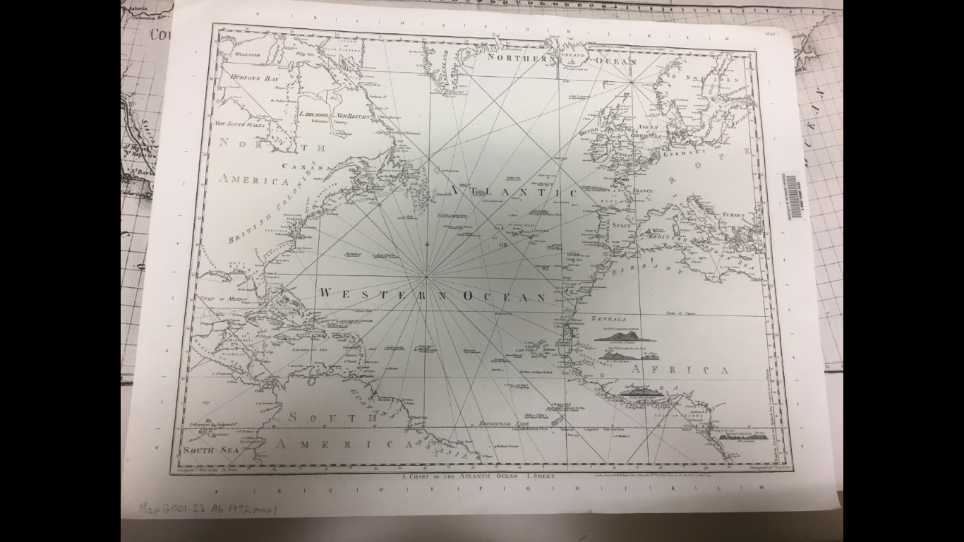
The Western world as seen by the most powerful nation on earth. In February of 1775 such a chart was published by Robert Sayer, in London, depicting the countries surrounding the Western Ocean. As a map from London, it is oriented around the British Empire and its inferior rivals in colonizing the new world. In early 1775 the British would still have assumed themselves to maintain full control of their American colonies and as such to treat them as worth only of a cursory indication of coastal territory. In fact, most countries and regions are labeled this way, such as Barbary in Africa, which included multiple established kingdoms, or even France and Spain, major European powers. Another explanation for vague labeling of the American colonies may be that the British may not have wanted to justify the individual colonies or their bodies of government at a time when these colonies were toying with the notion of becoming independent and self-governed states. Regardless of intention, evidence of the British superiority is seen in the subtle details across the map, from only labeling coasts to the fact that the map only encompasses territory in which the British held considerable sway. This British sense superiority and confidence is palpable even at a time when these English imperialists would be shaken to the core by the American Revolution. This juxtaposition of imperial power and revolutionary liberation qualifies this Western map as the official Map of the Week.
English superiority, a main theme in this map, is expressed in the way the rest of the world, including rival powers, are only labeled with coastal areas and port cities. As a growing empire, the British would have most likely been interested in the coasts for strategic bases for the imperial navy as well as places to conduct trade in order to enrich the kingdom. As a publisher of maritime charts, Sayer would have been influenced to tailor his maps for maritime purposes. As a result, this projection gives no indication that in the American colonies, the revolutionary sparks were starting to catch all across the east coast. The viewers of this map would have been by the American Revolution occurring to upend British imperialism. Because as Wood said in chapter 2 of the Power of Maps, maps simultaneously reflect as well as construct the history which they represent (Wood, 28-47). Meaning that in the unthreatening portrayal of the colonies the British people would have assumed the colonies were unthreatening to the British rule.
Just as some places can be misrepresented, others can be left out entirely from a map such as on this particular map: Spanish and Portuguese colonies in South America, Africa and the east where the British had little influence at the time. The places prominently displayed are North America, the coasts of West Africa and the Caribbean. All of the prominent the British’ colonies at the time (New World Encyclopedia). From this representation of the “world” the British appear to dominate territory across the map, even in the way colonies are labeled. At the time, every British subject would remember the Hundred Years War with France leading to the acquisition of Canada. This would have been a great source of national pride boldly highlighted by the map. National pride King George would have used to retain his imperial power as well as to inspire his subjects about the prospects for expanding British power and influence across the world.
This map is at the same time deceiving, yet very telling of the world and its political environment at the time. It downplays the 13 colonies as just coastal settlements identical to British colonies on the African coasts used only for trade. This entirely misses the underlying turmoil inside the colonies that would lead to the American Revolution and secession from the British. At the same time the map does not directly lie about any of the colonies or nations. However, as Wood explains in chapter 4, lying in cartography occurs when a map is taken at face value neglecting the fact that all maps have authors. Once we remember the author we can see how by not outlining any of the colonies or nations, Sayer is leading us to interpret that territory in a specific way (Wood, 70-94). In this instance to interpret England as the most powerful nation which the reader will as maps are the unsuspected betrayers to our trust. Identical to an Empire, maps are simply lies made by a few individuals which define the truth for the rest of the people of this world.
Bibliography:
- Woods, Denis. 1992. The Power of Maps. New York: Guilford Press.
- Contributors, New World Encyclopedia. 2016. British Empire. 12 20. Accessed 02 23, 2017. http://www.newworldencyclopedia.org/p/index.php?title=British_Empire&oldid=1002046.
I found this blog post very informative and thought-provoking. I think it’s a testament to how powerful the British Empire was during the eighteenth century when they were able to create maps of this nature. Even though there was a clear bias and purpose behind the creation of the map, it is still quite impressive to see just how immense the British domain was. I agree with your point that it is telling that the English creator of this map decided what to and what not to label. As you point out, any of the landholdings possessed by a rival imperialist nation such as the French or the Spanish is left blank. Even the British colonies in America were marked simply as the “British Colonies” instead of naming each individual colony. In my opinion, this speaks to the self-perceived superiority of the English during this era and the grip that they had on what was considered the “New World”. It is interesting to think that just a year from when this map was created, 1775, the American Revolution would completely shatter the perceived realities of this map. Overall, this was an interesting map and a quality post.