Class Presentation Summary: How Communists Menace Vital Materials, 10/31/23

The map we decided to focus on for our presentation is “How Communists Menace Vital Materials” created by an American cartographer from the Research Institute of America in 1956. This map was created during the height of the Cold War which was a proxy war between the USA and the USSR. The two superpowers never directly found each other but operated as large power heads controlling other countries. The Cold War was caused by ideological differences between the viewpoints of capitalism and democracy vs. communism, opposing views on how to handle Germany, and the race for nuclear weapons. This map is a hypothetical plan of how the USSR would both infiltrate foreign countries and how they would benefit economically from each country’s natural materials. It was presented to Congress to invoke fear and anger so the United States would take preventative actions against the Soviet Union in the Cold War. On the map, there are six arrows called “red thrusts” stemming out of the USSR, conveying where the Soviets planned to take natural resources from. Beneath the map, there are strategies for how they would manipulate/infiltrate each country into falling under their control. The map depicts how the Red Scare is an issue for the entire world, not just the United States. This map is extremely rhetorical, as its main function was to “tell” Congress to go into action by sparking fear, proving how compelling maps can be. Despite this map being a piece of American propaganda against the Soviet Union during the Cold War, its ability to still be relevant today demonstrates its historical importance.

Posted in Uncategorized | Comments Off on Class Presentation Summary: How Communists Menace Vital Materials, 10/31/23

Map Duo Presentation, “How Communists Menace Vital Materials” Eric and Douae

With the conclusion of World War II, the battle scarred European battlefield was split into two curtains to be reconstructed. The west which was run by mainly the United States and Great Britain, and the east, which was run by the Soviet Union. Because of this geographical divide, this was the foundation for what the Cold War eventually became, an ideological conflict between two giants: the United States and the Soviet Union, Democracy and Communism. The United States wished to rebuild Europe through Democracy, however the Soviets wished to spread their message of Communism, two ideologies that could never work together. However, due to the development of nuclear weapons, the US and Soviets were very hesitant to directly fight against each other. Instead, they fought indirectly. To do this, they funded wars around the world that stood for their ideology. For example, in the Korean war, the Soviets backed north Korea and Communism while the US backed South Korea and Democracy.

A movement in the US that was born from the Cold War was McCarthyism, also known as the second Red Scare. Senator Joseph McCarthy was a republican senator who claimed that multiple communists had infiltrated the state government and have gotten high positions of power, inside and outside the government. This started a chain reaction where people started accusing others of being insider communists, primarily within the government, left wing politicians, labor unions, and entertainment industries such as Hollywood. He created the House Un-American Activities Committee to investigate suspected communists and to carry out punishments.

“How Communists Menace Vital Materials” was a map that was created by the House Un-American Activities Committee and was used in Congress to persuade policy makers to act towards stopping the Soviet’s expansion of Communism. The map utilizes various techniques to push the idea of the Soviet Union as a threat. From an initial screening of the map, the large arrows extending out from the large hammer and sickle that blocks large portions of the map makes the Soviet’s influence larger than it seems, creating a feeling that the Soviets are taking over the world. Another layer that the arrows add is the idea of imperialism. Since the whole idea of the map is showing how the Soviets are taking over resources, Congress might feel urged to enact policies that push the US to contest these resources. Because the countries on the map are denoted by their resources rather than their actual name, the countries are dehumanized and not seen as autonomous nations but simply as resources to control. Furthermore, the map makers employed specific diction, such as “menace” in the title and “thrust” in describing how the Soviets spread their influence. The map makers also include buzz words in the perimap to further scare the audience, with phrases such as, “Encouragement of national terrorists” and “Tempting Germany with reunification.”

So what can this map teach us? “How Communists Menace Vital Materials” is an excellent representation of the context it was made in. The Cold War era took place when direct fighting wasn’t as prevalent but rather there was more political fighting through vicarious mediums. This map shows the rise of propaganda and how that can be used to fight wars and the importance/rhetoric it can carry.

Posted in Uncategorized | Comments Off on Map Duo Presentation, “How Communists Menace Vital Materials” Eric and Douae

Map of the Week: German and Polish Borders Across Time


This map shows the boundaries of the German Republic before the 1st World War overlayed with the current boundaries of Poland and the 2015 Polish Parliamentary elections. This map portrays the clear divide between Eastern and Western Poland. The Eastern side has been heavily influenced by the politics and social conservative traditions of the former Soviet Union. Meanwhile, the Western Provinces of Poland, influenced by Germany, have more progressive voting tendencies. This election between the PiS (the more Eurosceptic party) and the PO (pro-greater economic ties to the EU) highlights the remnants of these former borders. From a cartographer’s perspective, this map is successful at encapsulating the persisting nature with which historical boundaries have permeated into contemporary political dynamics. 

The Western Provinces of Poland are those contained within the boundaries of the former German Empire and are more economically developed than those in the East. Although the population of Western Poland has drastically changed over the past century, with the displacement of Ethnic German populations following World War One, the region still has the closest cultural and economic ties to Western European nations. Outside of Warsaw–the provinces of Lower Silesia, Greater Poland, and Silisia have the highest GDP per capita of the provinces in Warsaw. All three of the aforementioned provinces are heavily reliant on trade with the EU and tourism from neighboring European countries. The tourism industry of Lower Silesia in particular is composed of visits offered to the numerous medieval castles dating back to the German Holy Roman Empire and Habsburg Empire. The region is also a manufacturing hub–with coal mines, timber harvestation sites, and factories dotting the landscape. In 1988 the area underwent major environmental reform after major smog and deforestation affected the region. The regions within Western Poland also produce the most agricultural commodities with poultry, apples, rye, and potatoes being major staples of its export economy. For these reasons, it is unsurprising that the populace supports the PO party in Polish elections due to the party platform championing closer economic relations with the EU. 

In contrast to the regions of Western Poland, the culture of Eastern Poland is dominated by its proximity to the former Soviet Union. Devotion to Christianity is especially stark within these provinces and the Subcarpathian region in the South West portion of the nation containing the highest percentage of Christians within Poland (90%). This region is also less economically developed with the five poorest provinces, calculated by GDP per capita, all being confined to Western Poland. The least economically developed province, Lublin, has a GDP per capita of 10,700 USD per capita compared to the national average of 18,321 USD. The region is dominated by agricultural trade with the neighboring countries Ukraine and Belarus. During the ongoing Ukraine-Russia conflict, the province of Lublin has accommodated 300,000 Ukrainian refugees, the most of any region. For these reasons, Eastern Poland maintains less stringent ties to the European Union and votes for the euroskeptic PiS party by large margins. 

Although the contemporary political distinctions of East and West Poland appear to be straightforward, the map illustrates the susceptibility for metropolitan regions of Eastern Poland to be more favorable to the PO than the PiS. This trend is reflected in the three largest Polish cities, all located beyond the boundaries of the former German Empire. These cities–Warsaw, Krakow, and Lodz–are reliant on the burgeoning technological sphere and are cosmopolitan in nature. For these reasons, they broke with their regional trends and voted in wide margins against the PiS. Although the PiS has maintained control of the Polish government in the most recent elections, some analysts have acknowledged that the growing technological sector within smaller Polish cities may bring Poland closer to the EU sphere of influence. Others however, acknowledge that the recent uptake in immigration to EU nations may keep conservative Polish citizens from breaking away from voting for the PiS. 

Stepping away from an analysis of trends within this map, the overarching concept of utilyzing trans-national historical borders overlaid upon contemporary phenomenons is a way to portray evolution or lack thereof over time. Maps displaying trends from the Austro-Hungarian empire overlaid upon recent elections in Romania have utilized such a tool to display such occurrences. Overall, this tool could be used to both stir nationalist sentiment reminiscent of past governance and portray shifting demands of given populaces. In the near future, I envision such maps to become commonplace within mainstream political thought as both globalist and nationalist parties continue polarize nations across the globe.

Posted in Uncategorized | 3 Comments

“The Rhetoric of Cartography: Unpacking the 1932 Japanese Stereotype Map”

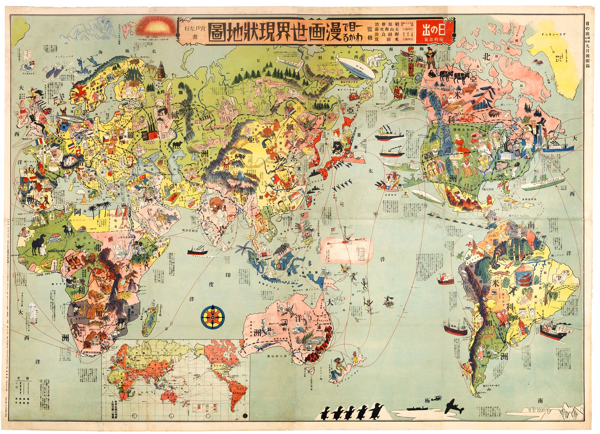
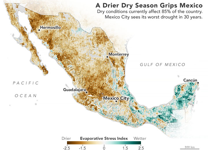
In the early 1930s, as Japan’s imperial ambitions were on the rise, an exceptional satirical world map was introduced to the Japanese public. This unique piece offered a vivid visual commentary on the world as perceived through Japanese eyes, particularly amidst the significant shifts in global politics and power. 1932, the year of the map’s publication, was a period of turbulence and transition. While Japan grappled with its increasing international isolation and internal political crises, like the assassination of its last party prime minister, Inukai Tsuyoshi, and the First Shanghai Incident, Germany saw the Nazi Party becoming increasingly influential. In the United States, Franklin D. Roosevelt secured his presidential victory. Created by Shishido Sagyo (1888-1969), the vibrant and detailed cartoon illustrations, coupled with informative text blocks, provided a snapshot of the “current world situation.” The map presents a riot of colors and symbols, with each region bursting with exaggerated caricatures and icons. During this pre-World War era, global challenges such as the Great Depression affected the economies worldwide, particularly in North America and Europe. Concurrently, the rise of fascist powers like Germany and Italy signaled a shift in the balance of power.

A Macroscopic View of Japan:

The significant warcraft and navy elements surrounding Japan and heading toward China can be seen as a direct reflection of Japan’s imperial ambitions in East Asia during the 1930s. This imagery foreshadows Japan’s aggressive expansionism, including its invasion of Manchuria in 1931 and the subsequent escalation into the Second Sino-Japanese War. (Ruoff, 2014)

The map visually represents Japan’s military prowess and intent to expand its territories, reflecting the real-world geopolitical situation of the time. Furthermore, the exaggerated size of features within Japan and the tall signal tower may signify Japan’s sense of self-importance and its aspiration to be a leading global power. The signal tower, specifically, could imply Japan’s focus on modernization and communication. The portrayal suggests Japan’s perception of itself as a beacon of modernity and progress in Asia, and possibly its view of itself as superior to its neighbors.

U.S.:

The portrayal of the United States is a montage of cultural and historical snapshots, ranging from Olympic athletes and filmmakers on the West Coast to black jazz musicians in the Southeast and the imprisoned Al Capone in the Midwest. Furthermore, modes of global transportation, like the Trans-Siberian railroad, zeppelins, and ships, are illustrated. A massive aircraft carrier near the U.S. hints at America’s burgeoning naval strength and its looming Pacific presence. This suggests that Japan might have been acknowledging the U.S. as a potential adversary or as a significant naval power to be reckoned with in the Pacific. Meanwhile, the factories on the map symbolize industrial prowess and economic power even amidst the shadows of the Great Depression, implying that the U.S. was seen as an industrial powerhouse, driving innovation and economic growth. Moreover, another expressive element portrayed on the map is a black male playing saxophone. This image is likely a nod to the Jazz Age and the significant cultural influence the U.S. had globally. The use of a black male figure also touches on the racial and cultural dynamics of the U.S., where African Americans played a crucial role in cultural developments like jazz. Ultimately, it implies that America was recognized not just for its economic or military power but also as a cultural exporter. In the context of 1932, despite the economic turmoil and the isolationist policies that characterized much of America’s stance during this pre-war era, there was still a discernible, perhaps even grudging, respect for American culture and capability. The acknowledgment of America’s cultural exports, industrial strength, and military potential indicates that even as the world faced mounting tensions and economic hardships, the U.S. was still seen as a beacon of cultural dynamism, innovation, and emerging power. This respect was likely tinged with a sense of wariness, as nations observed America’s growing influence with a mix of admiration and apprehension, given the shifting alliances and power structures of the time.

Europe:

Stalin’s colossal figure stands prominently, emerging from factories, symbolizing the industrial might of the Soviet Union. In more depth, details like the transformation of churches into factories, the militarization of farmers, and the usage of tractors for large-scale farming depict the USSR’s rapid industrialization. The map doesn’t shy away from commenting on other nations, either. Mussolini, the Leader of the Blackshirts, is portrayed along with his Foreign Affairs Minister Grandi. Likewise, Germany’s political turmoil is visually represented by President Hindenburg wrestling with Hitler, with Berlin spilled out across their entwined arms. Meanwhile, the face of an unidentified man, who seemed to be the French president, is captioned with France’s financial woes.

The use of humor and cartoons amidst the serious context of the era serves multiple functions. This stylistic choice reflects the complexities of how political and historical events can be interpreted and portrayed through art and cultural expression. Furthermore, by caricaturing Western Europe and its leaders, Japan asserts its own national identity and power, contrasting its perceived modernity and strength with the depicted chaos and strife in European countries.

Conclusion:

While the 1932 Japanese stereotype map presents a vivid representation of the world, it also sparks discussions on the dichotomy between historical accuracy and cultural perception. The map might not accurately represent every country’s political or social condition, but it provides an invaluable insight into how Japan perceived and portrayed these nations during the 1930s. On the other hand, some might argue that such maps, despite their inherent biases, do capture elements of historical truths. The portrayal of warcraft around Japan, for instance, does reflect the country’s militaristic ambitions of the time.

Ultimately, the map serves as a reminder that history is often not just about facts but also about perspectives, interpretations, and narratives. The 1932 Japanese stereotype map is a testament to the intricate weave of art, history, and politics in cartography. As we delve into more skillful insights into “Rhetoric of Mapping,” this unique piece serves as a reminder of the power and influence of maps in shaping our understanding of the world.


Citations:

RUOFF, Kenneth. “Japanese Tourism to Mukden, Nanjing, and Qufu, 1938—1943.” Japan Review, vol. 27, no. 27, 2014, pp. 171–200.

Varga, Tamás. “Japanese Stereotype Map of the World from 1932.” Earthly Mission, 10 Mar. 2019, earthlymission.com/japanese-stereotype-map-world-1932/.

“Why Jazz Music Is Important to American Culture.” Medium, Medium, 24 Sept. 2018, medium.com/@birdlandjazz/why-jazz-music-is-important-to-american-culture-f17efdf4a0ae.


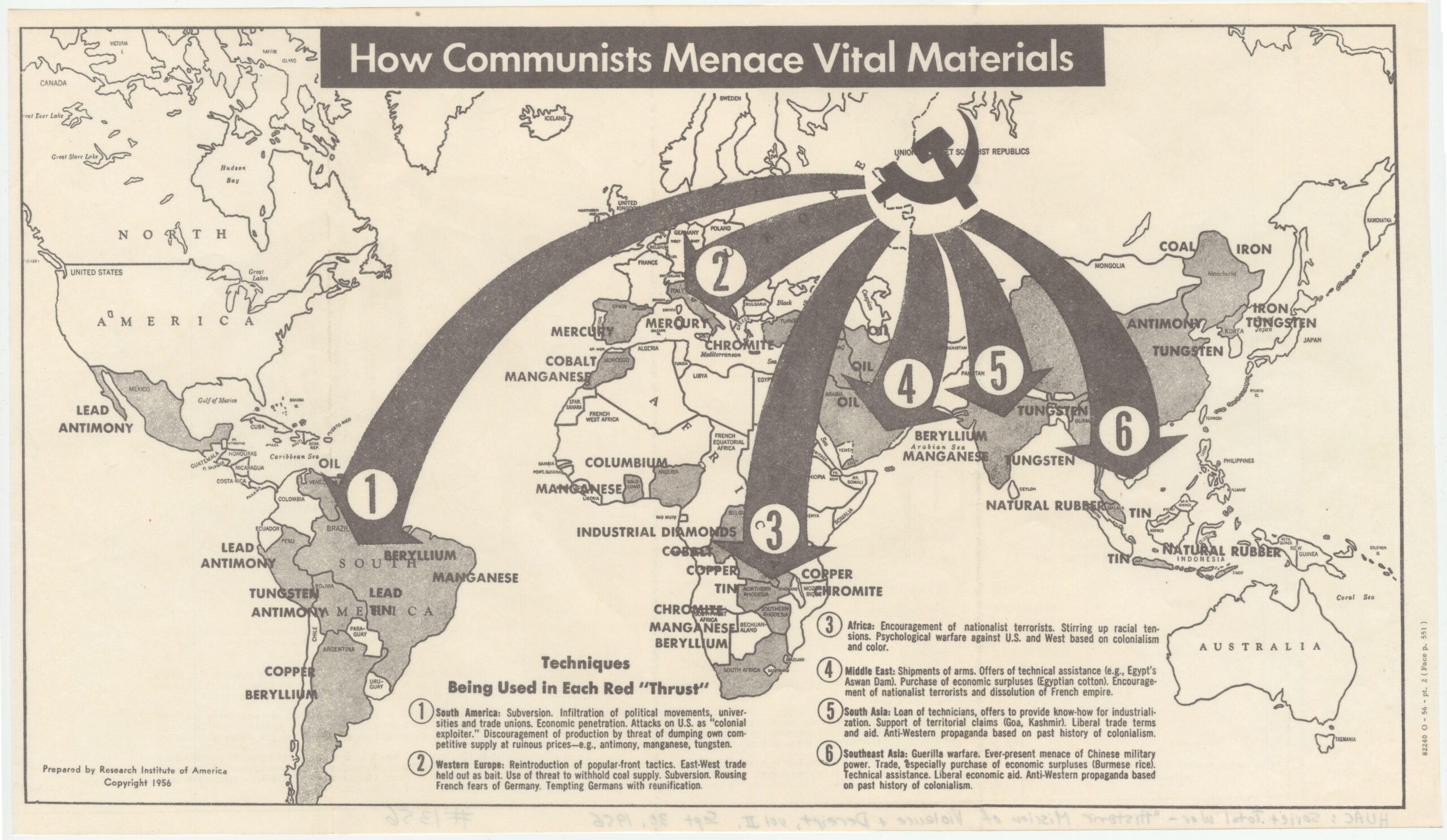
Atlas of the Week: https://www.westpoint.edu/academics/academic-departments/history/digital-history-center/atlases

Created by the West Point Military Academy, this reliable atlas collection provides ample wartime/conflict atlases. These atlases help us understand past conflicts and the lasting impact they have had on current international boundaries, political relations, and cultural connections.


Blog of the Week: https://blogs.loc.gov/maps/2019/09/propaganda-maps-to-strike-fear-inform-and-mobilize-a-special-collection-in-the-geography-and-map-division/

This is a great resource for propaganda maps that were each influential at the time of creation.


Posted in Atlases of the Week, Maps of the Week, Uncategorized | 1 Comment

The Political Polarization of Life Expectancy in America: Life Expectancy Increases as a Function of Political Affiliation

Map Link: www.sciencedirect.com/science/article/pii/S2352827321001154

The first map depicts the average increase in life expectancy since 2014, second shows the percentage of population that votes republican.

I’m sure all of us have been amused by the childish name calling and arguing of the recent presidential debates. However, this stubborn disagreement may affect you more than you think. In recent years, the political climate in America has been increasingly polarized with partisan politics favoring extremist politicians that must adhere strongly to the ideals of their respective parties. This was put on full display in the 2020 presidential election, with the presidential candidates taking stubborn stances on topics such as taxes, abortion, international affairs, and health care. This week’s map specifically studies the correlation between an area’s voting patterns in 2020 and that area’s increase in life expectancy since 1940. The most immediate observation that can be made about the two maps is that areas that tend to lean Republican also did not grow as much in life expectancy as Democratic-leaning areas. One possible explanation behind this is each party’s view on health care. To explain this, we must first explain the history behind America’s health care. America’s healthcare system has always been a topic of contention, but one thing that everyone can agree on is that it is dysfunctional. The country spends 17.8% of its GDP on healthcare, by far the most of any country in the world, yet it produces lackluster results compared to other first-world countries that spend much less on healthcare, in part due to the fully privatized health system of America (Sawyer, 2018).

Our health insurance was born when General Motors made a deal with the United Automobile Workers Union to provide health insurance to all their workers. This created a culture where health insurance is largely provided by your employer. However, not everyone can work. To combat this, President Johnson passed the Medicare and Medicaid Act as well as the Social Security Act to provide healthcare insurance for those who cannot afford private insurance, cannot work for employer insurance, are disabled, are too old, etc. Although this provided relief for the uninsured, many people remained uninsured, with 46.5 million Americans uninsured in 2010. This sparked the creation of the Affordable Care Act (ACA)/Obamacare which created several reforms such as expanding Medicaid, reforming private insurance, creating an employer mandate to provide insurance, and creating an individual requirement to buy health insurance. The ACA was massively successful in reducing uninsured people, with the uninsured population dropping to 26.7 million only two years after the ACA was implemented. However, republicans like Donald Trump fiercely fought this, eventually making Medicaid expansion optional on a state-by-state basis and striking down the individual mandate. As a result, republicans often opted out, and democrats often opted in. The single most life-saving factor of the ACA is the expansion of Medicaid, and it has been proven that Medicaid saves lives. In a study done in 2019, it was found that states that expanded Medicare saved 19,200 lives while states that opted out lost 15,600 savable lives (Broaddus, 2019). Circling back to the focus of the 2020 election, Donald Trump fiercely opposed the ACA, while Joe Biden firmly stood with it. Therefore, states that voted Democrat often enacted the ACA and reaped the benefits that came with it, while states that voted Republican repealed the ACA.

However, one state that seems to deviate from this pattern is Utah, the home of Mormons, with 70% of the state affiliating with religion. Because of this, Mormon ideals dominate the political stance of the state. Although Mormons vote Republican because of their views on abortion, gay marriage, and gender roles, they have very strict rules when it comes to lifestyle choices. For example, Mormons are forbidden to drink alcohol, consume any form of drugs, and smoke. They also promote healthy/natural eating, promote education, and prioritize a strong family life; all of which are correlated to living a longer life.

Now, how can we interpret this map as “critical cartographers?” This map was first published in Population Health, a scientific journal that analyzes social factors and their effects on public health. By choosing to use a map rather than a simple chart, the map makers further connect the data of life expectancy with the spatiality of the US states. Basically, saying that the problem of lower life expectancy exists within these specific areas. At first, one might assume that the role of these maps is to serve as purely scientific tools to visualize health concerns. However, there is a powerful political message that the maps send: if your state votes or aligns with republican ideals, then your longevity will be threatened. To further push this message, the maps used a spectrum from blue to red, with blue representing a higher life expectancy increase and leaning Democrat, and red representing a lower life expectancy increase and leaning Republican. This is also the traditional color scheme for each political party and not challenging that reduces confusion for the audience. As red is historically the provocative color, the map maker’s choice to assign these colors is a bias in itself, painting Republicans as threatening and inferior. Furthermore, the simplistic design of the two maps makes them seem more scientific and therefore more likely to be interpreted as fact. Even if the map makers didn’t intend for the political message behind the maps, the influence the maps have on its audience could be immense. With the 2024 presidential election getting closer, a rematch between Biden and Trump is likely. Powerful political tools such as these maps can be used to sway public opinion because of their seemingly objective message.

Works Cited

Lesley H. Curtis a b, et al. “Life Expectancy and Voting Patterns in the 2020 U.S. Presidential Election.” SSM – Population Health, Elsevier, 8 June 2021, www.sciencedirect.com/science/article/pii/S2352827321001154.

Matt Broaddus and Aviva Aron-Dine, et al. “Medicaid Expansion Has Saved at Least 19,000 Lives, New Research Finds.” Center on Budget and Policy Priorities, 6 Nov. 2019, www.cbpp.org/research/health/medicaid-expansion-has-saved-at-least-19000-lives-new-research-finds#:~:text=The%20Affordable%20Care%20Act’s%20(ACA,period%20from%202014%20to%202017.

Rachel Garfield, Kendal Orgera. “The Uninsured and the ACA: A Primer – Key Facts about Health Insurance and the Uninsured amidst Changes to the Affordable Care Act – How Many People Are Uninsured? – 7451-14.” KFF, 13 May 2020, www.kff.org/report-section/the-uninsured-and-the-aca-a-primer-key-facts-about-health-insurance-and-the-uninsured-amidst-changes-to-the-affordable-care-act-how-many-people-are-uninsured/.

Riess, Jana. “How Did Mormons Become so Republican?” Religion News Service, 14 Oct. 2020, religionnews.com/2020/10/07/how-did-mormons-become-so-republican/.

Sawyer, Bradley, and Bradley Sawyer. “Total Health Expenditures as Percent of GDP, 1970 – 2017.” Peterson-KFF Health System Tracker, 11 Dec. 2018, www.healthsystemtracker.org/chart/total-health-expenditures-as-percent-of-gdp-1970-2017-2/.

Schneider, Eric C. “Health care as an ongoing policy project.” New England Journal of Medicine, vol. 383, no. 5, 2020, pp. 405–408, https://doi.org/10.1056/nejmp2021701.


Blog Link: https://www.polgeonow.com/

Atlas Link: https://uselectionatlas.org/

This atlas shows the election results of each year for multiple positions such as president, president primary, senate, and governor. I chose this map primarily because it relates back to the map I chose. Also, this atlas is useful because it brings more attention to government positions other than president, as those elections are not given enough importance. Lastly, the data for these elections can be used to study the political climate throughout American history in order to study future political behavior.


Posted in Uncategorized | 3 Comments

Mapping the Road to Love in the 19th Century

If there was a guide to work your way into someone’s heart, would you use it? It is time to delete your Tinder profile and forget about the person you met at the bar last week because with this antique allegory of love you can find yourself on the roadmap into anyone’s heart. Set in the 19th century, this map helps describe the United States, a newly developing nation in which travelers continue to expand westward in the interest of exploration. At the same time, it tells us about people who are not only interested in the exploration of land but also in emotional realms as well, such as marriage. The societal expectations in partnership were that women served as caretakers and that men were providers. To illustrate such ideals, a woman crafted a satirical map to lay out the stereotypical heart of a woman which happened to include traits such as fickle and vane. This map contrasts a later released map which encloses the inner unemotional workings of a man. The disparity between the two maps illustrating the heart of a woman and a man serves as a looking glass into societal and romantic expectations during the 19th century through the use of tactical word choice, coloring incorporation, and opposing illustrations.

The societal expectations of womanhood in the 19th century reflect not only the women themselves but also the societies they cultivated. During a time of change characterized by urbanization, communication, and mechanization the expectations and roles of women began to shift as well, undermining previously conceived notions about what it meant to be a woman. Even so, many women continually felt the oppressive forces of male-dominated industries but found ways to make light of the situation. Such as a certain satirical map created by an author who identifies as a woman and which can now be used to illuminate gender role stereotypes present during a time when the roles of women were beginning to change. The Map of a Woman’s Heart laid out women’s moral character and interior lives on a piece of parchment ready for men to conquer. It describes how women were expected to feel in relationships and about love and marriage. A woman’s heart is depicted as an “open country” with terrain that is dangerous and should not be traveled on by the weak of heart. Located in the bottom right corner, a woman’s desirable traits such as love, hope, and enthusiasm are illustrated as impossible to reach as they are separated by mountains. Colored yellow, these positive traits are easily distinguishable in comparison to the undesirable qualities that make up the vast majority of a woman’s heart. Furthermore, a woman’s positive qualities are enclosed by the “Ego Mountains” which insinuates that a woman cannot possess such traits without being perceived as egotistical. With these characteristics of the map, women are portrayed as egotistical, fickle, and vane. The mapmaker’s choice of color is used to isolate a woman’s desirable traits while casting a sense of disgust because said traits are embellished with egotistical undertones.

The author’s word choice paints an ugly picture on the heart of a woman, by devaluing the power in femininity and making reference to women as easy to conquer as a territory on a map. Moreover, the map is a representation of what men have assumed a woman’s heart is supposed to look like and the author is simply depicting those feelings in an easily readable guide. The domestic nature of this map lies in the idea that it is possible for a woman’s heart to be mapped and that women are worth no more than a piece of land on a map. As expansion was at the forefront of people’s minds, the mapmaker chose to cater to the societal boom in colonization by insinuating that a woman’s heart could be conquered as well. The rhetorical satire of this piece can be inferred because maps are not considered factual and a woman’s heart does not solely comprise of the attributes the author chose to include. If anything, the map pokes fun at the idea that women were expected to have such undesirable qualities. Similar to a cartographic depiction, which was a tool used by a frontiersman to chart their exploration, The Map of a Woman’s Heart can not be considered factual because it is influenced by the bias of its author and should be read with caution. Equating the love of a woman to something that can be charted on paper diminishes its true value and undermines the idea that women are worth more than their marital qualities. Yet this map makes up only one half of a picture, which together paints a pessimistic picture of love…

In contrast to the susceptible yet undesirable traits of a woman’s heart is The Map of a Man’s Heart. Illustrated around the same time, the less welcoming heart of a man is enclosed by a wall that guards an emotionless and materialistic excuse of a human. The majority of the map attributes men as having an abundance of power and knowledge yet a lack of matrimonial appeal. For example, men are attributed with a “Love of Eating, Better Judgement, and Love of Money,” along with an impenetrable “Citadel of Self-love,” all of which can be interpreted as undesirable qualities in partnership. According to this map, the only penetrable section of a man’s heart is “The Land of Romance”. The satirical nature of this map lies in the man’s unfortified area which can only be communicated with a woman’s good sense, temper, and fortune. Men were commonly viewed as being heartless so it is natural that the depiction of their heart is guarded by a wall and can only be penetrated if a woman is wealthy or has materialistic value. It is clear from this map that during the 19th century, men were solely focused on making money and power. The importance of highlighting this once again speaks to the societal expectations of men at the time as being the head of the household. A man’s priority was to continue his bloodline and provide for his family by finding the strongest and most valuable partner to help him carry out said ‘duty’. Similar to the map, The Map of a Woman’s Heart, the heart of a man is illustrated as being conquerable despite the apparent difficulty. This map gives a gloomy outlook on the success of finding a suitable partner due to the unappealing characteristics attributed to a man’s heart.

These two rather disheartening maps for ambitious suitors at the time tell a story on their merit as well as in conjunction with one another. As depicted, a woman’s heart is concerned with the vanity of life, prioritizing having the most luxurious wardrobe and posh attitude while men are more focused on earning power and dominating the economy. It can be inferred that although each gender fantasizes about conquering the other, neither gender can see eye to eye or heart to heart on the other’s ideals. A man will never understand the complexities of a woman’s heart and vice versa. The hearts of men and women during this era were viewed similarly to the newly developing nation whose land was waiting to be conquered. The author specifically chose the device to map the heart because it is something the readers at the time could understand. Unfortunately for prospective lovers in the 19th century, they will continue to face the difficulty of mastering his or her own heart and are now tasked with conquering the heart of others as well. So ask yourself. Do you think you are ready to conquer the roadmap to love?


Atlas: The Digital Atlas Project

https://www.digitalatlasproject.net/about

The Digital Atlas Project grew out of our desire, as teachers, for students to have up-to-date maps and data at their fingertips whenever they need it, where ever they may be: in class, at the learning commons or library, at home or studying at a friend’s house. It now serves as a great guide for anyone to access really interesting maps that are free!


Blog: Map Room Blog

https://www.maproomblog.com/

The Map Room is a blog about maps that covers everything from antique map collecting to the latest in geospatial technology.


Works Cited:

Formichella, J. (2021, February 12). The map of a woman’s heart. Recollections Blog. https://recollections.biz/blog/the-map-of-a-womans-heart/

Buehler, M. (n.d.). Map of the fortified country of man’s heart. Boston Rare Maps. https://bostonraremaps.com/inventory/kellogg-fortified-country-of-mans-heart-1846/

Popova, M. (2022, May 6). A Map of Woman’s Heart: satirical illustrated cartography of Victorian gender stereotypes. The Marginalian. https://www.themarginalian.org/2011/09/30/map-of-womans-heart/

The Way To A Woman’s Heart: 19th Century Print Attempted To Map Female Emotion. (2017, December 7). HuffPost. https://www.huffpost.com/entry/map-womans-heart_n_1093421

Women In Nineteenth-Century America. (2018, March 13). Social Welfare History Project. https://socialwelfare.library.vcu.edu/woman-suffrage/women-in-nineteenth-century-america-2/#:~:text=American%20women%2C%20if%20we%20accept,nurtured%20children%20and%20sheltered%20husbands.


Posted in Maps of the Week | 4 Comments

Mexico’s Crippling Water Crisis

Map of the Week, Provided by the Central Intelligence Agency

Mexico’s Chronic Water Crisis


62% of Mexico’s municipalities face dangerous water shortages (newyorktimes.org). 73 Million Mexicans, 57% of the population, lack access to clean drinking water. Additionally, Mexico consumes the most water bottles per capita than any other country in the world (water.com). The United Mexican States, with a population of over 128 million people (worldometer.org), possesses a very diverse geographic landscape; the country’s geographical diversity ranges from the great Sonoran and Chihuahuan Deserts to the northwest, to lush green rainforests and nature preserves with sub humid climates in the south near the borders of Guatemala and Belize. Even with their diverse geography however, Mexico is suffering from an extreme water shortage that is affecting the entire population, hitting low-income citizens the most. As seen on the Map of the Week above provided by The Central Intelligence Agency, Most of Mexico’s states, as well as the capital Mexico City face concerningly high amounts of water allocation for their citizens. 

It is interesting that the Central Intelligence agency chose to make such a detailed map of their neighbor down south. It could be that because both Mexico and the southern United States are currently suffering the consequences of a powerful drought, understanding the effect the drought has on Mexico can give American intelligence to have a better idea on how the United States may be affected.

Throughout Mexico, but especially in its densely populated cities such as Mexico City and Monterrey, government-sanctioned water-delivery trucks known as pipas will deliver water to parched neighborhoods, where residents fill the largest container they own with water to carry back home. Some families only receive water from the pipas once a week (newyorktimes.org). 

Because of government regulations, large factories are able to acquire all the water necessary for operation. But for the Average Mexican, or even the wealthy Mexican, their needs for water allocation are secondary in the eyes of the government. This harsh reality, plus the unfortunate circumstances for residents is the perfect recipe for political unrest to brew. Beyond the numerous accounts of pipas being stoned, there are instances of locals threatening to kidnap drivers if they do not go off their scheduled driving route to deliver water to thirsty neighborhoods. (newyorktimes.org).

Another reason that has led to Mexico’s chronic water crisis is climate change and unexpected changes in water patterns. Global warming and climate change have led to less rain in Mexico. In the state of Nuevo Leon in the northwest that shares a small border with Texas, the rainfall only amassed to 10% of the monthly average recorded since 1960’s (newyorktimes.org). On the Map of the Week, Nuevo Leon falls into the High Category for water allocation, which is the same for every other Mexican state that shares a border with the United States. 

Scientists are certain that global warming is at least partially responsible for the ongoing drought that has plagued Mexico as well as the southwestern United States for years. Satellite Data from the NASA Earth Observatory report that about 85% of the entire country is impacted by droughts (earthobservatory.nasa.gov). The Villa Victoria Reservoir in the State of Mexico, the state surrounding the capital city is filled to about a third of its capacity, as of March 2021. The satellite images also show the rate of evapotranspiration, the amount of water that is evaporating from the ground as well as local vegetation. The map shows that most of the country ranges anywhere from 0.5 to 2.5 times drier than normal evapotranspiration levels (earthobservatory.nasa.gov.).

When it comes to actually looking at the Map of the Week, the regions that are highlighted to have the most stressed water allocation also happen to line up with the regions of Mexico that face either a dry or very dry climate on a climate map (mexicochannel.net). States in the southern part of the country, such as Tabasco and Oaxaca, are rather humid and do not face as severe a water shortage. 

If the Map of the Week is matched with a population density map of Mexico, provided by the University of Texas, Austin, one will discover that most of the population is concentrated around a bulge where the epicenter is Mexico City (metropolitan population of 22 million people). In this area, population density can run anywhere from 26 to 259 people per square mile (10 to 100 people per square kilometer)(maps.lib.utexas.edu). This area also happens to be the area where water allocation stress is very likely to be under the High or Very High category in the Map of the Week. 

Mexico’s water crisis has no end in sight and continues to plague Mexican citizens across the country. 55 million residents (42% of the population) do not have access to adequate sanitation facilities (water.org). Residents are forced to put up with the exorbitant costs of purchasing water tanks that consume half their weekly income. Schools in affected areas are letting students out for summer vacation weeks earlier because they cannot acquire enough water for the students. (newyorktimes.org). 

Tying back the whole idea to the map of the week, changes in geography, topography and climate can play a great deal in where people live, along with their quality of life. Most Mexicans live in the south and central part of the due to more amicable climates and landscapes opposed to the dry and less-livable Sonoran and Chihuahuan deserts. Geography can also take into account how vital resources such as water are allocated throughout an area, and can display the negative consequences that affect the population if the resources are not distributed equally. 

Understanding geography is paramount in order for one to accurately evaluate any world problem, including but not limited to water shortages, climate change, economic turmoil, and even coup d’etats, along with why some nations seem to have more violence than most. Evaluating the world without taking geography into account is like voting for a political candidate by simply flipping a coin; it’s completely unsensible and it does not logically explain why one voted for the candidate representing the tails side of the coin. In order to actually arrive to a solution to a problem as grandiose and complex as the Mexican water crisis, a fundamental understanding of geography is the foundation for the innovative ideas that will follow suit.    


Evapotranspiration Map, provided by the NASA Earth Observatory

Population Map, provided by The University of Texas, Austin

Climate Map, provided by The University of Texas, Austin

Atlas of the Week Link:

For the Atlas of the Week, here is a digital map of all the locations listed by Atlas Obscura, cartographer of strange and unknown places! I received a copy of the print edition of Atlas Obscura when I was in middle school and I was so amazed by the presence of all the world’s hidden gems, such as the Child Eater of Bern statue in Switzerland, and the various Buddhist Hell (Naraka) gardens spread out throughout Thailand. This book is one of the many sparks for my passion for travel and to learn about all the different cultural and natural beauties that the world has to offer. Please browse this atlas at your own convenience, there are even some Atlas Obscura locations right here in Richmond, VA!


Blog of the week link


For the blog of the week, here is a map blog from Instagram blog account that posts informative, unique, and funny maps. A small portion of these maps are known as sh*t posts, which are made for satirical purposes. Please enjoy.


Bibliography:


Map of the Week! Blog Post


  1. Rodriguez, Cesar, Maria Abi-Habib, and Bryan Avelar. 2022. “Mexico’s Cruel Drought: ‘Here You Have to Chase the Water.’” The New York Times, August 3, 2022, sec. World. https://www.nytimes.com/2022/08/03/world/americas/mexico-drought-monterrey-water.html.
  2. water.org. 2022. “Mexico’s Water Crisis – Water in Mexico 2020.” Water.org. 2022. https://water.org/our-impact/where-we-work/mexico/.
  3. Patel, Kasha. 2021. “Widespread Drought in Mexico.” Earthobservatory.nasa.gov. May 4, 2021. https://earthobservatory.nasa.gov/images/148270/widespread-drought-in-mexico.
  4. Central Intelligence Agency. 2016. Review of Mexico Allocation Water. Edited by Central Intelligence Agency. Cartography Maps 2010. Flickr.com. https://www.flickr.com/photos/ciagov/albums/72157674854391962.
  5. ‌ Worldometer. 2023. “Population by Country (2020) – Worldometers.” Worldometers.info. Worldometer. July 16, 2023. https://www.worldometers.info/world-population/population-by-country/.
  6. ‌Perry-Castañeda Library Map Collection. 1978. Review of Population. Edited by University of Texas, Austin. Atlases and Thematic Maps. University of Texas, Austin: Perry-Castañeda Library Map Collection. https://maps.lib.utexas.edu/maps/americas/mexico_pop_1978.jpg.
  7. Perry-Castañeda Library Map Collection, ed. 2012. Review of Principales Lipos de Clima de México. mexicochannel.net. https://web.archive.org/web/20120316194223/http://mexicochannel.net/maps/climates.gif.

Atlas of the Week:

  1. Atlas Obscura. 2017. “All Places in the Atlas on One Map.” Atlas Obscura. Atlas Obscura. June 9, 2017. https://www.atlasobscura.com/articles/all-places-in-the-atlas-on-one-map.

Blog of the Week

  1. “Instagram.” n.d. Www.instagram.com. Accessed October 26, 2023. https://www.instagram.com/fanmaps/.


Posted in Uncategorized | 4 Comments

Map of the Week: “Soviet Penetration in the Near East, Middle East and East Africa Through the Media of Hospitals and Medical Missions”

Whether it was espionage, space races, or the Red Scare, Americans have been fascinated, and at times terrified, by the formation of the Union of Soviet Socialist Republics (USSR). While most of the understanding we have from the time of USSR’s prominence is to-an-extent fabricated from Hollywood, there still was a level of intense intelligence work that was classified to the public. The featured Map of the Week, “Soviet Penetration in the Near East, Middle East and East Africa Through the Media of Hospitals and Medical Missions,” was published as a Classified Document by the Central Intelligence Agency (CIA). This map contains a “perimap” that includes more than the actual map itself. It is composed of the map, arrows, and texts. All these aspects of this perimap, work to create a code of what the CIA was thinking and going through at the time of the creation of the map. This helps us to better understand the geopolitical tensions that still exist today between the two countries that were built throughout the Cold War. 

The United States (US) and the USSR, alike, used several, sometimes questionable, methods to gain intelligence on the other. This intelligence was gathered as a part of the Cold War, which included an arms and space race, to try to stay one step ahead of the other country, whether that was ahead technologically or in security. The USSR, due to its authoritarian state faced less push back from the public and court system for its intelligence-gathering techniques. This meant that the USSR had the uninterrupted ability to conduct covert operations on several countries, including Ethiopia, Iran, Afghanistan, and South Yemen, which all are represented on the posted map. 

This is where American Intelligence services come in and form this map. The creator of the map was the CIA and everything on the map was chosen to be there through careful deliberation. For instance, a large majority of known Soviet intelligence hubs are now connected with Soviet ran hospitals on the map. This connection, while factual, also forms the relationship in the viewer’s head that they are in some way connected. Even the scope of the map helps to set up relationships between the marked countries because they are seen on the same plane. Furthermore, the map shows the extended relationship of Soviet hospitals, Ethiopia intelligence, and the location of uranium mines in the Belgian Congo. One also must remember during this time that most of the Soviet hospitals that the public would hear about in America was filled with horror stories. Soviet hospitals would service political dissenters and prisoners through methods of abuse, drug usage, and experimentation. This map would paint a very different picture in the 1970s as opposed to modern day. In the 1970s, this map would represent the fear of Soviet intelligence and indoctrination growing in our world. Today, socialist hospitals generally take on a different image, one of free healthcare for all. 

This is not to say that there is no connection between Soviet hospitals and gathering intelligence, as these hospitals were widely known to be highly interconnected within the government. It instead proposes a new way of thinking. Maybe a map was what the Americans needed to see the connections between the two. Maps set people up to think in terms of relations and correlations, the danger lies when there are cases of correlation being misunderstood for causation. Looking now at the present, there has been many instances of these charted relationships becoming true. Ethiopia and Russia continued a partnership with each other that started in the late 1800s and has grown to include the joint mining of uranium in Ethiopia’s neighboring nations, just like the map suggested.

It becomes clear that the makers of the map wanted to show what the agreed upon “facts” were, and maps have the special power to be able to do so. When a map is made, it is taken to be factual, when maps can be political and manipulative. There is a note at the bottom of the map that reads “The United States Government has not recognized the incorporation of Estonia, Latvia, and Lithuania into the Soviet Union…” In other words, while the US Government did not acknowledge the growth of the Soviet Union, the CIA does and because they are the ones that put it on the map, they took a political stance saying that this is what should be believed. It should be noted that because this map was classified, it was only available to a small group of people meaning its information wasn’t, at the time of publication, open to the general public. The secrecy of the map is even more intriguing because it shows the government controlling what information is exposed to the government. It shows the audience today that the US Government most likely agreed with the map behind closed doors and the increasing threat of the Soviet Union, but simply did not want to spread widespread panic on the issue. One can imagine a world where this map was freely published during the Cold War and the fear and panic that it would’ve brought to the masses truly demonstrates the power of maps.


Works Cited:

“Ethiopia, Russia Enter New Frontier.” AllAfrica.Com, 5 Apr. 2018. ProQuest, https://www.proquest.com/docview/2023435410/citation/58E1ACED5BAD417DPQ/1.

“Mind Destruction in the USSR.” National Review, vol. 31, no. 43, Oct. 1979, pp. 1347–48.

National Archives NextGen Catalog. https://catalog.archives.gov/id/175514357. Accessed 11 Oct. 2023.

Stack, Kevin. “The Cold War Intelligence Score.” American Intelligence Journal, vol. 18, no. 1/2, 1998, pp. 69–72.

“The Essence of the Soviet Health System.” American Journal of Public Health, vol. 107, no. 11, Nov. 2017, pp. 1736–38. PubMed Central, https://doi.org/10.2105/AJPH.2017.107111736.


Blog of the Week: https://catalog.archives.gov/id/305945 

This link connects to a collection of archival declassified CIA Maps from 1947-2015.


Atlas of the Week: 

Woodbridge’s Larger Atlas: Atlas On A New Plan, Exhibiting The Prevailing Religions, Forms Of Government, Degrees Of Civilization, And The Comparative Size Of Towns, Rivers And Mountains

https://www.davidrumsey.com/luna/servlet/view/search?q=Pub_List_No%3D%223024.000%22&pgs=250&res=1&sort=Pub_Date%2CPub_Date%2CPub_List_No%2CSeries_No 

This atlas would typically be used in schools to show different religions in relation to geography. The various maps have several legends to show which populations practice which religion. The atlas was published in the 1820s, but the exact year is contested between 1821 and 1824. Throughout the atlas, the word choice shows and reaffirms students the ideals of xenophobia and racism. One map explains how lower classes are often unsophisticated and ignorant. Additionally, the atlas generally favors towards Christianity , often using the terms “barbarous” and “pagan” interchangeably. This atlas is useful to understand how and why people in the 1800s thought the way they thought, including general public morals and beliefs.

Posted in Atlases of the Week, Maps of the Week | 3 Comments

Map of the Week: Mem-O-Map: Okinawa

Throughout the first six weeks of this course, The Rhetorical Lives of Maps, we have focused on how maps have much more meaning than just giving directions, and how they can tell a story. This was exemplified within the first few days of this course when we were assigned to create our own map by picking the five most meaningful locations from our hometown and explaining the importance behind each spot. Despite these presentations only being five minutes, I was able to learn so much about my classmates and gained a piece of who they were; maps tell stories and the cartographer is the author. 

The creator of this map of the week, John G. Drury, realized the “power” of maps on his ship back to America after being stationed in Okinawa, Japan during WWII. Drury enlisted late into the war, in 1943, and was stationed as a technician in Okinawa after the U.S. won the Battle of Okinawa. This three-month battle had the highest death toll of any battle in the Pacific and was the last big battle of the war. Tragically, the reason this battle had the highest death toll is because rather than surrender, most Japanese soldiers either fought to the death or committed suicide rather than be in American hands. More than one-third of the civilian population of Okinawa died either from being caught in the crossfire or from committing suicide once the Americans took over. One American soldier even said that Okinawa left him with “the most tortuous and persistent of all the ghastly war nightmares that have haunted [him] for many, many years” (The National WWII Museum). 

Despite all of the horrors Drury and the rest of the soldiers faced while stationed in Okinawa, during his free time on his trip home, Drury was inspired to create his own map of the Japanese island; however, he exchanged the bloody battles and chaos for more positive, eye-catching images of landmarks and vivid colors that include a boat labeled “a stones throw from Tokyo,” a traffic circle, and a “native hut.” All of his buddies on the ship took a keen interest in this map, so Drury had an idea. He made the maps customizable, by composing the legend out of symbols that each soldier could draw on their map. These symbols included places where they landed or departed from, where they were stationed, and where they had advanced or had movement. The idea of replacing the tragedy with more tangible things like the soldiers’ ships and dates was a way of coping with all of the deaths they had witnessed. Despite all of this, the map didn’t encourage the soldiers to completely forget those who had sacrificed their lives for their country, as it also included landmarks like the 77th Division Memorial, many airbases, and even the caves where U.S. and Japanese soldiers alike hid and fought. Drury called these maps “Mem-O-Maps”, something for the soldiers to remember their time spent at war with.

By the end of their journey, Drury had sold 232 copies of his map to the other soldiers on his trip, and he was inspired to make a business out of it. He and his partner, Corporal Richard G Bryant, converted Drury’s garage in North Hollywood into their studio and they got to work. They drew more maps of Okinawa and then new maps of the Philippines, Oahu, Japan, and the European Theater of Operations. Although there are a couple of conflicted copyright dates, these maps are presumed to have been published in early 1946. The pair advertised their new company “through American Veterans’ associations and the American Legion Magazine” (Barron’s Maps). They had the tagline “YOUR SERVICE – A MAP RECORD – with places you won’t forget if you live to be a thousand”. All of their maps overlaid amusing images and “memorable” landmarks (like strip clubs and bars that the soldiers often visited) over the true geography of the land. One European map even had a man peeing on Germany, either to comically show their distaste for the country and/or to represent many head figures such as Winston Churchill and US General George S Patton when they “relieved themselves” on German soil after their soldiers had won land-gaining battles. 

“Mem-O-Maps” was a hit, and they continued to be popular into the late 1970s. Although their business died down decades after the war, these maps can still be found in the homes of WWII veterans and their families to document the bravery and commitment these soldiers gave to our freedom. These maps spoke to the soldiers (and honestly any other viewer) because they didn’t just document the land, but each location that a soldier customized onto their map represents a chapter of their life, one that they will never forget if they live to be a thousand.    

Maps like Mem-O-Maps are so influential because they acknowledge the terrible history behind the map, however, they help potentially traumatized soldiers remember their time at war in a more personalized light-hearted way. The “Mem-O-Map” is just one example of how maps can have so much more meaning than just giving directions or displaying locations. They record history (even subjective history based on the cartographer). They contain memories and are able to share these memories for decades to thousands of years (much longer than the author can). They give the reader historical insight into the time. Lastly, based on what the author merits to be important enough to document on the map, they give the reader a glance into the mind and values of the cartographer. Maps can tell complex stories, but it is up to the reader to recognize them. 


Works Cited:

Givens, Adam. “Okinawa: The Costs of Victory in the Last Battle: The National WWII Museum: New Orleans.” The National WWII Museum | New Orleans, The National World War II Museum, 6 July 2022, www.nationalww2museum.org/war/articles/okinawa-costs-victory-last-battle#:~:text=So%20close%20to%20the%20home,disaster%20for%20civilians%20as%20well. 

“Map of the Week.” Map of the Week, University of Richmond, 11 July 2017, mapoftheweek.blogspot.com/search/label/military. 

“The Mem-O-Maps of John G Drury, 1945-46.” Barron Maps, Barron Maps, 25 Jan. 2017, barronmaps.com/the-mem-o-maps-of-john-g-drury-1945-46/. 

Atlas Link:

https://www.loc.gov/collections/general-maps/articles-and-essays/general-atlases/ortelius-atlas/ 

The Theatrum Orbis Terrarum was first created by Abraham Ortelius in 1570 and is generally regarded as the world’s first true atlas (or compilation of atlases). It was originally written in Latin and was a collection of 70 maps on 53 sheets of paper. What’s unique about this particular atlas, other than its incredible accuracy for the time, is that the majority of the atlas were based upon sources that no longer exist today. 

Blog link:

https://www.maproomblog.com/ 

I found this blog fascinating because it focuses on exactly what this assignment (and class) entails. It has a “map of the day” page where the creator, Jonathan Crowe, either finds or picks from an outside submission a map that defies the stereotypical map.  

Posted in Atlases of the Week, Maps of the Week | 2 Comments

Map of the Week: Alaska Size and Distance Comparison


When viewing the Mercator Projection of the United States map, how often do we consider the relative sizes of the fifty states? This map presents a graphic illustration of the size of Alaska in comparison to the entire continental United States. Alaska is 586,400 square miles, which is over twice the size of Texas. The length of Alaska is equal to the entire Eastern seaboard spanning from north to south from Maine to Florida and west to Tennessee. This raises the question, other than its massive size, why was the United States interested in making Alaska the forty-ninth US state? To examine this question, we need to look into the history, natural resources, and geographical location of Alaska. 

The history of Alaska reveals why the US became interested in this faraway land. The Russian Empire first colonized Alaska in the late 1700’s. However, the Russians had difficulty maintaining this vast territory and feared losing the land to Great Britain in the future. The Russians viewed the United States as a potential ally. Therefore, they agreed to sell Alaska to the United States in 1867 for 7.2 million US dollars, equal to 2 cents per acre. Alaska, the largest state in the nation, was once referred to as “Seward’s Folly.” Members of Congress ridiculed William Seward, the United States Secretary of State who pushed for the purchase of Alaska. When the potential purchase of Alaska was discussed, several politicians and journalists were opposed to what they called a “barren wasteland.” During World War II, America realized Alaska’s importance for national defense. In 1942, the Japanese took over two of the Aleutian Islands but were driven back by US troops. This led to the construction of military bases in Alaska and a highway that connected Alaska to the US mainland. Alaska became the 49th US state on January 3, 1959. Today, Alaska provides a place for air and missile defense for the nation. 

Located on the northwest point of North America and in close proximity to Russia, Alaska’s geography was a major consideration for statehood. Alaska is bordered by Canada on the east, the Arctic Ocean in the North, the Bering Sea to the west, and Pacific Ocean in the south. This consists of 36,000 square miles of coastline. The Bering Strait is home to two major shipping routes, the Northwest Passage and the Northern Sea Route. The largest city, Anchorage, is less than a ten-hour flight to Tokyo, Frankfurt, or New York City, providing quick transfer for air freight. As a result, Ted Stevens International Airport in Anchorage is one of the busiest cargo airports in the world.  

A major motive for the United States to grant statehood to Alaska was its vast natural resources. Oil was first discovered here in 1957, and Alaska now contains the largest oilfield in North America which covers over 200,000 acres. There is more than twice the amount of oil in Alaska than the next largest field found in Texas. Nonrenewable resources are mined throughout Alaska. The Red Dog Mine is one of the world’s largest zinc mines, the largest known graphite deposit in the world is found at Graphite Creek Prospect, and Ambler Mining District contains large copper-cobalt deposits. Alaska is the second most gold producing state with five major mines and also excavates a significant number of rare earth elements (REE). Over half of Alaska is made up of federally owned national forests, national parks, and wildlife refuges. Tongass National Forest, which covers over seventeen million acres in southeast Alaska, extends over five hundred miles in length along the Alaska panhandle. The second largest national forest in Alaska, Chugach National Forest, curves around Prince William Sound and covers over five million acres. 

 The word Alaska comes from the Aleut word alaxsxa, which means “great land.” When Alaska became a state, it increased the size of the United States by nearly 20 percent. This fact is clearly supported by the visual provided by the map. Other states appear insignificant when compared to Alaska. The image of Alaska projected over a map of the forty-eight states seems to glorify its size. If Alaska were not so big, would it have become the forty-ninth state or would it have been overlooked? However, the geographic location of this state and the valuable assets it possesses seem to be more important than size. But because of its size, it can supply more of everything – more oil, more coal, more trees, and more coastline. So perhaps Alaska’s acreage wins out. 


Works Cited:

“Alaska Maps & Facts.” WorldAtlas, WorldAtlas, 7 Mar. 2023, www.worldatlas.com/maps/united-states/alaska. 

“Alaska.” Encyclopædia Britannica, Encyclopædia Britannica, inc., 18 Oct. 2023, www.britannica.com/place/Alaska. 

Alec. “33 Maps That Explain the United States Better than Any Textbook.” All That’s Interesting, All That’s Interesting, 24 June 2021, allthatsinteresting.com/maps-that-explain-america. 

“Battle of the Aleutian Islands.” History.Com, A&E Television Networks, www.history.com/topics/world-war-ii/battle-of-the-aleutian-islands. Accessed 21 Oct. 2023. 

“Top Five Gold Mining States across the US Profiled.” NS Energy, 11 June 2020, www.nsenergybusiness.com/news/top-five-gold-mining-states-us/. 


Blog Link:

100 Amazing Maps of the World | Far & Wide (farandwide.com)

This blog includes several unique maps displaying random data from the United States and worldwide. 


Atlas of the Week:

DigitalAtlasProject.net

For my Atlas of the week, I chose the Digital Atlas Project which contains a variety of themes of world and regional maps. Categories of maps include demographics, urbanization, climate, and geopolitics. Within these categories, additional information is provided on trends and relevant data. Many of these maps are interactive, allowing the user to focus on a specific location or time period. A particularly interesting map found under the demographics theme is an interactive world migration map showing net migration of countries throughout the entire world. 

Posted in Atlases of the Week, Maps of the Week | 2 Comments