Map of the Week: The Intercontinental Railway

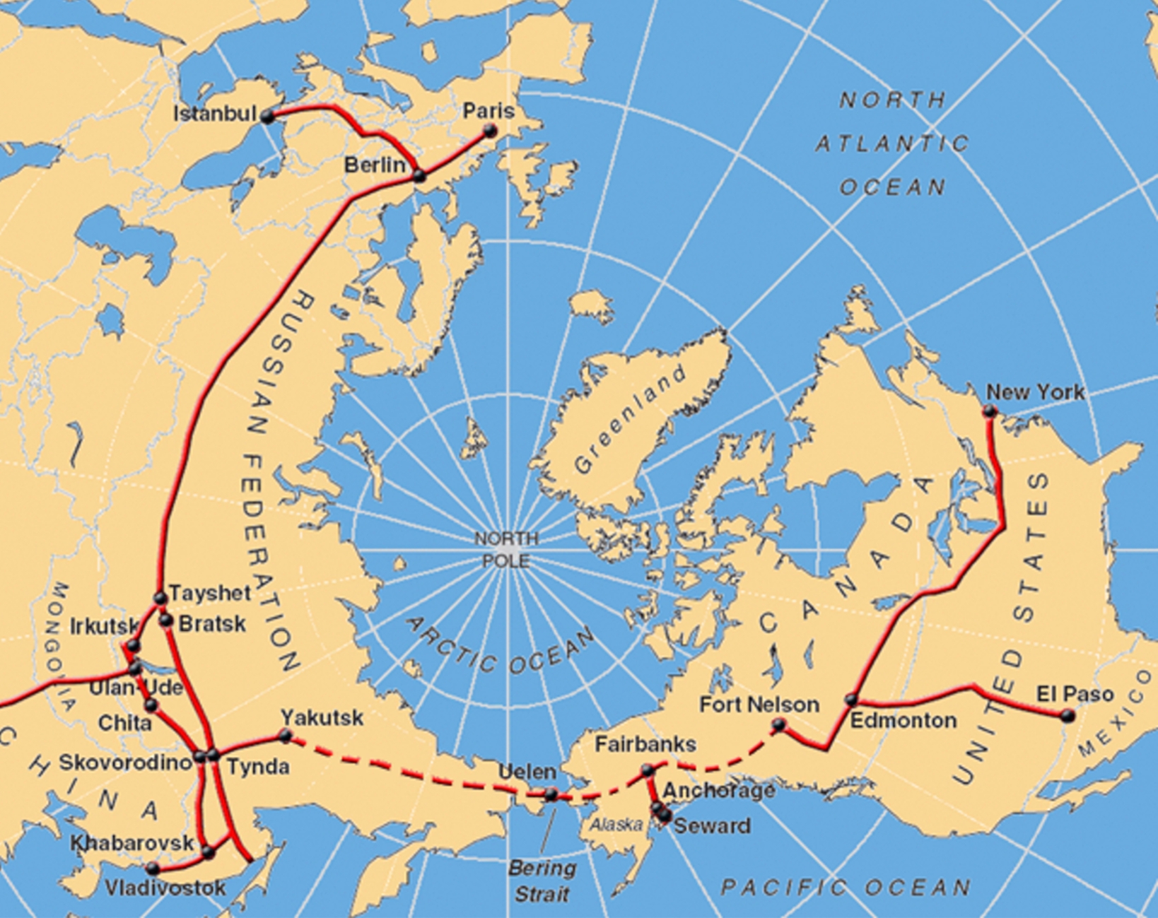
Visionaries, engineers, and leaders from all over the world have long been fascinated by the concept of connecting North America to Eurasia by rail. Currently in the planning stage, and now known as the Intercontinental Railway, this ambitious plan of a vast network of railways, including a vital connection between the United States and Russia, has recently gained momentum. This mega project would have the potential to transform international trade and connectivity in an unprecedented manner. 

The project’s initial objective is to extend the existing rail networks of the United States, Central America, and the Andean countries.  The completion of this stage of the project would establish a rail link between Alaska and Canada to the southern reaches of South America. However, the scaling of the Bering Strait to link Alaska’s railroads to Russia’s Trans-Siberian Railway is what most interests people about this proposal. The Bering Strait, a fifty-one mile wide section of the Pacific Ocean between Alaska and eastern Russia, is the most significant obstacle engineers would face in the construction of the Intercontinental Railway. In order to connect these two continents, a tunnel spanning an astonishing sixty-two miles in length and 160 feet below sea level would have to be constructed. Not even mentioning the difficult geopolitical hurdles involved in creating a physical link between the United States and Russia and other such challenges, the Bering Strait Tunnel itself would be a tremendous accomplishment. It would be the longest underwater tunnel ever constructed, nearly doubling the length of the Seikan Tunnel in Japan, the current record holder. The Bering Strait Tunnel would join Russia’s vast rail system, which extends through Siberia and connects with the Trans-Siberian Railway. In the end, the 5,500 miles of new track and related infrastructure for the project would carry a price tag of more than $100 billion dollars, according to the 2018 Intercontinental Railway Project Proposal. 

At first glance, this map invokes the audience with a futuristic vision of an elaborate high speed rail network connecting the globe, with exciting possibilities such as traveling from New York to Paris on a single train. The map appears to revolutionize the convenience and accessibility of long distance international travel with ultra high speed rail. While the map catches the eye of most for this reason, it is important to note that transportation experts and the project proposal itself agree that the true use-case for the Intercontinental Railway would involve cargo and not passengers. Transporting goods between North and South America currently requires either crossing the Panama Canal or taking lengthy, expensive sea routes. A faster, less expensive, and more effective mode of transportation would be made available by the Intercontinental Railway, which would result in significant cost savings for both businesses and consumers. Its construction would enable seamless trading by rail between North and South America and Eurasia. By enhancing trade, expanding markets, and lowering transportation costs, this integration could spur economic growth in all of the regions connected by the railway. Another advantage of this project is the potential reduction of fossil fuels. Although building such a sizable railway network is a monumental construction project, it would result in more environmentally friendly transportation options. Long-haul transportation’s greenhouse gas emissions could be reduced by using electric trains that are powered by renewable energy sources. The Intercontinental Railway would vastly diminish the frequency of highly polluting, fossil-fuel burning cargo ships crossing the Pacific Ocean. Conversely, many environmentalists hold significant concerns about both the initial and long lasting effects the railway would have. Alaska and eastern Russia are some of the most desolate and naturally undisturbed regions in the world. The effect of an infrastructure project of this scale, as well as the active disturbance of a rail line cutting through the habitats of numerous species of wildlife would have disastrous effects on the immediate ecosystem. 

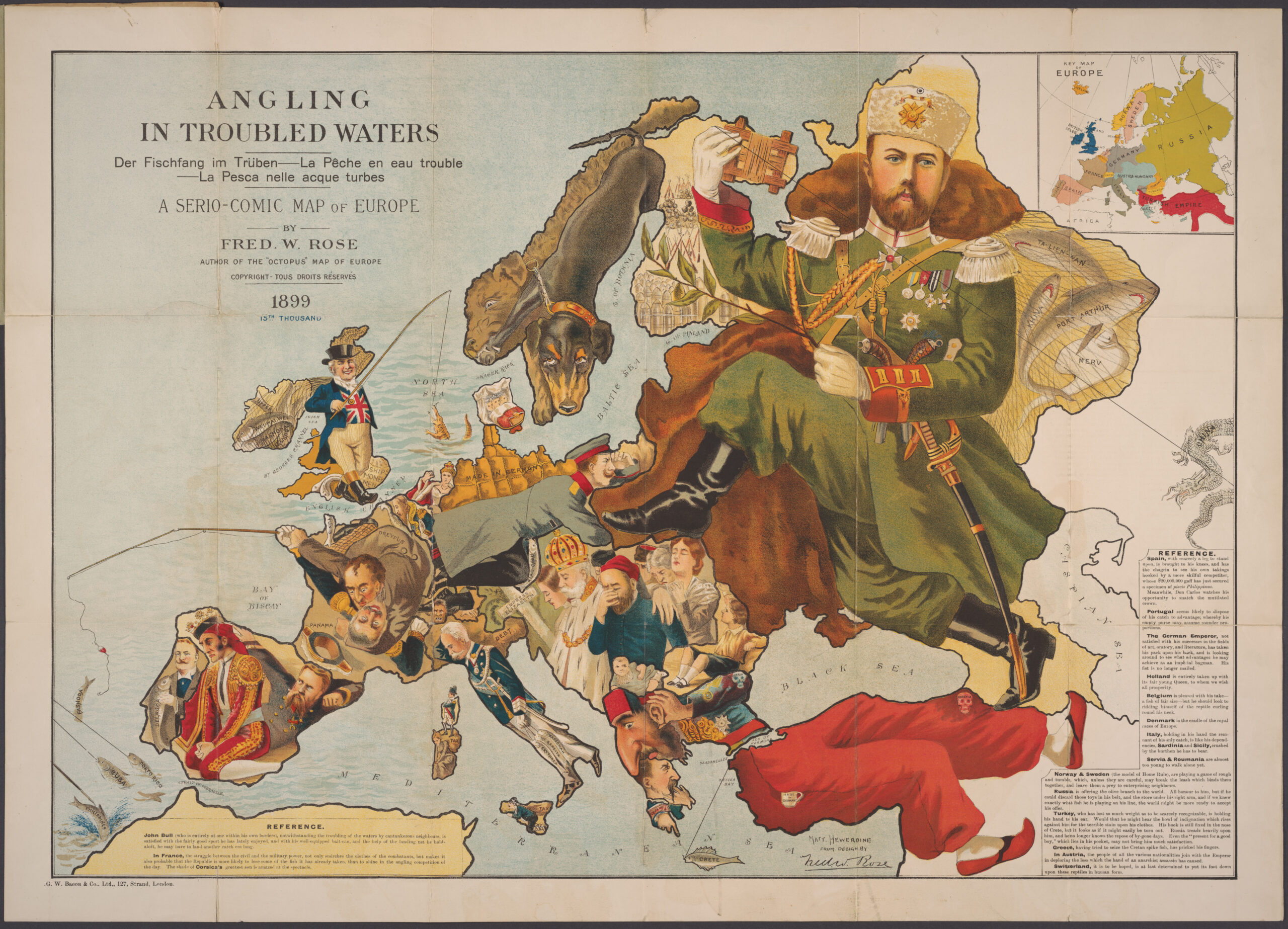
I believe the format and perspective of this route map provided by the advocates of the project is very purposeful. As this project is in the proposal stage, activists for the project’s construction are surely trying their hardest to establish a convincing argument for the construction of the Intercontinental Railway. The above map is a product of this. The route map is not displayed over the common Mercator projection, but instead on a birds-eye view of the upper half of the globe. Centered around the North Pole, this map is able to exclude the majority of the world, whether it be parts ignored from the project altogether (Africa), or even the included South America. This was likely done purposely due to the pursuit of gathering funding for the enormous price of the project, as North America and Russia would most likely be the heaviest and most likely contributors to the railway’s construction. The proposers are appealing to these parties by centering the map solely around these areas to clearly display the economic opportunities the project would provide to them. For a project that claims to be connecting the world by rail, the decision to choose a map that has such a narrow scope is very telling of who this project is truly marketed towards and most likely to benefit. These are aspects of a future initiative that are uniquely uncovered through the analysis of maps and the role such illustrations had in conveying certain persuasive messages.


Works Cited:

“InterContinental Railway Project Summary July 2018.” https://www.intercontinentalrailway.com, 2018.

Jacobs, Frank. “Intercontinental Railway: All Aboard the Train from New York to Paris – via Siberia.” Big Think, March 30, 2023. https://bigthink.com/strange-maps/intercontinental-railway/.

Peters, Ed. “Bering Strait Tunnel: Pipe Dream or Game-Changer for US-Russia-China Ties?” South China Morning Post, October 4, 2020. https://www.scmp.com/week-asia/economics/article/3103997/bering-strait-tunnel-pipe-dream-or-game-changer-us-russia-china. 

Blog Link:

https://bigthink.com/strange-maps/intercontinental-railway

The Strange Maps blog consists of a selection of thought-provoking maps and visuals across a wide range of interesting topics with corresponding narratives of each individual pieces.

Atlas of the Week:

https://epa.maps.arcgis.com/home/webmap/viewer.html?webmap=f16f5e2f84884b93b380cfd4be9f0bba

The National Walkability Index ranks the walkability of neighborhoods covering the entirety of the United States. Each block is given a walkability score calculated from a database of contributing attributes that are also accessible for the selected area. The page is easily maneuverable to gauge the walkability of a certain block of a small town all the way up to that of large cities and states. This walkability ranking provides an interesting visual of the overwhelming lack of walkable neighborhoods on a national scale, contributing to our subsequent car dependency in the United States. 


Posted in Maps of the Week | 2 Comments

The most photographed places in the world

Sightsmap. Mapping the World's Most Photographed Locations.

Europe. Sightsmap. Mapping the World's Most Photographed Locations.

Ever wonder why everyone wants to go to Greece or Italy for summer vacation? Or even to Austria or Switzerland for a skiing trip? The answer is simple: it’s really beautiful. Cities in Europe are built around the natural landscapes of the Earth, while also keeping a touch of each countries’ ancient architecture, giving it a much different feel from the modern day cities and skyscrapers and perfectly built roads we are used to here in the US. The map above is a depiction of the most photographed places in the world. It is evident that, by the collected data, Europe is the most photographed region in the world by a margin, specifically Western Europe. From landscapes with tall mountains, bright green forests, lakes and rivers, to cities with modern architecture, classic cars on heavily trafficked roads, Europe has a lot of places that are photograph worthy that we see in our everyday magazines, or, nowadays, our Instagram Explore page. By looking at the map, we can tell that the most photographed country in the world is Italy. The heaviest density of gold color lies in the region where the Alps range. Countries such as Germany, Switzerland, Belgium, Austria also have high data on this map. Moscow is an outlier of Northeastern Europe, being just a single spot of heavy photography. Eastern China and Japan are two of the very few heavily-photographed locations around their proximity. In the United States, New York City, Florida, and California are the top three, and rightfully so. The sharing of these photos of these places throughout the mainstream media through the internet had me, as a European myself, only knowing these three locations from the whole country of the USA. 

Being from Greece, half of my camera roll is scenery of the country, from ancient Greek landmarks, to the most beautiful beaches in the world. Greece is up there with the most photographed countries in Europe, with most of the “golden” areas laying on the coastal parts of the countries, highlighting the beaches and oceanic skyline. Whenever I’m back home, which is usually during the summer, I notice tourists spend more time taking photos of the beach rather than actually swim or suntan. They spend more time looking at the Acropolis through their phone screen while taking hundreds of photos without subconsciously realizing that they’re not admiring it with their own eyes. Even in restaurants, they’ll take a picture of their Greek salad and their Moussaka before they eat it. Got to have the moment filed in their phone, better not forget to take a photo! I’m 100% certain that this is evident in other popular European capital cities that are heavily photographed: Paris, Madrid, London, Athens, Rome, Moscow. Each countries’ signature plate or famous ancient landmark, tourists will most definitely take hundreds of pictures before departing. 

Thus far, only the continents of Europe and North America have been brought into discussion; so what about the other 5 continents? The simple answer would be that they just aren’t photographed as much. Yet, what if it’s just a lack of data? What if it’s just the lack of smartphones in those dark areas that are the modern day cameras everyone uses. We can all agree that Africa is a beautiful continent made up of healthy jungles and landscapes inhabited by animals. What if this map is just another biased image trying to positively endorse European countries? Well, Europe is the most visited continent in the world (worldatlas.com). Tourists mostly visit European countries and islands, which all have their own unique characteristics of natural landscape, cuisine, architecture, that is not seen anywhere else in the world. It’s a subconscious motive to take pictures of these things, and I’m speaking from personal experience seeing how tourists operate when they visit my home country. Additionally, not everyone has the opportunity to make such a big trip to European countries, so they look for all these photos online, which are all shared heavily, which increases this data even more. 

Works Cited:

Lalueta, Inés. “Holidays vs. Mapping the World’s Most Photographed Locations.” Holidays vs. Mapping the World’s Most Photographed Locations | The Strength of Architecture | From 1998, www.metalocus.es/en/news/holidays-vs-mapping-worlds-most-photographed-locations

Blog Link: https://twitter.com/Amazing_Maps

This Twitter/X page posts maps focused either on the US and specific states, or can show data from the whole world. The maps posted provide really random yet interesting data and information that may not really help us in our life, but can entertain us to some degree.

Atlas of the Week: https://storymaps.arcgis.com/stories/0a56aa3a277741bc9c6825880103d465

This page talks about the growth of “green life” within urban cities and counties in the US during the constant population growth. This page provides a lot of data about population growth over the years, its pros (economic development) and cons (pollution, energy consumption), and how urban trees can improve these cons. It later has an interactive map about the amount of trees in counties over the years. A really interesting and well thought out presentation about a problem of todays world.


Posted in Uncategorized | Comments Off on The most photographed places in the world

Map of the Week: Every Country Britain HAS NOT Invaded


Every Country Britain HAS NOT Invaded – map by Indy100 (https://www.indy100.com/news/uk-great-britain-invasion-empire-war-conquest-globe-invaded-2017-7460711)

Great Britain (or England, The United Kingdom, etc.) has possessed large international status and power for a number of centuries. Their early industrialization coupled with aspirations to dominate on the global level have led to these unrivaled amounts of invasion and colonization across the globe. Just 22 countries have not been invaded by Britain, highlighted in purple on this map: Andora, Belarus, Bolivia, Burundi, Central African Republic, Chad, Congo, Guatemala, Ivory Coast, Kyrgyzstan, Liechtenstein, Luxembourg, Mali, Marshall Islands, Monaco, Mongolia, Paraguay, Sao Tome and Principe, Sweden, Tajikistan, Uzbekistan, and Vatican City. Invading 171 out of 193 total countries worldwide is not a small feat, and the extent of this is emphasized in this map in which nearly the entire land area of the globe is shaded pink (meaning at one point invaded by Britain). For context, the United States has only invaded 68 total countries in its existence (although a much shorter time frame than Britain). This map effectively tells a story about the longstanding worldwide power of Great Britain, while staying as minimal as possible by conveying one simple statistic.

For centuries, the power of the British Empire allowed the nation to expand their territory and take advantage of areas that possessed useful resources. Colonization and the European “race” to take control of native peoples/regions in Africa and the Americas spanned for centuries, leading to invasions of most of the nations on those continents in a very short period of time. This wasn’t anything absurd for a powerful European nation from the 16th-18th centuries. Belgium and France were very present in Africa and Portugal and the Netherlands set their eyes on the sugar of the Americas. England, however, aimed for both and more as they had industrialized rapidly and were power hungry. The British Empire’s mission to show their industrial strength and assert dominance was their main motive, but it isn’t the same for all invasions. Each specific country/region has its own history and circumstances that cannot be shown on this map. The arrival of the British often meant a different thing depending on where it was. Some were taken advantage of by Europeans for their crops while others for slave trade or territorial dominance. 

Examples of context differences when it comes to this map could be the United States (Revolutionary War period), colonization of Africa in the 19th century, and the World Wars. All of these have their own circumstantial differences and are relevant in different ways to Britain. The United States was a revolution against Britain in which they fought for control of the states, colonization in Africa lead to the slave trade and was based around resources and military control, and both World Wars consisted of many invasions by the British army across Europe. The reasons for these three individual invasions differ greatly, as they do with all 171. The map also cannot take into account the frequency, as while some African or Central American nations were raided just once, many European nations held several battles during the World Wars. This is not a problem – the map still gets its point across very efficiently, but its simplicity ignores important history of the very country it means to highlight and leaves the viewer with questions on this very topic.

The map breaks down centuries of history while simultaneously being as simple as possible, as it is just merely a world map with two different colors. Although not describing each individual invasion whatsoever or providing context, the map depicts the power of Britain throughout history in a concise and direct way. The choice to not include additional information about every country’s invasion is an intriguing one, as well as not possessing any labels or legends. The lack of this information forces questions such as: “How could one country possibly handle this?” or “When and why did Great Britain invade Thailand?”, dragging the viewer of this map into a rabbit hole of research and questions that make this map especially compelling. Britain has indeed invaded 90% of the countries in the world today, and this map is made into a very effective and simple way of conveying that statistic.

Works Cited

Kottke, Jason. “Britain Has Invaded All but 22 Countries.” Kottke.org, 16 November 2012, https://kottke.org/12/11/britain-has-invaded-all-but-22-countries. Accessed 13 October 2023.

Vesey, Joe. “A map of every country Britain has ever invaded.” Indy100, 23 December 2018, https://www.indy100.com/news/uk-great-britain-invasion-empire-war-conquest-globe-invaded-2017-7460711. Accessed 13 October 2023.

Posted in Uncategorized | 2 Comments

Map of the Week: Shark vs Human Killing Inequality

One of our maps of the week is about the troubled relationship between sharks and humans. I’ve long had an issue with the idea of shark-infested waters. If we use this sentiment in human terms, Los Angeles is human-infested land. Shark attacks are a relatively new idea as well. Prior to the release of Jaws, they were considered shark accidents or bites. Though Jaws is a masterpiece of a movie, the effect it has had on shark populations has been detrimental. People have developed an irrational fear of sharks, despite the chances of getting attacked being incredibly slim. Jaws changed the public perception of sharks from creatures minding their own business to bloodthirsty killers, especially in pop culture. Shark movies became a new genre, and we saw the emergence of other shark-based media, notably Shark Week. Shark Week has done an incredible job of demonizing sharks to continue the myth that they are against humans. Originally created for shark education, they realized the actual profit was in entertainment, so they switched gears to upping the scare factor and decreasing the education in their content. The reputation of sharks unfortunately never recovered.

In reality, humans are in virtually no danger to sharks, while sharks are in immense danger from humans. Overfishing and bycatch pose a huge problem for shark species, more than intentional shark fishing ever has. That’s not to say that the shark fin industry is not a problem. It is a ruthless practice that while being legal in international waters, is being fought against by advocacy groups, as well as countermaps such as this one. Unintentional catching of sharks poses a much greater threat as commercial fishing has become so efficient that they are catching more than what they intended to. The nets are made to span a large area with little intention to filter the animals caught. This has helped contribute to one of the greatest problems facing not only sharks, but the entire marine ecosystem, that being overfishing. Great white sharks can live anywhere from 30 to 70 years old as an adult. It is becoming much more rare to see great whites in the later stages of life, as they are being killed before they can reach adulthood and reproduce. It takes anywhere from 25-35 years for a great white to sexually mature and begin the reproduction process. This is a story all too familiar to other species of shark, namely great hammerheads, having a population decline of 80% in the last 25 years, leaving only around 200 left in the wild (Miguelez).

That is where the map of the week comes into play. The lack of knowledge on this issue and the fact that action can still be taken makes this map a perfect candidate for the map of the week. This map is a textbook countermap, going against the generally perceived notions of what the public expects from cartography. Its purpose is to inform people about the realities of shark overfishing compared to the lack of shark attacks worldwide despite widespread fear. The title “Sharks vs Humans: 2014” gives off the vibe of sharks being a force to be reckoned with. The cartographer immediately flips the script from the title, switching to an anti-human perspective. The map itself uses relatively simple tactics to convey its information, putting the millions of sharks killed by humans across the entire ocean instead of in actual spots where they occurred. This is for two reasons, the first being that it is impossible to know the exact location of where the sharks were killed, and the other is to promote the cartographer’s agenda. The choice of color plays a role in how we subconsciously view the map, making the dots of the sharks killed by humans red to make the map look almost bloody and dark. On the other hand, the bright green dots representing humans killed by sharks comes off as almost natural, and something that is out of our control.

The intended audience of the map is not only the general public, as a way to change the perception of sharks, but also for governmental bodies. Governments have done very little for shark conservation efforts. Hawaii implemented a law that it is illegal to fish for sharks in state waters, but other than that, shark fishing is legal in most territorial waters. Even in waters where it is unlawful, the industry is quite profitable so it continues to thrive. Shark conservation, as well as marine conservation as a whole, is an issue that needs to be brought to the light of the public as well as governmental bodies to stop the overfishing and illegal trade of sharks. The endangered species list was the first step in the right direction, but there is more work to be done in order to change the public perception of sharks and help promote repopulation. Maps such as this one may seem simple and made just as a visual to present information in an intriguing way, but they actually project world issues in a digestible way. Maps provide a way of showing relationships between spatial data and societal/environmental problems that other media cannot provide which makes it the perfect medium for presenting information such as this.

Miguelez, Clara. “Great Hammerhead Shark: Characteristics, Threats, and Conservation Efforts.” Earth.Org, 3 Feb. 2023, earth.org/?endangered-species=great-hammerhead-shark.

Blog Link

https://www.instagram.com/terriblemap/?igshid=MzRlODBiNWFlZA%3D%3D

One of my favorite forms of maps is a comedic depiction of spatial data. This Instagram page provides an ever-growing collection of maps that show relatively useless information.

Atlas of the week

https://measureofamerica.org/maps/?state^crime_violent^all_all^Safety-Security^safety-security

This atlas provides a wealth of information on the United States, which can be looked at from the state level down to the congressional districts level. These maps provide data on everything from the percentage of elderly people to the violent crime per 100,000. These maps can also be divided by gender and race to look at trends in population. Every one of the maps is a choropleth so while there may not be major variations in the type of map, there is a huge variation in the information that can be presented.

Posted in Uncategorized | 4 Comments

Map of the Week: The Cost of Starting a Business in Countries Around the World

Map: https://bigthink.com/strange-maps/cost-of-starting-a-business/

When comparing how much it would cost to start a business in different countries around the world you may be surprised how big the gap is between the cheapest and most expensive country. When calculating a country’s cost to start a business possible factors can include, currency conversion, economic conditions, government fees, administrative requirements, and living standards. The makers of this map, a group associated with the World Bank, chose to convert all the currency into U.S. dollars which will make it easier to compare between countries and accurately determine why some countries’ costs are exponentially higher or lower than others. The startup cost by itself can not accurately tell a person which country is best to begin their business endeavors in, but it can be an important factor in choosing the right location. Combining this statistic with others like quality of living, average income, taxation, transportation accessibility, and others, can be beneficial when deciding what country would be the best fit for an individual. 

This map is part of a project called the Doing Business 2020 project. The project itself was first launched by the World Bank Group in 2002 and its goal was to look into various businesses and provide clear measures of business regulations. Since the project’s inception, it has been providing insights regarding economics. These range from data as small as individual companies, to economic statistics covering entire countries and continents.

By assessing the map starting with the lowest startup expenses, Slovenia is an outlier in the sense that its startup costs are completely free. With the exact factors that go into this data being up for interpretation, diving deeper into the country’s economic history and significance helps determine if it is a beneficial location for starting a business. Slovenia, a country located in central Europe, has acted as a center for skilled labor for the past few decades, drawing in massive amounts of global investment. Slovenia’s strategic location, in the middle of Europe, and the presence of its many knowledge-based sectors help make the development and expansion of a business here a much easier process. Additionally, Slovenia’s business-friendly laws, investment incentives, reduced corporate income tax rates, and investment tax benefits further enhance its appeal as a favorable business destination. With all of this in mind, it seems that Slovenia would make an excellent country to begin an entrepreneurial endeavor.

Looking at the opposite end of the spectrum, countries like Italy, Switzerland, Austria, and San Marino have the highest startup costs. However, to move away from Central Europe and look at different economies I have chosen to shift focus to the Middle East, specifically the countries surrounding Saudi Arabia. With most of these countries being in the one to two thousand range, and one of the countries (UAE) having the most expensive startup cost at 7,433 U.S. dollars, it makes this region seem like a very difficult place to start a business. Something to note about this region, however, is that when compared to the monthly income in these countries the startup cost is not as large as it seems. For example, even though it costs 7,433 U.S. dollars to start a business in UAE, which is the most expensive in the world, it is actually not the least affordable because it is equivalent to only a little more than two months of the average income. This highlights an important idea in the map, which is that high startup costs can be misleading. High costs do not necessarily mean it is more difficult to begin business endeavors in a country because factors like average income, taxation, and economic laws still have to be taken into consideration. 

In the Strange Maps blog, where I was able to find this map and very interesting interpretations of its data, the average income of a country is mentioned a lot in comparison to its cost to start a business and I found this to be a very sensible way of assessing a country’s economic background. Average income is a major factor in the calculation of economic difficulty to start a business and is also effectively represented in the North American portion of the map. The United States, with a startup cost of $725, is near the global average. However, one of the reasons the United States is nicknamed “the land of opportunity” and seen as such a good place to start a business is because of the ratio of startup cost to average income. The average income in a month for an American is $4,458, making the startup cost only 16 percent of average income. This is a lower percentage when compared to most countries. With Mexico already having a staggeringly higher cost to set up a business compared to the United States, the price gap between the two countries is further widened when compared to its residents’ typical salary. With the average monthly income of a Mexican citizen being around 620 U.S. dollars when this map was created, it would generally take almost 2 and a half months to make enough money to afford the initial startup costs. 

When using this map solely to determine which countries would be best for an individual to start a business, the only critique I have is that the data being shown is limited to just the startup costs which is only one of the many factors that go into choosing an ideal location for starting a business. If political or social factors, such as average income, were included along with the startup costs, this map would be a more holistic tool for evaluating where to start a business. Another thing that needs to be considered when evaluating a map is the source of the information. In this case, all the information is being provided by the World Bank so this tells us the data is coming from a reliable source and that the data isn’t biased from country to country because data input isn’t coming from one singular source. 

Overall, the map does a fantastic job using simple visuals, like the different colors representing costs and zoom-ins on certain regions, to make it easy to compare the startup costs of different countries. These are things that other forms of data representation like graphs or tables have a harder time conveying; making a map the ideal tool for representing this kind of information. 

Bibliography:

“How Much Does It Cost to Start a Business? There’s a World Map for That.” Big Think, 6 July 2021, https://bigthink.com/strange-maps/cost-of-starting-a-business/.

Slovenia | History, Geography, & People | Britannica. 13 Oct. 2023, https://www.britannica.com/place/Slovenia.

Top 10 Challenges of Doing Business in Slovenia. https://www.tmf-group.com/en/news-insights/business-culture/top-challenges-slovenia/. Accessed 13 Oct. 2023.

The Cost of Starting a Business in Every Country – BusinessFinancing.Co.Uk. 23 June 2021, https://businessfinancing.co.uk/cost-of-starting-a-business-in-every-country/.

“Doing Business Legacy.” World Bank, https://www.worldbank.org/en/businessready/doing-business-legacy. Accessed 13 Oct. 2023.

Posted in Maps of the Week | 1 Comment

Atlas and Blog of the Week: Atlas of Economic Complexity

https://atlas.cid.harvard.edu/
For my atlas of the week, I chose this awesome atlas about economic complexity that was put together by Harvard’s Growth Lab. The atlas included 4 separate map articles that help visualize new economic growth opportunities around the world. My favorite of these is a customizable map showing global trade with what seems like infinite options you can fiddle with. I chose this atlas because of how interactive it is and it related to similar concepts I highlighted in my map of the week. The website is very easy to navigate and uses the maps’ color and interesting design to catch the viewers’ eye. This website has many uses and would be very helpful and intriguing for anyone interested in understanding how global economics works.

https://andywoodruff.com/blog/

Posted in Atlases of the Week | Comments Off on Atlas and Blog of the Week: Atlas of Economic Complexity

Map of the Week: A Serio-Comic Map of Europe

PJM1135_01, 8/13/14, 5:44 PM, 8C, 5610×7707 (203+208), 100%, Repro 2.2 v2, 1/15 s, R57.7, G33.6, B51.9

              Imagine looking at a map and discovering that it’s not just a geographical representation but a witty commentary on the political tensions of the time. That’s exactly what happened with the satirical maps created by English cartographer Frederick William Rose during the Second Boer War. These maps not only provide a unique insight into the political propaganda of the late nineteenth century but also a glimpse into the cultural attitudes towards imperialism and colonial expansion. Today, we’ll take a closer look at two of Rose’s most famous maps, “Angling in Troubled Waters” and “John Bull and His Friends,” and explore how they skillfully depict the tensions between nations and ultimately, the impact of these tensions on the start of World War 1.

               This map of the week is two maps that fit together to create a clearer view of what was happening in 1899-1900 in Europe. These maps were created during the Second Boer War. This war took place in South Africa and was fought between the British Empire and the two different Boer Republics in South Africa. This impacted the culture in Europe due to Germany and Russia supporting the Boers, creating tension with the British Empire. These two maps display how tensions rose leading to the start of World War 1. As a British cartographer, Rose could have taken an interest in the rising levels of hostility between the European nations during this period. Frederick William Rose was the most famous active satirical mapmaker in the late nineteenth century. But he is elusive even going by a pen name Fred. W. Rose to maintain his privacy. Rose was born in London, giving the insight that his maps could have a British superiority ingrained in them.

         This pair of maps has been rewarded with the status of map of the week due to its witty response to the tensions that happened in Europe. This is clear even through the maps being titled “Serio-Comic Maps”. An aspect of the maps is that they are a joke and not taken seriously. In both of these maps Roses used somewhat cruel stereotypes to represent each of these countries. In both maps the Ottoman Empire is depicted with a large nose, reinforcing this cruel stereotype.  

 In the map “Angleing in Troubled Waters” many of the countries are displayed fishing for colonies. This shows the importance of colonial expansion at this time but also how it affected relationships with other European countries. Then only one year later in the map “John Bull and His Friends” Rose showed how the tensions between the nations changed from being predominantly in colonies to shifting back to the European nations. The fishing for colonies is over and many countries are displayed in military regalia holding weapons as the continent is amping up toward war.

         One of the major differences between the maps is Tsar Nicholas ll of Russia. In the map “Angleing in Troubled Waters” the Tsar is standing upon Türkiye and Eastern Europe. This does not show Russia taking over Türkiye and Eastern Europe but implies that Russia is above these parts of the world. It is also shown that Russia has China on a fishing line showing Russia attempting to colonize China. The second map “John Bull and His Friends” displays the escalation Tsar Nicolas ll of Russia is taking to expand the Russian Empire. In this map, the Tsar is displayed as an octopus strangling Poland, Finland, Persia, Afghanistan, and parts of the Ottoman Empire. Rose uses the sign of the octopus to explain Russia’s increasing attempts at Imperialism.

         In conclusion, the satirical maps created by Frederick William Rose during the Second Boer War provide a unique insight into the political tensions and propaganda of the late nineteenth century. The maps, “Angling in Troubled Waters” and “John Bull and His Friends,” display the shift in tensions between nations from being predominantly in colonies to shifting back to the European nations leading up to World War 1. Rose using a map as a base for the satirical cartoon allows people to gain context of how these different European relationships worked while including the spatial dynamics. The maps highlight the growing imperialism of Russia and the impact of the war on cultural attitudes towards colonial expansion. Overall, these maps are an important reminder of the role of propaganda in shaping political attitudes during times of war.


Works Cited 

“Angling in Troubled Waters: A Serio-Comic Map of Europe.” Cornell Library Digital        Collections, August 25, 2015. https://digital.library.cornell.edu/catalog/ss%3A3293834.

Mason, Betsy. “Check out These Propaganda War Maps.” Culture, May 3, 2021. https://www.nationalgeographic.com/culture/article/propaganda-war-maps-galler.

“Rose, Frederick William.” Daniel Crouch. Accessed September 29, 2023. https://www.crouchrarebooks.com/discover/mapmakers/rose-frederick-william.


Blog Link:

https://blog.mastermaps.com/2010/05/thematic-mapping-in-slovakia.html

This blog displays the different thematic mapping of Slovakia.


Atlas  of the Week:

https://maps.lib.utexas.edu/maps/slovakia.html

The atlas that I chose is the University of Texas at Austin “Perry-Castañeda Library Map Collection” on Slovakia. I found this intriguing due to this atlas not only shows current-day Slovakia but also shows back to when Slovakia was still a part of Czechoslovakia. I found particle intrigue with the topographic maps as you can see how the land of Slovakia has changed from 1942-1959. I also found it fascinating the level of detail that was in some of these maps for how old they were. This atlas provides beneficial information regarding Czechoslovakia and Slovakia.

PlayPlay

Posted in Uncategorized | 1 Comment

Atlas and Blog of the Week: The World Atlas of Languages

https://en.wal.unesco.org/world-atlas-languages?

The atlas I chose shows the status of languages around the world. It is interesting because it’s interactive and you can see what languages are spoken in a country, or see the different countries a language is spoken in. It shows the number of speakers, whether it’s an endangered language or not, and the severity of it. This provides valuable information about languages and is especially important in the process of saving and preserving endangered languages.

Blog

https://somethingaboutmaps.wordpress.com


Posted in Uncategorized | Comments Off on Atlas and Blog of the Week: The World Atlas of Languages

Blog Links and Atlas of the Week: More Maps of Korea

New Blog Links:  https://history.army.mil/books/maps.htm and https://history.army.mil/books/maps.htm

My first blog link shows an archive of maps depicting Asia or Korea in the Korean War from the U.S. Army Center of Military History. The second is a collection of rare maps from the National Library of Korea.

Atlas of the Week: https://www.edmaps.com/html/korea.html 

For my Atlas of the Week, I chose Edmaps’ Historical Maps of Korea, which is a collection of both maps of Korea during the 19th, 20th, and 21st centuries. I chose this atlas site because it is a great resource for understanding the propositions being made and perspectives being expressed by certain groups of people (the US, Korea, Japan, National Geographic, etc) on Korea’s role regionally and geo-politically in the modern era. For example, one of the maps it shows is a map created during WWII by the USA of the railways that the Japanese put into Korea to China in 1928.  This map was both a proposition of how the US saw how their enemy was structurally organized in Korea, and (at least to my own analysis) tells us that they were going to use this information to help win the war. This atlas is also a great resource because it provides links to other atlases depicting East Asia from mainly university sources.

Posted in Uncategorized | Comments Off on Blog Links and Atlas of the Week: More Maps of Korea

Map of the Week: Most popular language studied on Duolingo around the world

Did you know that a map about the most popular languages on an app isn’t as straightforward as it seems? In fact, it can reveal long complex histories of imperial influence and situations developing currently. Also, learning a new language has many benefits. It improves listening and memory skills, and increases your odds when you’re searching for a job. Learning another language also slows down cognitive decline and helps delay disorders like Alzheimer’s and Dementia. This is because the language learning process stimulates your brain and enhances it. You’ve probably heard of Duolingo, the language learning app that has quickly become one of the most popular apps around the world. It is a great tool for education and it is completely free and accessible to users across the world. This map shows the most popular language people studied on Duolingo in each country in 2022. The information may just appear random but we can clearly view and analyze the history and current social, political, and economic situations of countries through this information. A map can show the spaces in which languages exist and it shows linguistic relationships between countries all over the world.  

English is by far the most popular language on Duolingo, ranking first place in one-hundred-nineteen countries. Almost the entirety of Latin America, and the vast majority of Asia, Europe, and Africa appear to have a strong preference for learning English. This is not surprising due to the fact that English is the de facto language of the modern world. It is the language used most often on the internet, and it is considered the “International language.” This is a legacy of the British colonial empire, which at one point spanned 13,700,000 square miles or roughly twenty-four percent of the world’s total land area. The rise of the United States of America in the twentieth century also plays an important role in the expansion of the English language. Since becoming a superpower, the United States has meddled in the affairs of countless nations, having invaded 84 nations and has been militarily involved with 191 of them. Also, the U.S is the birthplace of the internet, and its presence on media and the internet have been huge since the day of its birth. These are some factors which help maintain the status of the English language as the lingua franca. English is the language used globally and it looks like it’s here to stay and will keep expanding. 

In the Balkans, we can see a cluster of countries who prefer to study German rather than English, sticking out from the rest of their neighbors who choose to learn English. Slovenia, Croatia, Serbia, Bosnia and Herzegovina, North Macedonia, and Kosovo all chose to learn German over English. One thing in common they have is they all were formerly part of Yugoslavia. Neighboring Albania, although never officially part of Yugoslavia, also prefers learning German. These countries all tend to perform poorly compared to the rest of the continent in terms of GDP per capita, HDI, and the quality of life. After the brutal conflict that concluded the breakup of Yugoslavia, these countries were left devastated. Many people flocked to wealthier countries in search of better opportunities and arrived as guest workers. These nations hold large diasporas in German speaking countries like Germany, Austria, and Switzerland. Many of the current youth still choose to emigrate to these countries for better opportunities, creating generational trends.  

If you look closely at the map, you can see that Sweden is an anomaly. It is one of the only nations that prefer learning their own language rather than a foreign one. This is because most of the people learning Swedish on Duolingo are foreigners, rather than Swedes themselves. Since the 2015 European Migrant Crisis, Sweden has offered refuge to hundreds of thousands of migrants fleeing from war and crises. Refugees in Sweden mostly originate from Syria, Ukraine, Afghanistan, and Iraq. In order to adjust to their new lives and integrate into Swedish society, these newcomers must learn Swedish. Fortunately, Duolingo is free and it seems that many people in Sweden seem to take advantage of this resource, which shows how important this language learning app is, especially for refugees. 

In Tanzania, Swahili and English are both the official languages. Swahili is the most popular language among Duolingo users in Tanzania. Unlike Sweden, it is the native people of Tanzania who are learning their national language. Although Tanzania has two official languages, more than 120 languages are spoken throughout the country. In order to communicate with other people in the country, many people are learning Swahili. It’s important to remember how many borders were formed without regard to ethnic and linguistic differences by colonizers. This is one of the remaining effects of colonialism. Language and colonialism have such a complex relationship because even non-colonial languages can spread as a result of colonialism. In this case, Swahili became popularized in Tanzania, because the colonists created arbitrary borders, and the people of Tanzania needed a common language to communicate with each other. 

This map was selected as map of the week because it shows how modern technology is a tool which is beneficial. It also shows the deeply ingrained effects of colonialism, and it makes you look at the world through a different light.  Denis Wood talked about counter-mapping and how it helped movements fighting against colonialism and occupation. Although this map does not directly show that, we can still see social remnants of post-colonialism spread throughout the world. For one, English is the most dominant language on the map, as the British and Americans were the most successful colonizers. You can see that French still has a lot of influence in Africa, and Japanese is popular in its former colonies in Southeast Asia. Learning a language is an important skill, but it is important to note that the majority of languages considered most beneficial today are the languages of nations which were the most successful colonizers. These trends will likely remain, but it is important to acknowledge the motivations and the context behind the incentive to learn these different languages. 

Sources

Craib, Raymond B. Decolonizing the Map: Cartography from Colony to Nation; Ed. by James R. Akerman. UNIV OF CHICAGO Press, 2017. 

Kamm, Henry. “Yugoslav Refugee Crisis Europe’s Worst since 40’s.” The New York Times, The New York Times, 24 July 1992, www.nytimes.com/1992/07/24/world/yugoslav-refugee-crisis-europe-s-worst-since-40-s.html. 

Kelly, Christopher, and Stuart Laycock. America Invades: How We’ve Invaded or Been Militarily Involved with Almost Every Country on Earth. Book Publishers Network, 2014. 

“Tanzania Language Focus: What Do You Know about the Language Spoken in Tanzania?” Tomedes, www.tomedes.com/translator-hub/tanzania-language. Accessed 6 Oct. 2023.

Posted in Uncategorized | 1 Comment