
One of our maps of the week is about the troubled relationship between sharks and humans. I’ve long had an issue with the idea of shark-infested waters. If we use this sentiment in human terms, Los Angeles is human-infested land. Shark attacks are a relatively new idea as well. Prior to the release of Jaws, they were considered shark accidents or bites. Though Jaws is a masterpiece of a movie, the effect it has had on shark populations has been detrimental. People have developed an irrational fear of sharks, despite the chances of getting attacked being incredibly slim. Jaws changed the public perception of sharks from creatures minding their own business to bloodthirsty killers, especially in pop culture. Shark movies became a new genre, and we saw the emergence of other shark-based media, notably Shark Week. Shark Week has done an incredible job of demonizing sharks to continue the myth that they are against humans. Originally created for shark education, they realized the actual profit was in entertainment, so they switched gears to upping the scare factor and decreasing the education in their content. The reputation of sharks unfortunately never recovered.
In reality, humans are in virtually no danger to sharks, while sharks are in immense danger from humans. Overfishing and bycatch pose a huge problem for shark species, more than intentional shark fishing ever has. That’s not to say that the shark fin industry is not a problem. It is a ruthless practice that while being legal in international waters, is being fought against by advocacy groups, as well as countermaps such as this one. Unintentional catching of sharks poses a much greater threat as commercial fishing has become so efficient that they are catching more than what they intended to. The nets are made to span a large area with little intention to filter the animals caught. This has helped contribute to one of the greatest problems facing not only sharks, but the entire marine ecosystem, that being overfishing. Great white sharks can live anywhere from 30 to 70 years old as an adult. It is becoming much more rare to see great whites in the later stages of life, as they are being killed before they can reach adulthood and reproduce. It takes anywhere from 25-35 years for a great white to sexually mature and begin the reproduction process. This is a story all too familiar to other species of shark, namely great hammerheads, having a population decline of 80% in the last 25 years, leaving only around 200 left in the wild (Miguelez).
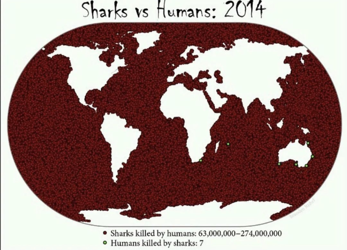
That is where the map of the week comes into play. The lack of knowledge on this issue and the fact that action can still be taken makes this map a perfect candidate for the map of the week. This map is a textbook countermap, going against the generally perceived notions of what the public expects from cartography. Its purpose is to inform people about the realities of shark overfishing compared to the lack of shark attacks worldwide despite widespread fear. The title “Sharks vs Humans: 2014” gives off the vibe of sharks being a force to be reckoned with. The cartographer immediately flips the script from the title, switching to an anti-human perspective. The map itself uses relatively simple tactics to convey its information, putting the millions of sharks killed by humans across the entire ocean instead of in actual spots where they occurred. This is for two reasons, the first being that it is impossible to know the exact location of where the sharks were killed, and the other is to promote the cartographer’s agenda. The choice of color plays a role in how we subconsciously view the map, making the dots of the sharks killed by humans red to make the map look almost bloody and dark. On the other hand, the bright green dots representing humans killed by sharks comes off as almost natural, and something that is out of our control.
The intended audience of the map is not only the general public, as a way to change the perception of sharks, but also for governmental bodies. Governments have done very little for shark conservation efforts. Hawaii implemented a law that it is illegal to fish for sharks in state waters, but other than that, shark fishing is legal in most territorial waters. Even in waters where it is unlawful, the industry is quite profitable so it continues to thrive. Shark conservation, as well as marine conservation as a whole, is an issue that needs to be brought to the light of the public as well as governmental bodies to stop the overfishing and illegal trade of sharks. The endangered species list was the first step in the right direction, but there is more work to be done in order to change the public perception of sharks and help promote repopulation. Maps such as this one may seem simple and made just as a visual to present information in an intriguing way, but they actually project world issues in a digestible way. Maps provide a way of showing relationships between spatial data and societal/environmental problems that other media cannot provide which makes it the perfect medium for presenting information such as this.
Miguelez, Clara. “Great Hammerhead Shark: Characteristics, Threats, and Conservation Efforts.” Earth.Org, 3 Feb. 2023, earth.org/?endangered-species=great-hammerhead-shark.
Blog Link
https://www.instagram.com/terriblemap/?igshid=MzRlODBiNWFlZA%3D%3D
One of my favorite forms of maps is a comedic depiction of spatial data. This Instagram page provides an ever-growing collection of maps that show relatively useless information.
Atlas of the week
https://measureofamerica.org/maps/?state^crime_violent^all_all^Safety-Security^safety-security
This atlas provides a wealth of information on the United States, which can be looked at from the state level down to the congressional districts level. These maps provide data on everything from the percentage of elderly people to the violent crime per 100,000. These maps can also be divided by gender and race to look at trends in population. Every one of the maps is a choropleth so while there may not be major variations in the type of map, there is a huge variation in the information that can be presented.
Very interesting post, Christopher. When initially looking at the map, I immediately see the intentional use of strong color contrast. The blood red color in the ocean vastly overshadows the seven green specs scattered around the map. I love how you very correctly categorize this map as a counter map, as it fights against the narrative of sharks as human killing monsters. Furthermore, I agree with the sentiment that Hollywood is the culprit of overblowing and creating false narratives around concepts, with the threat of zombies, ghosts, and animals like spiders being other creatures being overblown in movies. However, one bias I see with this map is the lack of non-lethal injury towards humans being included. After doing a little bit of digging, I found that there have been 2900 total documented shark attacks that caused some form of injury. Although this is still a seemingly small number of attacks relative to the millions against sharks, the inclusion of these attacks may convince some that sharks are still a threat to humans. Overall, this is a very nice map showing the power of information inclusion/exclusion and how that can affect human perception.
Good job Chris. When I first looked at the map, I only saw one of the green dots, and it took me a few seconds before I started to see more of them. This is most definitely a counter-map, so nice job identifying that crucial aspect. I really liked how you addressed the unfair perception of and vilification of sharks in media. That really emphasizes the need for counter-maps, to represent the interests of the oppressed. Humanity has been committing a genocide against sharks in the shark’s natural habitat all across the world. For a human to not be harmed by a shark, they just have to remain on land. For a shark to not be harmed by a human, they need to travel to a time before humanity existed. I appreciate how you recognized that purpose of maps which is to put global issues into spatial existence on a viewable plane. When I looked at the map key, I was appalled by the amount of red dots on the map; all the sharks that have died.
Great job on this Chris!
This is a really creative and well thought out post. It took me a solid minute to find the 7 green dots on this world map, and to be honest, I thought that red was just the color for the ocean for some reason, before realizing that that’s the presentation of the dead sharks and specs; it’s like the art technique of pointillism. This is a great paradox you’ve chosen to talk about of the relationship between sharks and humans. I think you did a great job of giving a thorough relapse of the effects that the blockbuster movie ‘Jaws’ had on the world. The contrast of color and specs between the red and green dots is amazing, it almost looks like an exaggeration, which I think is a great aspect of this map, as it makes you think. I also felt relieved to see no human deaths in beaches that I go to. However, I was also saddened by the amount of shark deaths.
Overall great job!
I really appreciate the clear yet sufficiently supported stance you take on the generally negative and predatory attitude the public has towards sharks. Not only is the map you chose an unbelievably brutal visual, it also presents strikingly factual figures that point towards a broader problem in society regarding the effect media has on the public perception of issues. I enjoyed your background information regarding Jaws and Shark Week, and the way those pieces of media led into an anti-shark narrative that still has lingering consequences in modern society. I think you were able to develop not only a strong argument as to what purpose of the map was, but also as to how countermaps such as this serve a critical role in counteracting the effects of other media. I also appreciated how you emphasized that the audience of the map was more so governmental than public, as I agree that the purpose of this map to achieving real change in protecting the world’s shark population. I think this is a good example of how a countermap is able to make an argument not just visually, but by providing the audience with actual information to assist in its persuasion.