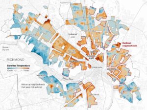
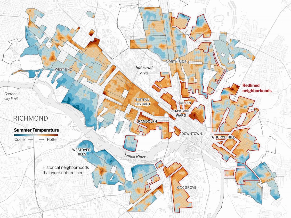
If one were to travel from Richmond’s West End or Westover Hills to Church Hill or Oak Grove on a sweltering summer day, the difference in temperature would be appreciable. Representing average summertime temperatures, areas colored in red and orange on the map above (left) face temperatures as much as 20℉ hotter than those in blue (Plumer et al., 2020). This isn’t because West End and Westover Hills sit at a higher elevation. The difference is not due to position relative to the equator or some other small geographic anomaly. Instead, it has to do with strategically drawn lines mapped onto Richmond in the 1930s, a phenomenon now known as “redlining.”
In the 1930s, a federal government agency called the Home Owners’ Loan Corporation (HOLC) was tasked with determining fair mortgage and insurance rates as a way to combat the financial ruin many were facing in the wake of the Great Depression. However, the HOLC failed to justly make these determinations. Thus, redlining is the “institutional practice of refusing to issue fairly priced home mortgages or insurance in areas deemed too risky for investment due to their racial composition, income level, housing age or condition, or some combination thereof” (Markley, 2023). The areas where offering lower mortgages and insurance was determined to be a risk (as the value of these properties was expected to decrease) for the investors were outlined with red and the term redlining was born (Jackson, 2021).
Critically, these areas were in predominantly Black neighborhoods, meaning that Black individuals were routinely denied loan opportunities–most prominently the newly created government-subsidized loans–that could lead to home ownership. This persistent exclusion in turn makes it difficult to build intergenerational wealth, as a house’s value typically continues to grow across its “lifespan.” Black families were unable to either pass down or liquidate that asset, putting them at a disadvantage in comparison to white families and therefore limiting their social mobility. Consequently, predominantly Black neighborhoods were passed over for infrastructure advancements and “were cut off from affordable credit” (Markley, 2023). Evidently, the sociopolitical agenda of the mapmakers and their financiers was embedded within redlined maps and they were able to silently pass racist beliefs off as facts. The maps exemplify Denis Wood’s assertion that maps tend to “take[] a stand while pretending to be neutral,” and suddenly, the maps insert a legal form of segregation into an already racist culture (Wood, 77).
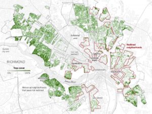
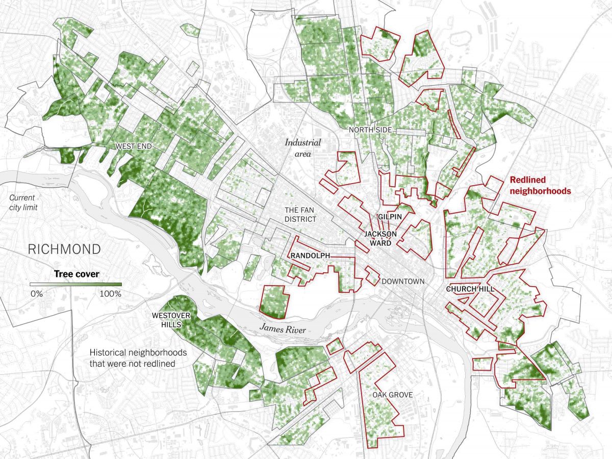
Although redlining has long since been outlawed, the effects of these maps are still felt today. The United States’ Treasury notes that as of 2022, 75% of white families in the United States were homeowners, while only 45% of Black families were (U.S. Department of the Treasury, 2022). Alarmingly, this statistic is the same as it was in 1970, more than 30 years prior. Yet another enduring disadvantage of redlining is the lack of infrastructure and investment in historically redlined locations. These locations sit directly next to Richmond’s industrial area (above the Fan District) and are dissected by interstate 95. Many are therefore inundated with concrete and asphalt, lacking trees and other greenery vital to improving air quality and, as shown in the map above (right), lowering temperatures.
Noticeably, areas outlined in red (the historically redlined neighborhoods) on the heat index and redlining map present much warmer summer temperatures than those which the HOLC deemed reliable investments. When compared with the map of tree cover in Richmond, a direct result of government investment in neighborhoods, the correlation is clear: redlined areas have less tree cover and higher temperatures. Research at the Science Museum of Virginia affirms this, stating that “greenspace, trees, or water bodies within a city have been correlated with cooler land surface temperatures (LST), and more greenspace or water is related to lower urban LST at the location of that greenspace” (Hoffman et al., 2020). An increase in average temperature ultimately leads to adverse health effects, the most obvious being a rise in heat deaths, an issue which will only become more pressing as the effects of global warming continue to impact our planet. Essentially, calculated lines drawn on maps close to a hundred years ago are killing people today.
Now, these redlining maps have taken on a different message, one which spurs upset and action. First published by the Science Museum of Virginia, the choice to overlay redlined zones on maps of Richmond which display several different trends (as shown here, summer temperatures and tree cover) immediately suggests a correlation to the reader. The different layers act as the map’s sign, allowing the reader to interpret that correlation and the accompanying racial injustice as the map’s supersign. Equally important is the physical representation of the map’s signs. The mapmaker chose to continue outlining the redlined areas in red, thus emphasizing the impacts those historic decisions continue to have on communities of color. That is likely meant to evoke an anger or upset in the reader, aided by the color’s association with violence and danger. Moreover, the mapmaker’s choice to leave Richmond’s landmarks further emphasizes the continued inequality. While the “blue” neighborhoods with lots of tree cover sit near the James River and far from the bustling Downtown area, the “red” neighborhoods are near an industrial area and at the heart of Richmond. This represents the city’s growth in a way which deeply benefitted its well-off, white inhabitants (offering them a respite from hectic, polluted city life) while putting marginalized residents at an even greater disadvantage; they had nowhere to escape to.
Thus, these new maps are meant to show just how far Richmond still has to go regarding racial inequality. While it is vital to employ solutions that will provide immediate relief to these historically overlooked communities, truly solving these problems means taking today’s issues and then looking back to the past to determine their roots. We must determine what structural inequalities redlining set in place and work to dismantle them, changing the way Richmond functions in a way that better promotes equity and equality. Perhaps, this process begins through maps. These redlining maps began as perpetrators of inequality, yet today have developed into catalysts for change, as identifying injustice is the first step to righting it.
Citations
Hoffman, Jeremy S., Vivek Shandas, and Nicholas Pendleton. “The Effects of Historical Housing Policies on Resident Exposure to Intra-Urban Heat: A Study of 108 US Urban Areas.” Climate 8, no. 1 (January 2020): 12. https://doi.org/10.3390/cli8010012.
Jackson, Candace. “What Is Redlining?” The New York Times, August 17, 2021, sec. Real Estate. https://www.nytimes.com/2021/08/17/realestate/what-is-redlining.html.
Markley, Scott. “Federal ‘Redlining’ Maps: A Critical Reappraisal.” Urban Studies, July 7, 2023, 00420980231182336. https://doi.org/10.1177/00420980231182336.
Plumer, Brad, Nadja Popovich, and Brian Palmer. “How Decades of Racist Housing Policy Left Neighborhoods Sweltering.” The New York Times, August 24, 2020, sec. Climate. https://www.nytimes.com/interactive/2020/08/24/climate/racism-redlining-cities-global-warming.html.
U.S. Department of the Treasury. “Racial Differences in Economic Security: Housing,” October 26, 2023. https://home.treasury.gov/news/featured-stories/racial-differences-in-economic-security-housing.
Wood, Denis, John Fels, and John Krygier. Rethinking the Power of Maps. New York: Guilford Press, 2010.
Atlas of the Week: Atlas of Prejudice
https://atlasofprejudice.com/
The Atlas of Prejudice is a compilation of maps which calls attention to the stereotypes of continents, countries, and other, smaller areas. This atlas does precisely what the name implies: it allows us to see our prejudices. By pointing out beliefs and misconceptions in a satirical and easily consumable manner, we are able to better accept (and then adjust) our biases, as well as to better understand the convictions of groups we are not a part of. The Atlas of Prejudice unabashedly reminds us that every map, regardless of the makers’ intent, has an agenda, inspiring individuals to look for preconceptions buried into each supposed fact they are told.
Blog Link

 While the precise date is unknown, the Negro Program of the Communist Party Map predates the Guerilla Acts of Sabotage map. The map was published by the South Carolina Klu Klux Klan to associate African Americans and communists together to foment hatred of them both. Questions on how to organize a multiracial society and those surrounding what to do with economic surplus and how socially planned the government should be are not inherently connected and the authors feel the need to make this connection explicit. The way they do this is by pulling materials from “The Platform of The Class Struggle” a widely disseminated pamphlet published in 1928 that talks about the problems and opportunities for communism to spread to the United States. While the pamphlet considers many aspects of American society, from problems of housing, foreign-born workers, miner strikes, and child labor, the problem the communist party focuses on is the chapter speaking to the “oppression of the negroes.” In this chapter, the authors discuss how African Americans are second-class citizens oppressed in every manner imaginable and how they are the perfect candidates to help support a communist uprising in the American South. While the map itself is sourced from somewhere else, the left page of the Klan pamphlet is pulled entirely from the communist literature. The Klan then attempts to analyze the communist propaganda it pulled while furtively adding in suppositions and conclusions of its own and presenting those as truths. For example, nowhere in the section it pulled, or the source material for that matter, does the mass displacement of 10 million white people, or their forced evictions come up. Nor does giving New Orleans, Savannah, Charleston, Shreveport, and Atlanta to African Americans come up. Lastly, nowhere in the literature is Paul Robeson (jazz musician, football player, and activist) mentioned. The KKK is masking its claims of what the future would hold under communist leadership by pointing back to the source literature and their preternatural understanding of communist party functions (by saying the map came from secret files of the communist party they’re implying that they have other hidden knowledge). Occasionally they throw in a date so exact or an article or committee so specific that the reader can’t help but feel no one would brazenly lie like that, but other claims it makes are entirely unsubstantiated.


