
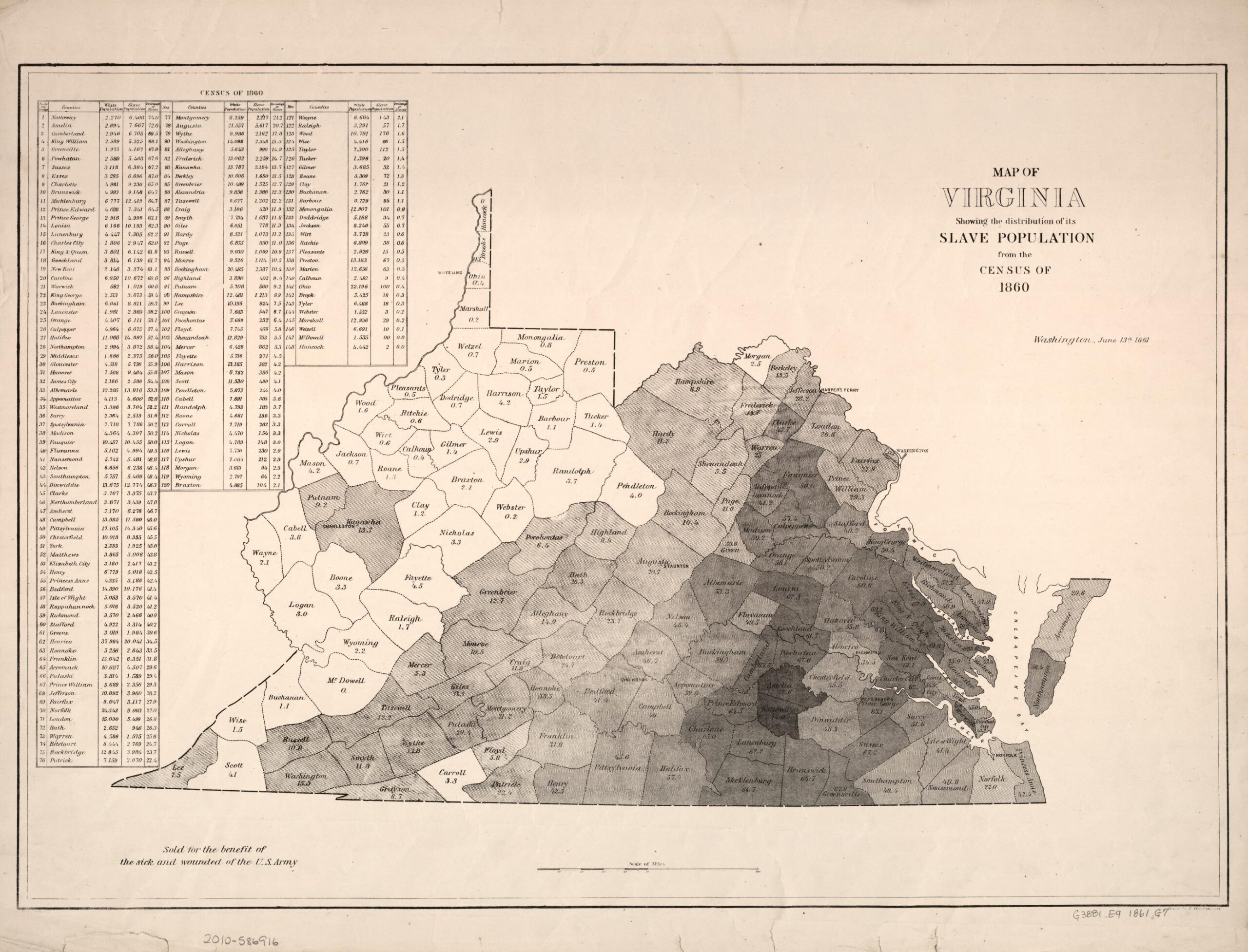
This is a map of Virginia showing the state’s slave population, information obtained from the 1860 census. Slavery had existed in Virginia since it’s beginning as a British colony, stretching back to 1619. By 1860, enslaved persons comprised around one-third of Virginia’s total population, numbering up to 500,000 enslaved people. For context, in 1860, there were about four million total enslaved persons in the United States, and 12.5% of those enslaved people lived in Virginia. However, when examining the map, it is visible that those 500,000 enslaved persons were not distributed evenly across the state. The western counties, for the most part, had minuscule percentages of enslaved persons comprising their populations, whereas the eastern counties had populations that were composed by significant percentages of enslaved persons.
This 1860 census map of Virginia is deserving of its status as map of the week for its contrast of factual objectivity with underlying tones of wartime propaganda, how it acts as a foreshadowing of historical events, and its relevance to the lives of Virginians today.
The historicity of the map is not up to debate. Unlike some other maps of the week, this map presents objective, data-driven information. The map is formed from census data collected by the United States government. What is interesting, though, is the reason this map was sold. For context, this map was issued June 16, 1861, two months following the start of the American Civil War. A portion of the perimap tells viewers that the map was “sold for the benefit of the sick and wounded of the U.S. Army.” This leads me to believe that the purpose of this map was not to inform citizens on the census tracts of Virginia, but instead to strengthen support for the Unionist cause against the Confederacy, as well as raising monetary support for the Union war effort. The map’s primary focus on enslaved people, established by the title “Map of Virginia Showing the Distribution of its Slave Population from the Census of 1860,” (with slave population being boldened to attract the eye of the viewer) seems unique, as enslaved people were, by law, not counted as full citizens in the apportionment of Congressional seats, nor extended American citizenship nor the rights afforded by thereof. While the belief in racial equality between white and black people was not prevalent in northern society, and white supremacy was still the societal norm in the north leading up to the American Civil War, abolitionism and attitudes opposed to the expansion westward of slavery were very much present in the north. Displaying the sheer expanse of slavery in a state bordering the Union, and so connected to Washington, D.C., could have been used to furtively suggest to unionists that the slavery in Virginia, and the Confederacy as a whole, could spread to the Union; this could have motivated Americans in the north to financially support the Union war effort.
This map acted as a foreshadowing of historical events. In 1863, West Virginia seceded from the Commonwealth of Virginia and was formally admitted to the United States of America. For context, the western region of Virginia did not rely on slavery to any comparable extent as did the central and eastern regions of the state, and the citizens living in the western region often felt underrepresented in the state legislature. Citizens in the western region of Virginia were broadly not in favor of the expansion of slavery, and were not in favor of secession from the Union. The stark contrast between the dark shading of the central and eastern regions of Virginia in relation to the overwhelming lightness, and for the most part, lack of shading in the west, allows for someone unaware of the domestic differences within Virginia to interpret that there was a noticeable discontinuity between the western region and the rest of the state.
The significance this map still has to the lives of Virginians today, especially black Virginians, is profound. Many black Americans are able to trace their lineages back to the counties their enslaved ancestors lived in. I, in particular, am able to trace my paternal lineage to Caroline County, Virginia, which had its total population comprised of 60.6% enslaved people; a majority. This map is a living representation of my enslaved ancestors.
This map relates to one of the earlier concepts we learned in FYS 100 Rhetorical Lives of Maps from Dennis Wood. Maps can be political and they assert propositions. Politically, this map was intended to produce anti-Confederate sentiment, and conversely, produce sentiment favoring the Union cause during the American Civil War. This map asserts that Virginia is a slave state, and in many places has just as many enslaved people as it does free. It is a contradiction of the supposed desire of freedom from tyrannical government espoused by Virginian secessionists.
Bonus Information:

This shows information gathered from escaped slave records. Robert S. Wigglesworth, from whom my surname originates, held my ancestors in bondage in Caroline County, about 35 miles north of the University of Richmond.
Atlas of the Week:
The ‘Historical Church Atlas’ is a collection of eighteen colored maps and fifteen sketch maps. The maps illustrate the history of eastern and western Christianity up to the reformation, and the Anglican Communion up to 1897. ‘The Historical Church Atlas’ was published by the London Society for Promoting Christian Knowledge, so its purpose seems to spread uncommon knowledge of historical Christendom to contemporary Christians.
Blog of the Week:
This blog is a great site for finding wacky, obscure maps.
Citations:
Map of Virginia Showing the Distribution of its Slave Population from the Census of 1860
“Map of Virginia : Showing the Distribution of Its Slave Population from the Census of 1860.” The Library of Congress, www.loc.gov/item/2010586922/. Accessed 8 Nov. 2023.
“West Virginia Statehood, June 20, 1863.” National Archives and Records Administration, National Archives and Records Administration, www.archives.gov/legislative/features/west-virginia. Accessed 8 Nov. 2023.
“‘Runaway Slave’ Records: Virginia Open Data Portal.” Tyler Data & Insights, data.virginia.gov/Education/-Runaway-Slave-Records/vbqa-smsu/data#:~:text=A%20“runaway%20slave%20record%2C”,escape%20bondage%20to%20pursue%20freedom. Accessed 8 Nov. 2023.
Great job Jacob! Your analysis of the census map provides a great analysis of its historical, political, and personal significance. Your interpretation of the map is enriched by the contrast you draw between its objectivity and its underlying wartime propaganda. The observation about the map during the early days of the American Civil War sheds light on its potential dual role as an informational and propagandistic tool. The emphasis on enslaved populations in the title suggests a strategic effort to gain support for the abolishment of slavery caused by emphasizing slavery’s prevalence in a border state like Virginia. The map’s ability to reflect regional hardships is greatly highlighted by its role as a foreshadowing of historical events. I like how you added the connections that you have to the map, as it elevates the map from a historical artifact to a living representation. Your map reflection encapsulates an in-depth examination of the map’s multifaceted significance, historical context, political implications, and personal connections, very interesting, great job!
I really loved how you dug into the purpose that the map serves. I think the intention of the map is very important to consider when analyzing because it’s often a source of bias. In my opinion, the fact that this map was even created shows bias. As you mentioned, most Southerners at the time viewed enslaved people as property and as a result would have opposed a census of enslaved people within the state. This map’s existence challenges that notion and not only says that enslaved people are obviously still people, but also goes as far as to show their location and demographics. From a historical view, this map is also incredibly interesting. The modern-day borders of West Virginia can be seen with the stark contrast in the number of enslaved people. This makes you wonder how the two states were even together at the time given the tensions that slavery caused. When looking at this map it makes the breakup almost seem inevitable.