
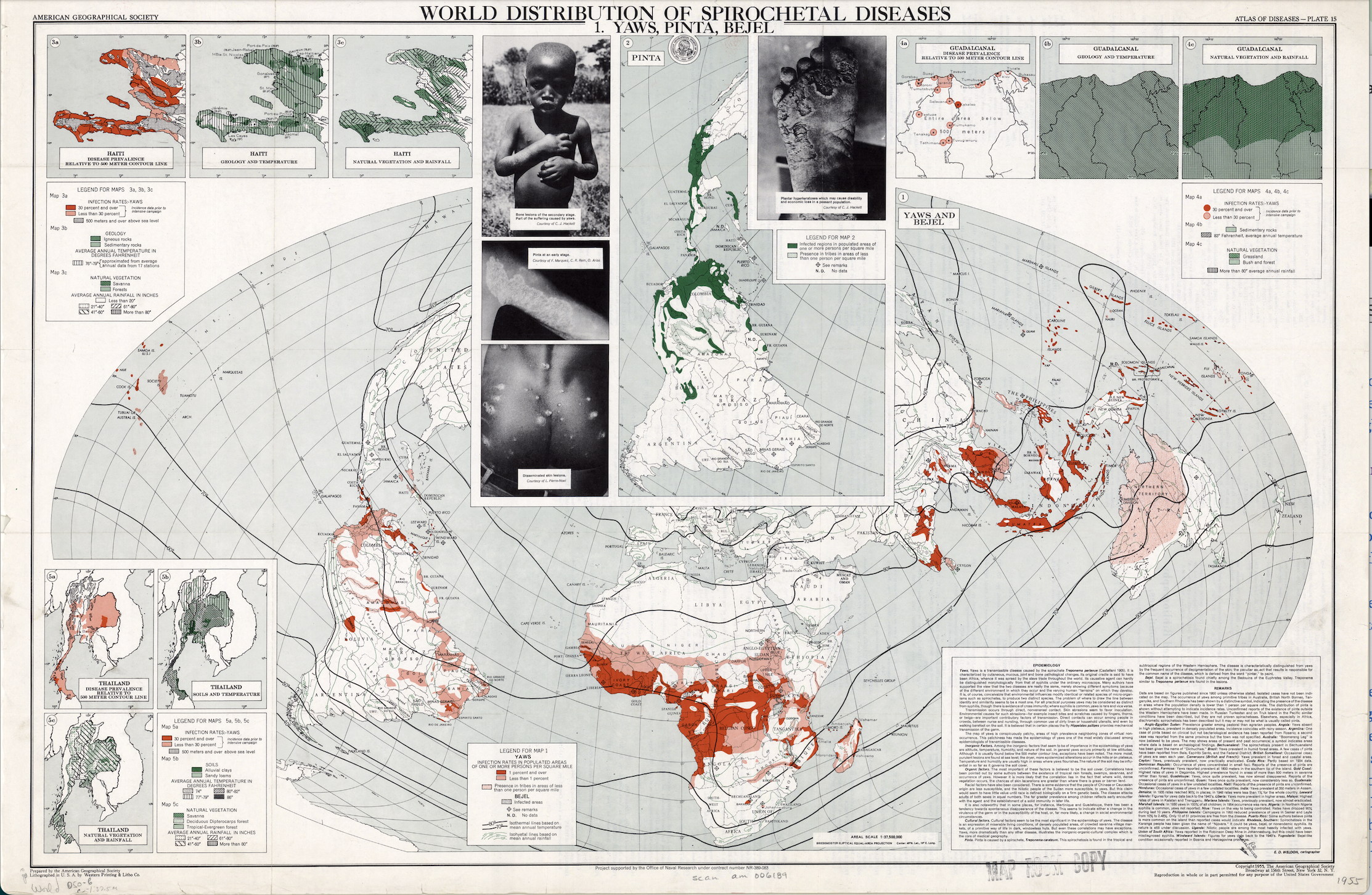
Created in 1950 by Dr. Jacques May, the “Atlas of Disease: World Distribution of Spirochetal Diseases” was created during the Cold War to mark the divide between the Northern and Southern Hemispheres, and more prominently, the so-called “First” and “Third” World countries. Part of a series which documented the global spread of many diseases, it reflected the rivalry between the United States and the Soviet Union. The map served as Cold War propaganda, highlighting the significance of worldwide modernization and suggesting the ease with which Africa and other “Third World” countries could be taken over by communism, which the United States saw as the ultimate threat. Sponsored through a collaboration of the American Geographic Society, the U.S. Armed Forces, and international pharmaceutical corporations, this map would instill a sense of fear in those who read it (including military officials in Vietnam, Congress, and Pfizer).
This was accomplished through specific rhetorical techniques of the mapmakers. They used the Briesemeister projection, painting Africa as the center of disease. Simultaneously, the Northern Hemisphere was covered, suggesting that the supposedly “First World,” northern countries are disease-free and therefore creating a division between these different areas of the world. The strategic use of the color red–a color associated with communism, bad outcomes, and alarm–as well as large, striking images of children and disease are impossible to ignore. They associate the countries portrayed on the map with only negative things, using photos of children to evoke sympathy and outrage, and a communist color to evoke fear.
Although these maps technically show accurate information, the American people in general had very little information about these countries, which are now embedded in their minds as only disease ridden. Additionally, while consumed primarily by Congress and other government employees, the maps are difficult to understand due to a lack of clear, easily consumable information, making the manipulative rhetorical elements all the more prominent. The heavy use of the color red in these maps, regardless of its intended representation of infection rates, could be perceived as an attempt to mislead viewers and manipulate them into associating communism with disease. For instance, dark red signifies an infection rate of 1% in one context and 30% in another, potentially leading to misconceptions. Notably, the maps seem to serve as a gateway to focus on “improving” certain countries, yet those nations are omitted from the conversation. This omission raises questions about the underlying motives and selective framing of information. Overall, despite technically providing accurate information, the lack of accessible details for the general public and the maps’ potential to reinforce biased perceptions makes the manipulative rhetorical elements more pronounced, especially when considering the limited awareness of the American people regarding these nations.
Propaganda maps, despite their surface appearance of presenting geographic relationships, often deviate from an objective portrayal of reality. In this context, the intentional exclusion of North America and substantial portions of Europe suggests a selective focus, potentially aimed at steering attention away from certain regions. The scientific assertions employed in these maps, reminiscent of the supposed scientific objectivity found in publications like National Geographic, carries a subtle bias against the “Third World” countries, hinting at an agenda despite claims of impartiality. Crucially, the organizations financing the creation of these maps are revealed to have personal, rhetorical agendas, shedding light on the underlying motivations that may compromise the maps’ objectivity and reinforce their propagandistic nature.