The Arctic is Shrinking!


2016 marks a new record low for the Arctic sea ice wintertime extent.  Frozen seawater at the top of the Arctic Ocean melts during the spring and summer and reforms during the fall and winter.  Sometime between February and April, the frozen seawater reaches its maximum yearly extent.  In 2016, that happened on March 24.  However, this year’s maximum extent is the lowest it has ever been (5.607 million square miles).  There was a slight decrease from 2015’s maximum extent (5.612 million square miles), which was the record low.  Over the past 3.5 decades, about 620,000 square miles of frozen seawater have been lost.  

There are a few reasons for this continued record lowering of the maximum extents.  One has to do with wind patterns – January and February’s wind patterns consisted of bringing warm air from the south to the Arctic, making ice cover expansion difficult.  Another reason for this record low is that the ocean is also growing warmer, which is not allowing the ice to extend as far as it used to.

This pattern is of great concern because the Arctic is essential in regulating the Earth’s temperature.  Its surface reflects the sun (solar energy) instead of the ocean absorbing it.  The loss of sea ice causes more areas to be open water, which will cause more heat to be put into the atmosphere.  A climate scientist at Rutgers University, Jennifer Francis, said “ […] As winter sea ice disappears, areas of unusually warm air temperatures in the Arctic will expand.  These are also areas of increased evaporation, and the resulting water vapor will contribute to increased cloudiness, which in winter, further warms the surface.”

The implications of this phenomenon are clear and dangerous.  


Source:  


https://www.sciencedaily.com/releases/2016/03/160328195126.htm
Science Daily is a great way to stay up to date on current research regarding a number of interesting topics.  I’d encourage you all to check it out when you have the time!

MyWATERS Mapper

http://watersgeo.epa.gov/mwm/

Curious about the water quality of streams and rivers near your house? Check out this website! MyWATERS Mapper shows snapshots of waterways right from the Environmental Protection Agency Office of Water program data. This website contains huge databases of information just a click away on an interactive map: the status of the National Pollutant Discharge Elimination System (NPDES), which is a program established under the Clean Water Act that controls water pollution by regulating point sources in the United States for each State; information from the Clean Watershed Needs Survey, which is a comprehensive assessment of the primary needs of waterways in order to meet the water quality goals laid out in the Clean Water Act; and finally, water quality assessments of nutrients, sedimentation, and pathogens levels.

I looked up a stream near my house in Philadelphia called Neshaminy Creek (Neshaminy was once a Native American tribe in the region) and discovered that it has a sedimentation problem from a non point source (which makes sense if sedimentation is caused by runoff). I was also able to observe other streams in the area and where they drained into the Delaware River, which is the receiving water body for most of the waterways in the region. The website even has downloadable data and enables you to create customized maps at national and local scales. One feature that would have made this website even better would have been a “watershed” layer that shows the watershed each waterway is part of. Another possible improvement would be to integrate this map with USGS databases on the peak stream flow, daily discharge, and flood frequency of waterways throughout the US. It would be interesting to investigate how these aspects compared with sedimentation TMDL or non point source pollution.

-Don Edmonds

National Weather Service

National Weather Service of the National Oceanic and Atmospheric Administration

http://www.weather.gov/

Many of us check the weather on a daily basis, simply wondering how to dress for the day. Well the National Weather Service (NWS) website is more than your basic weather app with all of the fancy graphics and animations. Instead the website is a comprehensive compilation of historical, real time, and prediction models of weather,  water and climate patterns. This website is a more serious and extensive source of weather information. The website is truly a valuable tool for a geographer.

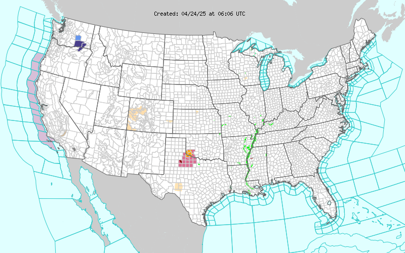
The mission of NWS is to provide weather, water, and climate data, forecasts and warnings for the protection of life and property and enhancement of the national economy. The website takes on the notion that weather can be very powerful and costly and takes all measures to ensure the American population is prepared for weather events. One of the major roles the website has is to share information about weather warnings. The first thing you see on the homepage of the website is a map of the United States divided up by counties. Some of the counties are shaded in different colors which correspond to different warnings. Beneath the map the websites lists 29 different types of warnings, watches, and advisories which include wind, tornadoes, floods, winter weather, and even high surf. This map is a useful tool to observe the weather patterns occurring nationwide as well as viewing the potential weather threats on a local scale. 

In addition, the website has countless other features. The most useful feature for the casual user is the customized forecast which allows you to search for weather by zip code. Like many other websites, it provides you with a overview of current weather a forecast for your local area. Unlike some other weather sites though, this forecast comes straight from the local NWS weather forecasting office, of which their are 122 nationwide. The website has many of the typical weather features you see on any other website, but far more detailed and comprehensive.Graphic of Air Quality Forecast Guidance for the CONUS

The website also provides countless other useful graphics like the one above which shows air quality or ozone concentration. Additionally the website has real time graphs and maps about floods and fires that can be very useful. The casual web surfer can learn so much about weather, and someone who understands how weather patterns work will be mesmerized by the wealth of information on this website. You could waste lots of time looking at all the historical trends and forecasts for all kinds of natural events that occur in the United States.

Finally the website has some very useful links about safety tips for all kinds of weather related events. This website is a good resource for any skill level of geographers. NWS has a respected name and their website has a very professional feel that would encourage me to use it more often for weather information especially now that I know more about how the atmosphere and hydrosphere work.

-Aaron


KidsGeo! Geography for the young’uns.

www.kidsgeo.com

It may seem rather juvenile to write my review about this site – and indeed, it is a website catering to children – but I thought it would add an interesting perspective to the overall course to review this type of geography-related website. This website, as an information base and resource, falls under the category of Tools of the Geographer; I will focus my review of website content on the material included about the Hydrosphere.

First impressions, which are usually visual, are very important – the aesthetics of this website are thus the first subject of my review. The color scheme doesn’t appeal to my personal eye; however, the bright and multiple colors will attract the attention of the children the site is made for; the images serve this same purpose. There is a lot going on, in terms of content and words, on the home page; the sheer amount of words and click-through opportunities are overwhelming and may detract from the ability of users to actually find the information they are looking for. Additionally, there are a few places on the page containing advertisements – it is not fitting, though, to have ads on a website catered towards young children.

The overall content of this site is quite broad in the scope of information it covers. Geography and geology, two broad studies of the Earth, are subjects within this website; individual topics include the atmosphere and its processes, the hydrosphere, the biosphere, and others. The range of subject matter is a strength of this site. Another strength is the inclusion of several other websites linked to this particular one, such as one that takes the site users to a different website about dinosaurs. The website, KidsGeo, is a good resource for curious children who have the desire and ability to search around and find information. The content and the wording used is very relatable to the audience; for example, in explaining salinity of the ocean, the text of the website asks the reader if they have ever tasted the ocean, and if so, what does it taste like?

This website has several sub-sections under the general category of the hydrosphere. These include some basic background information about water, specific details about each of the earth’s major oceans, several sections about the ocean, and a section about each of the other major existences of water (ice, lakes, rivers, etc.). There are images and diagrams within each section; the diagrams are over-simplified versions of the processes they describe, but simplicity is often beneficial in getting main ideas across – the simple diagrams are appropriate, then, for a kids’ geography website and for teaching them the primary concepts.

Overall, this website is rather visually overwhelming and very simple in regards to the depth of information covered. However, it serves its purpose as a resource for children to find out information about the earth.

–Natalie Somerville

ScienceDaily: Your resource for the latest research news

ScienceDaily is one of the most popular scientific websites. About 5,000,000 people visit this website monthly. One of the reasons that people prefer this website for their scientific research is that it is well organized and easy to search for topics that they want. The site has five big categories on the top: Health, Physical/Tech, Environment, Society/Education, and Quirky. There are more specified categories below these five categories like Space and Matters, Animals and Plants.

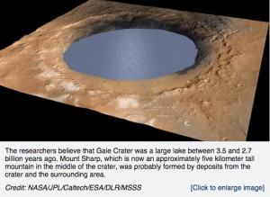
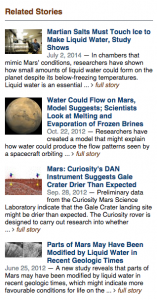
For example, if you are looking for a resource about Mars, you will go to Physical/Tech, Space and Matters, and click Mars. There is a research about Marsh might has a salty water. It provides summary of the news and information about the laboratory where the research was done. You will see the recent researches about Mars and the related stories additionally on the right side. In addition, “Related stories” section that recommends further research is shown based on your search topic. It helps you to gather more related information about the topic and to develop your study once you search, so that you do not have to search several times.

Screen Shot 2015-04-15 at 1.00.38 AMScreen Shot 2015-04-14 at 11.50.19 PM

The website is designed well for the young people who are interested in scientific issues. It has a Facebook page, Twitter, and Google+ so that you can get the latest news through them. And the website allows you to share the news on Facebook, Twitter, and Google+ simply clicking “Share this”.

The website is useful for our course, Geography 250 because it has great amount of resources about physical geography including Atmospheric, Biospheric, Hydrospheric, and Lithospheric news. In Space & Time section, there are detailed resources about space that can be linked with what we learned in chapter 3, the atmospheric composition. The earthquake news of the website announces a recent issue about the earthquake like Japan Quake and Tsunami Spurred Global Warming which can be associated with Chapter 12.

LiveScience

This website (LiveScience) does not just deal with geography topics specifically, as it offers a broad range of news sources and studies relating to a variety of scientific fields. Many of these stories relate to physical geography.  The website offers a variety of news stories, videos, and images concerning topics like health, space, and animals. The main tabs that I focused on covered “Planet Earth” and “Space.” The stories found on the “Planet Earth” included a large range of topics that we have discussed in class, such as the effects of global warming, access to freshwater, and the state of coral species who are reacting to warmer waters. The “Space” tab provided information such as the effects asteroids could have on Earth and Earth-size planets that could support life. All of these news stories are easy to read and include links to further scientific resources that could be used to learn more. Most stories are also accompanied by videos or photos to help illustrate the story.

LiveScience also shows the scientific topics of the day that are “trending,” such as global warming or military and spy technology. This site also offers links to other additional resources that relate to these scientific topics.

Overall, it is a helpful compilation of recent news stories that relate to a variety of scientific topics. They are fairly easy to read and can be understood by the general public. Based on our recent discussions in class, websites like these could be a helpful link to bridging the gap between the scientific community and the public on matters like global warming.

To visit the site: http://www.livescience.com/.

BiosphereSmart

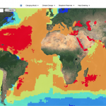
The website that I chose is an interactive tour of the world. The purpose of the website is to visually show how climate change has affected or will affect the Earth and its systems.  It’s also provides a good visual summary of how much humans have impacted these systems. It offers 4 categories to choose from: Changing World, Climate Change, Biosphere reserves, and Help greening. In changing world, users can choose from one of Earth’s 4 systems: Lithosphere, Hydrosphere, Atmosphere, and Biosphere as well as a 5th one, Antroposphere. Within each system, users can choose a variety of topics that are associated with each system and can visually see the distribution or levels of each topic around the world. Climate change category is of course all about climate change and it’s causes. Users can visually see all the changes that occur with climate change and where on the planet will be most affected. Biosphere reserves category shows the many reserves and world heritage sites on the planet today and their boundaries. Finally the last category, Help greening, talks about how humans can help to slow down climate change and make a contribution to the healthiness of the Earth.


This is a really good website in which it isn’t just about giving facts and information but provide visually appealing graphs/data/pictures, allowing users to quickly determine where on the Earth each topic is occurring. It provides a sense of scale. I really liked the website because instead of actually reading about what’s going on in the planet, I get to actually see how much damage is occurring to the world and where. And so this website relates to everything that we have been learning in class.

http://www.biospheresmart.org/#


Ocean Observatories Initiative

In the well-known television and film series, Star Trek, space is often referred to as the “final frontier.” However, much closer to home, the earth’s oceans remain relatively un-explored and a major mystery for scientists, geographers and oceanographers today. The website I reviewed is dedicated to a project aimed at answering the unanswered questions of the deep seas.


The website, http://www.interactiveoceans.washington.edu is designed to inform the public about the National Science Foundation Ocean Observatories Initiative. According to the website, a greater knowledge of the ocean’s interrelated systems is vital for increased understanding of effects on biodiversity, global warming, ocean and coastal ecosystems, environmental health and climate. Furthermore, the website stresses the need for more real time data, over extended periods of time, so that we can be better prepared for future catastrophic oceanic events. 


In order to accomplish these tasks, the National Science Foundation has created the mission of designing and constructing a U.S. regional cabled ocean observatory in the Northeast Pacific Ocean that will serve researchers, students, educators, policymakers, and the public. These cable networks will provide significant electrical power and high telecommunications bandwidth in real time to an array of sensors located on the sea floor and throughout the water column. The hope is that these cable systems will enable scientists to understand more fully the major ocean currents, active earthquake zones, creation of new seafloor, and marine plant and animal environments. 


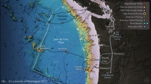
The first cable ocean observatory to be implemented will be launched with nearly 900 kilometers of cable across the Juan de Fuca tectonic plate, running from a shore station in Pacific City, Oregon, out to the Juan de Fuca Ridge and south along the Cascadia subduction zone to Hydrate Ridge.

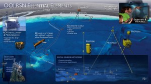
The website includes links to pages discussing what the project is, the technology and instruments involved, maps of where the sites will be, the research that the cable systems will provide, how it can be used as an educational too, data already collected, and a gallery of photos and maps. The picture below shows the essentials for the cable system.

This website was very interesting, and I highly recommend it if you are at all wondering how we are going to be monitoring oceans and oceanic events in the future (like ocean crust earthquakes and tsunamis).


Combining Geography and Art

In science, findings and knowledge are usually spread through papers and reports that are usually contained within the scientific community. Terrain.org is an online journal that helps ordinary people, environment enthusiasts, and experts spread their thoughts and findings through a very different channel: art.

On Terrain you can find literary art like poems and prose; you can find visual art like photographs and videos; or you can read informational pieces through nonfiction work, columns, interviews, and articles about urban centers. Terrain tries to connect the physical and natural environment to the built and human environment. Readers and viewers can really gain insight on issues involving these two contrasting realms. Terrain says that “the works contained within Terrain.org ultimately examine the physical realm around us, and how those environments influence us and each other physically, mentally, emotionally, and spiritually.”

Although the works are more personal pieces and not based on experimental findings, all topics pertain to either environmental/geographical issues or an individuals personal feelings on the topic. It’s a unique space and translator for the natural environment and gives a different perspective to physical geography than what we usually encounter in class.

Suggested Pieces:

BioMap2: Conservation Roadmap for Massachusetts

Antarctica: A Year in Photos by Ben Adkinson

Interview with Andres Duany ( Founder of Duany Plater-Zyberk & Company: the architectural firm in charge of the East End Transformation Project in Richmond)


The Climate Wizard

The Climate Wizard is an interactive map that allows users to view the future predictions for temperature and rainfall as well as historic records for any area in the world; available at http://www.climatewizard.org/ The Climate Wizard allows users to specify analysis area, time period, climate model, average temperature or precipitation, and average or change. Analysis area allows users to select either global or specific regions, such as a state, although increased zoom is available.  Climate model can also be changed to see different prediction levels; low, medium, high.

The interactive map allows users to visualize what a particular region of the world will look like in 2050 or 2080, hopefully educating users on the changes that can be expected. The Climate Wizard also allows users to look back over the past 50 years to see changes that may have already occurred. Modeling precipitation and average temperature may also help local governments and policy makers take climate into account in decision making.

The Climate Wizard was developed in a collaborative effort by The Nature Conservancy, University of Washington, and the University of Southern Mississippi in 2009. The data for creating the predictions for specific regions of the world was gathered from Oregon State University and a variety of other contributors that model changes in precipitation and temperature.  The Wizard uses data and predictions from the IPCC fourth report. Hopefully the Climate Wizard will be updated with the predictions from the IPCC fifth report.