An “Alternative Map”: The Vinland Map

vinland_map

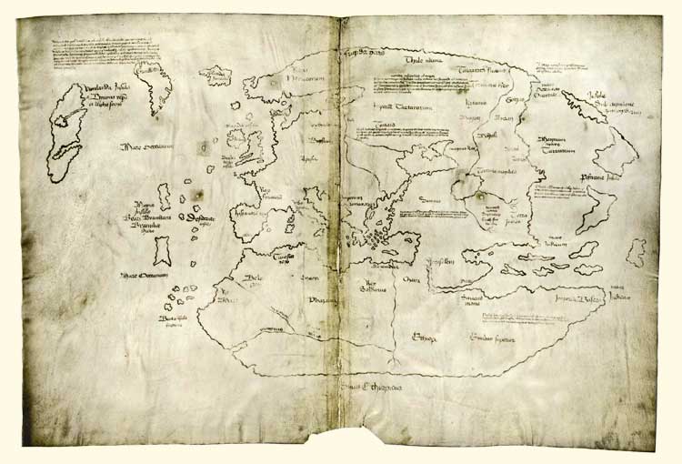
On the eve of Columbus Day, 1965, Yale University issued a statement that they possessed a map that disputed the agreed upon fact that Columbus discovered the New World. After this announcement, Yale received visits from many esteemed historians attempting to study the famous Vinland Map. Historians were enthusiastic about the new development of an authentic Viking map; the public’s reaction, far less accepting. The Vinland Map challenged the core knowledge of many Americans’ cultural heritage. Protests occurred and more attention was drawn to the map. As it turned out, more eyes didn’t help. Instead, historians were torn between authenticating the map and decrying it as a fake. All the evidence pointed to the map being forged by someone in the 1950s.

The Vinland map’s heavily debated authenticity is something to focus on. How is it that a map, with glaring falsities—like ink that was created in the post-Atomic era, and depictions of Greenland inconsistent with the beliefs at the time—can still be considered real? To some extent, some blame must be placed on Yale historians: the map was carbon dated to around AD 1434, was bound in an anthology of verified Medieval documents that had been collected by the Catholic church, and the black ink followed the process of yellowing and browning like a document contemporary to the time would (McCulloch). Yale historians saw these markers as undeniable proof and left their analysis of the map at that. The Vinland map would be an amazing collector’s item for Yale: the implications of this map were great enough, ground breaking enough, that despite the evidence against the map the context this map implied should be considered.
Not only are maps considered historical documents, their context regularly remains unquestioned. A map can be found of Jerusalem in the 1200’s that is wildly inaccurate, however it will be taken at its face value. The biases that the mapmaker had go unquestioned because the creators of maps often remain invisible. This phenomenon of the invisible author remains true in modern maps as well—historical maps simply have help write the history of a time period. A map like the Vinland map could very easily shift Viking history as we know it.
The Vikings were a civilization built on maritime travel, but up until the discovery of the Vinland Map it had been assumed that their voyages were done without maps. The Vinland Map verified many things: the use of maps in Viking society, knowledge of America pre-Columbus by the Catholic Church, and settlements in North America almost a century before Columbus. The map was released on the eve of Columbus Day, a publicity stunt by the university, and effectively outraged both American and European citizens alike. Suddenly the world-wide pat on the back that Columbus received was unwarranted (not that it wasn’t to begin with, but that’s another story) and the Americans who traced their lineage back to Columbus’ voyages felt somewhat lost on the importance of their heritage. This map questioned the identity many Americans found in Columbus’ discovery. The Vinland map muddled the authenticity of Spain’s discovery of the New World. Archaeologists questioned their findings in Scandinavia and historians took another look at the texts published on the Viking culture. Sooner, rather than later, archaeologists began new digs in Canada in an attempt to verify the settlement displayed on the map (Smithsonian Channel).
If all maps are biased and do not fully show the reality of the time—then what does a fake map show? As the years have passed more and more historical cartographers have labeled the map a ‘clever forgery’ (Goldstein). In 2008, Ohio State University published a 62-page paper that contained a majority of the evidence against the Vinland Map, and yet… The map continues to be cited to counter the argument of Columbus discovering the New World. Maps are used to interpret and help grasp the vastness of the world around us, in turn they are viewed as the reality. The Vinland Map quickly became the perceived reality of the 1430’s. Without developing news covering the dismantling of the map’s authenticity, the public continued to believe that the Vikings settled in American and the Roman Catholic church knew. Fake as the map was, it became part of their perception of history. As it turns out, even a fake map can impact history.

Secrets? A Viking Map. Documentary. Directed by Kenton Vaughn. 2012. Smithsonian Channel.
Goldstein, Thomas E. Conceptual Patterns Underlying the Vinland Map, (19:4, 321-331). Renaissance News, 1966
McCulloch, Huston. The Vinland Map—Some “Finer Points” of the Debate. Ohio State University. March, 2005.

Posted in Uncategorized | 1 Comment

Atlas of the Week: Food Environment Atlas

Food Environment Atlas

Atlas of the Week:

The Food Environment Atlas is produced by the United States Department of Agriculture’s Economic Research Service. The purpose of this atlas is to evaluate determinants of food choices and diet quality as well as examine communities’ abilities to obtain healthy food. The atlas includes a variety of maps that together create a full picture of the food environment in different communities, which is made up of factors such as restaurant availability, food assistance, and health and physical activity. This atlas can also shed light on the Food Insecurity Map chosen for the Map of the Week; maps in this atlas showing access/proximity to grocery stores and food prices/taxes might be useful in explaining why some areas experience greater amounts of food insecurity than others.

https://www.ers.usda.gov/data-products/food-environment-atlas/go-to-the-atlas/

Blog Link of the Week:

This blog showcases a variety of maps on topics including business, politics, arts and entertainment, and health. Some maps in this collection are scientific and educational, while most are purely for entertainment. Regardless, all provide the audience with new and unconventional ways of looking at the world. On this blog one can see which countries have the most expensive slice of pizza, what the shortest route between all the pubs in the UK is, and what the world looks like according to Donald Trump.

http://bigthink.com/articles?blog=strange-maps


Posted in Atlases of the Week | Comments Off on Atlas of the Week: Food Environment Atlas

Map the Meal Gap: Food Insecurity in the United States

Feeding America Map

This map produced by Feeding America represents food insecurity rates in the United States in 2014, though it hints at deeper issues of social injustice ingrained in American society. The map is broken down by states and counties, with each county colored in one of five shades of green. The shades represent different ranges of food insecurity, with the lightest shade representing food insecurity rates of 4-14% and the darkest shade representing food insecurity rates of 30% and above. Feeding America defines food insecurity as a “lack of access, at times, to enough food for an active, healthy life for all household members and limited or uncertain availability of nutritionally adequate foods” (Feeding America). Below the map, additional statistics on the topic are presented. In 2014, the United States was home to 48,135,000 food insecure people, with an average food insecurity rate of 15.4%. One particularly striking statistic is the fact that the annual food budget fell short of securing food for all those living in the country by $24,558,800,000.

When critiquing this map, one must keep in mind that it is produced and presented by Feeding America, a nonprofit organization whose very mission is to “feed America’s hungry through a nationwide network of member food banks and engage our country in the fight to end hunger” (Feeding America). Decoded, the second part of that statement essentially means get Americans to care about each other and donate money. One assumes that Feeding America goes through the trouble of collecting and organizing all of this data every year not simply to show off their cartography skills, but instead with the hope that their map will strike an empathetic and generous chord in the hearts of Americans and inspire them to donate. The choice of a map as the medium through which to communicate this information rather than simply presenting the facts in a research report allows the audience to see all of the information at one time and remember the issue more vividly, as they can recall the image of the map more easily than the text of a report. By presenting a map of the United States, the mapmakers are painting the issue of food insecurity onto a very familiar canvas. The map of the United States is recognizable for most Americans and often evokes a sense of patriotism. That pride in the greatness of the nation contrasted with the truly unjust issue of food insecurity strikes a compassionate tone in the American audience, prompting them to help the cause for the good of their nation.

Though there is an obvious intention with this map, its authors are fairly transparent in their research, providing methodologies explaining exactly how the map data was obtained. In the methodology reports, one can read that much of the data is composed of estimates generated from analyzing the relationship of food insecurity and food insecurity indicators at the state level and then considering the effect of those same indicators at the county level. The report of the methodology used in calculating the food budget shortfall also reveals the subjectivity of the mapping data. The final data takes into account the amount of money those who were food insecure reportedly needed to meet their foods goals, which varies from household to household. The way in which the map itself and the additional information are presented are rather simple. There is little labeling on the map, only contrasting colors showing the ranges of food insecurity; and below the map is a collection of simple, but shocking, pieces of information that help the audience better understand the scope of the issue, such as the number of food insecure people in the United States, the nation’s food insecurity rate, and the average meal cost. The mapmakers do not want to complicate the issue; as their intent is to enlighten and inspire, they presented the information as easily consumable as possible, giving the audience no trouble in understanding the issue and no excuse to ignore it.

I found it interesting to note that the regions of highest food insecurity are not where I originally expected them to be. When considering food insecurity, I assumed the regions most susceptible would be heavily populated cities, where homelessness and poverty are high. However, this map clearly demonstrates the extent of rural poverty in the United States, as food insecurity is prevalent in areas such as West Virginia, Kentucky, Missouri, Arkansas, Oklahoma, Texas, Mississippi, Alabama, Georgia, South Carolina, North Carolina, Florida, Maine, Arizona, New Mexico, Oregon, and Alaska, and not in the nation’s most heavily populated cities such as New York City, Los Angeles, Boston, Chicago, Philadelphia, and Washington D.C. This observation causes one to wonder why rural areas experiencing this epidemic of food poverty and what the correlation is between food poverty and other types of poverty such as homelessness or job insecurity. Many Americans are brought up believing that U.S. poverty exists mostly in large cities, where homelessness is obvious and prevalent, so many anti-poverty efforts are focused there. Therefore, until we actively seek out information or are presented with a map such as this, injustice in the distribution of resources continues to grow.

Disguised in this map are an onslaught of social justice issues. The deep South, New Mexico/Arizona, and Alaska represent three regions with some of the highest numbers in terms of food insecurity. These regions also, not by chance, are substantially inhabited by minority populations that have faced historic discrimination; the deep South is heavily populated by African Americans, New Mexico and Arizona are heavily populated by Native Americans and Latinos, and Alaska is heavily populated by Eskimos and Native Americans. This information about the demographics of the population, however, is not presented on this particular map. Even the newest students of cartography know that this effort to conceal was an intentional choice made by the mapmakers. Whether the reason was to maintain simplicity or perhaps to avoid evoking prejudices, key information is missing, and a comprehensive understanding of the issue is only possible when we put maps in dialogue with one another. By consulting a second map depicting ancestry by county, one is able to see that areas of high food insecurity are also areas inhabited by minority populations. These two maps speak to each other and enable us to notice an important correlation that cannot be overlooked. It is not simply a coincidence that minority communities are experiencing the largest amounts of food insecurity, and I think this dialogue hints at deeper issues of social injustice and historical discrimination that are embedded in the nation.

Works Cited

“Feeding America.” Feeding America. N.p., n.d. Web. 31 Jan. 2017.

Hickey, Walter. “The 22 Maps That Define America.” Business Insider. Business Insider,          04 July 2013. Web. 31 Jan. 2017.

Posted in Maps of the Week | Comments Off on Map the Meal Gap: Food Insecurity in the United States

Atlas of the Week: Atlas of the city of New York, Borough of Manhattan

This atlas contains maps representing the borough of Manhattan. This series of maps is interesting because of the time in which they were produced, in 1920s. During the 1920s, many African-Americans were migrating from the South to Northern cities like Boston and New York. Some of the maps in this atlases show the borough of Manhattan, which contains the famous Harlem neighborhood, right before this cultural explosion. This atlas will be one of the last to represent (or arguably create) a reality of New York without an African-American influence.

Posted in Atlases of the Week | Comments Off on Atlas of the Week: Atlas of the city of New York, Borough of Manhattan

Infographic: Is Your State’s Highest-Paid Employee a Coach? (Probably)


As you sit here, about to read this blog, a football coach is probably the highest paid public employee in your state. Or maybe it’s your basketball coach. Those are the big takeaways from Deadspin’s “Highest-Paid Public Employees” Map. Well that and 10 states that don’t care about sports primarily are probably paying a college president or dean the most. Either way, this maps speaks volumes to the priorities in America’s society.

This map makes the argument that majority of the American society places football or basketball as a top priority because they are willing to support these entities financially. At the same time the map would have viewers believe that only a small sliver of the public do not place sport as its top priority.In a society where sports like football and basketball are becoming increasingly popular, is it possible to think that these trends won’t continue?

I have to say that at first glance, this map gives me the impression that football and basketball rule the world. With 40 out of 50 states paying the coaches of football and basketball teams the most in the state, the questions about priorities can only become more prevalent. Now before you complain to your local politician, you should understand that most of these coaches’ salaries come from revenue earned from the teams. Some of the reported salary used for this map is comprised of “additional compensation” and this is made up of media appearances, apparel contracts, and fundraising. Before you rest easy, you should also know that only a small percentage of college football teams actually make a profit, and an even smaller percentage of basketball teams earn a profit (Dosh). Also, if the outside sources are not able to compensate their share of the coaches’ salary, the universities are responsible for the remainder.

Personally, this is not a shock to me as coaches have been getting outrageous salaries for what seems like an eternity. Football coaches have been selling to university boards the impact that football has on other points of interest for universities (such as admissions or recognition in general). Coaches have an argument for their salary, but what about the players. A map like this brings another controversial subject into question: Should college athletes be paid? Ever since the NCAA coined the term “student-athlete” colleges had a shield behind which they could hide and reap all of the financial benefits. These players are the attraction as I am certain that millions of people are not paying to see two coaches battle. It is about the players and the product on the field. I’m not saying that players should also be on salary because that could lead to an even more ridiculous map but a stipend or some type of compensation for their performance some more than justifiable. A map like this makes the argument of paying student-athletes and coaches at colleges much easier to discuss because of its simplicity. There is not a ton of figures or statistics to deter audiences from questioning why America prioritizes sports to this extent.

Reuben Fischer-Baum could have easily represented the data he collected using a table and accompanying it with a bar graph. Typically Fischer-Baum is driven to offer visualizations that force audiences to question a serious side of American sports. There is another Deadspin he published showing how menial the $765 million the NFL paid to former players in a concussion lawsuit. That was a bar graph that showed the disparity between the settlement payment and the revenue the NFL will earn over the payment period ($180 billion in revenue compared to $765 million). The payment comes out to be less than 1% of the revenue. Here, the power Fischer-Baum gains from using the flexible map is that he can show the distribution of preferences across the country.

Additionally, because this map was circulated all over television and copied onto various blogs, the message of questioning priorities was spread for all to see. The ease of circulation and discussion makes this map even more powerful. All kinds of audiences, because this caters to diverse demographics through its inclusive and inviting nature can debate over the priorities of America societies. This map could potentially be credited for the revolutionized American priorities because it caused many people to question society’s blind hegemonic relationship with sports. The nature of the map includes the typographical choices that were made (color, font, etc.).

The amount of yellow and orange that immediately hits the audience strikes as someone trying to send a bold message. Margaret Rhodes of Fast Company wrote in a review of the map, “In some ways, the color pattern of the map also parallels a red and blue electoral map.” By having this map paralleled, to an electoral map, there’s an undercurrent of persuasion, change of thought, and coercion. I agree with Rhodes as the more liberal states appear to have college officials as their highest paid officials, while the more conservative states have football coaches as their highest paid officials. This can open a dialogue about regional preferences and politics but that is for another blog. Fischer-Baum makes a point of Texas, a state that paid its football coach at the time Mack Brown $5 million. The team went 8-5, which by college football standards is quite poor. However, the team garnered over $100 million of revenue for the University of Texas. This indicates as Fischer-Baum put it, “You don’t have to pay someone $5 million to earn football revenue in Texas.”

Another aesthetic element to the map is, the use of large text in this map is important because it removes the barriers to understanding and increases the simplicity of the map. Immediately, as you look at this map the large text of Football Coach and Basketball Coach are somewhat overwhelming. It makes you question the American society and the preferences of the society. After I looked the map, it took some time to remember that there are other things of importance to prioritize in America. At the same time the large text helps Fischer-Baum achieve one of his central goals, forcing audiences to question serious issues occurring in our sports and society. Because there is really just the large, overwhelming text and contrasting colors, audiences can debate and discuss why American priorities are the way they are. Intuitively, if we value something, we will pay for it. Here the message is we value football and basketball more than education or government or anything else for that matter. Fischer-Baum’s map provokes a few important questions: Does it make sense that these sport coaches are the highest paid employees in 40 of 50 states because they can help bring in millions from devotes fans? Or is it a terrible budget plan leading to the demise of college sport? Right now, I do not have the answers to these questions. I do know this, the preferences of our democratic land are reduced by this map to sports and not sports. And sports reign supreme.


-Quincy McKoy


Works Cited

Dosh, Kristi. “Texas Tops in NCAA Football Profit, Revenue.” ESPN. ESPN Internet Ventures,
12 Dec. 2012. Web. 01 Dec. 2014. <http://espn.go.com/blog/playbook/dollars/post/_/id/2556/texas-tops-in-football-profit-revenue>.

Fischer-Baum, Reuben. “Infographic: Is Your State’s Highest-Paid Employee A Coach?
(Probably).” Deadspin. Gawker Media, 09 May 2013. Web. 15 Nov. 2014

Rhodes, Margaret. “Infographic: Who’s The Highest-Paid Public Employee In Your State?”
Co.Design. Fast Company Magazine, 25 June 2013. Web. 15 Nov. 2014.

Posted in Maps of the Week | 2 Comments

North Korea’s Largest Concentration Camps on Google Earth

overview-of-north-koreas-concentration-and-labor-camp-system.jpg

The Committee for Human Rights in North Korea and other human rights activist groups have used the satellite software, Google Earth, to locate North Korea’s concentration camps. The Committee for Human Rights in North Korea estimates that approximately 120,000 people are held in government owned-military operated concentration and detention camps. In this series of maps of North Korean, different maps show satellite views of the camps, bird’s eye view of the camps, and also the location of nuclear test sites in close proximity to camp sites. It is believed by many activists that prisoners in these detention camps are forced to work in dangerous conditions such as nuclear testing sites and mining for up to 16 hours per day.

North Korean government officials have vehemently denied the existence of detention camps in North Korea however satellite images and witness accounts prove otherwise. Survivors and escapees of these camps claim that the camps are mainly run by the National Security (bowibu) and the People’s Security Agency (anjeonbu) two government organizations. The detention camps are divided into three subcategories, Kwan-li-so political prison camps, Kyo-hwa-so labor education camps, and Jip-kyul-so / Ro don dan ryeon dae regional collection and labor-training camps. Failed attempts to escape North Korea’s concentration camps result in execution.

-Travis and Avery
Posted in Uncategorized | 3 Comments

Failed States Index


These maps were created by an organization called Fund for Peace. The Fund for Peace is a non-profit organization that works to promote sustainable security worldwide and prevent violent conflict through research training and education. They focus on the problems of struggling, or failing states and work to create practical and approachable tools to avoid conflict. We discussed the significance of the Fund for Peace and their contribution to promoting sustainability. The main objective of these maps is to promote greater sustainable security, which is the ability of a state to solve its own problems peacefully without an external military or administrative presence. In our presentation, on of the first things students noticed was the color gradient. A “green” country is normally considered more sustainable, so in the map, the color green indicates a more sustainable country. The color red is very bold, so it indicates that the country needs to change what it is doing because it is a failed state. Labelling a state as failed, however, has created many issues. It is argued that it eliminates all hope for future success. Therefore, in 2014, the index was renamed the “Fragile States Index” to imply that the state still has potential and has not completely failed. Although our discussion time was cut short, we still were able to learn some very interesting new things about this breaking news.

-Cynthia and Lauren

Posted in Uncategorized | Comments Off on Failed States Index

Failed States Index Presentation

The Fragile States Index map provides a unique analysis of the world in its insistence upon numerical data in addition to a colorful approach. Perhaps the most important aspect is the sheer amount of data implicated by the map itself, then through the actual data provided alongside the map to back up its points. The map reflects countless hours of research by its creators, the Fund for Peace. The group plays an important part in full understanding of the map, as they are a nonpartisan, non-profit group based in Washington DC yet with international ties. They view themselves as unbiased creators, yet by creating the map they are asserting opinions into the national field. The group is interjecting the opinion that outside action should be taken in international affairs to better stabilize the world as a whole.

It defied some expectations with a number of nations which are more or less “Fragile” than others. Others met expectations, such as the African countries of Sudan and Somalia which were deemed most fragile, as well as the Scandinavian countries which topped the list as least fragile. The use of colors make the map into this sort of stoplight, where green suggests approval and red gives a dark message to discontinue current actions and change the current situation. As we’ve studied, red was often used in Cold War mapping and suggests an ominous, dark tone. It’s quite alarming that such a relatively low proportion of the world is listed as Sustainable. The use of colors in this way gives the idea that the green or yellow, stabile nations should act as overseers in world affairs and shift the map to become more stabile.

Lastly, the data must be looked at for a complete view of the map, as without it we are simply taking the map for granted. The charts available on the Fund for Peace website give in depth analysis by listing various categories which comprise sustainability, from economic situation to human rights status. It gives each country’s numerical status and appears that the data has been well researched and well composed with the number of data and accompanying research articles. Without directly stating the intentions the creators of the map will use it for, the map and website allow onlookers to make their own conclusions about world politics.

-Ellen Brooks and Mike Olano

Posted in Uncategorized | Comments Off on Failed States Index Presentation

Team Map Presentation: North Korean Prison Camps


There is estimated to be as many as 120,000 people being held in North Korean Prison Camps. 400,000 people have died in these camps from torture, starvation, disease, and execution.  This is a pressing issue that has been brought into the spotlight by two guys, Daniel and Joshua, through their use of Google Earth technology. Their blog, One Free Korea, is a compilation of Google Earth images taken of North Korean Prison Camps. Through the use of Google Earth technology they were able to map out prison camps and show the world that these places really do exist. The significance of this project, aside from the fact that it was able to draw attention to blatant human rights violations in North Korea, is that these two average guys were able to obtain this very sensitive information from Google Earth.

We really liked how our presentation turned out. The class was very responsive and seemed to enjoy some of the elements that we tried to incorporate. One of the first things that got people involved was a video that we showed. In it Shin Dong Hyuk, one of the only people ever to escape from a North Korean prison camp, recounts his life as a prisoner at one of the labor camps in North Korea. Although his explanation of his life included some disturbing moments, it really brought to life the severity of this situation. This led to a discussion about why this issue isn’t more publicized and why a majority of people in the United States have never even heard of these prison camps. The class discussion was lively and engaging, and led to the exploration of other pressing issues. We explored whether or not North Korea was entitled to privacy within their own borders and what were the potential implications of Google Earth technology on national security. For every question we had for the class, it seemed like the class would immediately raise a new question. This back and forth led to a constructive dialogue that emphasized the potential implications of this groundbreaking technology.

Bibliography:

Bielefeld, Daniel. “North Korea’s Largest Concentration Camps on Google Earth.” One Free Korea.

N.p., n.d. Web. 4 Dec. 2014. <http://freekorea.us/>.

Dong-hyuk, Shin. “Prison Camp Escapee: North Korea Won’t Change Its Repressive Ways.” CNN. N.p.,

n.d. Web. 4 Dec. 2014. <http://www.cnn.com/2014/10/27/opinion/

north-korea-prisoner-human-rights/>.


-Sam & Jack


Posted in Uncategorized | Comments Off on Team Map Presentation: North Korean Prison Camps

Map of European Language Origins

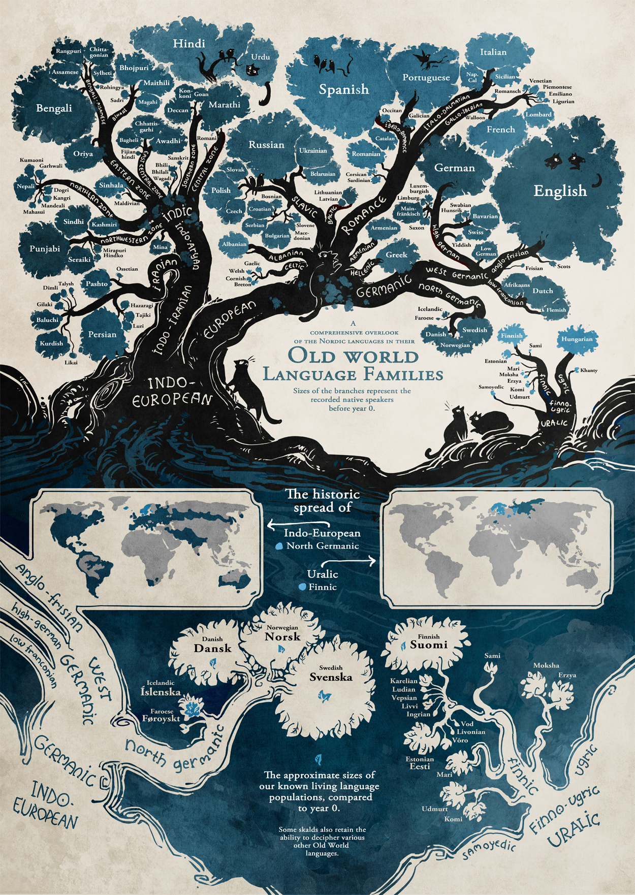
What is a map? Typically people might assume that a map has to be an outright depiction that clearly shows the reader to a destination. Today I present something that might not usually be counted as a map: an image depicting the growth and history of old-world European languages. This image might not appear to be a map on the surface, as it contains very few instances of typical map components, such as landmasses or cardinal directions, etc. However, I believe that this can be considered a map despite its lack of typical map pieces, because the basis behind its main point is to help aid and guide its viewers towards understanding the foundation of language and its originations in Europe. In addition, just as a landmass might signify that a certain group of people would live there, the leaves on the trees of this map similarly describe how a certain linguistic group occupies space together; these groupings can be seen akin to any geographic collection of people. Just as any other “traditional” map’s main focus is to help its readers reach a certain location, such as a country or an island, this map is similarly focused on bringing its readers to realizations regarding its focal point of language. As far as this point goes, its important for the reader to realize how far back they can trace their own linguistic origins, and to see how connected languages that might seem polar opposites, are.

When I first saw this map I was struck by its elegant and effective use of artistic technique, which it uses in order to facilitate the readers understanding of linguistic origins. One particular artistic piece which is most prevalent in this map is the usage of tree-imagery in order to symbolize the growth and breaking off of different sects of languages and dialects, just as branches stem off from the main trunk. For example, through this imagery, one can clearly see the monumental split in language that occurred thousands of years ago, that in turn caused a division between two entirely separate linguistic families; European and Indo-European. This tree illustration also helps the reader better understand the popularity of each language, as the thicker trunks were often more popular language families, leading to in turn, the languages with the highest popularity being accompanied by the larger leaf groups seen at the end of each branch. This effective use of foliage-based imagery aids the reader in their understanding of the map through a number of symbolic pieces. This map was certainly made for the enjoyment of the masses, as it displays a usually complicated topic very succinctly and fascinatingly enough so not to lose the readers attention. The author clearly thought to approach the map less from a scientifically correct stance and more from an artistic map that also gets the point across. A linguist might have lots of points to add to this map, but certainly the existing assumptions the map presents are also factually true.

This map has a unique ability in that it is able to show readers the true “roots” of the languages that we speak today. This map truly allowed me to see how the English I speak today shares common origins with a number of languages that I might consider quite different from English. Through its numerous artistic iconography, this map shows how language has developed, changed and evolved over time, and this stemming off of different linguistic sects allows the reader to wonder and question what might have caused these significant changes, be it cultural, ethnic or other.  This map faces a number of limitations regarding the information it presents. Perhaps the most glaring limitation is the sole inclusion of Indo-European languages in the map. While the title shows that this was the aim of the mapmaker, the addition of African or other similar languages might aid greatly in helping people who might not speak one of the languages on the existing map, find their linguistic roots. In addition, the expansion of actual textual explanation regarding the expansion of languages since 0 AD would be highly beneficial, yet at the same time might jeopardize this maps artistic purpose, as it could clutter and take away from the image.

Posted in Uncategorized | Comments Off on Map of European Language Origins