
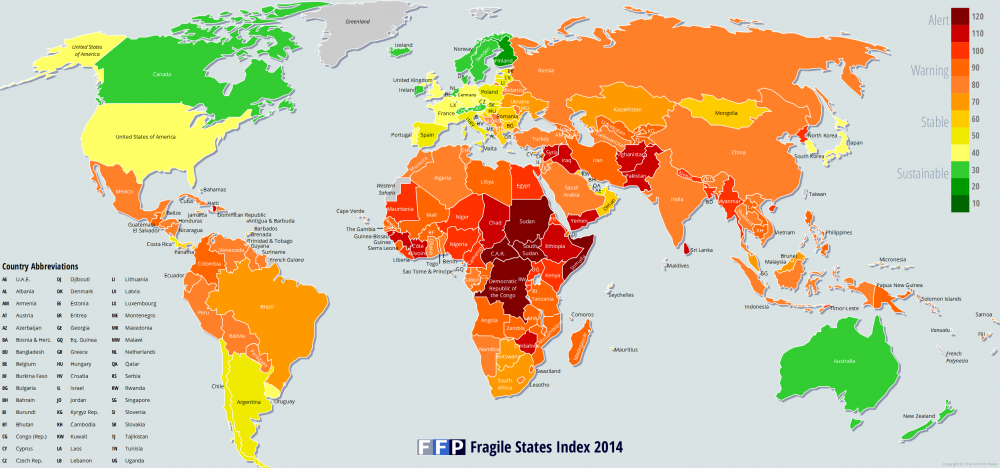
The Fragile States Index map provides a unique analysis of the world in its insistence upon numerical data in addition to a colorful approach. Perhaps the most important aspect is the sheer amount of data implicated by the map itself, then through the actual data provided alongside the map to back up its points. The map reflects countless hours of research by its creators, the Fund for Peace. The group plays an important part in full understanding of the map, as they are a nonpartisan, non-profit group based in Washington DC yet with international ties. They view themselves as unbiased creators, yet by creating the map they are asserting opinions into the national field. The group is interjecting the opinion that outside action should be taken in international affairs to better stabilize the world as a whole.
It defied some expectations with a number of nations which are more or less “Fragile” than others. Others met expectations, such as the African countries of Sudan and Somalia which were deemed most fragile, as well as the Scandinavian countries which topped the list as least fragile. The use of colors make the map into this sort of stoplight, where green suggests approval and red gives a dark message to discontinue current actions and change the current situation. As we’ve studied, red was often used in Cold War mapping and suggests an ominous, dark tone. It’s quite alarming that such a relatively low proportion of the world is listed as Sustainable. The use of colors in this way gives the idea that the green or yellow, stabile nations should act as overseers in world affairs and shift the map to become more stabile.
Lastly, the data must be looked at for a complete view of the map, as without it we are simply taking the map for granted. The charts available on the Fund for Peace website give in depth analysis by listing various categories which comprise sustainability, from economic situation to human rights status. It gives each country’s numerical status and appears that the data has been well researched and well composed with the number of data and accompanying research articles. Without directly stating the intentions the creators of the map will use it for, the map and website allow onlookers to make their own conclusions about world politics.
-Ellen Brooks and Mike Olano