
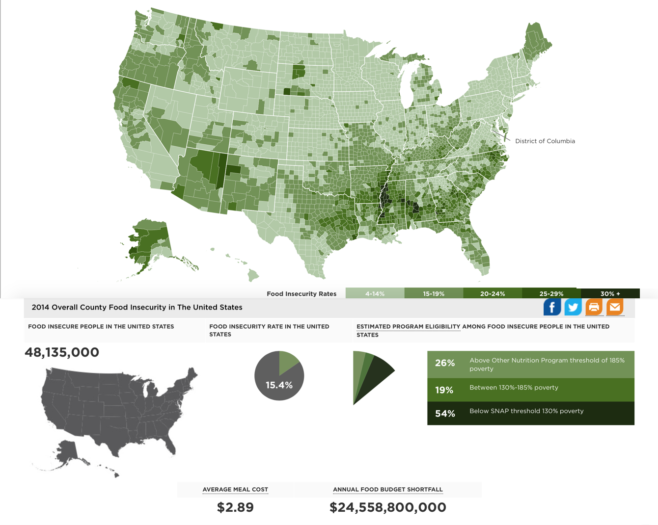
This map produced by Feeding America represents food insecurity rates in the United States in 2014, though it hints at deeper issues of social injustice ingrained in American society. The map is broken down by states and counties, with each county colored in one of five shades of green. The shades represent different ranges of food insecurity, with the lightest shade representing food insecurity rates of 4-14% and the darkest shade representing food insecurity rates of 30% and above. Feeding America defines food insecurity as a “lack of access, at times, to enough food for an active, healthy life for all household members and limited or uncertain availability of nutritionally adequate foods” (Feeding America). Below the map, additional statistics on the topic are presented. In 2014, the United States was home to 48,135,000 food insecure people, with an average food insecurity rate of 15.4%. One particularly striking statistic is the fact that the annual food budget fell short of securing food for all those living in the country by $24,558,800,000.
When critiquing this map, one must keep in mind that it is produced and presented by Feeding America, a nonprofit organization whose very mission is to “feed America’s hungry through a nationwide network of member food banks and engage our country in the fight to end hunger” (Feeding America). Decoded, the second part of that statement essentially means get Americans to care about each other and donate money. One assumes that Feeding America goes through the trouble of collecting and organizing all of this data every year not simply to show off their cartography skills, but instead with the hope that their map will strike an empathetic and generous chord in the hearts of Americans and inspire them to donate. The choice of a map as the medium through which to communicate this information rather than simply presenting the facts in a research report allows the audience to see all of the information at one time and remember the issue more vividly, as they can recall the image of the map more easily than the text of a report. By presenting a map of the United States, the mapmakers are painting the issue of food insecurity onto a very familiar canvas. The map of the United States is recognizable for most Americans and often evokes a sense of patriotism. That pride in the greatness of the nation contrasted with the truly unjust issue of food insecurity strikes a compassionate tone in the American audience, prompting them to help the cause for the good of their nation.
Though there is an obvious intention with this map, its authors are fairly transparent in their research, providing methodologies explaining exactly how the map data was obtained. In the methodology reports, one can read that much of the data is composed of estimates generated from analyzing the relationship of food insecurity and food insecurity indicators at the state level and then considering the effect of those same indicators at the county level. The report of the methodology used in calculating the food budget shortfall also reveals the subjectivity of the mapping data. The final data takes into account the amount of money those who were food insecure reportedly needed to meet their foods goals, which varies from household to household. The way in which the map itself and the additional information are presented are rather simple. There is little labeling on the map, only contrasting colors showing the ranges of food insecurity; and below the map is a collection of simple, but shocking, pieces of information that help the audience better understand the scope of the issue, such as the number of food insecure people in the United States, the nation’s food insecurity rate, and the average meal cost. The mapmakers do not want to complicate the issue; as their intent is to enlighten and inspire, they presented the information as easily consumable as possible, giving the audience no trouble in understanding the issue and no excuse to ignore it.
I found it interesting to note that the regions of highest food insecurity are not where I originally expected them to be. When considering food insecurity, I assumed the regions most susceptible would be heavily populated cities, where homelessness and poverty are high. However, this map clearly demonstrates the extent of rural poverty in the United States, as food insecurity is prevalent in areas such as West Virginia, Kentucky, Missouri, Arkansas, Oklahoma, Texas, Mississippi, Alabama, Georgia, South Carolina, North Carolina, Florida, Maine, Arizona, New Mexico, Oregon, and Alaska, and not in the nation’s most heavily populated cities such as New York City, Los Angeles, Boston, Chicago, Philadelphia, and Washington D.C. This observation causes one to wonder why rural areas experiencing this epidemic of food poverty and what the correlation is between food poverty and other types of poverty such as homelessness or job insecurity. Many Americans are brought up believing that U.S. poverty exists mostly in large cities, where homelessness is obvious and prevalent, so many anti-poverty efforts are focused there. Therefore, until we actively seek out information or are presented with a map such as this, injustice in the distribution of resources continues to grow.
Disguised in this map are an onslaught of social justice issues. The deep South, New Mexico/Arizona, and Alaska represent three regions with some of the highest numbers in terms of food insecurity. These regions also, not by chance, are substantially inhabited by minority populations that have faced historic discrimination; the deep South is heavily populated by African Americans, New Mexico and Arizona are heavily populated by Native Americans and Latinos, and Alaska is heavily populated by Eskimos and Native Americans. This information about the demographics of the population, however, is not presented on this particular map. Even the newest students of cartography know that this effort to conceal was an intentional choice made by the mapmakers. Whether the reason was to maintain simplicity or perhaps to avoid evoking prejudices, key information is missing, and a comprehensive understanding of the issue is only possible when we put maps in dialogue with one another. By consulting a second map depicting ancestry by county, one is able to see that areas of high food insecurity are also areas inhabited by minority populations. These two maps speak to each other and enable us to notice an important correlation that cannot be overlooked. It is not simply a coincidence that minority communities are experiencing the largest amounts of food insecurity, and I think this dialogue hints at deeper issues of social injustice and historical discrimination that are embedded in the nation.
Works Cited
“Feeding America.” Feeding America. N.p., n.d. Web. 31 Jan. 2017.
Hickey, Walter. “The 22 Maps That Define America.” Business Insider. Business Insider, 04 July 2013. Web. 31 Jan. 2017.