Atlas of the Week

Concise Atlas of the World (Sixth Edition) by DK Publishing, Inc. is the atlas of the week.  This atlas contains over 400 maps.  Many of the maps in this atlas utilized the latest digital mapping techniques, allowing for more detail than ever before.  This atlas helps us to understand our place in the world by allowing us to see our relative location to other places in the world.  There is a physical copy of the atlas in the Boatwright Memorial Library at the University of Richmond, for those who would like to check it out.

Posted in Atlases of the Week | Comments Off on Atlas of the Week

The United States Interstate Highway Map

It is impossible for maps to be neutral.  

Mapmakers decide what information to include and exclude from their maps.  Their choices reflect their personal values, beliefs, and knowledge of the world around them.  Therefore, all maps communicate their mapmakers’ bias, whether or not this is the mapmakers intention.

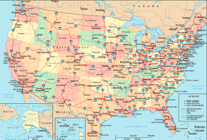
This is true for all maps, including the United States Interstate Highway Map by OnlineAtlas.us.  

President Dwight D. Eisenhower listed the benefits of an Interstate Highway System in a speech to the Governors’ Conference in 1954.  These benefits included increased safety, less congestion, a stronger economy, and better defense “should an atomic war come.”

On June 25, 1956, President Eisenhower signed the Federal-Aid Highway Act of 1956.  The Federal-Aid Highway Act of 1956 established a 41,000-mile National System of Interstate and Defense Highways, which has become known as the Interstate Highway System.

The United States Interstate Highway System has allowed industries to spread and grow, encouraged rural areas to be further away from cities, and created a jump in U.S. employment since being built.  Over the past fifty years, the highways have authorized unprecedented economic growth and opportunities for millions of Americans.

At first glance, it may seem like the United States Interstate Highway Map is a simple map that shows paved roads in the United States, but this is clearly not the case.  

First, the mapmakers had to choose how to project the United States.  They chose to put the North at the top of the map and the South at the bottom.  Why not the other way around?  

There is no correct way to orient the United States – the idea of a “north” and a “south” is a social construct.  It would make sense, however, that the Americans who created this map would put North at the top of the map, as it hints at a superiority of their home country – the United States.

Second, the mapmakers saw it fit to include state names, as well as state capitals.  This could have been to show how the interstate highway created an interconnectedness between the different major cities of the United States.  

The United States becomes safer and more efficient as it increases its interconnectedness, and therefore, the impact of the interstate highway is clearer when one can see what cities it goes through.

The map also showcases the areas that are not connected by the interstate highway, perhaps hinting at the idea that those locations are not as important, or are inferior, to the interconnected locations.   

Third, the mapmakers selected certain colors to represent the different states.  How come Florida and Maine are colored red, while Nebraska and Oregon are colored yellow?  Is there some kind of similarity between states with the same color, or were the colors picked at random?  

It seems that the colors were picked at random to make state lines more clear, but that could be an incorrect assumption.  There could be a similarity between the same color states that the mapmakers are trying to convey in their map, though there is no way to know for sure by simply observing the map.

Fourth, the mapmakers chose to include the major lakes in their map.  Why would they do this?  What does that add to the map of the interstate highway?  Perhaps, it shows the power of the United States, since there seem to be more man made highways than natural rivers on the map.

Lastly, the mapmakers decided to include Alaska and Hawaii on the map, despite the fact they do not contain any interstate or U.S. highways.  It is possible they did this to show the unity of the United States, despite the lack of physical unity it has.

The United States Interstate Highway map shows how much power a map can contain.  Since the map seems to be straightforward, people may accept the map as truth, and nothing but the truth.  This map excludes as much as it includes, however, giving the onlooker a limited version of the truth.

People may observe this map and start to believe that Nebraska and Oregon share an innate similarity to one another, some areas of the United States are superior to others, and/or we have connected our country to a greater extent than have our natural waterways – but these observations lack a depth of knowledge that is required to make such claims.  

As people living in this map-filled world, we must be critical thinkers who question the knowledge that is presented to us.  If we would like to further the human population’s knowledge and exploration, we must be active participants in the dissemination of correct and unbiased information.

Maps are not neutral, but if we realize this and deal with them carefully, maps can become greatly useful to us and they can lead us to new and exciting experiences.


Resources

The Editors of Encyclopædia Britannica. “Mercator Projection.” Encyclopædia Britannica, Encyclopædia Britannica, Inc., 16 Aug. 2013, www.britannica.com/science/Mercator-projection.

“Impact.” The History of the Interstate Highway System, highway.umwblogs.org/impact/.

Molloy, Antonia. “Gerardus Mercator: 3 Ways Influential Cartographer Changed the Way We Look at the World.” The Independent, Independent Digital News and Media, 5 Mar. 2015,www.independent.co.uk/news/world/gerardus-mercator-how-the-cartographers-map-could-be-influencing-your-view-of-the-world-in-ways-you-10087386.html.

United States. Congress. House. Committee on Transportation and Infrastructure. Recognizing the 50th Anniversary of the Interstate Highway System: Report (to Accompany H. Con. Res. 372). [Washington, D.C.: U.S. G.P.O.], 2006.

“United States Highway Map.” United States Interstate Highway Map, Online Atlas, www.onlineatlas.us/interstate-highways.htm.

Weingroff, Richard F. “Highway History.” U.S. Department of Transportation/Federal Highway Administration, 27 June 2017, www.fhwa.dot.gov/infrastructure/originalintent.cfm.


Posted in Maps of the Week | 2 Comments

Governed Claims of Antartica Map Critique

Most people are completely unaware that areas of Antartica have been politically claimed for centuries. So it is easy to see why a map such as this might be completely alien to the average viewer. Claims on Antarctica go back as far as 1493 when Spain claimed a large section of Antarctica directly south of their territory in modern day Argentina and Chile. Spain’s claim of Antarctica was even mediated by the Catholic Church who was the recognized arbiter of international claims during that time period. Much later, from 1908 to 1917, the United Kingdom continued to press claims from the Falkland Islands to the south pole completely overlapping the old Spanish claims. After United Kingdom claimed part of Antarctica the rest of the world jumped into the game and claims were made by a multitude of countries which included Norway, Nazi Germany, the Soviet Union, France, Australia, and New Zealand. Meanwhile Argentina and Chile, which had now been separate independent nations from Spain for centuries, argued that the old Spanish claims on Antarctica were now theirs. This led to conflict with the United Kingdom since their claims overlapped so a fleet from the Royal Navy was sent down to intercede the South American nations from occupying the area in Antarctica. (1)

While there are now many treaties that have been agreed upon and internationally recognized, many countries do not recognize any claims over Antarctica and proclaim that Antarctica should remain free from sovereign borders. This includes the United States of America, who is the largest supporter of a free Antarctica. That is why from an American perspective, this map’s existence is an alien idea. The power of this type of map is that it seems to be a completely neutral view, even while it is pushing its political agenda. This map keeps alive the idea of imperialism and colonialism by western countries. It attempts to validate the claims on Antarctica simply by existing. This map is colonial in nature, and because of that a viewer might presume that every country with claimed lands has settlements of members of each nation in their territories. This idea couldn’t be farther from the truth. Many countries not listed on this map have small operating bases all over Antarctica and many countries with claims have no operations in Antarctica at all. (2)

But my critique on the map does not stop at the map’s existence. It is impossible to miss the simplicity of this map as a whole. But as you dive deeper into the realism behind the simplicity it is easy to notice that this stems from the lay out of the claims. All of the claims are in the shape of a sector, with the vertex at the south pole. This goes to show how abstract these claims are. While looking at this map one should question the legitimacy of a border that is two straight lines along exact longitudes.

The orientation of Antarctica in this map shows the dominance of the Western World in the author’s decisions. If the south pole is the center how does the author orientate the continent? His decision seems to be directly inspired by the common positioning of most western maps. The part of the continent facing towards the top of the image is south of the Atlantic Ocean and the continent of Europe. But it’s not just the orientation on of the map that required abstract choices from the author. Even the colors on this map were a conscious decision they had to make. Once you’ve looked at enough western political maps you become aware that many countries are almost always depicted in the same color. Red for the United Kingdom and blue for France are the most common color associations. This choice shows the importance of these two countries to the author over the rest. New Zealand and Australia’s flags are also red, white, and blue. So why are they depicted in black and yellow? The truth is that the author is probably adhering to his audience which consists of mostly Americans, and Western Europeans.

This map hides its deeply political agenda through the facade of being scientific and objectively factual.  But all maps that talk about the existence of claims on a territory are inherently political. The author’s conscious decisions of only showing certain sovereign claims, choosing how to color each country’s territory, and orientating the map in a specific way, all illustrate the ideas what the author wants the viewer to take away from this map.

Sources

http://discoveringantarctica.org.uk/how-is-antarctica-governed/the-antarctic-treaty/making-claims/

  1. http://www.antarctica.gov.au/law-and-treaty/history/antarctic-territorial-claims
  2. http://www.coolantarctica.com/Community/antarctic_bases.php

Atlas

https://www.ncddc.noaa.gov/website/google_maps/OE/mapsOE.htm

This Atlas consists of all of the deep ocean exploration sites since 2001. This interestingly interactive digital atlas will make a great edition to our collection. And I’m not just saying that because I watched The Titanic recently and became very inspired by Steven Spielberg.

Posted in Uncategorized | 1 Comment

An Atlas of International Migration

The An Atlas of International Migration, published by Aaron Segal in 1993, presents you with interesting maps about major international migrations, from the migration routes of people in early 16th Century to global remittances transfers in the late 1900s. As the international society is raising attention for globalization, the atlas can be a good resource for learning about the migrations in history and promoting future cooperation between countries.

Posted in Atlases of the Week | Comments Off on An Atlas of International Migration

Blog Link of the Week: A Few ‘Interesting’ Maps

Check this “A Few ‘Interesting’ Maps” section of the blog “Antique Prints Blog” out! You’re sure to find some new perspectives of looking at a map!

http://antiqueprintsblog.blogspot.com/2017/08/a-few-interesting-maps.html

Posted in Uncategorized | Comments Off on Blog Link of the Week: A Few ‘Interesting’ Maps

Atlas of the Week: Earth 3D – Amazing Atlas

An atlas is typically a collection of individual maps which each describe a separate topic, whether it be population or weather. The Earth 3D – Amazing Atlas by 3Planesoft, is an interactive online map of the world which is able to describe many topics (typically found on different individual maps) in relation to one another. In addition to this map software being very interesting, it can also be used as a great tool in class discussions, as it is able to represent a 3D globe as opposed to a 2D world distorted with biased shapes and surface areas.

Posted in Atlases of the Week | Comments Off on Atlas of the Week: Earth 3D – Amazing Atlas

Blog of the Week: The Map Room

Link: http://www.maproomblog.com/

The Map Room is an incredibly interesting blog about infinitely different sorts of maps—from a simplified version of JRR Tolkien’s Middle Earth, to India and Pakistan mapped by differing textiles, to the enlightenment and its spread to Europe and her overseas colonies.

Posted in Uncategorized | Comments Off on Blog of the Week: The Map Room

A World Ravaged by Global Warming

Few scientists challenge the notions of climate change and global warming. Although these fact-based, scientific theories have been thoroughly proven through countless years of evidential data, there still remains those who refuse to accept the prospect that humans may be the primary contributors to our Earth’s gradual decay. “The World: 4º Celsius Warmer” is a scientific yet hypothetical map which describes a world ravaged by severe global warming—one where two-thirds of South America is underwater, the entirety of Madagascar and Polynesia have disappeared, and the Amazon Rainforest is now known as the Amazon Desert—and may be a map with such strong underlying rhetoric that it might just spook a global warming skeptic into believing in a need for change. Published eight years ago by the prominent British journal, New Scientist, the map’s contents are extremely alarming, but how accurate can a projected map of a world in the year 2100 (or even later) really be if it was created in 2009? Regardless, any map published by a renowned and reliable scientific journal (and which therefore holds scientific backing) and depicts western Antarctica as a future metropolis demands to be heard and should be analyzed in detail.

The map presents a world almost unrecognizable in population patterns, energy distribution, and, most obviously, climate. As if the very conditions chosen to be represented in the key at the bottom of the diagram did not highlight the devastational changes loudly enough, the map’s creators also chose to include 18 additional blurbs detailing the vast and distinctive changes of chosen geographical areas, however the tone of these 18 blurbs throughout the map is composed of eerily negative rhetoric. Words such as repercussion, abandon, consequence, encroach, and vanish jump out at the reader as they scan the map, while even more evidently somber diction can be observed from sentences such as “the Colorado river is a mere trickle.” Was this sentence really necessary? The information stated within the “Southwest US” blurb is not changed whatsoever by the addition of this sentence—it was only made to have a more “doomsday” tone. Most likely, this is a reflection of the map’s creators’ underlying interests; being creators of a map that depicts the long term effects of global warming, they most probably side with the existence of global warming themselves, and thus, while perhaps subconsciously, made this map a type of propaganda urging others to believe and fear the same as them.  

Other inquiries can be made regarding the legitimacy of this map and the values of its creators. Over 50% of the world on the map is labeled as “uninhabitable,” but by what standard? An additional 4º celsius in the desert of Dubai will not make the desert any more desert than it currently is and will not increase the temperature to the point where it would be impossible for a human being to survive. Further, the choice to measure increase in temperature in celsius instead of farenheit could even have been a strategically deceitful decision, as an increase in 4º celsius is equivalent to a 7.2º increase in fahrenheit, making the drastic results of a world increased by 4º celsius much more believable compared to the same map with a title of “The World: 7.2º Fahrenheit Warmer.” Lastly, the sources/research behind the creation of this map are nowhere to be found on either the map itself nor on the New Scientist website. Without any provided proof that any of these potential phenomena are capable of happening in the future, the information behind “The World: 4º Celsius Warmer” could be completely fabricated, and thus, the map could have been made to serve the sole purpose of scaring society into believing in climate change and global warming.

But is creating a map that prioritizes emotional persuasion over scientific reliability or accuracy such a crime? Accuracy is a standard that is often placed onto maps in western culture, and consequently we tend to forget that a map may serve an overt purpose or function that is unrelated to accuracy. “The World: 4º Warmer” accomplishes its objective by urging the reader toward fear of a post-global warming world. It can even be considered refreshing to come across a map that openly aims to persuade rather than hide its true intentions or motives behind science or accuracy. Occasionally, overt bias is acceptable in a map where issues such as global warming and climate change are in dire need of increased social awareness and change—thus identifying the map of “The World: 4º Warmer” equally as legitimate as one constructed with accuracy as its central principle.

Posted in Maps of the Week | 1 Comment

D-Day infographic Critique


Image result for dday infographic

D-Day, one of the most important and influential events of the 20th Century, is portrayed through various American media outlets over the centuries that show the war more through the allied perspective as opposed to the axis. The invasion took place on June 6, 1944, and is a crucial moment in both American and World history. The assault allowed the allies to gain a foothold on continental Europe, and gave England a much-needed break from the German bombing runs that had devastated London. To this day, the invasion is the largest amphibious assault in history, consisting of 160,000 allied soldiers, 700 warships, and 2,500 landing crafts spread over 5 beaches in Northern France. The Western most beaches (Utah and Omaha) were assaulted by the Americans, while the Eastern beaches were assaulted by English and Canadian forces. In addition, many companies of allied paratroopers were flown in behind enemy lines, in an effort to take some of the fire off of the beaches. In my opinion, this was a maneuver by Winston Churchill in an effort to not repeat his disastrous invasion of Gallipoli during World War One. As is common knowledge, the invasion was a success with the allies taking all 5 beachheads and establishing a front against Germany.

The infographic I selected is very clear by our standards of judging maps. Not only does it incorporate visuals that paint a picture of the how and where the invasion took place, but it also includes lots of text that allows the map to dive into the specifics of the assault. It begins by giving a brief overview of what D-Day is, and the numbers involved in the invasion. It also includes which beaches were attacked by which nations, and who was leading the allied assaults on the beachheads. This shows the level of detail involved in the process, while making it abundantly clear where the allies were targeting. On the other side of the battle, the infographic shows the movement of the Southern German divisions after the invasion began. Since the target of the invasion was unknown to the Germans beforehand, they had to maneuver reinforcements to France as quickly as possible after the armada was spotted on the horizon. In addition, the map includes many smaller details that lead to it being my choice for map of the week. In the bottom left hand corner, the letter that General Dwight D. Eisenhower sent to his soldiers before they left for the invasion is shown. Before seeing this infographic, I was unaware that such a letter even existed, and being the world war 2 enthusiast I am, was very excited to learn something I didn’t already know about one of the most important events in world history. The infographic also includes the location of allied airdrops behind enemy lines: an inclusion that speaks to the World War Two junkies who will likely be reading this map. This shows the level of detail and amount of research that went into making the map.

While the infographic is well put together and researched, it doesn’t come without it’s drawbacks. Coming from a website regarding D-Day infographics, a battle which the allies won, the map is clearly from an allied perspective, with the majority of the map being covered with the allied invasion targets. Also, while the map does show the German troop movements, it doesn’t show how large their forces were or who was leading them as it does for the allies. Plus, the initial German defensive positions are completely left out, and the progression of the advancement into France is only shown from the allied perspective. While I wouldn’t go as far as to claim that this map is an attempt at propaganda, it’s clearly biased towards the allies. The map paints the invasion in a light that neglects the mass devastation felt by both sides on June 6th, 1944. Plus, the use of color also shows that the cartographers favored the allies. This is because the allied invaders are highlighted by a bright red that pops off the map. On the other hand, the Germans are barely shown at all, and are simply given small gray arrows showing their movements.

This infographic is an effective way of portraying D-Day. While it doesn’t accomplish everything I would look for in such a map, it does hit on several key things. First, it makes it clear which beaches the allies were targeting, and begins to show how they went about gaining a foothold in Northern France. It also shows the allied advance by giving dates of the allied location after the initial landings. The map also includes many roads and highways that connect Normandy to the rest of France and were likely used in the allied expansion into Europe. Overall, this infographic accomplishes what it needs to in an applicable and successful way.


Blog links

http://ww2live.com/en/content/world-war-2-21-best-infographics-d-day-normandy-landings

https://www.vox.com/a/world-war-i-maps

Atlas

http://www.westpoint.edu/history/SitePages/American%20Revolution.aspx

The atlas I have selected to add to our curation is a collection of maps of America during the Revolutionary War. In order to understand America’s current foreign policy, it is necessary to understand the nations past. With this Atlas, it is easy to see how our great nation gained it’s independence, and what it’s initial relations with world powers were.

Posted in Uncategorized | Comments Off on D-Day infographic Critique

Watch out! A New Way to See the World!

As scholars have pointed out since decades ago: a map is far more than just “reproducing” reality; it has characteristics, that define who it is and what it’s for.

Denis Wood stated in his The Power of Maps, “maps link the territory with what comes with it.” I assume there are three aspects in Wood’s idea. First, the Geographic depiction of boundaries that tie up with the spatial reality of a specific area. In this World Population Map published in 2005, the whole image is filled with regular squares of a grid. As the squares are colored according to the relative positions of the countries in the world, people can basically recognize which country a colored area represents.

World Population Map (2005)

Secondly, related information about the area, like demography or climate, can be presented on the map. It is the main focus of this Population Map to show demographic situation about different countries. While a square represents one million people, the map clearly shows the proportions of how many people are living in respective areas. It is especially useful when an audience can get numerical information from the graph directly, both the approximate figure of the population and relative proportions compared with that of other countries. Clearly, China and India, having the two largest populations in the world, are the ones to catch audiences’ attention at the first glance.

Among the various characteristics, there is one factor that stands out, and that’s the third aspect I like to point out: the representative of political power – the selectivity of mapping reflects mapmakers’ political view. On the one hand, the main presentation of population subverts people’s common cognition of the world to some extents: except for China and India having both huge area and population, some large countries with small populations are shrunken, while some others with inconspicuous size but a rather big population stand out and draw people’s attention. For example, it may take you a while to find Canada, Russia, and Australia as they have turned into thin lines or dots in the large picture. On the contrary, it’s easier to notice places as Singapore, Philippines, and Indonesia in this map when they are magnified because of the relatively large proportion of the population. Generally speaking, since the Asian part is prominent, it can be inferred that the cartographers want to emphasize the enormous human resource in Asia.

On the other hand, the choice of “color” also reveals the concept in a political perspective. When Taiwan and mainland China, Kosovo and Serbia are not in the same color, mapmakers demonstrate their standpoints that they recognize Taiwan and Kosovo as independent states, which other countries may not agree to.

In addition, by putting the Atlantic Ocean in the middle of the map, which amplifies North America and Europe, it is obvious that the cartographers consider the West as the center of the world.

At the same time, I identify some advantages of looking at the world in this brand-new way: this map was published in 2005, and it tells the story of history. When audiences are looking from a present perspective of view in 2017, they are aware of what has changed during the past 12 years: The State Union of Serbia and Montenegro has dissolved; South Sudan declared independence from the Republic of Sudan… In other words, maps are reflections of the history. Just as Denis Wood stated: “When the map is produced, it’s already out of date.” Moreover, the vague border lines between areas avoid the controversies of disputed areas, like Kashmir between India and Pakistan.

All in all, as a tool that reflects both reality and ideology, the Population Map offers a great opportunity to look at the world in an innovative view, that not only provides detailed information, but also makes audiences think about the “hidden languages” behind the picture. Therefore, I chose it as the “Map of the Week.”

Posted in Maps of the Week | Comments Off on Watch out! A New Way to See the World!