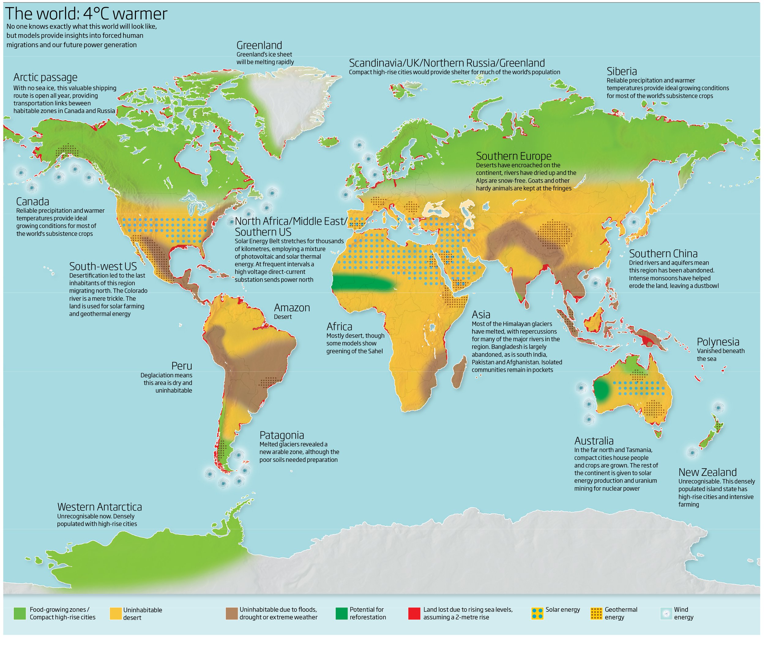
Few scientists challenge the notions of climate change and global warming. Although these fact-based, scientific theories have been thoroughly proven through countless years of evidential data, there still remains those who refuse to accept the prospect that humans may be the primary contributors to our Earth’s gradual decay. “The World: 4º Celsius Warmer” is a scientific yet hypothetical map which describes a world ravaged by severe global warming—one where two-thirds of South America is underwater, the entirety of Madagascar and Polynesia have disappeared, and the Amazon Rainforest is now known as the Amazon Desert—and may be a map with such strong underlying rhetoric that it might just spook a global warming skeptic into believing in a need for change. Published eight years ago by the prominent British journal, New Scientist, the map’s contents are extremely alarming, but how accurate can a projected map of a world in the year 2100 (or even later) really be if it was created in 2009? Regardless, any map published by a renowned and reliable scientific journal (and which therefore holds scientific backing) and depicts western Antarctica as a future metropolis demands to be heard and should be analyzed in detail.
The map presents a world almost unrecognizable in population patterns, energy distribution, and, most obviously, climate. As if the very conditions chosen to be represented in the key at the bottom of the diagram did not highlight the devastational changes loudly enough, the map’s creators also chose to include 18 additional blurbs detailing the vast and distinctive changes of chosen geographical areas, however the tone of these 18 blurbs throughout the map is composed of eerily negative rhetoric. Words such as repercussion, abandon, consequence, encroach, and vanish jump out at the reader as they scan the map, while even more evidently somber diction can be observed from sentences such as “the Colorado river is a mere trickle.” Was this sentence really necessary? The information stated within the “Southwest US” blurb is not changed whatsoever by the addition of this sentence—it was only made to have a more “doomsday” tone. Most likely, this is a reflection of the map’s creators’ underlying interests; being creators of a map that depicts the long term effects of global warming, they most probably side with the existence of global warming themselves, and thus, while perhaps subconsciously, made this map a type of propaganda urging others to believe and fear the same as them.
Other inquiries can be made regarding the legitimacy of this map and the values of its creators. Over 50% of the world on the map is labeled as “uninhabitable,” but by what standard? An additional 4º celsius in the desert of Dubai will not make the desert any more desert than it currently is and will not increase the temperature to the point where it would be impossible for a human being to survive. Further, the choice to measure increase in temperature in celsius instead of farenheit could even have been a strategically deceitful decision, as an increase in 4º celsius is equivalent to a 7.2º increase in fahrenheit, making the drastic results of a world increased by 4º celsius much more believable compared to the same map with a title of “The World: 7.2º Fahrenheit Warmer.” Lastly, the sources/research behind the creation of this map are nowhere to be found on either the map itself nor on the New Scientist website. Without any provided proof that any of these potential phenomena are capable of happening in the future, the information behind “The World: 4º Celsius Warmer” could be completely fabricated, and thus, the map could have been made to serve the sole purpose of scaring society into believing in climate change and global warming.
But is creating a map that prioritizes emotional persuasion over scientific reliability or accuracy such a crime? Accuracy is a standard that is often placed onto maps in western culture, and consequently we tend to forget that a map may serve an overt purpose or function that is unrelated to accuracy. “The World: 4º Warmer” accomplishes its objective by urging the reader toward fear of a post-global warming world. It can even be considered refreshing to come across a map that openly aims to persuade rather than hide its true intentions or motives behind science or accuracy. Occasionally, overt bias is acceptable in a map where issues such as global warming and climate change are in dire need of increased social awareness and change—thus identifying the map of “The World: 4º Warmer” equally as legitimate as one constructed with accuracy as its central principle.


I think this map makes a strong political statement, urging people to take action in preventing global warming. This seems to be an uncommon purpose of a map, since most maps deal with things that have happened in the past, not things that could happen in the future. I like that aspect of this map, however, as it is different. Global warming is a big issue, and we want to deal with it before it is too late. Having a map like this helps people to wrap their heads around what is happening to their earth – hopefully initiating action among them. Thank you for sharing this map on this blog – I feel that it not only raises interest visually, but also politically, which is important when it comes to wanting to make change.