
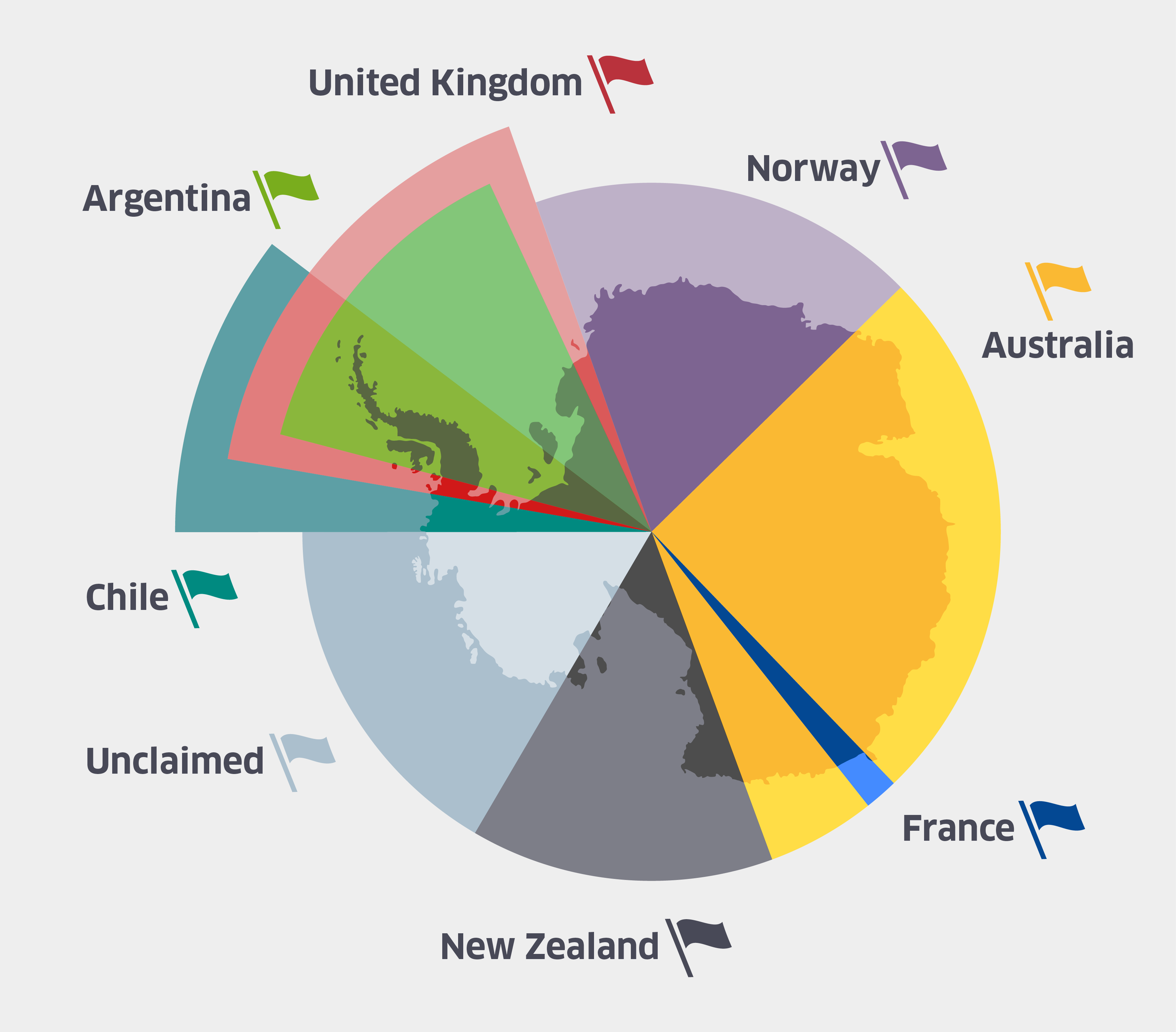
Most people are completely unaware that areas of Antartica have been politically claimed for centuries. So it is easy to see why a map such as this might be completely alien to the average viewer. Claims on Antarctica go back as far as 1493 when Spain claimed a large section of Antarctica directly south of their territory in modern day Argentina and Chile. Spain’s claim of Antarctica was even mediated by the Catholic Church who was the recognized arbiter of international claims during that time period. Much later, from 1908 to 1917, the United Kingdom continued to press claims from the Falkland Islands to the south pole completely overlapping the old Spanish claims. After United Kingdom claimed part of Antarctica the rest of the world jumped into the game and claims were made by a multitude of countries which included Norway, Nazi Germany, the Soviet Union, France, Australia, and New Zealand. Meanwhile Argentina and Chile, which had now been separate independent nations from Spain for centuries, argued that the old Spanish claims on Antarctica were now theirs. This led to conflict with the United Kingdom since their claims overlapped so a fleet from the Royal Navy was sent down to intercede the South American nations from occupying the area in Antarctica. (1)
While there are now many treaties that have been agreed upon and internationally recognized, many countries do not recognize any claims over Antarctica and proclaim that Antarctica should remain free from sovereign borders. This includes the United States of America, who is the largest supporter of a free Antarctica. That is why from an American perspective, this map’s existence is an alien idea. The power of this type of map is that it seems to be a completely neutral view, even while it is pushing its political agenda. This map keeps alive the idea of imperialism and colonialism by western countries. It attempts to validate the claims on Antarctica simply by existing. This map is colonial in nature, and because of that a viewer might presume that every country with claimed lands has settlements of members of each nation in their territories. This idea couldn’t be farther from the truth. Many countries not listed on this map have small operating bases all over Antarctica and many countries with claims have no operations in Antarctica at all. (2)
But my critique on the map does not stop at the map’s existence. It is impossible to miss the simplicity of this map as a whole. But as you dive deeper into the realism behind the simplicity it is easy to notice that this stems from the lay out of the claims. All of the claims are in the shape of a sector, with the vertex at the south pole. This goes to show how abstract these claims are. While looking at this map one should question the legitimacy of a border that is two straight lines along exact longitudes.
The orientation of Antarctica in this map shows the dominance of the Western World in the author’s decisions. If the south pole is the center how does the author orientate the continent? His decision seems to be directly inspired by the common positioning of most western maps. The part of the continent facing towards the top of the image is south of the Atlantic Ocean and the continent of Europe. But it’s not just the orientation on of the map that required abstract choices from the author. Even the colors on this map were a conscious decision they had to make. Once you’ve looked at enough western political maps you become aware that many countries are almost always depicted in the same color. Red for the United Kingdom and blue for France are the most common color associations. This choice shows the importance of these two countries to the author over the rest. New Zealand and Australia’s flags are also red, white, and blue. So why are they depicted in black and yellow? The truth is that the author is probably adhering to his audience which consists of mostly Americans, and Western Europeans.
This map hides its deeply political agenda through the facade of being scientific and objectively factual. But all maps that talk about the existence of claims on a territory are inherently political. The author’s conscious decisions of only showing certain sovereign claims, choosing how to color each country’s territory, and orientating the map in a specific way, all illustrate the ideas what the author wants the viewer to take away from this map.
Sources
http://discoveringantarctica.org.uk/how-is-antarctica-governed/the-antarctic-treaty/making-claims/
- http://www.antarctica.gov.au/law-and-treaty/history/antarctic-territorial-claims
- http://www.coolantarctica.com/Community/antarctic_bases.php
Atlas
https://www.ncddc.noaa.gov/website/google_maps/OE/mapsOE.htm
This Atlas consists of all of the deep ocean exploration sites since 2001. This interestingly interactive digital atlas will make a great edition to our collection. And I’m not just saying that because I watched The Titanic recently and became very inspired by Steven Spielberg.
I find this map and the history behind it extremely interesting. I had no idea that Antarctica has been politically claimed, despite the fact that it has been politically claimed for centuries. I also find it captivating that the United States decided to take a stand against claiming Antarctica. This seems unlike the United States. Maybe that is the reason we rarely hear about how it is claimed – because we do not own a part of it. I think this map was a great choice for the “Map of the Week,” since it showed a map, I am sure, few have seen as well as it allowed you to share a history that few seem to know. Thank you for opening my eyes on this subject – and for sharing your ideas on this blog!