As scholars have pointed out since decades ago: a map is far more than just “reproducing” reality; it has characteristics, that define who it is and what it’s for.
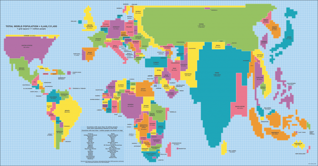
Denis Wood stated in his The Power of Maps, “maps link the territory with what comes with it.” I assume there are three aspects in Wood’s idea. First, the Geographic depiction of boundaries that tie up with the spatial reality of a specific area. In this World Population Map published in 2005, the whole image is filled with regular squares of a grid. As the squares are colored according to the relative positions of the countries in the world, people can basically recognize which country a colored area represents.
Secondly, related information about the area, like demography or climate, can be presented on the map. It is the main focus of this Population Map to show demographic situation about different countries. While a square represents one million people, the map clearly shows the proportions of how many people are living in respective areas. It is especially useful when an audience can get numerical information from the graph directly, both the approximate figure of the population and relative proportions compared with that of other countries. Clearly, China and India, having the two largest populations in the world, are the ones to catch audiences’ attention at the first glance.
Among the various characteristics, there is one factor that stands out, and that’s the third aspect I like to point out: the representative of political power – the selectivity of mapping reflects mapmakers’ political view. On the one hand, the main presentation of population subverts people’s common cognition of the world to some extents: except for China and India having both huge area and population, some large countries with small populations are shrunken, while some others with inconspicuous size but a rather big population stand out and draw people’s attention. For example, it may take you a while to find Canada, Russia, and Australia as they have turned into thin lines or dots in the large picture. On the contrary, it’s easier to notice places as Singapore, Philippines, and Indonesia in this map when they are magnified because of the relatively large proportion of the population. Generally speaking, since the Asian part is prominent, it can be inferred that the cartographers want to emphasize the enormous human resource in Asia.
On the other hand, the choice of “color” also reveals the concept in a political perspective. When Taiwan and mainland China, Kosovo and Serbia are not in the same color, mapmakers demonstrate their standpoints that they recognize Taiwan and Kosovo as independent states, which other countries may not agree to.
In addition, by putting the Atlantic Ocean in the middle of the map, which amplifies North America and Europe, it is obvious that the cartographers consider the West as the center of the world.
At the same time, I identify some advantages of looking at the world in this brand-new way: this map was published in 2005, and it tells the story of history. When audiences are looking from a present perspective of view in 2017, they are aware of what has changed during the past 12 years: The State Union of Serbia and Montenegro has dissolved; South Sudan declared independence from the Republic of Sudan… In other words, maps are reflections of the history. Just as Denis Wood stated: “When the map is produced, it’s already out of date.” Moreover, the vague border lines between areas avoid the controversies of disputed areas, like Kashmir between India and Pakistan.
All in all, as a tool that reflects both reality and ideology, the Population Map offers a great opportunity to look at the world in an innovative view, that not only provides detailed information, but also makes audiences think about the “hidden languages” behind the picture. Therefore, I chose it as the “Map of the Week.”

