Blog of the Week

http://greenmap.org

For Blog of the Week, I chose this blog to showcase the importance of climate change and how data from cartographic maps can display the importance and our much-needed action. This blog shows the aspects of the environment and provides several news links to current climate noteworthy events. One of my favorite things is that it also helps you create a map. If you want to an create an account and make a map, go for it, and have some fun. Finally, it shows a lot of the green projects that many individuals across the world have started.

Posted in Uncategorized | 1 Comment

Atlas of the Week

http://floodatlas.org/redesign/

For the Atlas of the week, I chose this atlas that relates to flooding. It is known as the “Flood Atlas”.  It was created by three meteorologists and has several tools and features to view live photos and helps map varying flooding data that has been collected. It also helps locate floodwaters and extreme flooding events. The atlas consists of a lot of analytical data and publications that relate to the flooding of certain areas. It is a fun website that can really be a time waster if you have fun looking through the various maps that are present.

Posted in Atlases of the Week | Comments Off on Atlas of the Week

Map of the Week

Oh, no! It is starting to creep in, get the towels! These are just some of the statements I heard from family as floodwaters began to rise rapidly around my home. If you ask anyone I say I am a proud Houstonian and resident of Harris County, however, my hometown has had its fair share of flooding disasters in recent years. So, it is safe to say flooding is in every Houstonian’s DNA. The city flaunts itself as a cosmopolitan city, which simply means the city is very diverse. Following the landfall of Hurricane Harvey, there was a lot of questions that needed to be answered regarding the areas within Harris County and the city of Houston that were more prone to flooding. Questions regarding the environment and climate change as well as urbanization and the imminent threat of other hurricanes forming and hitting the Gulf Coast also began to rise. The Kinder Institute, a think-and-do tank at Rice University whose primary focus is tackling urban issues in Houston and other cities, partnered with many local officials to answer some of these questions. Scientists, meteorologists, and many federal workers began to work on the collection of data to see where most the issues regarding the flood prone areas along waterways and tributaries across the Houston metropolitan area lied.

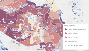
For starters this map shows a wide range of tributaries and rivers that traverse Harris County but lacks labeling. One of the main things you see from the map is the legend in which there is a display of the racial diversity across the different neighborhoods that encompass the county. The darker the shade, the more diverse a neighborhood is, meaning there are more demographics and ethnic groups in these neighborhoods. On the other hand, the lighter the color, the less diverse the neighborhood is, meaning there are populations that are predominantly white. One important purpose of the map is to show the flooding effect across Harris County however the map lacks the labeling of bayous, rivers, and neighborhoods. The range of flooding is not implicitly pictured, thus leading to some confusion at first glance. Fortunately, the map does show the cities within the county such as Houston, Sugarland, Missouri City, Pearland, Pasadena, and Baytown. The labeling of these cities is important because it can help further research and locate the effects of flooding in the county based on a particular city’s diversity index.

The City of Pearland in Pasadena is known for their large Latinx population, while the outskirts of the Sugarland and Missouri City area outside Harris County are known to be predominantly White.  The index of a more homogeneous neighborhood, where most of the population is within the same ethnic and demographic group, shows that they were more likely to see less effects of catastrophic flooding than those who were more of a heterogenous neighborhood. The omission of the names of certain neighborhoods across the county, the labeling of the flooding data, and the labeling of rivers, lakes, and streams can highly affect the data and the readers perspective. This can give a completely different view of what the data was meant to show: more diverse neighborhoods had a higher effect of flooding than those of less diversity.

Racial diversity ties in with the infrastructure that is available for that neighborhood. These neighborhoods that are more diverse meaning they encompass minority populations are less likely to receive large amounts of funding from the city and the county. This is the opposite when it comes to neighborhoods that are predominantly white and less diverse who tend to receive the most of the amount of funding from the city’s coffers.

Additionally, one of the main sources of flooding in the city of Houston has to do with street flooding. The county’s infrastructure is built so that highways, roads, and boulevards flood as a safety mechanism to prevent properties from flooding. However, the sewerage system in less diverse and predominantly white neighborhoods are more maintained than those of more diverse minority neighborhoods.

This map created by the Kinder Institute shows that areas with less diversity have a clear advantage to see less flooding than those who live in neighborhoods with a more diverse, minority populations. In line with one of our readings, the effect of silence on a map can be great. Harley emphasizes the power of silence and how the choice in how you display data on a map can change the overall depiction of a map.  Leaving out the names of these well-known Houston neighborhoods, flooding data, and names of tributaries just gives a consensus of the diversity of the county and flooding in the map but does not show that the more affluent, less diverse, and predominantly white neighborhoods fared a lot better than those neighborhoods with minority, more diverse and less affluent neighborhoods.

Finally, cartography and what is displayed on a map can have drastic effects on a reader’s perspective. Especially when it comes to the display of data from a devastating storm that question the effects of climate change, increased urbanization, and lack of upgraded infrastructure within a city. This just shows the power that a map can hold over its readers. This map was chosen because it displays a looming crisis in climate change and the inequities of city infrastructure and how the research and data play a major role in the perception of how natural disasters truly effect the people. So yes, this topic hits close to home, literally, but if you’ve seen your fair share of flash flooding events occur in front of your eyes, you would be just as critical of any irregularities.

Works Cited

Chakraborty, Jayajit, et al. “Exploring the Environmental Justice Implications of Hurricane Harvey Flooding in Greater Houston, Texas.” American Journal of Public Health, vol. 109, no. 2, Feb. 2019, pp. 244–250. EBSCOhost, doi:10.2105/AJPH.2018.304846.

Lee, Katherine D., et al. “A Once-in-One-Hundred-Year Event? A Survey Assessing Deviation between Perceived and Actual Understanding of Flood Risk Terminology.” Journal of Environmental Management, vol. 277, Jan. 2021, p. N.PAG. EBSCOhost, doi:10.1016/j.jenvman.2020.111400.

Lieberknecht, Katherine, et al. “Hurricane Harvey: Equal Opportunity Storm or Disparate Disaster?” Local Environment, vol. 26, no. 2, Feb. 2021, pp. 216–238. EBSCOhost, doi:10.1080/13549839.2021.1886063.

Kinder Institute. “Mapping Tool Helps Neighborhoods Better Understand Harvey, Houston.” The tool from the Kinder Institute brings together a wide range of datasets, including recent flood data. Houston, 3 September 2017.

Posted in Maps of the Week | 2 Comments

Map of the Week

During the cold war, the Soviet Union’s Military secretly mapped the world with such precision, that in certain areas, it would appear they were preparing for an invasion. In total, the Soviet Union created more than 1.1 million different maps some of which date back to the 1980s. Some places on the maps detail the dimensions of buildings and roads, going as far as to include bus stops. The extreme accuracy given to this collection of maps created a whirlwind of assumptions. Were they getting ready to attack, rolling their tanks through our city streets or was this merely precaution due to feeling threatened? The Soviets’ intentions with this mapping gets particularly questionable when looking at the precision as well as its covert goal. In red ink, on the top right of every map you can find “секрет”, the Russian word for secret. This map has several different aspects to inspect: The visual component, the historical context and the possible interpretations of its purpose. 

In terms of the visual component, the use of a variety of vibrant colors and defined lines allow the viewer to process the area with clarity, an element that many maps do not achieve. It lays out the grid pattern of New York City and the many ways to cross the water. To some scholars, the practicality of these maps suggests plans to someday be in charge of that area. Others give Russia the benefit of the doubt and say that it was their way of gathering intelligence. Another important visual component is that they had multiple maps for certain locations with varying scale. Therefore, depending on which map you are looking at you would see different details and highlighted areas. This element tells you about the care they went through while producing these. They spent the time and effort to map places not one or twice but three times in locations like New York City.

The most prevalent source about this discovery of maps is the full exposition made by Greg Miller at Wired. “The maps are still a taboo topic in Russia today, so it’s impossible to know for sure, but what they’re finding suggests that the Soviet military maps were far more than an invasion plan. Rather, they were a framework for organizing much of what the Soviets knew about the world, almost like a mashup of Google Maps and Wikipedia, built from paper”. This quote is an example of how uncertain and possibly harmless or deadly the maps could be. Re-starting tensions between Russia and the United States is the last thing anyone wants but exploring the idea of a USSR plan to attack New York City or any other highly mapped area can allow us to create many conflicting narratives about how history could have gone. One thing that can be certain from these maps is that the Soviet Union, and more specifically their military, wanted to have a compendium of knowledge of what basically is the whole world’s geography. It reveals that they prioritized scientific cartography and were willing to expend great resources to have this knowledge. This knowledge could have been used in multiple ways but both lead to the soviet union having power. Either they can attack because they have what is almost like a satellite view of the world or they do not attack but they are able to flaunt their information over us, which could have also led to more conflict. After considering multiple approaches, I believe that this collection of maps is an example of how seriously the Soviet Union and the United States took each other’s threats.

This map connects to many themes we have discussed but can be clearly connected to the ideas proposed by Harley. More specifically the concept of maps having material consequences as well as how “The single stroke of a pen can determine the lives and deaths of millions.” If these maps were found during the cold war they could have easily been the end of a proxy war and nuclear battle. Those very detailed strokes on a map could have greatly upset the United States and other anti-communist countries. The Soviet Union’s mapping of the world and the different interpretations prove the immense material and ideological power of maps.

Posted in Maps of the Week | Tagged | 2 Comments

Blog of the week

https://adventuresinmapping.com

For this week’s featured blog, I chose ‘Adventures in Mapping’. Although the website’s interface is quite bland it provides many interesting articles. I especially liked how you can read the title and a bit of the article before selecting to continue. This allows for you to skim your options and focus on topics you would like more insight on.


Posted in Uncategorized | Tagged | Comments Off on Blog of the week

Atlas of the Week

The atlas of the week is Transit Maps of the world because transportation is a vital part of our society and is a large part of the culture I was raised in. Being someone who grew up in a city known for its amazing public transportation I thoroughly enjoy judging other towns, cities and countries’ means of transportation. This atlas provides numerous maps on how people commute and travel. Furthermore, the graphics and colors in these maps make exploring them fascinating.

Posted in Atlases of the Week | Tagged | 1 Comment

Atlas of the Week

https://permanent.fdlp.gov/gpo147376/P1004ICU.pdf

The Great Lakes – An Environmental Atlas and Resource Book is a very interesting resource which gives readers a comprehensive overview of the Great Lakes region. It covers both history and science, spanning from the lives of native peoples before colonization to pollution in modern day ecosystems. I found this atlas particularly interesting because its maps taught me a lot about a part of the world I didn’t know much about. I especially recommend checking out the New Directions for the Great Lakes Community section which looks towards possibilities for the future, since the Atlas was published in 1995 and we now know what actions have been taken since its release.

Posted in Atlases of the Week | Comments Off on Atlas of the Week

Blog of the Week


http://www.old-maps.com/blog/

I chose Old Maps as blog of the week because its mission is to revive historical maps in a modern way. The business collects maps from the past, specifically New England, and reprints them for customers to purchase today, as well as making them more available through free digital formats. I was pleasantly surprised to find a map of Seaside Park, New Jersey on the front page, since I grew up in and spent several years working in the area. Overall, it’s a lot of fun to scroll through history and see how this business has worked to give these maps new life both in store and on the internet.

Posted in Uncategorized | Comments Off on Blog of the Week

The Time and Tide Map of the Atlantic Charter

1941 was a year of global uncertainty. By August, German forces had conquered nearly all of continental Europe, and Nazi expansion was an increasingly menacing reality. While many feared that the end of democracy was imminent, Franklin Roosevelt and Winston Churchill had a more optimistic idea of what a post-war world would look like. The Atlantic Charter, located at the top of the Time and Tide map, is a statement composed of eight clauses detailing the United States and Great Britain’s ideal plan for global society after World War II. The text, signed by each country’s respective leaders, focuses on peacekeeping goals such as freedom of the seas, self-determination, and disarmament. 

The main focus of this map is the fourth point of the Atlantic Charter, which demands equal access for all countries to markets and “to the raw materials of the world which are needed for their economic prosperity.” The plane is littered with postings representing natural resources which are explained by the key at the bottom right of the map. Unsurprisingly, among these resources are British and American favorites such as tea, precious stones, and sugar, as well as vital war materials like petroleum and iron. It is interesting that the creator, Macdonald Gill chose to bring the most attention to natural resources, since most of the Atlantic Charter is about territory, not the economy. In fact, to make room for all of the exports offered around the world, labels of certain cities, countries, and islands are represented on banners adjacent to their respective territories instead of on the land itself. As someone who started his career as an artist and focused on calligraphy and mural painting, it is important to recognize that Gill may have been biased to focus more heavily on artistic elements rather than cartographic accuracy.

It seems as though every blank space on this map is filled with something, whether it be anti-war quotes from ancient and modern philosophers, shipping trade routes, or stereotypical drawings of the people who live in different regions of the world. The aforementioned details give the map and the alliance which it represents a sense of credibility, since it seems to be supported by quotes from some of the most notable thinkers in history. Additionally, the content of the quotes and their heavy focus on nonviolence implies that the United States-Great Britain post-war plan will inevitably lead to world peace. It is important to notice that the locations of natural resources are illustrated in great detail, but that the drawings of the people who live in the places containing them are depicted as caricatures, such as the Saudi Arabian man with a camel or the white South African boer. As we’ve learned since the beginning of the semester, a map’s meaning is heavily influenced by the ideals of its creator, and it is clear that Gill placed a high value on each country’s profitability rather than accurately representing its inhabitants.

The bright yellow sun at the top of the map may suggest that this map and its goals are entirely benevolent, but it’s important to acknowledge the underlying biases hidden within the colorful iconography. In an era when most maps aimed to present themselves as scientific, the choice to illustrate the Atlantic Charter in an older, stylistic way with themes of hope and happiness scattered throughout is clearly a strategic rhetorical move to garner support for the alliance. It also serves as a reminder that both countries had been major world powers since very early practices of modern cartography and implies that they will continue to be global leaders in an idyllic post-war era. The idea of free access to world resources definitely has its benefits, but for countries like the US and Great Britain with vast territorial possessions and more technologically advanced extraction methods, it would be much easier to take full advantage of said resources. Additionally, viewing places in the world as economic opportunities rather than focusing on culture and national identities is problematic because it blithely reduces a nation to its potential aggregate output.

The Time and Tide Map of the Atlantic Charter has many challenges, but that is exactly why I chose it as map of the week. It perfectly depicts the rhetorical nature of maps because its very existence is an argument for capitalism, democracy, and globalization in a post-war society. As we’ve discussed since our first reading, maps are not an objective interpretation of space, and this one is no exception. This map is a promise of continuation of life as it was experienced at the time, and holds an expectation of strong alliance between the two countries in the future.

Posted in Maps of the Week | Comments Off on The Time and Tide Map of the Atlantic Charter

Blog of the Week

https://www.washingtonpost.com/news/worldviews/wp/2013/08/12/40-maps-that-explain-the-world/

I chose “40 Maps That Explain the World” by Max Fisher in the Washington Post. He includes maps from a variety of topics: political, military, human rights, foreign relations, ethnicity, language, religion and more. There are maps included from the 1900’s up to present day and they come in many forms. Some interesting maps from this site include “A Russian professor thinks the U.S. will break up into these four countries” and “A European missionary’s map of Africa, circa 1908”.

Posted in Uncategorized | 1 Comment