
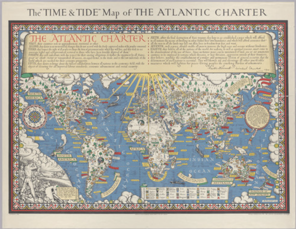
1941 was a year of global uncertainty. By August, German forces had conquered nearly all of continental Europe, and Nazi expansion was an increasingly menacing reality. While many feared that the end of democracy was imminent, Franklin Roosevelt and Winston Churchill had a more optimistic idea of what a post-war world would look like. The Atlantic Charter, located at the top of the Time and Tide map, is a statement composed of eight clauses detailing the United States and Great Britain’s ideal plan for global society after World War II. The text, signed by each country’s respective leaders, focuses on peacekeeping goals such as freedom of the seas, self-determination, and disarmament.
The main focus of this map is the fourth point of the Atlantic Charter, which demands equal access for all countries to markets and “to the raw materials of the world which are needed for their economic prosperity.” The plane is littered with postings representing natural resources which are explained by the key at the bottom right of the map. Unsurprisingly, among these resources are British and American favorites such as tea, precious stones, and sugar, as well as vital war materials like petroleum and iron. It is interesting that the creator, Macdonald Gill chose to bring the most attention to natural resources, since most of the Atlantic Charter is about territory, not the economy. In fact, to make room for all of the exports offered around the world, labels of certain cities, countries, and islands are represented on banners adjacent to their respective territories instead of on the land itself. As someone who started his career as an artist and focused on calligraphy and mural painting, it is important to recognize that Gill may have been biased to focus more heavily on artistic elements rather than cartographic accuracy.
It seems as though every blank space on this map is filled with something, whether it be anti-war quotes from ancient and modern philosophers, shipping trade routes, or stereotypical drawings of the people who live in different regions of the world. The aforementioned details give the map and the alliance which it represents a sense of credibility, since it seems to be supported by quotes from some of the most notable thinkers in history. Additionally, the content of the quotes and their heavy focus on nonviolence implies that the United States-Great Britain post-war plan will inevitably lead to world peace. It is important to notice that the locations of natural resources are illustrated in great detail, but that the drawings of the people who live in the places containing them are depicted as caricatures, such as the Saudi Arabian man with a camel or the white South African boer. As we’ve learned since the beginning of the semester, a map’s meaning is heavily influenced by the ideals of its creator, and it is clear that Gill placed a high value on each country’s profitability rather than accurately representing its inhabitants.
The bright yellow sun at the top of the map may suggest that this map and its goals are entirely benevolent, but it’s important to acknowledge the underlying biases hidden within the colorful iconography. In an era when most maps aimed to present themselves as scientific, the choice to illustrate the Atlantic Charter in an older, stylistic way with themes of hope and happiness scattered throughout is clearly a strategic rhetorical move to garner support for the alliance. It also serves as a reminder that both countries had been major world powers since very early practices of modern cartography and implies that they will continue to be global leaders in an idyllic post-war era. The idea of free access to world resources definitely has its benefits, but for countries like the US and Great Britain with vast territorial possessions and more technologically advanced extraction methods, it would be much easier to take full advantage of said resources. Additionally, viewing places in the world as economic opportunities rather than focusing on culture and national identities is problematic because it blithely reduces a nation to its potential aggregate output.
The Time and Tide Map of the Atlantic Charter has many challenges, but that is exactly why I chose it as map of the week. It perfectly depicts the rhetorical nature of maps because its very existence is an argument for capitalism, democracy, and globalization in a post-war society. As we’ve discussed since our first reading, maps are not an objective interpretation of space, and this one is no exception. This map is a promise of continuation of life as it was experienced at the time, and holds an expectation of strong alliance between the two countries in the future.