

An expansion of The Atlantic magazine, CityLab is a news site that focuses on urban planning and metro areas around the world. Designed for people who are “creating the cities of the future,” CityLab includes a section dedicated to displaying maps of worldly conflicts and interesting developments.
Clink of the “Maps” tab at the top of the site, peruse the map thumbnails, and explore dozens of stories covering a wide assortment of subjects, including politics, health, history, industry, environmental sciences, and more.
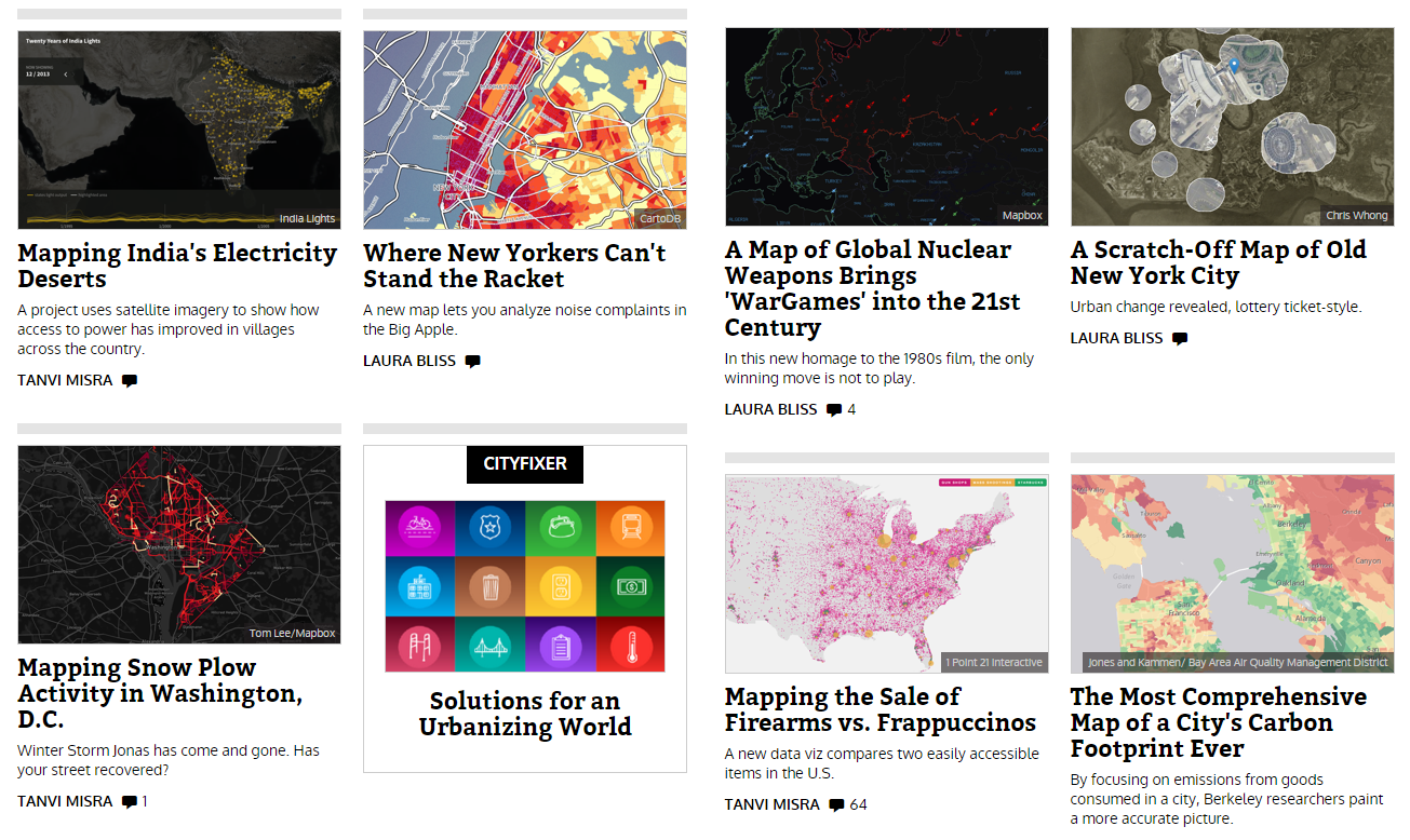
Maps are extremely important visual aids when paired with a news story. Often, maps can more quickly and efficiently present material than an article, so creating a good map is critical for CityLab. This website is really great at looking at different sets of data and seeing the very different ways to display them.
Depending on the topic, a mapmaker can choose to use a choropleth map, dot map, heat map, etc to show information as accurately as possible. I challenge you to closely examine a map when you click on it to analyze the cartographer’s choices and think how or why they made them – what do the colors symbolize? Where are the trends in the map? What are the “silences” or the map, or where was something left out?
Have fun browsing the great maps of CityLab!
http://www.citylab.com/posts/maps/