Interactive Wildfire Tracker

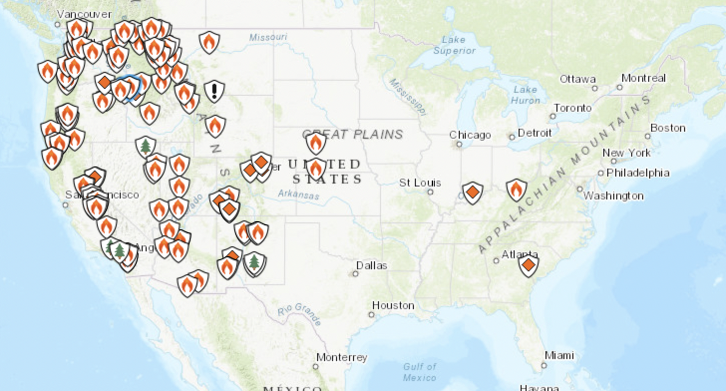
Anyone may monitor active wildfires that may threaten their home or the homes of loved ones with this interactive map. It provides frequent updates on information about the size of the wildfire and its containment level. It displays wildfires in the United States of all sizes. It aids in determining the direction in which the wildfire is spreading. This website makes it possible to monitor wildfires from any location and can inform users whether they will soon need to evacuate. The percentage of containment is highly helpful in letting people know if the fire will continue to spread or if it has been brought under control.

People are able to read in-depth information about the circumstances that caused this fire to spread and what ignited it. It contains details about the restrictions imposed in the region where the wildfire is. Additionally, it provides details about the incident teams in charge of the fire. This shows the number of personnel and resource types allocated to this fire. This applies to aircrafts, engines, handcrews, and smokejumpers. Both educational and incident information materials can be found on this website. It helps provide a clearer picture of who is at risk and who might be in the near future.

https://inciweb.nwcg.gov

Real-Time Interactive Earthquake Map

UC Berkeley’s Seismology Lab website both collects and provides information on earthquakes and solid earth processes. One of my favorite features on this website is an interactive earthquake map that shows real time data for seismic activity around the world. The interactive map component allows users to see the location, date, time, and magnitude of earthquakes that have occurred up to a week prior. Users can select specific points, change the range of data, and observe patterns of seismic activity on a global, national, regional, and even local scales. The website also connects users to resources for reporting information about earthquakes they’ve experienced so the information can be used to create maps of felt experiences and damages caused by seismic activity. Furthermore, the website provides resources on commonly asked questions and concerns about earthquakes and connects users to resources for earthquake preparedness and safety.

This website is a great tool for education both in an academic setting and for the general public. In an academic setting, this could be used to educate students on patterns of seismic activity and how they are connected to tectonic movement, faults, and other geologic processes. It can also be used to educate residents on the risks of earthquakes near them and what to do in the event of an earthquake to remain safe. I also think this website and the information it provides could be a useful resource for city planners and architects to study and implement earthquake resistant infrastructure in locations prone to high seismic activity.

Matteo – NOAA Satellites

https://www.nesdis.noaa.gov/current-satellite-missions/currently-flying


Another one of NOAA many cool features is to learn about all of the currently flying satellite missions. You can learn about the six specific satellites that NOAA operates, independently, or read about what satellites do as a whole. For example, the Jason-3 satellite is related to sea level rise, ocean circulation, and climate change. It even allows you to go further and read about the mission, team members, and more.

Earth History! (Zazi Halla – Fall 2022, Biosphere & Lithosphere)

Link

This website, https://dinosaurpictures.org/ancient-earth#35, shows the progression of Earth all the way back to 750 million years ago during the Cryogenian Period. It is an interactive tool because you can view whatdinosaurpictures.org/ancient-earth Earth looked like by changing the time frame (ex: select “what did Earth look like (x) years ago”. Most notably, this shows changes in the lithosphere because Pangea can be seen breaking apart due to tectonic plate movement. This website also connects directly to our lithosphere unit by illustrating places where isostatic rebound can be occurring. For example, students can change the time-scale and see how glaciers have been melting (a cause of isostatic rebound).

This website also connects to the biosphere unit, because there is an option to look at Earth based on what major species were present at the time. For example, you could look at when the first algae on Earth appeared or when the first land animals appeared. Students can try to infer how atmospheric changes influence biomes across Earth and subsequently provide habitable zones for different species over Earth’s history. Additional information is also provided on the diversity of species at the time. For example, when land animals appeared on Earth, it details that during this time “Insects diversify and fish develop sturdy fins, which eventually evolve into limbs”. Very cool stuff!!

NOAA Sea Level Rise Map

This interactive map created by the National Oceanic and Atmospheric Administration serves as a highly useful tool in understanding where rising sea levels are occurring throughout the US and their effects. Using a vertical slider this website visualizes how sea levels ranging from 1 to 10 feet could affect coastal areas. It also includes information about the varying risk levels of counties along the coast in regards to flooding and possible damage. On a more local scale, the website allows users to select “local scenarios” to observe the projected sea levels for that specific area by year. In Richmond, our current intermediate level is approximately 0.5 feet, however according to the map, by 2100, this number is estimated to be 3.87 feet. Additionally, this map provides information about high tide flooding and the alteration of marsh areas over time

This information on this site can be used for both educational and preventative purposes. Data on what areas will suffer the most from rising sea levels and the approximate timeframe for when areas will become “high risk” can be used by both the local and national governments to create plans for mitigating these consequences. Not only will this provide a baseline for when and when actions must be taken, such as building floodwalls or elevating surrounding infrastructure, but I also helps people visualize this rapidly growing threat. Illustrating how many people and ecosystems are at risk due to rising water levels is an extremely effective way to get people to understand the severity of this situation, regardless of one’s education on climate change.


https://coast.noaa.gov/slr/

Earth:: a global map of wind, weather, and ocean conditions

https://earth.nullschool.net/ 

This website functions like google earth where you can spin the globe around, zoom in, and zoom out. However, instead of displaying satellite images, the earth’s surface displays patterns of wind, weather, and ocean movement. Using this site one can look at the live wind patterns such as jet streams and identify large ocean currents. Similarly, users can use the site to investigate trends in temperature seeing both the latitudinal and continental effects on temperature. Finally, this site can also be used to display concentrations of particulate matter and chemical pollutants. for example, users are able to see clear trends of higher CO2 levels in population centers.

Overall this site provides an easy to use interface to visualize and explore trends in abiotic factors including the atmospheric and hydrosphere conditions. This site could be particularly useful as a teaching tool. Teachers could ask their students to identify and screenshot areas of the world that exhibit the trends and patterns that are being taught, such as those related to the Coriolis effect, unequal warming, particulate matter, or ocean currents.