Atlas of the Week 5 (October 7 – October 13): Atlas of Human Infectious Diseases

Did you know that bacteria and viruses exist everywhere on Earth? Did you also know that only three percent of all microbes can harm you? Microbes can be extremely dangerous and even fatal despite them being microscopic and naked to the human eye. The Atlas of Human Infectious Diseases by Heiman F.L. Wertheim gives an overview of the present-day distribution of the major infectious diseases. The maps in this atlas are colored and show the areas in the world where these harmful agents exist. Also, each map contains a basic summary of key facts about each agent. As a result of diseases killing many people, the maps show changes in human population and how the disease is spreading. This atlas is extremely important for many reasons. For example, if someone is diagnosed with a rare infectious disease such as Schistosomiasis, a parasitic worm that lives in the liver and gives birth to thousands of eggs, which contain a sharp spike and tear up tissue all over the body, one could use this atlas to determine possible regions where the patient might have gotten the disease from and learn more about the specific microbe. This atlas is an essential tool for anyone wanting to learn about major infectious diseases.

– S.K.

Works Cited

“Atlas of Human Infectious Diseases.” Fundaciono. N.p., n.d. Web. 9 Oct. 2013. <http://www.fundacionio.org/img/books/Atlas%20of%20human%20infectious%20diseases.jpg>.

“Atlas of Human Infectious Diseases.” University of Richmond Libraries. Ex Libris Group, n.d. Web. 9 Oct. 2013. <http://librarycat.richmond.edu/vwebv/holdingsInfo?searchId=5861&recCount=25&recPointer=9&bibId=1538445>.

Posted in Atlases of the Week | Tagged , , , | Comments Off on Atlas of the Week 5 (October 7 – October 13): Atlas of Human Infectious Diseases

Map of the Week 5 (October 7 – October 13): Africa in Perspective


Maps are lies! They do not accurately depict reality; this is partly due to projection. Projection causes distortion in maps, which depend on the mapmaker. In the “Size of Africa,” map, created by Times Atlas, several other countries are placed on an outline of Africa. Due to the countries and even Africa possibly being distorted in this map, the cartographer includes the size in square kilometers of several regions to show how small each country is when compared to Africa; this allows the viewer to imagine the sizes of the regions along with seeing them. In this map, China, Western Europe, India, the United States of America, and Argentina, all fit onto Africa with plenty of room left over. Placed in the left over space is Finland, Norway, Sweden, and the British Isles. All these countries combined take up just about as much space as does Africa. The mapmaker chose to create this map to emphasize the vast differences between Africa and the other nations mainly regarding size.

In 2012, China maintained a population of 1.343 billion, India had 1.205 billion, and the United States contained 314 million. Though these are just three of the seven regions placed on Africa in the map, they have a total population of almost three times that of Africa. This is rather significant because Africa, the world’s second largest continent, contains a lesser population than that of India, a country about ten times as small as Africa. The fact that the cartographer chose not to include the population of each country and Africa is bewildering. Though power can be constituted by size, it is also created by population, especially on a map. A densely populated country usually has more strength than one with few people. For example, Greenland is very large, roughly 2.166 million square kilometers; however, it only has a population of a mere 56,840. This proves that size does not mean power.

According to Dr. David Salisbury, all maps are lies, they are outdated once they are created, and they contain power. This is, without a doubt, true. The “Size of Africa” map lies because it does not give all the information that is needed; in other words, there are silences that are not accounted for. This map is outdated because the size of the nations, both in population and in square kilometers, is always changing. Finally, this map contains power because it compares Africa to essentially the rest of the world; this allows for the comparison of supreme nations. For example, the United States, which is a lot smaller than Africa, contains more authority and influence. The supremacy of a country can be depicted through a map; however, the power of a map can be fabricated and partial. This is why many maps are considered to be propaganda. The cartographer chooses how he wants his map to look, and it can unknowingly persuade people. Every choice a cartographer makes is a political one; this map is extremely political because the cartographer chose to compare prosperous areas of the world to Africa.

Projection is a tool mapmakers can use to distort maps and alter the power maps contains. If one chose to critique the projection of the “Size of Africa” map, he would definitely ask why the map is so basic, why the regions chosen on this particular map were chosen, why population was not included, and why the United States is placed on top. Though this map is not as sophisticated or “geographic” as other maps in the sense that it does not, for instance, display mountains, rivers, and cities, it actually provides just as much, if not more, information than other maps, and although this map contains countless silences, it brings the same large amount of information, rhetoric, and accuracy as the others do. The reason why the United States is placed on the top is perhaps because the mapmaker is possibly American and biased; therefore he decided he must place “his” country on top. Or if the cartographer is not American, maybe he chose to place his country of residence on the map. Every country on this map was chosen for a reason. Even the continent was chosen for a reason. Why Africa? Why not the other six continents?

Africa, being the second largest continent, does not receive as much attention as it should. Whenever the United States is mentioned alongside Africa, it usually involves the United States helping out Africa by providing aid. This is just one example of how Africa is perceived as inferior and needy to the rest of the world. Western maps define Africa as a lacking continent that is essentially uncivilized and in desperate need of modernity. However, this perception of Africa is not true. Western maps hide the truth about Africa, along with several other nations, and many people believe the maps’ false assumptions. This is totally unfair because these standards were forced upon African countries by other nations that do not actually know what Africa is like. This creates a political problem because it causes other nations around the world to underestimate Africa. The cartographer purposefully chose to specifically place China, India, and the United States, on the map for many reasons; one very important reason is that these three countries are top world powers, and Africa, as a whole, is not one. The placement of these countries on Africa not only displays the obvious differences, such as size, but they also bring to light the more hidden differences, such as variances in power. This map also masks the diverse continent of Africa as one mass that is the same throughout. This also is far from the truth; while there are many African countries and nations in the midst of political chaos, there are many other prospering countries in Africa. This proves that there is a lot variety and diversity throughout Africa that is all hidden on the map.

This map, despite being basic and simple, constructs power that can be shaped in the viewer’s eyes. A map’s power derives from how it is perceived, and the fact that each person views a map differently shows just how much power a map can have. Another reason this map is so influential is because of the political choice of Africa, a very large and diverse place, being the map’s focus and the fact that Africa is compared to world powers. All in all, each map has the power to change the views of the looker, in both a positive and negative sense. Maps give people knowledge and provide new understandings, which is why cartography will never be diminished. Though the art of mapmaking has significantly weakened, the science of it has grown tremendously. With new technology, maps are doing things that they never could before. Soon maps, such as the “Size of Africa” map will be able to accurately reflect the power of Africa. As technology continues to progress and maps become more and more advanced, we as humans will stretch our limits, become smarter, and nothing will be deemed impossible any longer.

– S.K.

Works Cited

“Greenland Population Clock.” Country Meters. N.p., 2013. Web. 9 Oct. 2013. <http://countrymeters.info/en/Greenland/>.

Harley, J.B. The New Nature of Maps: Essays in the History of Cartography. Baltimore: John Hopkins University, 2001. Print.

“India: Size and Location.” Excell Up. N.p., 2009. Web. 2 Oct. 2013. <http://www.excellup.com/classnine/sstnine/indialocation.aspx>.

“Population of Africa 2013.” World Population Review. N.p., 2 Oct. 2013. Web. 9 Oct. 2013. <http://worldpopulationreview.com/africa/>.

Prelli, Lawrence J. A Rhetoric of Science: Inventing Scientific Discourse. Columbia: U of South Carolina, 1989. Print.

“Size of Africa.” Big Think. N.p., 20 Nov. 2006. Web. 2 Oct. 2013. <http://bigthink.com/strange-maps/35-the-size-of-africa>.

“Ten Countries with the Highest Population in the World.” Internet World Stats. Miniwatts Marketing Group, 10 Sept. 2013. Web. 2 Oct. 2013. <http://www.internetworldstats.com/stats8.htm>.

Turchi, Peter. Maps of the Imagination: The Writer as Cartographer. San Antonio: Trinity University, 2004. Print.

“What Is the Size of Greenland?” Ask. N.p., 2013. Web. 9 Oct. 2013. <http://www.ask.com/question/what-is-the-size-of-greenland>.

Wood, Denis. The Power of Maps. New York: Guilford, 1992. Print.

Zijlma, Anouk. “How Big Is Africa?” About. N.p., 2013. Web. 2 Oct. 2013. <http://goafrica.about.com/od/africatraveltips/ig/Maps-of-Africa/Map-of-Africa-Showing-True-Size.htm>.

Posted in Maps of the Week | Tagged , , , , , | 1 Comment

Atlas of the Week 4 (September 30- October 6)- Atlas of Global Strategy (1985)

The Atlas of Global Strategy; War and Peace in the Nuclear Age by Lawrence Freedman is a great atlas to check out as it is a perfect segue into the Post World War II theme we will be studying in class. This atlas encompasses the time period after WWII, up until the near end to the Cold War, covering such items as nuclear mapping, patterns of warfare, and military strategy. With growing technology and weapons that carried increased damage, the world was forced to rethink conventional fighting methods and reform mapping techniques to suit the geo-political forces that were dominating the globe.

– Carl Johnson

Freedman, Lawrence. Atlas of Global Strategy. New York: Facts on File, 1985. Print.

Posted in Atlases of the Week | Tagged , , , , , | Comments Off on Atlas of the Week 4 (September 30- October 6)- Atlas of Global Strategy (1985)

Map of the Week 4 (September 30-Ocotber 6): The Racial Dot Map

Source: http://demographics.coopercenter.org/DotMap/index.htmlSource:

The United States of America has had a tumultuous past regarding race relations, as you may have learned a thing or two about in history class. Borders of states were often shaped with race and culture in mind, namely the slave versus non slave states in the mid 18th century. Even cities, which had their own boundaries and borders, were often set around cultural and racial pretences due largely to economic conditions of the time. The Racial Dot Map created by Dustin Cable of University of Virginia’s Weldon Cooper Center for Public Service helps display this history through a modern day synopsis of integration in the USA today. While most maps of America show expansion and growth from a physical sense (purchase of land, population density, etc.), this map shows the aspect of population by noting what actually comprises a map…the citizens.

When critiquing this map, keep in mind that it does attempt to portray every citizen, based on the 2010 census, of the third most populous country in the world, the U.S. From a broad perspective (no zoom) there is an amalgam of various colored dots combined together to form different shading all over the map. While overwhelming at first, it is in this view that the point of the map can be made. While the USA has the image of being a “melting pot” of different types of people, the map clearly shows while ethnicity may vary, race, from a more categorical standpoint, does not. America is predominantly white, 63% white alone/ 78% white including other races (“USA Quick Facts”). The blue dots represent White, with green for Black, red for Asian, gold for Hispanic, and brown for other respectively. While most maps as Harley wrote, “exert a social influence through their omissions as much as by the features they depict and emphasize”(Harley 67), this map is compelling because it brings out these omissions, or silences, of the people that comprise a region, and showcases them as the highlight of the map.

The Racial Dot Map brings out the silences of the people and displays them while silencing other “conventional” aspects of a map. The focus is not on the boundaries of the states or towns, but rather on the boundaries of the people. Cable utilizes a fairly basic outlay of the geographic display of the map, which accents the dots of individual, with choices to add or remove labels to help identify a certain region. As Kyle Vanhemert, a reviewer for Wired.com puts it, “When you’re dealing with 300 million dots at varying levels of zoom, getting the presentation just right is as much an art as a science” (“The Best Map Ever Made”). By leaving out key elements of his map, Cable maintains this balance to make a map that is more presentable to the viewer and avoids the convoluted marks that one is used to seeing on a map, i.e. rivers, highway signs, territorial bounds, etc. The only symbolism and legend needed is one that represents the people, because on this map, that is the one thing Cable is trying to showcase.

As Wood said, “What do maps do when they work? They make present—they represent—the accumulated thought and labor of the past…” (Wood 1). It is important for the viewer to think of the social climate that has shaped the map. Since the country’s founding, segregation and integration has been a part of politics and everyday life. Despite all of the conflict that has arisen, there are still boundaries between races of people. Fully zoomed out, the map can show a basic picture of this. However, when zooming in and going from state to state or even town-to-town, the picture shows a deeper focus. Cities hold much of the Black and Hispanic populations, suburbs include much of the White population, with the Asian population and other category being mixed into both. Although these are very basic representations associated with the various groups of people, it serves to simplify the map making a more attractive final product. This map is the accumulation of hundreds of years of history being represented into the present, and while this map reveals a lot about the people of this country now, the map is always subject to change. Cable in portraying integration in America, not only created a graph to serve his and the viewer interests, but also showed the changing demographic of the country. This range not only covers the past to the present, but also most important room for change into the future.

With 300+ million people being represented and accounted for across the country in one map, Cable needed to be very selective in what he included with the material at his disposal.  While items such as ethnicity, age, roads, and rivers were left out, by either a lack of data or for aesthetics, the depiction of segregation and integration in America is clear. Dustin Cable and the Cooper Center’s Racial Dot Map from a thematic stand point reveals while as a country we have come far with race relations, there is still a long way to go before “we” become truly equal as a nation. The fluid combination of both race and population of every citizen in the USA to create a unique map is what makes this map the ideal choice for “Map of the Week”.

-Carl Johnson

Works Cited

Cable, Dustin. “Demographics and Workforce.” The Racial Dot Map: One Dot Per Person. N.p., n.d. Web. 26 Sept. 2013. <http://www.coopercenter.org/demographics/Racial-Dot-Map>.

Harley. “The Silence of Maps.” Maps, Knowledge, and Power. N.p., n.d. Web. 02 Oct. 2013. <https://blackboard.richmond.edu/bbcswebdav/pid-989810-dt-content-rid-1081192_1/courses/201310_13467/Harley%20on%20Maps%20and%20Power.pdf>.

Vanhemert, Kyle. “The Best Map Ever Made of America’s Racial Segregation.” Wired.com. Conde Nast Digital, 24 Aug. 2013. Web. 26 Sept. 2013. <http://www.wired.com/design/2013/08/how-segregated-is-your-city-this-eye-opening-map-shows-you/>.

“USA QuickFacts from the US Census Bureau.” USA QuickFacts from the US Census Bureau. N.p., n.d. Web. 26 Sept. 2013. <http://quickfacts.census.gov/qfd/states/00000.html>.

Wood, Denis, and John Fels. The Power of Maps. New York: Guilford, 1992. Print.

Posted in Maps of the Week | Tagged , , , , , , | Comments Off on Map of the Week 4 (September 30-Ocotber 6): The Racial Dot Map

Atlas of the Week 3 [September 30-October 6]: Hammond’s Ambassador World Atlas

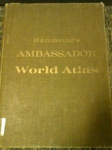
Hammond’s Ambassador World Atlas transports the reader back to 1961 through country profiles, exotic pictures, and hundreds of maps. This atlas is a reflection of a society with atomic anxiety, and the obsessive desire to spread their beliefs internationally and even on the moon. Just as an ambassador represents their country abroad, Hammond’s Ambassador World Atlas serves to represent the world in a modern, “scientific” way.

Shayna Webb

Hammond’s Ambassador World Atlas. 2d ed. Maplewood, N.J.: C.S. Hammond and Co., 1961. Print.

Posted in Atlases of the Week | Tagged , , | Comments Off on Atlas of the Week 3 [September 30-October 6]: Hammond’s Ambassador World Atlas

Map of the Week 3 [September 30-October 6]: Population Density of the United States 1790

source: http://www.census.gov/history/www/reference/maps/1790_population_map.html

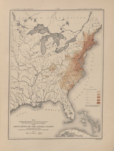
How could a map exclusively of the United States shape national identity and American international relations? The Department of the Interior’s map of the population of the United States shows the population density of 1790. This was the first time Americans were able to pinpoint exactly where they were on the map while also showcasing the uncivilized western territory. Maps like these provide a sense of identity as an American citizen. However, this map does exclude certain groups, such as the Native Americans. The map, along with its necessary silences, is an early example of the young nation showcasing its potential power. The Population of the United States map proves that a map of one nation can have an impact on the way America potentially behaves internationally.

The first census of the United States was collected in 1790. The Department of the Interior put together maps that showed population density with this information. The densest areas (mostly coastal areas) are indicated by a dark shade of brown and the color lightens as it travels west and the population becomes less dense. Not only does the map show densely populated areas, it unveils the never ending wilderness to the left. All this territory belonged to the United States and an American citizen looking at this map could see the endless possibilities of the frontier. One of the main responsibilities of the Department of the Interior was the “exploration of western wilderness” (“History of the Interior”). A map such as this, created a desire to explore and tame the rugged land and to conquer every corner of the country. In early American history, the continent was their identity (Schulten). As the country began to grow accumulate more land and people, it established a uniquely American identity and drive that would later carry through the country’s international relations. This map motivated Americans to claim the West and spread their presence throughout the world.

A map cannot possibly include everything one may want it to. What the author chooses to leave out is called a silence. According to J.B. Harley, “maps-just as much as examples of literature or the spoken word- exert a social influence through their omissions as much as by their features they depict and emphasize”(Harley).  The map blatantly states that it excludes non-taxed Indians. This map created an American voice while silencing the voice of the Native Americans (Bruckner). The U.S. Census counted white males over the age of 16, white males under the age of 16, white females, and slaves (“1790 Population Map”). Notice, the map does not have a different color for a particular group of people; it maps the total population. The reader cannot differentiate the number of slaves in a particular area because of this particular choice. At a time when only white, adult males were able to vote, this map does not exclusively show them. Women, children, and slaves were accounted for and have a place on this map. Where someone lives is just as much a part of their identity as their name, especially in early America (Schulten). Seeing oneself on this map made one feel like an important part of the nation which increased a sense of pride among Americans.

This map created a sense of American pride among the inhabitants and it shows the potential power of America. Nations started using maps as tools of power since the age of exploration. The British Empire and much of Europe used maps to show superiority and more refined culture than their colonies and the rest of the word by distorting and “painted bombastic scenes of territorial conquest” (Schulten). American cartography was much less elaborate. Most early American maps were inexpensive and practical. The population density map does not show American power the way a British map does. The size of the country alone is intimidating and presents America with a challenge. If America could conquer the great unknown of frontier, then it could conquer the rest of the world.

This map of population density did not only show population. It is a statement of America. First, it created a drive to discover and harness the West. Second, it created the voice of the country, but also silenced the voices of the Native Americans. And ultimately, it showed the potential power of America. Once America civilized the West, there was no limit as to how far it could stretch its reach across the globe.

Shayna Webb


Works Cited

Brückner, Martin. The Geographic Revolution in Early America: Maps, Literacy, and National Identity. Chapel Hill: Published for the Omohundro Institute of Early American History and Culture by University of North Carolina, 2006. Print.

Harley, J. B. Maps, Knowledge and Power. N.p.: n.p., 2004. Print.

“History of Interior.” U.S. Department of the Interior. N.p., n.d. Web. 04 Oct. 2013.

Schulten, Susan. Mapping the Nation: History and Cartography in Nineteenth-century America. Chicago: University of Chicago, 2012. Print.

Posted in Maps of the Week | Tagged , , , | Comments Off on Map of the Week 3 [September 30-October 6]: Population Density of the United States 1790

Atlas of the Week 2 [September 22-29]: Atlas of Clinical Vascular Medicine

source: http://librarycat.richmond.edu/vwebv/holdingsInfo?bibId=1543172


This is the Atlas of Clinical Vascular Medicine written in 2013 by Michael R. Jaff. The reason why I chose this as an interesting atlas to check out is because it is amazingly unique. This atlas is not of maps in a conventional way, but maps of diseases through a collection of words, pictures, and diagrams. It is amazing how when we think of maps we think of conventional maps with roads and nations, not guides to diseases. Yet that is exactly what a map is, a guide through directions, thoughts, and ideas.

Posted in Atlases of the Week | Tagged , , , | Comments Off on Atlas of the Week 2 [September 22-29]: Atlas of Clinical Vascular Medicine

Map of the Week 2 [September 22-29]: Rand McNally’s “Hawaii”


Source: http://www.bigmapblog.com/2013/map-of-hawaii-rand-mcnally-191/


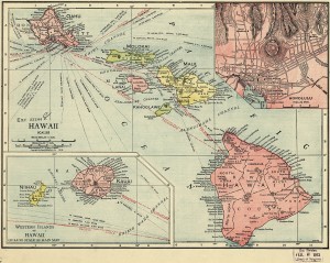
A map’s power derives from the decisions of what to include made by cartographers, which have an immense impact on their underlying meaning and importance. It is not apparent from a brief glance at a map, but the individual choices have the ability to completely change how a map is used and viewed. Dennis Wood even describes maps as “the interests of their authors in map form” (Wood, 71). This 1912 Rand-McNally map of Hawaii is a great example of this. At first, it seems to be a normal cut and dry map, which it partially is, but many decisions went into this map altering the audience’s view of it. The Rand-McNally cartographers decided how to obtain the information pertinent to this map, where to focus it and what colors to use, and the placement of various aspects.

Cartographers obtain the ability to shape a map right from the beginning of the process in what to map and how to go about doing so. As Rand-McNally is a well-known industrial map-making company, this map would seem bland to look at. It was probably created for the common classroom or a household, but not much more. This makes observers wonder why in fact would they create this map of an island 47 years before it formally becomes a state in the Union (gohawaii.com). Interestingly enough, in 1912 and the years just prior, Hawaii was sort of making a name for itself, becoming more visible to the mainlanders (Americans in the contiguous 48 states). For example, in 1910 Honolulu, the capital of Hawaii, became one of the first cities in the world with dial telephone services. Then in 1912, Bird of Paradise, a Broadway play, was introduced to New Yorkers, making Hawaii more present (hawaiihistory.org). Americans had been involved with Hawaii in ways of poachers and large companies such as YMCA, but through these few years more common Americans were becoming aware of the small group of islands. One can only speculate that maybe the more prevalent Hawaii became to Americans, the larger was the demand for a map of the region. Now that the cartographer decided what the map would be of, data must be collected. The problem lies in how and from where the information is obtained. In 1912 there were not satellites floating around the world taking in depth pictures, and the flying capabilities were not very strong.  Due to this we are left to ask where the information used to define borders and distances come from. This is a huge question that comes with the creation of a map because one does not know if the data is reliable or even accurate.

The colors used and the focus of the map are two major decisions that can alter how an audience views it. The distinction of color is clear on this map. The separate islands of Hawaii are clearly and perhaps purposefully shaded differently, with the big island and Oahu shaded red.  Along with this, the center of the map is focused over the ocean with the two islands of Maui and Lanai nearest. What is so grabbing is that Hawaii island and Oahu are arguably the two main islands (both shaded red), which grab the audiences attention first. Then, almost as an attempt to not have the other islands forgotten, the center is not on either. The same color and the focus could easily be coincidence and a lack of space, yet it is thought provoking that the cartographer chose these.

Another choice given to the cartographer which can drastically affect a map is the placement of various objects and pictures. For example, almost every map will have a compass rose designating the four cardinal directions, and this one does not fail. Ironically the stand out feature of this compass rose is that it does not stand out. In fact, the compass rose is almost hidden in the top right corner, making directions either understood subliminally, or seemingly not important. Also, the deliberate choice to put a smaller map of Honolulu in the corner is thought provoking. First, one wonders if it was chosen as a highlight only because it is the capital of the island chain or for a separate reason. Then, it is remarkable how it clearly shows the different roads in downtown, yet there are no street names. Also only some buildings are labeled. This is problematic because this mini map can only be used to check if something exists, but even then many buildings that are there are not marked or labeled. In actuality, this close up of the city does not have many practical uses.

This Rand-McNally map of Hawaii may seem like an ordinary map, but the decisions made by the cartographer have a huge impact on the finished product. Even from the beginning of the process with the question of what to map and how, the mapmaker has a large effect. It is not only this map of Hawaii that is affected by decisions; every map has its information and gaps of it, and it is these differences that drive the effect a map has on its audience.

-Michael Beck


Works Cited:

Wood, Dennis. The Power Of Maps. New York, NY 1992. Print

http://www.gohawaii.com/

http://www.hawaiihistory.org/index.cfm?fuseaction=ig.page&year=1912


Posted in Maps of the Week | Tagged , , , , | 1 Comment

Atlas of the Week [September 22-29]: Africa–Atlas of Our Changing Environment

Africa: Atlas of Our Changing Environment provides a detailed look into the environmental issues across the continent of Africa through maps, diagrams, charts, and vivid photography. The atlas includes satellite images and graphs to give an informative account of the changing environmental conditions of various locations throughout the continent, through both natural and human effects. This atlas serves not only as an informative historical reference but also serves as a reminder of the negative conditions and a request for a better environmental future for Africa.

Lily Calaycay

Africa: Atlas of Our Changing Environment. Nairobi, Kenya: United Nations Environment Programme, 2008. Print.

Posted in Atlases of the Week, Uncategorized | Tagged , , | Comments Off on Atlas of the Week [September 22-29]: Africa–Atlas of Our Changing Environment

Map of the Week [September 22-29]: Africa in 1909

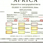
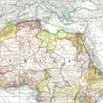
In the words of Denis Wood, “mapmaking fuses its growth and development with history, in the transformation of the world” (Wood 47). The National Geographic Magazine map of Africa from 1909 shows modern viewers the continent of Africa in a time of European conquests and commercialism. This map is particularly significant because it shows one of the first views of the continent of Africa through American eyes.  With advances in technology, education, and a growing sense of American identity, the nation was steadily on its way to becoming an international power. Along with this growing power came an interest among the people to discover more about the world outside of their American bubble. The National Geographic Society, founded in the 1880s, allowed Americans to explore the geographies, relationships, and cultures of the other continents of the world through pictures, essays, and maps collected and published in the National Geographic Magazine. Though young America took no part in the conquest and colonization in Africa, this map shows a snapshot in time of the influence of European nations in Africa in 1909. It indicates the territorial claims in 1909, resources and goods located throughout the continent, and railroads and ocean liner routes leading within the continent as well as out onto the ocean.

The first thing the viewer notices on this map is the motley of pastel colors. These colors represent the territorial claims to Africa during this time period. During the late 19th century, European nations began to colonize the continent, beginning the “Scramble for Africa.” The Berlin Conference in 1884 allowed the nations of Britain, France, Germany, Italy, Portugal, Spain, and Turkey to divide the land up into territories (“Imperialism”). During the conquest of these lands, the powers faced resistance from the Africans, especially in West Africa, but the natives were overpowered due to the Europeans’ superior weaponry (“Expedition Africa”). The viewer perceives that most of the northern area of the continent is colored pink or a darker variation of pink, signifying French and British territory respectively. A large area labeled “French Territory,” located mainly in the northwestern area, includes a number of countries such as Algeria, French Guinea, Senegal, Dahomey, and the Ivory Coast. These territories were conquered by imperialists largely in an effort to regain power lost after France’s defeat in the Franco-Prussian War (“East Africa in the 19th Century”). The lighter pink in the northeastern area, including “Anglo-Egyptian Sudan,” shows Britain’s claims. The Anglo-Egyptian Sudan refers to the area of East Sudan which was ruled by a joint British and Egyptian government from 1899 to 1955 (“Anglo-Egyptian Condominium”). Other British territories shown include Uganda, Nigeria, Gold Coast, and Sierra Leone, all territories kept by Britain for purposes of commerce and production (“Southern Africa”). A noteworthy number of territories are also colored with the yellow signifying “Independent Territories and Congo State.” Abyssinia, a territory of modern day Ethiopia, became independent in 1889 with the compromise of the Treaty of Wichale in which Italy was given an area north of the territory, Eritrea, which we see shaded in the dark orange signifying Italian control (“Abyssinia”). The Congo State was a colony of French Congo beginning in 1891, becoming a republic within the French Community and later acquiring complete independence in 1960 (“Republic of the Congo”). This map is primarily an artifact telling the history of European imperialism in Africa. The color-coded areas of control demonstrate the power inflicted by those nations on the natives of Africa. One thing this map does not convey is the fact that natives were often treated with brutality and disrespect from the Europeans, who were forcefully exploiting their resources. The map shows the influence of the empires with no perspective on the native people of the area. The various colors of the map, upon close inspection, represent a very intricate story of each territory’s history with foreign relations in Europe.

Another important topic this map demonstrates is the production of natural resources throughout the territories of Africa. This is a significant detail because the products available to harvest or cultivate in any specific area were an important factor of interest in the territories of Africa. The “Principle Products” appear in red lettering over the map, marking the locations of products such as wine, iron ore, pearls, myrrh, coal, gold, ivory, palm oil, ebony, and rubber. Because of the continent’s vast supply of these materials, European conquest brought Africa into the global economy, which was a big step for the continent. However, they were brought in on unfair terms due to European control over the territories where the materials were found (“The Scramble for Africa”). A prominent example of this is the British control over the Cape Colony. As we can see from the map, the Cape Colony located at the southern tip of the continent is rich with minerals, in particular gold, silver, copper, and coal. Britain quickly annexed this area in the late 18th century, right along with Germany’s annexation of South-West Africa and Portugal’s annexation of Portuguese East Africa. By 1895 all of the African territory south of the Congo State were annexed (“Southern Africa”). Similar stories apply for the other territories claimed by European powers for the purpose of production and commercialism. The red markings on the map are an important piece of the story of European imperialism in Africa because they reveal why countries chose to conquer the territories.

Another significant piece of information we can draw from this map is the transportation systems both within and outbound from Africa. This information is an important factor in understanding the means of exploration and transportation for the powers controlling much of the continent. Inbound, we can see that the railroads (both in operation and proposed) run all across and up and down the continent. There are also many caravan routes running mostly in the northwest territories. The ocean liner routes appear to have very frequent ports along the coasts of the continent, but particularly on the western coast. The Canary Islands, a supplier of wine, sugar and bananas, has six different routes running through their waters. Large ports seem to be located at Freetown in British-controlled Sierra Leone, a supplier of sugar; Monrovia in independent Liberia, where gold and wine are marketed; Lagos in British Nigeria, a provider of many products including cotton and sugar; and most prominently, Cape Town in the British Cape Colony. There appear to be about six ocean liner routes leading in and out of Cape Town, with destinations of Hamburg, Southampton, and Australia. The great number of routes leading out of the southern tip is justified by their high supplies of minerals, especially gold. Though the ports on the eastern coast are far between, there seems to be much interest in the ports of Suak-in in Anglo-Egyptian Sudan, a producer of tobacco and gums; Dar-es-Salaam in German East Africa; and several in Portuguese East Africa. The ports are an important feature of this map because they emphasize the importance of trade routes from the territories. Likewise, the railway and caravan routes show the means of transportation of goods for countries not located on the coast. These routes, clearly not a part of the native Africans’ culture, show the forceful European modernization of the native land for the purpose of exploitation of goods. The transportation system markings on this map add depth to the story of European control in Africa.

This map offers a powerful insight into the culture of Africa in 1909. It is important to consider that the map was created by American National Geographic, while we had no part in the actual goings-on in Africa at the time. The production and publication of this map reveals American interest in affairs abroad, a sentiment caused by our growing sense of identity and presence overseas. Through the color coded territorial claims it is easy to see the power of predominantly France and Britain along with other countries at the time. The resources written along the terrain help provide perspective to the issue of production and commerce. Lastly, the transportation routes, in particular the ocean liner routes, show the viewer both how the people of Africa and goods were transported among countries as well as to the rest of the world. Though at first glance the map appears to be a standard representation of the continent, deeper examination reveals the powerful story of European imperialism in Africa, gained largely through force and incivility toward the natives. National Geographic provided not only a resource for early 20th century America to see this perspective on Africa, but also an insight for viewers today into the world in 1909.

Lily Calaycay


Works Cited

“The French in West Africa.” The French in West Africa. N.p., n.d. Web. 24 Sept. 2013. <http://courses.wcupa.edu/jones/his312/lectures/fren-occ.htm#algeria>.

“The British in West Africa.” The British in West Africa. N.p., n.d. Web. 24 Sept. 2013. <http://courses.wcupa.edu/jones/his312/lectures/brit-occ.htm>.

“Abyssinia.” Encyclopædia Britannica. Encyclopædia Britannica Online Academic Edition. Encyclopædia Britannica Inc., 2013. Web. 19 Sep. 2013. <http://www.britannica.com/EBchecked/topic/2494/Abyssinia>.

“Southern Africa.” Encyclopædia Britannica. Encyclopædia Britannica Online Academic Edition. Encyclopædia Britannica Inc., 2013. Web. 19 Sep. 2013. <http://www.britannica.com/EBchecked/topic/556618/Southern-Africa>.

“Anglo-Egyptian Condominium.” Encyclopædia Britannica. Encyclopædia Britannica Online Academic Edition. Encyclopædia Britannica Inc., 2013. Web. 19 Sep. 2013. <http://www.britannica.com/EBchecked/topic/25025/Anglo-Egyptian-Condominium>.

“Republic of the Congo.” Encyclopædia Britannica. Encyclopædia Britannica Online Academic Edition. Encyclopædia Britannica Inc., 2013. Web. 19 Sep. 2013. <http://www.britannica.com/EBchecked/topic/132321/Republic-of-the-Congo>.

“Algonquin College – Expedition Africa – Small World Big Picture.” Algonquin College – Expedition Africa – Small World Big Picture. N.p., n.d. Web. 24 Sept. 2013. <http://lyceum.algonquincollege.com/swbp/africa/main/articles/History-Scramble.htm>.

“East Africa in the 19th Century.” East Africa in the 19th Century. N.p., n.d. Web. 24 Sept. 2013. <http://courses.wcupa.edu/jones/his312/lectures/eastafr.htm>.

“Imperialism.” History Haven. N.p., n.d. Web. 24 Sept. 2013. <http://www.historyhaven.com/APWH/unit%204/IMPERIALISM.htm>.

Posted in Maps of the Week | Tagged , , | Comments Off on Map of the Week [September 22-29]: Africa in 1909