
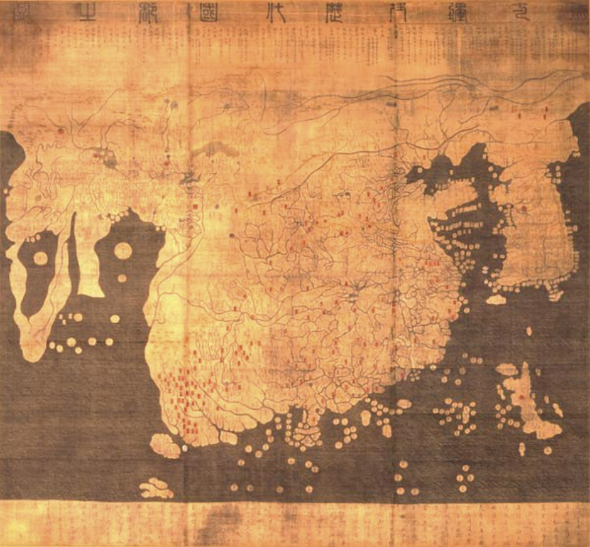
 (Ryūkoku Kangnido)
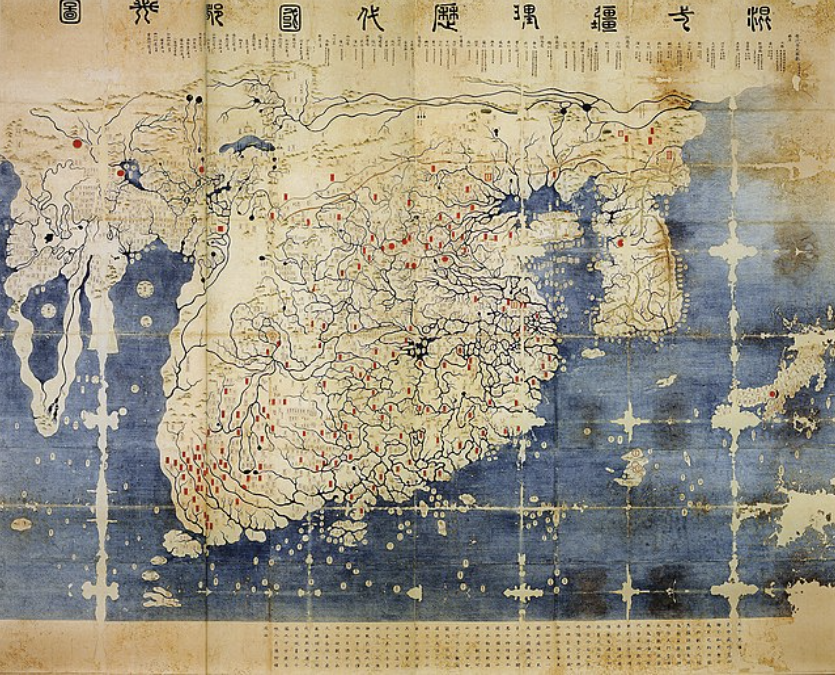 (Honkōji Kangnido)
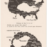
Kangnido (also abbreviated as Gangnido) is known as Korea’s “oldest world map” (Place). It was first compiled in the year 1402 in the Joseon Dynasty by Korean officials Kim Sa-hyeong, Yi Mu, Yi Hoe, and Kwon Geun; however, the original map no longer exists, with only two copies from the 15th and 16th centuries existing today (Central). Dr. Nurlan Kenzheakhmet, a visiting professor of History, Philosophy, and Religion at Nazarbayev University, titled these maps “Ryūkoku Kangnido” (made around in the 1470s in Korea) and “Honkōji Kangnido” (an updated Japanese version of the map made in the 1560s) based on where they are kept in Japan. He further notes how Ryūkoku Kangnido has been known and studied since the early twentieth century, while Honkōji Kangnido was not rediscovered until 1988 at the Honkōji temple. For our purposes, I will be covering and showing both.
Firstly, both of these maps have copied notes and an afterword left by Joseon official Kwon Geun (these writings are at the bottom in the perimap), which in part state that this map was influenced by two older lost Chinese maps: Shengjiao Guangbei Tu by Li Zemin and Hunyi Jiangli Tu by Qingjun (Sung). On the top there is “a description of the Yuan-dynasty administrative divisions” (Central). One indisputable influence on the Kangnido was the conquests of the Mongol Empire throughout most of Eurasia (Sung). Through their conquests, they were able to create a more interconnected trade network that allowed for Islamic and European maps to circulate to China and Korea. Using European, Islamic, and the two aforementioned Chinese maps, a group of Korean officials were able to create the Kangnido.
The most noticeable feature of both maps is the sheer size of Korea and China. This feature is primarily due to all of the map makers having the bias of being Sinocentric (Sung). For everyone living in the Joseon dynasty, they saw China as the center of the world. Since the Joseon dynasty were vassals of the Chinese Ming dynasty at the time, they thought of themselves as the second most important place in the world. This map thereby reinforces the Sinocentric worldview of the Ming governmental power of being the economic and international center of the world and Korea being second only to the Ming. It is also important to note that the Japanese-influenced Honkōji Kangnido has a larger and more prominent Japan on the map than the non-Japanese-influenced Ryūkoku Kangnido. This and later Japanese world maps suggest that East Asian kingdoms placed themselves second to China in geographic importance depending on how much influence they had in the creation of the map (Sung). This difference shows how mapping is solely a proposition of how certain groups of people see the world rather than maps being representations of pure spatial data.
It is also important to note that this map is a product of all of the Kangnido source maps, which means that some bits of these sources’ conscious rhetoric and information were imparted in the Kangnido; however, this information and rhetoric is transmitted through a distinctly Joseon perspective (Sung). This means that, while all of the information comes from various sources around the world, all of them are interpreted and placed in importance by the Joseon officials who created the map. This is why at first glance, despite their size, China and Korea look relatively accurate to the real world, while the rest of the world does not.
The next most important places to the Joseon were India (located Southwest of China) and Southeast Asia (the land and islands directly south of China) for two reasons (Figure 1). The first was the proximity and shared history they had with China and Korea. The second being that both regions held spices that were important to China’s economic and international dominance of the time period. All of this means that both India and Southeast Asia were portrayed with more detail and larger than any other external region.
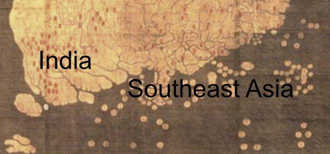 (Figure 1)
For Central Asia, the Middle East, Europe, and Africa (all located to the west of India on the far western peninsula), since they were all far away from East Asia and they usually came to East Asia looking for silk and spices (not the other way around), they were given relatively small regions (Figure 2). However, it is important to note that, while the physical geography of the Western regions is wildly inaccurate, the names of certain places described in Arabic sources (which is where most of their Western sources came from) are “as close an approximation to original Arabic sound as the Chinese language is capable of expressing” (Place). This basically means that these East Asian world maps contain the perspectives and rhetoric of older Arabic maps. This is particularly true when looking at many Mediterranean cities and regions placed next to each other (Figure 3). In these maps there can be seen some semblance of accuracy in where they were spatially located (like Genoa, Sicily, and Rome being close together, and Cairo and Tripoli being across from each other); however, most of the regions are woefully inaccurate both in terms of geography and where the regions are placed next to each other due to the recent greater international connection and communication with these far Western regions.
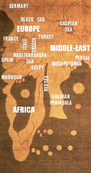 (Figure 2)
 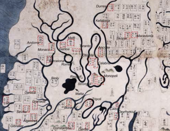 (Figure 3)
Both Kangnido maps are important to display as maps of the weeks, not only because they were used to institute the governmental power of Korea and China as the most important places geo-politically and economically, but also because they show us what the Joseon dynasty and their officials thought of the rest of the world in a post-Mongol Empire era. It shows that, despite still being quite Sinocentric, the Joseon dynasty had a solid understanding of the names of foreign places and some of their culture. Nevertheless, it is still quite clear that they had a limited understanding of the geography and spatiality of these regions because of their restricted contact in centuries past. Overall, these maps demonstrate how the Mongol Empire had a great effect on widening the Joseon dynasty’s understanding of the world through the connections made by the Mongols of different cultures and regions across Eurasia. More broadly, these maps also tell us that early mapping emphasizes the importance of one’s own country (or general region) in relation to other regions, and that the early history of mapping instituted state power and a certain perspective in the world (in this case that of Sinocentrism).
Works Cited
- Kenzheakhmet, Nurlan. “Central Asian Place Names in the Kangnido.” Journal of Asian History., vol. 49, no. 1-2, 2015, pp. 141–60, https://doi.org/10.13173/jasiahist.49.1-2.0141.
- Kenzheakhmet, Nurlan. “The Place Names of Euro-Africa in the Kangnido.” The Silkroad Foundation, no. 14, 2016, pp. 106-125. http://www.silkroadfoundation.org/newsletter/vol14/Kenzheakhmet_SR14_2016_106_125_Pl7.pdf
- Sung, Bae Woo. “Joseon Maps and East Asia.” Korea Journal, vol. 48, no. 1, 2008, pp. 46–79, https://doi.org/10.25024/kj.2008.48.1.46.
