Map of the Week 7(October 28- November 3): China in the end of 19th Century

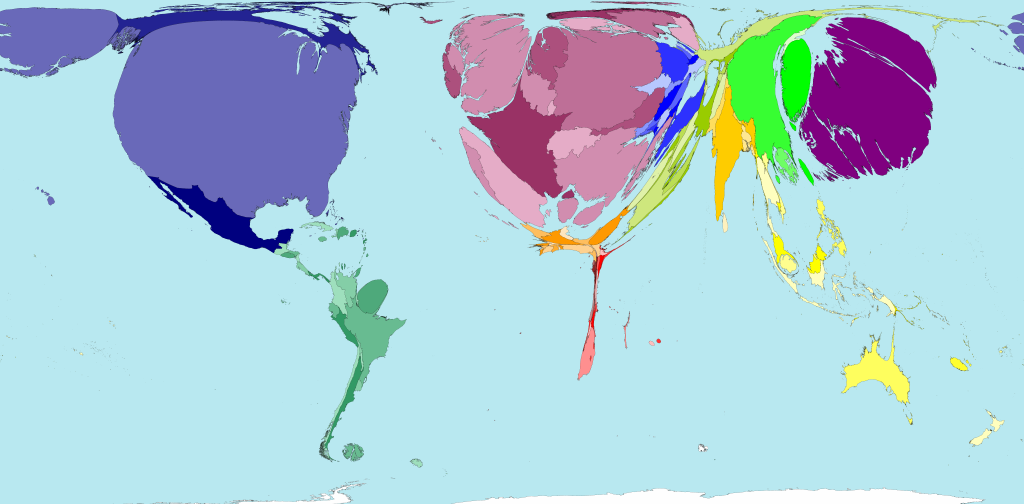
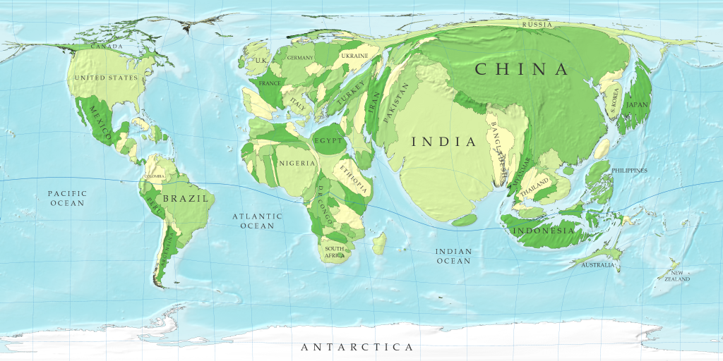
Maps are like photos of the world. In my photo albums, there are pictures of me as a crying baby, a basketball player in the team or a party girl running crazy with friends. Whenever I open those albums, I always feel like traveling back to the old days and meeting the different “me”. So are the maps. They are actually pictures of the world captured in different times, from different perspectives and with different focus.  Imagine China as a young adult, we now have the chance to glance at the figure of this adult from the “photo” taken 100 years ago when he was weak and small. We could analyze what the picture speaks about him, what he looked like and how he grew from weak to strong.

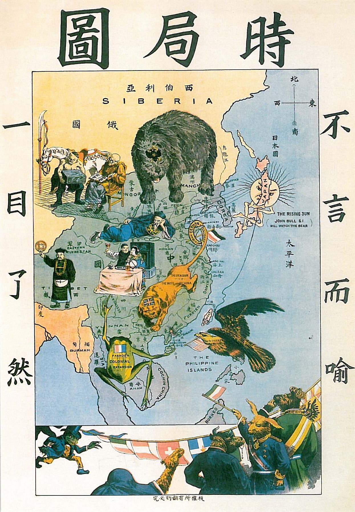
“Western power dividing China up like a melon”

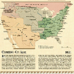
“The Situation in the Far East” is a map made by a Chinese Scholar Tse Tsan-Tai. He depicts the desperate situation that China faced in the end of nineteenth century in a symbolic form. The eagle represents United States approaching from the Philippines; the bear represents Russia invading China from the north; the frog represents France coveting China in the Southeast Asia; the sun, the bulldog and its tail represent Japan, England and Germany placing their power on China in different areas. China at that time was so vulnerable just like a melon in front of monsters’ mouth. After bourgeois revolution, western countries enjoyed a rapid growth in economics and technology and started expanding their power oversea; while at the same time, holding the superiority view that it was the one chosen by God, China’s corrupted government of Manchu adopted the “Close-Door Policy” and immersed itself in secluded peace.  However, all the sudden China’s secluded peace was shattered by the defeat of First Anglo-Chinese War (1839-1842). Since China signed the first unequal treaties, western countries gradually open the door of this mysterious country and for the first time, China was forced to notice the fierce power outside of China. Indeed, this map captured this subtle feeling Chinese people had at this particular moment, haughty but scared of the Westerns. Tse Tsan-Tai depicted this tangled emotion by choosing animals as the representation of Western countries, portraying them as less developed than human but more violent and brutal.

 “Asleep and Waking Up”

 Tse Tsan-Tai not only presented the imminent danger China faced from the coast, but also put forward his argument tactfully of the inherent causes that leads to China’s weakness and vulnerability. The lying man in the center represents the government officials totally ignoring the nation’s crisis; under the net held by his right hand, two people represent the Chinese youth obsessed with pursuit of official or military career and ended up just like the incompetent officials; the other two men represent Chinese indulging in wine, women and money. This map poses sharp sarcasm on Manchu government. However, we are still missing something. We see all the covetous monster and depraved government officers, but where is the hero? Where is the side of justice? Tsan-Tai intended to put the hero in silence in order to call Chinese people’s attention. First, he imposed a pride but scared feeling of the endangered Country on Chinese people; then, he abandoned people’s hope on government; now he cut off their last means of retreat by creating this despairing sense of missing hero and arouse the patriotic feeling that the reader is the one in charge of the Country. ”There is NO hero. Wake up Chinese people! It is the time for you to act!” This reflected the truth of the situation: each class made some attempt to rescue China from the crisis but not yet find the right way. The Bourgeois class undertook Hundred Days’ Reform during 1898, and the Xinhai Revolution in 1911; the landlord class initiated Self-Strengthening Movement during 1861 to 1895; the peasantry class initiated Boxer Rebellion between 1899 and 1901. All classes acted yet failed. China in the end of 19th century desperately needed a hero to stand out and unite the people of all classes together to fight against the westerns powers and the Manchu Government. China needed to wake up.

 “Bear in mind of the past and create a bright future”

This map is so significant for all Chinese people that it has shaped their national identity. This map is printed on all 8th and 11th grade history textbook as a testimony of China’s small and weak past and a reminder for students. Personally, I still remember writing answers such as “bear in mind of the past and create a bright future” for questions like “what did you learned from this map?” on plenty of tests in school. Those words still naturally ring in all Chinese people’s mind when they think about the past. In general, Chinese take this map as part of their complex national identity:  they were the weak and vulnerable nation suffered under corrupted government, both haughty and scared of the western powers. But, the “sleeping” giant now has awakened. Tse Tsan-Tai would probably be grateful if he sees the nation today because his initial purpose has been realized. Not only had China solved the national crisis, but also has become a prosperous and respectful country.

-Jennifer He

Posted in Maps of the Week | 1 Comment

Atlas of the Week 7 (October 28-November 03):The Women’s Atlas of Te U.S.

The Women’s Atlas of the United States made by Timothy H. Fast and Cathy Carroll Fast focus on issues common to women. This atlas provide a wide range of maps, charts and cartograms that depict a wealth of topics and issues relevant of great concern to women today. Through the close analyses in employment, family, health, crime and politics areas, we are able to examine regional differences in attitudes about women and gain a more comprehensive picture of the gender role of America.

-Jennifer He


Timothy H. Fast & Cathy Carroll Fast. The Women’s Atlas of The United States. Revised edition. Facts on File. 1995, Print.

Posted in Atlases of the Week, Uncategorized | Comments Off on Atlas of the Week 7 (October 28-November 03):The Women’s Atlas of Te U.S.

Team Map Presentation, October 22: How Communists Menace Vital Materials, 1956

Source:  https://blackboard.richmond.edu/bbcswebdav/pid-1007588-dt-content-rid-1115813_1/courses/201310_13467/Great%20Pretense%20HUAC%20Report.pdf

“How Communists Menace Vital Materials” (1956), by the Research Institute of America and released by the HUAC (House of Un-American Activities Committee), came out during the very heart of the Cold War. This map comes from an early think-tank, the RIA, in which they brainstormed ways the USSR could take economic control over the world. To comprehend what was happening during the time the map was released; one also needs to be conscious of the events that lead up to this time period. At the end of World War II in 1945, the US and the Soviet Union emerged as world leaders. The two superpowers were wary of each other, however, instead of collaborating to help rebuild countries devastated by the war, tensions continued to rise. Conferences between the US and the USSR in Yalta and Potsdam only further strained relations. In 1947, the US became involved in the Greek Civil War. This is often considered the beginning of the Cold War, as American troops were deployed to fight off communist guerrillas to contain communism in the east. Also in 1947, the US issued the Marshall Plan and the Truman Doctrine. The former gave aid to European countries crippled by the war in the hopes of rebuilding their economies and promoting trade. The latter gave economic aid specifically to Greece and Turkey so they could resist the pulls of communism.

Thus far, the war had been highly conceptual for the majority of Americans—“we” were fighting an idea (communism) rather than countries as in WWII. However, in 1949, the Soviet Union detonated its first atomic bomb, sending the Cold War into full effect. Now there was a possibility—at least in people’s minds—that the US was in danger even on home soil. Thus began the arms race component of the Cold War. The US developed its first hydrogen bomb in 1952, but three years later the USSR had accomplished the task as well. Terror gripped the nation, and various methods of propaganda were used to scare the nation further and condemn communism.

In order to fully understand the context in which the map arises, one needs to be aware of the various ways in which the countries, especially the US and USSR, were being affected. In the 1950s, the arms race was hitting its peak, but beyond the military action being taken, there was also a cultural and economic expansion as well. More specifically, in the US and USSR, new organizations were being created such as the KGB and NASA. The new formations apart of the “age of information” were becoming the norm and an ideological competition came to fruition. Competition was not limited to solely political or social means, but also to economic ones as well. In this map, one can see the global reach the USSR had on the world. The idea of a closed globe comes into play because realistically, there was no place in the world the Soviet Union could not take a hold on. Their reach looks similar to that of a hand reaching and grabbing each country for its resources.

At the heart of every conquest lies economic motive. During the Cold War this idea was no exception. America had its eye on stopping the spread of Communism. In addition, however, America also had its eye on the economic value of the world. On this map, every country has a list of natural resources instead of the actual names of the country. This was not a map focused on military power, but rather of the possible economic power and global reach of the USSR. The RIA, creators of the map, thought of six major ways in which the Soviet Union could accomplish global economic power. The first method of “dumping”, used in South America, was the threat the USSR would sell all of their own similar resources at very low prices to destroy the economies in this area. The second method in Western Europe was trade threats and the threat of reunification of Germany. Third, the threat was support of terrorist regimes and colonialism in Africa. Fourth, the USSR would ship arms and take economic surplus in the Middle East. Fifth, in South Asia the USSR would industrialize and lay territorial claims on the area. Sixth, in Southeast Asia the USSR would provoke guerilla warfare and display western propaganda to take hold on the region. There were a number of ways in which the USSR could take control and the US and congress needed to be aware of these facts.

Although the map is not as detailed as other maps of the time, it still serves a purpose in the backdrop of the Cold War. While this map is a form of propaganda, this map also shows very relevant information and the importance of stopping the spread of Communism, in regards to the US economy. In noting the resources and reach of the Soviet Union, the interests of the US around the world can also clearly be shown. This map does not just put a country’s name and color it in red for symbolism of USSR control. It instead denotes the economic importance of the globe as a whole, and what resources could or could not be lost if the US fails to intervene during the Cold War.

-Sophie Holmes, Carl Johnson

Works Cited

RIA, “How Communists Menace Vital Materials”

“Soviets Explode Atomic Bomb.” History.com. A&E Television Networks, n.d. Web. 26 Oct. 2013. <http://www.history.com/this-day-in-history/soviets-explode-atomic-bomb>.

“The Cold War.” The Cold War. N.p., n.d. Web. 26 Oct. 2013. <http://www.historylearningsite.co.uk/coldwar.htm>.

Posted in Uncategorized | Tagged , , , , | Comments Off on Team Map Presentation, October 22: How Communists Menace Vital Materials, 1956

Atlas of the Week 6 (October 21-27): The West Point Atlas of American Wars

The West Point Atlas of American Wars painstakingly catalogues American military history in great detail. The university library has the first two volumes in the series that span from the colonial wars through the Korean War. Each battle of each war is described clearly, and each battle has an extremely detailed accompanying map. The maps are quite impressive; they show the movement of troops and the progression of battle. This atlas is relevant to our class’s studies because it details the more aggressive side of US international ventures.

-Sophie Holmes


Esposito, Brigadier General Vincent J. The West Point Atlas of American Wars. New York: Henry Holt, 1995. Print.

“West Point Atlas of American Wars.” University of Richmond Libraries. N. p., n.d. Web. 27 Oct. 2013. <http://richmond.summon.serialssolutions.com/search?utf8=✓&s.q=west+point+atlas+of+american+wars>

Posted in Atlases of the Week | Tagged , , , , | Comments Off on Atlas of the Week 6 (October 21-27): The West Point Atlas of American Wars

Map of the Week 6 (October 21-27): GDP Wealth

Source: http://www.worldmapper.org/display.php?selected=169/

The gap between the world’s rich and poor is inconceivable. Worldmapper’s GDP Wealth map attempts to demonstrate the extent of this disparity by showing the shockingly disproportionate gross domestic product of each of the world’s countries, relative to each other. Worldmapper is a website that creates hundreds of such cartograms, embodying a variety of categories on a global level from languages to pollution to services. Land area on this particular map corresponds to the country’s GDP, not population or area. Color families are used to distinguish different regions, and shades differentiate between countries. The US, Western Europe, and Japan clearly have the highest GDP, while African and many Asian countries have the lowest. This map is effective because it quickly communicates the inequality of wealth in the world, and leaves a lasting impression on the viewer. By doing so, it reinforces the notion that cartography can be employed to present a strong argument about the ideas it represents.

The first thing one notices when looking at this map is how disproportionate the countries are. We instinctively label the map as inaccurate or skewed. However, it can also be argued that we have remarkably skewed perception of the world itself, and perhaps a biased map is more accurate than an unbiased map in this instance. The GDP Wealth map succeeds in showing us our own inflated views of ourselves and our lifestyles. Much as in life, our gaze is drawn to those with power and money, and we often try not to think of those less fortunate. To exemplify this, the map literally reduces the poor to silences. We tend to think of ourselves as living average lives. By no means are the lives we live as Americans average. Roughly 80% of the people in the world live on less than $10 a day, and nearly 50% lives on less than $2.50 a day. The stereotypical “average American” would never survive on this budget. The numbers get more frightening: a billion of the world’s 2.2 billion children live in poverty. An estimated one billion people are illiterate because of lack of adequate education. Basic human needs are not being met for astronomical numbers of people. 640 million people (twice the population of the entire US) live without access to adequate shelter. 1.1 billion people live without access to adequate water, and 2.6 billion (over a third of all people) live without access to basic sanitation. Additionally, an entire quarter of the world lives without electricity (Poverty Facts and Stats). The GDP Wealth map does not attempt to hide its bias and argument about world inequality, and its honesty makes it all the more effective.

No map is perfect, and likewise this map is not without flaws. It is just a snapshot of ever-changing economies, based on 2004 data. It has no doubt shifted since, but the general trends are still present and by no means has the world’s GDP evened out. Also, countries with smaller populations are naturally going to be depicted as smaller on the map, because fewer people are contributing to the GDP. In this case less populous countries may appear to be less wealthy, but their per capita wealth may be comparable to countries that appear much larger. Additionally, the map does not contain a legend, so its assertions of wealth are purely proportional. The mapmakers may have felt that their argument about discrepancies in global affluence is self-evident in the layout of the map, and therefore a legend would be redundant and unnecessary. Further, by not including any text on the map whatsoever, the mapmakers require viewers to have substantial prior knowledge about what the world looks like for a basis of comparison.

This map also hints at the opportunity for great inequalities in international relations. Countries that are tiny in terms of GDP are straining, and the focus is on countries bursting with wealth. Africa and parts of Asia are virtually nonexistent on the map, perhaps symbolizing the infinitesimal control many countries in these regions have over foreign policy issues. Countries with more wealth have unimaginable influence over those without. To a country overcome by debt and poverty, assistance is eagerly accepted no matter what strings are attached. The inequality between people of different countries can best be described by GDP PPP, the per capita purchasing power of citizens in a given country. The CIA World Factbook reports that the US, ranked fourteenth in the world, has a per capita GDP of $50,700. Conversely, the Democratic Republic of the Congo, one of the poorest countries in the world, has a per capita GDP of $400. Further, the world’s poorest countries, comprising 2.4 billion people (a third of the global population), only produce 2.4% of the world’s exports, which greatly limits their power on a global level. The map enunciates these discrepancies with its use of size and projection. Unlike the Peter’s projection or Mercator projection, the GDP Wealth map manipulates land area to correspond to a country’s wealth and thereby accentuates disparities across the globe.

In short, this map makes a strong statement about the startlingly unequal distribution of wealth in the world. The GDP Wealth map points out our inflated lifestyle while also bringing attention to the fact that poverty is the only reality for many people. Its depiction of squeezed poorer countries is remarkably metaphorical, much like its portrayal of richer countries that appear to be bursting at the seams. The image is almost grotesque—its wrongness is unsettling and to a degree repulsive. Naturally, this grossness translates to a clear condemnation of the world’s extreme inequality. Instead of using cartography as an instrument of power, Worldmapper actually employs this map to question power on a global level.  Despite its flaws, the GDP Wealth map is more than qualified to be the map of the week, as it not only argues that some countries are inordinately richer than others, but also that a map that doesn’t disguise its political argument can actually be more accurate and enlightening in the long run.

-Sophie Holmes

Works Cited

“GDP Wealth.” Worldmapper: The World as You’ve Never Seen It before. N.p., n.d. Web. 21 Oct. 2013. <http://www.worldmapper.org/display.php?selected=169>.

“Poverty Facts and Stats.” Global Issues. N.p., n.d. Web. 21 Oct. 2013. <http://www.globalissues.org/article/26/poverty-facts-and-stats>.

“The World Factbook.” Central Intelligence Agency. N.p., n.d. Web. 21 Oct. 2013. <https://www.cia.gov/library/publications/the-world-factbook/rankorder/2004rank.html>.


Posted in Maps of the Week | Tagged , , , | 1 Comment

Atlas of the Week 6 (October 21-27): The Historical Atlas of World War II

The Historical Atlas of World War II takes its audience back to one of the deadliest wars the world has ever seen. The change in economic, military, and political context during this wartime is shown through some of the maps and background information this atlas portrays. In addition, at a time of technological breakthroughs in warcraft, the atlas reflects some of the newest technology at the time through its arial depictions of the war. Overall, the atlas chronicles the big and small parts of the war in Europe, Africa, the Middle East, Asia, and the Pacific making it the perfect historical reference for our class.

-David Ruffini

Pillmot, John. The historical atlas of World War II. 1995. Print.

Posted in Uncategorized | Comments Off on Atlas of the Week 6 (October 21-27): The Historical Atlas of World War II

Map of the Week 6 (October 21-27): A Cartogram of the World’s Population


A Cartogram of the World’s Population

            David Salisbury, a well-respected geographer from the University of Richmond, said, “all maps are lies and are out-of-date the minute they are published.” Most would hear this statement when seeing a map and be perplexed to why someone would call this scientific document a “lie”. However, in the case of a cartogram, most of these types of maps are distorted in order to show statistical information. A cartogram is defined as a presentation of statistical data in geographical distribution on a map (TheFreeDictionary). Because of this, there is going to be obvious lies throughout the map in order to portray the statistical message it was designed for. Even though the Cartogram of the World’s Population is supposed to be an incorrect portrayal of the world, the inaccuracies highlight the disparities in the populations of the world and give readers a different viewpoint of our world.

The inaccuracy that a cartogram comes with causes the cartographer to make choices throughout their map to give the reader the best view of the statistics. With the Cartogram of the World’s Population, an important choice that the cartographer made was the projection it used. It used a very common projection that most people are familiar with: the Mercator projection. By using this, it is easily read by the public but it also presents problems throughout the map. The first thing one should notice is that the cartographer tried to keep the countries relative to where they are actually projected but this distorts the map heavily in areas close to the poles, especially in northern Europe, northern North America and northern Asia. The most obvious distortion due to this projection is found in Russia. Russia, the biggest country area-wise in the world, is stretched to a point where it borders a countless amount of countries across Asia and Europe. Along with these distortions of reality, the silences of maps come into play, especially in this cartogram. Harley said, “the notion of ‘silences’ on maps is central to any argument about the influence of their hidden political messages” (Harley 67). The things that are silenced throughout this map are the countries with small populations. They are depicted as slivers in this specific projection and do not account for the impact they have in the world’s geography. Surprisingly, a majority of the countries don’t even have a label! Because of that, I would argue that this map has a strong bias towards the world powers and overlooks some of the smaller populations making them seem less significant.

The cartogram is not all bad though. In fact, I would argue that this map has a very distinct usefulness about it. By choosing a cartogram of population, there are positive distortions to small countries with a large amount of people. Take Bangladesh or Ethiopia for example. These are very small countries on a regular map but in a cartogram, its immense population makes it a focal point of the map.  This map makes an argument for some of these small countries with big populations to demand more attention from the world. It’s saying that the resources that may be going to the world powers need to be spread out when comparing the populations of “the little guys” in a traditional map. The cartogram can also open the eyes of certain world powers, especially the U.S. The cartogram inflates the growing countries around the world especially India and China. This serves as a very important purpose to the U.S. because the ballooning of these particular Asian countries should give us an idea that the relationships with these countries will be changing too as they demand more economic, political and military resources the larger they get.

Overall, the Cartogram of the World’s Population intentionally distorts reality to show the populations of the world. These distortions come with inaccuracies and cover up some of the things a traditional map doesn’t. However, it gives us an essential and different viewpoint on how the world actually looks with the people in it. Typically, one associates size with power. But on a cartogram, the countries shift (almost to an unrecognizable degree) and challenges the audience in taking perspective on how the world actually is. For that reason, the Cartogram of the World’s Population was deserving of the map of the week.

-David Ruffini

Works Cited

Harley. “The Silence of Maps.” Maps, Knowledge, and Power. N.p., n.d. Web. 02 Oct. 2013. <https://blackboard.richmond.edu/bbcswebdav/pid-989810-dt-content-rid-1081192_1/courses/201310_13467/Harley%20on%20Maps%20and%20Power.pdf>.

The Free Dictionary by Farlex. N.p.: n.p., n.d. TheFreeDictionary. Web. 27 Oct.

2013. <http://www.thefreedictionary.com/cartogram>.

Strange Maps. BigThink, 31 Mar. 2007. Web. 27 Oct. 2013. <http://bigthink.com/

strange-maps/96-a-cartogram-of-the-worlds-population>.

Posted in Maps of the Week | Tagged , , , | 1 Comment

Team Map Presentation, October 8: New World Order Map, 1942.

Source: http://en.wikipedia.org/wiki/File:Gomberg_map.jpg

If you make a comparison between maps and literature, most maps would be like a biography in which the author presents reality. However, The New World Order map created by Maurice Gomberg, in 1942, is not like most Mercator projection maps. Comparatively speaking, it is more of a science fiction novel in which Gomberg presents his prediction of the post-war world. In the post-war era, Gomberg believes America will be the moral leaders of the world and the Axis powers would be destroyed. Gomberg states that this is the only way there would ever be a world without war. The New World Order map is shaped by the historical time period and Gomberg’s wild imagination, but his intentions are unclear.

Gomberg’s map was discovered in a recent Library of Congress excavation.  There is not much background information on Maurice Gomberg or what his intentions were for this map. However, the time frame in which this map was produced is vital in understanding the mindset he may have had. After WWI, the U.S. adopted a policy of isolationism due to the horrors of the Great War and established the Neutrality Act in the hopes of ending relations with European affairs. However, Germany’s invasion of Poland in 1939 caused the U.S. to become uneasy and more concerned about Europe. This was also a time of “Air-Age Globalism”, in which America was just a short plane ride away from the rest of the world (Henrikson). It was not feasible for America to stay isolated with this ever-increasing aeronautic technology. As WWII unfolded before their eyes, inactivity created anxiety and anticipation among the public. But the war approval rating among the American people was still not at full capacity. If the government wanted to enter the war, they were going to need ample support on the home front. January 11, 1941, Roosevelt delivered the “Four Freedoms” speech. This created a larger ‘fan-base’ for the war by planting the idea in civilian’s minds that it was America’s moral responsibility to lead the world in the right direction.

Gomberg’s map takes the ideals from the “Four Freedoms” speech to an extreme level. Roosevelt’s speech clearly influenced Gomberg’s decision to make the New World Order map, as it is printed on it. The speech is not the only text here. Gomberg provides a list of forty-one policies that the U.S. should carry out in his ideal post-war world. The main duties of America and its allies are to crush the Axis powers and free the world of colonial oppression and dictatorship. The world is organized into 14 independent sovereign states, 13 of them democracies and 10 of them demilitarized. Continents, such as Africa and South America become united. The United States includes Mexico, Canada, Greenland, Iceland and the entire Pacific Ocean. The allied (and later enemy) USSR has a great deal of control over Europe. During the early stages of the war, many believed that the world can achieve peace only if great powers set up general rules and countries move towards coalition. On this map, three emergent superpowers (US, USSR, and Britain) create the “New World Moral Order”, establishing “…permanent peace, freedom, justice, security and world reconstruction”. The U.S. would be the moral police of the world and establish their presence throughout the globe by establishing a League of Nationalities and nationalizing the economy. The U.S. would control all natural resources and foreign trade. The Axis powers would be severely punished. All people of Japanese, Italian, and German descent would be expelled from the entire Western Hemisphere, even if they were fifth generation American citizens. The resemblance of these specific policies and those of Hitler’s is uncanny. The U.S. establishes a dictator-like dominance over the globe in this new world order. If America were to carry out these policies, it would become the very thing it wished to destroy.

Unfortunately, in the midst of “Air-Age Globalism”, The New World Order map never took flight. The lack of popularity caused the lack of information on Gomberg and his intentions. The reader is left with more questions than answers. Was Gomberg just extremely passionate about the U.S. becoming the moral dictators of the world? Or, is this map a satire? Gomberg could have made these policies so ridiculous that this map had to have been a mockery of an exaggerated American elitist’s point of view. Maybe the government played a role in why this map did not become popular. After all, it was an opinion that could have been detrimental to the support of the war.

The New World order map is a rare piece of history. This map is heavily influenced by the historical time period. “Air-Age Globalism” ended all hopes of America remaining isolated and international relations were soon to become a main priority of the government. President Roosevelt’s “Four Freedoms” speech called for America to step up and be the moral leaders of the world. Gomberg elaborates these moral duties through dozens of policies on this map. After much analyzing, critiquing, and comparing, Maurice Gomberg’s intentions for this map, remains a mystery. WWII was intended to be the war to end all wars. No one knew what the world was going to look like post-war, not even Gomberg, but many hoped it would be a peaceful one. Sadly, Maurice Gomberg and the generation of WWII never lived to see the day where there was no hate, oppression, or war.

-Jennifer He and Shayna Webb

Works Cited

Henrikson, Alan K. “Maps, Globes, and the “Cold War””


Posted in Uncategorized | Tagged , , | Comments Off on Team Map Presentation, October 8: New World Order Map, 1942.

Atlas of the Week 5 (October 7 – 13): The Times Atlas of World Exploration

The Times Atlas of World Exploration transports the reader back to the world’s first civilizations and through a narrative of progress educates the reader on how the world we see today has formed since the beginning of time. A majority of the maps demonstrate this narrative and evolution of the world with color-coded arrows signifying distinctive trade and migration routes from 3,000 years ago up until thirty years ago. The author, Felipe Fernandez-Armesto does an excellent job in showing the development of the modern world in an organized and comprehensible fashion.

Fernandez-Armesto, Felipe. The Times Atlas of World Exploration. New York: HarperCollins Publisher, 1991. Print.

Posted in Uncategorized | Comments Off on Atlas of the Week 5 (October 7 – 13): The Times Atlas of World Exploration

Map of the Week 5 (October 7 – October 13): Territorial Growth of the United States

Source: http://maps.nationalgeographic.com/maps/print-collection/us-territorial-growth-map.html

When the United States declared its independence from Great Britain in 1776, the country only consisted of thirteen colonies. In the matter of three centuries, the borders of the country expanded and transformed to create the fifty states that make up the United States of America today. The history of U.S. expansion has been recorded through cartography and the evolution of maps depicting its borders. Territorial Growth of the United States Map published in 1987 by the National Geographic Society includes nine distinct maps, each representing a separate, significant time in U.S history that coincided with the growth of the nation. The map centers on an enlarged, antique map of the United States in 1783 created by John Mitchell. Surrounding this antique map are eight smaller maps that illustrate specific historical events that altered the United States’ borders. The cartographers of this map underwent a selective process to choose which parts of U.S history they found significant or “map-worthy.” This idea of selectivity, making certain things visible and others invisible, makes each map unique, as they reflect the cartographers’ personal and cultural biases. In this map, the cartographers demonstrate an understated sense of pride and support for the western concept of “manifest destiny,” justifying the expansion of the current United States borders as an inherent right. This narrative of progress visualized in The Territorial Growth of the United States Map creates a sense of national identity for Americans as the country’s borders altered and developed.

The 1783 Map of the British and French Dominions in North America included in The Territorial Growth of the United States Map was an essential tool in the conclusion of the American Revolution. The 1783 map created by John Mitchell was used as the primary map for negotiating boundary lines in the Treaty of Paris to avoid any further territorial disputes between the United States and Great Britain (“Expansion and Growth of the US”). This exemplifies Denis Wood’s statement that a map’s sense of superiority is due to its foundation in codes, laws, contracts, treaties, etc. The 1783 map is perceived as valuable because it has “the ability to link territory with what comes with it” (Wood 10). Mitchell outlines the thirteen colonies with a thick line and indicates the land inside of it as the United States’ territory. Through this process of mapping, the land is branded as territory rather than “unclaimed” space (Wood 10). The cartouche reads “The New and Correct Map of the United States of North America…” stating that any map preceding this one is considered inaccurate. The Map of the British and French dominions in North America represents the roots of the United States and the beginning of several changes for the country. The map establishes the claiming and mapping of new land as a cultural practice in US history; initiating a pattern to be followed for years to come.

The eight inset maps that follow the 1783 map visually outline the transformation and expansion of the country’s borders. The cartographers label each map with a date that corresponds to a significant event for the United States such as a war, land purchase, expedition, etc. Each event has a positive impact on the borders of the country, and continuously reinforces the belief of “manifest destiny” as the country expands out West.  National Geographic enforces this belief with a powerful and positive narrative of the territorial gains acquired by the United States. Time and space are key components in this map because they have the ability to create a sense of spatial identity for Americans within the rest of the world. The conjoined use of time and space in this map portrays a sense of national identity for the country. One part of this map’s purpose is to educate the audience about the United States’ territorial growth, but it also serves to demonstrate how national identity emerges from this territorial growth. National identity relates to power, and a country without national identity is powerless. Therefore, this map not only shows the growth of borders, but also the growth of power in United States history. This national power seems to only be expressed through the positive consequences of these events, ignoring the negative consequences that also surfaced. These negative consequences that are ignored are considered the “silences” of the map (Harley 67). Cartographers intentionally omit instances that could depict the United States in a negative light, since such instances would challenge the United States’ sense of superiority and its inherent right of expansion. National Geographic encourages a sense of patriotism through the tension between what is seen and unseen as it focuses solely on events that the United States considers to be accomplishments.

The final map entitled “A Broader View” utilizes a distinct type of projection, different than the other surrounding maps.  Rather than implementing the conventional projections seen in the previous eight maps, this inset imitates John Paul Goode’s “Orange Peel Projection.” This map is produced from an aerial perspective, an idea of what you might see from an airplane or satellite. The cartographers chose this method over a conventional projection because they aspired to portray a more modern, high-tech view of the world. This type of projection allows the map to focus on the regions outside of the borders of the United States rather than solely attend to territories inside the borders. National Geographic cartographers chose this perspective to insinuate that the United States hopes to expand their nation’s territory and power. The United States considers itself an international power with no limitations on their borders, and the neighboring countries are viewed as potential areas to acquire and expand to. The narrative of progress continues in “A Broader View” map, but uses a different approach than the previous conventional maps.  Rather than using the country’s history to create the present, this map uses the country’s present to predict a future for the country. This inset concludes The Territorial Growth of the United States Map on a positive note, insisting that there are no actual endings for the United States, only new beginnings.

The National Geographic’s The Territorial Growth of the United States Map follows a narrative of progression that insinuates and justifies American exceptionalism. Since cartography is considered a scientific practice, the National Geographic is able to depict this narrative as fact, and present it as universally accepted knowledge. However, as Harley’s article has shown us, it is important to account for not only what is seen but also what is unseen in a map. The Territorial Growth of the United States Map focuses on depicting American expansion in a positive light, thus eliminating controversial elements in US history. While The Territorial Growth of the United States Map emphasizes the notion of American exceptionalism, one must remember that maps are products of selectivity that reflect cultural biases.

Vanessa Kowalski


Works Cited

“Expansion And Growth Of The United States.” National Atlas of the United States. N.p., n.d. Web. 9 Oct 2013. <http://nationalatlas.gov/articles/history/a_expansion.html>

Wood, Denis, and John Fels. The Power of Maps. New York: Guilford, 1992. Print.

Harley, J.B. The New Nature of Maps. Baltimore: JHU Press, 2002. Print.


Posted in Maps of the Week | Tagged , , , , , | 1 Comment