
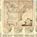
Source: http://maps.nationalgeographic.com/maps/print-collection/us-territorial-growth-map.html
When the United States declared its independence from Great Britain in 1776, the country only consisted of thirteen colonies. In the matter of three centuries, the borders of the country expanded and transformed to create the fifty states that make up the United States of America today. The history of U.S. expansion has been recorded through cartography and the evolution of maps depicting its borders. Territorial Growth of the United States Map published in 1987 by the National Geographic Society includes nine distinct maps, each representing a separate, significant time in U.S history that coincided with the growth of the nation. The map centers on an enlarged, antique map of the United States in 1783 created by John Mitchell. Surrounding this antique map are eight smaller maps that illustrate specific historical events that altered the United States’ borders. The cartographers of this map underwent a selective process to choose which parts of U.S history they found significant or “map-worthy.” This idea of selectivity, making certain things visible and others invisible, makes each map unique, as they reflect the cartographers’ personal and cultural biases. In this map, the cartographers demonstrate an understated sense of pride and support for the western concept of “manifest destiny,” justifying the expansion of the current United States borders as an inherent right. This narrative of progress visualized in The Territorial Growth of the United States Map creates a sense of national identity for Americans as the country’s borders altered and developed.
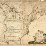
The 1783 Map of the British and French Dominions in North America included in The Territorial Growth of the United States Map was an essential tool in the conclusion of the American Revolution. The 1783 map created by John Mitchell was used as the primary map for negotiating boundary lines in the Treaty of Paris to avoid any further territorial disputes between the United States and Great Britain (“Expansion and Growth of the US”). This exemplifies Denis Wood’s statement that a map’s sense of superiority is due to its foundation in codes, laws, contracts, treaties, etc. The 1783 map is perceived as valuable because it has “the ability to link territory with what comes with it” (Wood 10). Mitchell outlines the thirteen colonies with a thick line and indicates the land inside of it as the United States’ territory. Through this process of mapping, the land is branded as territory rather than “unclaimed” space (Wood 10). The cartouche reads “The New and Correct Map of the United States of North America…” stating that any map preceding this one is considered inaccurate. The Map of the British and French dominions in North America represents the roots of the United States and the beginning of several changes for the country. The map establishes the claiming and mapping of new land as a cultural practice in US history; initiating a pattern to be followed for years to come.
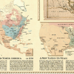
The eight inset maps that follow the 1783 map visually outline the transformation and expansion of the country’s borders. The cartographers label each map with a date that corresponds to a significant event for the United States such as a war, land purchase, expedition, etc. Each event has a positive impact on the borders of the country, and continuously reinforces the belief of “manifest destiny” as the country expands out West. National Geographic enforces this belief with a powerful and positive narrative of the territorial gains acquired by the United States. Time and space are key components in this map because they have the ability to create a sense of spatial identity for Americans within the rest of the world. The conjoined use of time and space in this map portrays a sense of national identity for the country. One part of this map’s purpose is to educate the audience about the United States’ territorial growth, but it also serves to demonstrate how national identity emerges from this territorial growth. National identity relates to power, and a country without national identity is powerless. Therefore, this map not only shows the growth of borders, but also the growth of power in United States history. This national power seems to only be expressed through the positive consequences of these events, ignoring the negative consequences that also surfaced. These negative consequences that are ignored are considered the “silences” of the map (Harley 67). Cartographers intentionally omit instances that could depict the United States in a negative light, since such instances would challenge the United States’ sense of superiority and its inherent right of expansion. National Geographic encourages a sense of patriotism through the tension between what is seen and unseen as it focuses solely on events that the United States considers to be accomplishments.
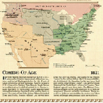
The final map entitled “A Broader View” utilizes a distinct type of projection, different than the other surrounding maps. Rather than implementing the conventional projections seen in the previous eight maps, this inset imitates John Paul Goode’s “Orange Peel Projection.” This map is produced from an aerial perspective, an idea of what you might see from an airplane or satellite. The cartographers chose this method over a conventional projection because they aspired to portray a more modern, high-tech view of the world. This type of projection allows the map to focus on the regions outside of the borders of the United States rather than solely attend to territories inside the borders. National Geographic cartographers chose this perspective to insinuate that the United States hopes to expand their nation’s territory and power. The United States considers itself an international power with no limitations on their borders, and the neighboring countries are viewed as potential areas to acquire and expand to. The narrative of progress continues in “A Broader View” map, but uses a different approach than the previous conventional maps. Rather than using the country’s history to create the present, this map uses the country’s present to predict a future for the country. This inset concludes The Territorial Growth of the United States Map on a positive note, insisting that there are no actual endings for the United States, only new beginnings.
The National Geographic’s The Territorial Growth of the United States Map follows a narrative of progression that insinuates and justifies American exceptionalism. Since cartography is considered a scientific practice, the National Geographic is able to depict this narrative as fact, and present it as universally accepted knowledge. However, as Harley’s article has shown us, it is important to account for not only what is seen but also what is unseen in a map. The Territorial Growth of the United States Map focuses on depicting American expansion in a positive light, thus eliminating controversial elements in US history. While The Territorial Growth of the United States Map emphasizes the notion of American exceptionalism, one must remember that maps are products of selectivity that reflect cultural biases.
Vanessa Kowalski
Works Cited
“Expansion And Growth Of The United States.” National Atlas of the United States. N.p., n.d. Web. 9 Oct 2013. <http://nationalatlas.gov/articles/history/a_expansion.html>
Wood, Denis, and John Fels. The Power of Maps. New York: Guilford, 1992. Print.
Harley, J.B. The New Nature of Maps. Baltimore: JHU Press, 2002. Print.
The map of the week Vanessa selected provides a crash course on U.S. history in nine simple steps. My initially expectation was to see the map of the year 1776 in the center but as Vanessa points out, “The cartographers of this map underwent a selective process to choose which parts of U.S history they found significant or “map-worthy.”” And the tie they selected to link all these maps together was on the basis of historical moments where there were dramatic shifts in power politically, legally, and economically. There is a need for the state of the country to be organized into moments of historical jubilee that were previously thought unfathomable for such a young nation.
And the way the map is set up encouraged me to not read the side bars and to look straight at the pictures. I believe that the National Geographic organized the maps in such a manner (aside from chronological order) to overwhelm the onlooker with good in hopes of he or she not even blinking twice on the silences Vanessa mentions. I agree with her point on the National Geographic’s mission to encourage patriotism and this is definitely conveyed even through minor elements such as the cartouche in the corner of the 1783 map. The statement of the map being “correct” is bold and rash because that overrules any possible additions/corrections and opinions. It seems to implement the technique of bandwagon; you are either with us or against us! And props to Vanessa for reminding the reader “that maps are products of selectivity that reflect cultural biases.”