Northern Polar Mosaic: The Revolution of Cartography

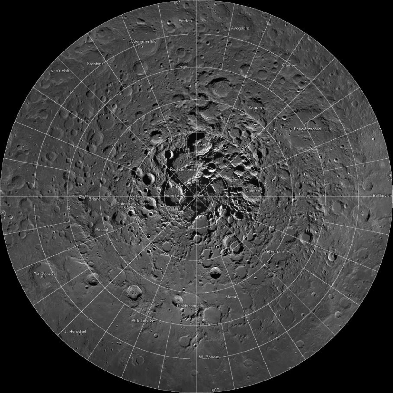
Non-interactive version of the Northern Polar Mosaic

Once the United States successfully placed a man on the moon, the last frontier was finally breached, and with it came a new age of exploration. As the possibility to send a man to the moon became ever more probable in the sixties, NASA and other international space organizations dedicated their efforts in mapping the moon. Just like the Europeans began to map the “New World” during the age of exploration, scientists believed that mapping the moon was an essential step in the process of landing a man on the moon. Presented in our FYS course, the Lunar Wall Mosaic: (compiled by the US Air Force in 1962) typifies the extreme interest in cartography at the time of the Space Race. More importantly, it also set the stage for a new era of cartography, an era where maps are compiled using colossal data sets that not only improve accuracy but also redefine the way users can interact with the maps they are presented.

Today, more than 50 years since the publication of The Lunar Wall Mosaic, the continued advances in technology have confirmed the initial hypotheses about the direction of cartography. What used to be an accurate trustworthy map of the moon in 1962 almost seems absolutely useless compared to the improved LROC Northern Polar Mosaic that was recently published by NASA and Arizona State University. Unfortunately (or fortunately), the second a map is completed it is outdated. Since maps are not constantly changing like the space they hope to capture, they can never be an exact representation. The moment images taken from a satellite were sent to Earth for someone in the Air Force to analyze, there was some change on the moon (whether it was a small rock that moved out of position or an asteroid that hit the moon) that immediately made the image an outdated representation of the moon. Nevertheless, this limitation is also what makes maps so useful because they help preserve a space or idea within a historical context. Additionally, by making abstract representations of the spaces they capture, maps are able to synthesize massive amounts of information in an effective form that we can more readily understand.

In 2009 NASA dispatched the Lunar Reconnaissance Orbiter, which has effectively been taking photos of the moon for about four years now. Just as the name suggests, the map is effectively a selection of approximately 10,581 images that were connected to make an interactive mosaic. The thousands of pictures compiled to create this map also hints at the heightened tension between cartography and photography in future mapmaking. Unlike cartography, photography has always had a stronger connection to authentic reality because it manages to exactly capture a given space at an instantaneous moment. Maps might not exactly represent a space, but they are able to abstract the space to portray more than just a geographical reality but more importantly a social or economic reality. Although future cartographers might depend greatly on photography in their production of maps, there will always remain an essential abstraction that makes maps unique in their ability to simplify complex data.

Unlike previous maps, maps of the new era of cartography (such as the Northern Polar Mosaic) have shattered the limitations of what a map can display to its audience. Maps have essentially extended their already massive amount of power. Made up of 681 billion pixels, the map can display the surface of the moon with such detail that it has given NASA the power to more efficiently find landing spots for future missions and even to assess minerals and water in the moon’s soil. There are so many pixels in this map that each pixel is equal to just two meters.

Although the technology behind the creation of this map will never seize to amaze me, it is equally interesting to assess what these advancements in technology will mean for the future of cartography. Using this map as a glimpse into the future of cartography it is important to recognize some of the unique features of this map, which bring up some interesting topics in the science (or art) of cartography. The zoom in feature of this map is perhaps the single most important and amazing aspect of the map. It allows the viewer to look at the surface of the moon with such detail and clarity that it almost makes the viewer seem like he or she is actually on the moon. The viewer can also drag the Northern Pole of the moon in any two dimensional direction to better navigate through the map. Given that this map was a selection of images, rather than an abstract drawing or design some individual created, can this map actually be considered a map or is it just a large picture? As cartography develops, maps are becoming much more accurate and less abstract in portraying the spaces they capture. They can manage and hold massive amounts of information that not only make them more accurate,but more importantly, give the map more power. As Denis Wood constantly reminds us, maps are power, and the Northern Polar Mosaic is no exception. Even the amazing technology used to produce this map give it a significant impressiveness that demands scientific credibility; making this map a symbol of intellectual superiority. NASA created this highly sophisticated map because it gives them power, a strategic advantage, over the moon.

The Northern Polar Mosaic is an example of the tremendous revolution in cartography, which begins with the implementation of sophisticated technology. The use of this advanced technology provides a magnificent tool for cartographers to better express their interests. More importantly, the advancements in technology now allow users of maps to take a greater role in the rhetorical life of modern maps. However, with these advancements in cartography through the use of different technologies like the internet and modern photography, maps may lose their unique ability to abstract complex arguments. Furthermore, the increased power maps will hold in the new era of cartography might lead some states to abuse their power in order to pursue and enforce their interests.

Like so many other sciences, technology has given cartography the ability to break through its traditional barriers and make them even more indispensable in our societies. In 2014 NASA has successfully mapped the northern pole of the moon with such precision that the tracks left behind by astronauts from the six Apollo landing sites are clearly visible, it is difficult to imagine what maps will be able to tell us in fifty years – welcome to the revolution of cartography.

Sincerely,

Santiago Espinosa

Visit the interactive map here: http://lroc.sese.asu.edu/gigapan/

Works Cited

Wood, Denis. The Power of Maps (New York: Guilford Press, 1992), 71,122.

Diep, Francie. “Big Pic: The Biggest Map Ever Of The Moon’s North Pole.”Popular Sicence, March 19, 2014.

Robinson, Mark. “LROC Northern Polar Mosaic (LNPM).” Lunar Reconnaissance Orbiter Camera. March 18, 2014. Accessed April 8, 2014. http://lroc.sese.asu.edu/news/index.php?/archives/874-681-Gigapixels!.html.

Posted in Uncategorized | 2 Comments

The Nuclear Club

All maps lie to varying degrees. “The Nuclear Club” by Michael Kidron and Ronald Segal pushes these limits. Issued in The State of the World Atlas in 1981, “The Nucelar Club” absolutely evokes certain interests and opinion. With tensions of the Cold War looming at the time, Kidron and Segal clearly intended to scare their audience as a warning against the rise of the nuclear age. Based on characteristics such as ambiguity and convolution, the map is considered an ideal example of radical geography. Radical geography attempts to represent political messages and is easily used to protest Government policies. Dr. Timothy Barney describes this type of mapping as “not your second grade social studies maps,” because of the lack of geographic accuracy with the direct insertion of a political message.
“The Nuclear Club,” was printed shortly after the elections of neo-liberals around the world including Ronald Reagan and Margret Thatcher. These leaders worked to increase military spending to combat and subsequently amplify tensions with the Communist world. Both authors were peace activists and vehemently against rearmament. Michael Kidron was a leader of the International Socialist in the U.K. and was a founder of the Permanent Arms Theory. Ronald Segal was a leading anti-apartheid activist and socialist who was exiled from South Africa. They created this map to express their disagreement over the rise of global armament and shock others into thinking the same. In The State of the World Atlas, they use radical cartography in other maps as well to project their own interests or opinions.

Pete and Brenden

Posted in Uncategorized | Comments Off on The Nuclear Club

Map Link

http://www.theatlanticcities.com/technology/2013/12/most-innovative-maps-2013/7952/

This collection of maps put together by a news website is made up of the ones they found most interesting in 2013. The maps range from 3-D design to abstract concepts that may be hard to understand at first. Overall the website has a nice diversity of maps that are interesting and thought provoking.

Posted in Uncategorized | Comments Off on Map Link

Atlas of the week

http://www.nationalatlas.gov/maplayers.html

The link above will take you to the national atlas website. The interface of the website is pretty grainy to be honest, but gives it almost an authentic feel. While toying around with the interactive site, you will find many useful tools. Everything from air pollution sites to the geography and terrain of different locations around the United States is available. You can then search different maps by category which include, map layer, printable maps, wall maps, dynamic maps and you can even generate your own map using the “map maker” tab. This link of the national atlas will keep you occupied for hours and there is a ton of very useful information within every tab and link.

Posted in Uncategorized | Comments Off on Atlas of the week

Map of the Week: North Korea Missiles

The Federation of American Scientists (FAS) was founded in 1945 by a group of scientists, who were heavily involved in the Manhattan Project and development of the first atomic bomb. Their mission in forming the Federation was to educate the public on important science and technology that dealt with nuclear power and its potential uses. Within the FAS, the Military Analysis Network provides information on specific countries and their military equipment. The expertise of the FAS provides a sense of credibility to the scientific reports presented, meaning the information is very accurate. This map of North Korea and its missile count provided by the FAS serves to educate the public in a manner they see as adequate.

At first glance, the map of North Korean missiles looks rather shocking. The zoomed in portion of Asia and parts of Canada and the United States seem to all be in range of certain missiles. During further review of the map, it is clear through the use of the key, that not all of the missiles are operational. More specifically, the Taepodong-2, which has the capability to reach United States soil, is still in a developmental stage.  Taking a step back, it is clear that North Korea is the focal point of this depiction of propaganda. Propaganda in the form of a map is very common and in some cases has a bigger impact due to its visual effects. This North Korean missile map appeared in an article from the website Voice of America this past year. Within that article, there were comments regarding Presidents Obama’s intentions to stop North Korean missile testing. The President strengthens his arguments by putting North Korea on a pedestal and explaining how other countries would reciprocate their positive behavior.[i]

As an earthquake has an epicenter with waves radiating from it, this map has North Korea with potential missile ranges radiating from it. Centered on the country of North Korea, this map takes a very small portion of the world and puts it under a magnify glass. The circle cut out portion of the map resembles a magnify glass itself and hints that, this is what is important and needs to be closely studied. The propaganda map is clearly used to put North Korea in a bad light but it is important to understand that this technique of showing nuclear capacity, could be used to represent any other country in the “Nuclear Club”. This synopsis of the map just briefly outlines the appearance and possible intentions, yet it does not describe the importance of what is missing.

The obvious aspects of the map are clearly stated and easy to follow. The name of the missile, its range, stage in development, length and quantity are all presented in a user-friendly manner. This layout does not busy the eye in a distracting way but provides a tremendous amount of useful information to take in. Additionally, the most important countries according to this association are labeled to better orient the audience. To understand what is missing from the map, the observation of what is presented must be acknowledged first. Without any prior knowledge of missiles and their uses, it is very troubling to see the projected ranges and not know what their capability is.

A silence, when referring to a map, represents what a cartographer has left out. Most of the time each silence is intentional and has a specific reason for its absence. In some cases, an aspect must be left out in order to include another piece of the map. Upon reevaluation of the map, the capabilities of the missiles are clearly missing. This valuable information leaves the audience guessing whether the ground missiles have nuclear abilities or are effective in any way. This sense of unknowing is exactly what the FAS wants to create. In an article written by Dr. Timothy James Barney, the description of William Bunge’s Nuclear War Atlas is as follows, “By arguing for a new language of what proximity comes to mean on the surface of maps, the Nuclear War Atlas uses the ultimate fear of annihilation ironically as a catalyst for social change.”[ii]  In a much less radical way, the North Korean missile map almost requests the initiation for change by the way of instilling fear. Of course, the rest of the world is left out intentionally to focus on the information that is being presented. The other continents not in the field of vision are irrelevant, as North Korea does not have the means of reaching them by missile.

As every map should do, this map prompts the further research of its subject matter. By leaving out the specifics of each missile, the FAS is daring the audience to research their potentials. While continuing the synopsis of the map and further researching the intentions, the “threat” of theses missiles disintegrates rapidly.  The two longest-range missiles, the Taepodong-1 and Taepodong-2 are both non-operational according to the map, but also do not have nuclear intentions according to outside research. The Taepodong-1 is used as a space launcher and is not a production missile. This means that not only is there a long assembly time but the expense is extreme for an impoverished North Korea. The Taepodong-2 is a supposed improved version of is predecessor, but disintegrated after forty seconds in its only launch attempt. All of these facts are not attached with the map, yet they provide an enormously different emotion to the map.

A map of propaganda, illustrating the “threatening” potential of North Korea and their missiles may not be as intimidating as it seems. With additional information revealing the capabilities of the missiles that threaten U.S. soil, the intensity of the map is lessened substantially.  This map may seem alarming with the information provided, which is rather extensive but missing some elements, yet its intention may be unclear. The real intention of the map is designed to show the current nuclear capabilities of North Korea and provides the spark to light the fire of imagination of what capabilities North Korea could hold in the future. However, the propaganda losses a great deal of power when the real nuclear potentials are revealed with additional knowledge.


Sources:

1.) Anonymous post to Voice of America newsgroup, “Obama Urges Pyongyang to End Nuclear, Missile Testing,” March 13, 2013. Accessed April 10, 2014. http://www.voanews.com/content/obama-urges-pyongyang-to-end-nuclear-missile-testing/1620868.html.

2.) Barney, Timothy James. “‘Missels as Missives’: The Radical Cartography of William Bunge’s Nuclear War Atlas.” blackboard.com. Accessed April 10, 2014. https://blackboard.richmond.edu/bbcswebdav/pid-1030844-dt-content-rid-1172302_1/courses/201320_24900/Barney%20on%20Bunge.pdf.

Posted in Uncategorized | 4 Comments

Map Links

http://www.boredpanda.com/fun-maps-they-didnt-teach-you-in-school/

This website is called “40 Maps They Didn’t Teach You in School”. All of these maps are very funny and fascinating and can actually help you draw on some pretty interesting conclusions.

Posted in Uncategorized | Comments Off on Map Links

Atlas of the week

Infoplease.com is a website where you can find many atlases of the world and has a map library. This online atlas allows you to view the world by simply clicking a button. The homepage allows you to click which continent you want to see and then zooms in to show all the countries located there. You can then click on a country and it will zoom in even further and shows major cities and gives descriptions of the country. There are also links to encyclopedias and almanacs of that country if you what to learn more about it. I find this atlas to be very well put together and suggest anyone that is interested in travelling or just interested in a specific country to give this atlas a look because it is so easy to access.

http://www.infoplease.com/atlas/

Posted in Uncategorized | Comments Off on Atlas of the week

Map of the Week: More than half of humanity lives within this circle

During the past several years, the continued increase in population has been becoming a serious problem throughout the world. With the increase in population and rapid use of limited natural resources, it is becoming very hard to sustain life in certain parts of the world. The world population, according to the U.S Census Bureau, is roughly 7,083,460,000. This map, which was featured in the Washington Post’s 40 Maps That Explain the World, shows that there are more people living in the white circle than outside it. China has the largest population with 1,349,585,838 people and India comes in a close second with 1,220,800,359. These are astonishing numbers that are only predicted to increase. Although with these populations being so high, many of the countries located inside the circle are developing countries. These countries do not have the technology and capability to support the populations; many people are forced to live in horrendous conditions. To try and control population, some governments use unethical methods to try and stop the skyrocketing population. Developed nations are put in a hard position because they want to help countries that are struggling, but they also need resources for their own people.

Because countries outside the circle have different political views on how to fix this population problem, there has been tension with countries inside the circle and outside the circle. After World War II, many of the countries in the circle were decolonized and faced with joining the American system, Soviet system, or go their own way. Most countries outside the circle are more developed than the countries inside the circle and are faced with more opportunities to expand their economy. Countries that do not have this luxury face the task of finding another way to support their economy and often have a hard time doing so. If these developing countries do not do something to control and support their populations, eventually earth will not be able to sustain the huge population and people throughout the world will be forced to change their lifestyle.

When viewing a map, perspective is a huge component in trying to understand what the cartographer is trying to get across. Usually when talking about population people use numbers to compare because numbers tend to be easier to understand. This cartographer does something out of the ordinary and uses a map to split the world into two parts. The area inside the circle is one part and all the area outside the circle is another part. By splitting the world into two parts, the map becomes very simple. It emphasizes the fact that there are more people inside the circle even though there are a lot more countries and land outside the circle. This shows how condense the population is in the area inside the circle.

Although this map brings up many good points by splitting the world into two parts, there is one problem with this approach that tarnishes the map. By being split into two groups, the map becomes very general and does not give country names, borders, or the population for any country. By doing so, this becomes a map of the haves and have-nots. The viewer of the map is forced to have knowledge on where each country is located and how big it is. Since the map does not give populations for any country it blends all the populations together. With all the populations being blended together, the map doesn’t allow you to make any individual national comparisons or interpretations of how different countries’ populations are, it simply splits the world into two different areas.

Overall, this is a very fascinating map that shows a very different approach on the population of the world. Although it is eye opening to see that more people live in 2/3 of Asia than the rest of the world, there are a lot of concerns that are brought up by this fact. Governments need to start implementing policies before the populations get so far out of hand that it cannot get fixed.

References

Denis Wood, The Power of Maps (New York: Guilford Press, 1992), 110.

Dewey, Caitlin. “Map: More than Half of Humanity Lives within This Circle.” The

Washington Post 7 May 2013: n. page. Web. 30 Mar. 2014.

<http://www.washingtonpost.com/blogs/worldviews/wp/2013/05/07/map-more-

than-half-of-humanity-lives-within-this-circle.

Posted in Uncategorized | 4 Comments

“How Communists Menace Vital Materials”

The “How Communists Menace Vital Materials,” is a propaganda map that is portraying the USSR as a “Menace.” The Map was created by the Research Institute of America, an early private think tank. The map was created in 1956 which was right around the time of the Red Scare.

The Red Scare was a time during the 1950’s where Americans were being accused of being communists. Although many powerful people believed in the Red Scare, Senator Joe McCarthy was the main leader in accusing American citizens. The map, enhances the idea that communism is all around the world and that it can attack and “menace.” In the map the big red arrows, correlate to the “Techniques Being Used in Each Red ‘Thrust.’” In the techniques, the map describes how in different parts of the world the USSR is taking over and destroying and using the country for its own good. The map also talks about how the USSR has been using anti-American propaganda, which is quite ironic, because this map is a form of propaganda.

When looking at the map it is clear that the USSR is the center of attention due to the huge sickle and hammer that is on top of the USSR. When looking at this map the reader needs to have a general knowledge of what was happening before and during this time. The US was trying to stop the spread of communism and promote the spread of democracy. The Cold War was essentially communism vs. Democracy. The map itself, was created like stated above by a private institution. Furthermore, this map was used in two congressional reports, which shows that congress was using this map to create even more hatred toward the USSR. Overall it is important for the audience to see this as what it is, a form of propaganda.

Vincent Colapinto & Brendan Hynes

Posted in Uncategorized | Comments Off on “How Communists Menace Vital Materials”

Atlas of the Week: The Catalan Atlas

Famed Jewish cartographer Abraham Cresques has only one map we can trace back to his hand, but his renown is well deserved. “The Catalan Atlas”, created in 1387, depicts Medieval Europe and surrounding regions. The making of the map was commissioned by King Charles V of France, who requested that a set of Catalonian maps be constructed. Cresques was from Catalonia where cartography, compass making, and nautical technologies were all considered top-quality. For the late 14th Century Cresques’ atlas was considered a state-of-art piece of work given the detailing of ports, trade routes, seafaring routes, and resources. He also highlighted city-states and their allegiances symbolized by a flag. It also includes legends and text, giving the atlas a pretty familiar layout of many modern maps. Cresques was also credited with the first compass rose ever included on a map. Unlike nautical maps, the atlas is supposed to be read the North at the bottom, orienting from left to right Asia and the Atlantic Ocean. The atlas was split into six different 65 x 300 cm parchments, mapping also the Middle East and parts of Asia and Africa. Cresques’ work became popular for merchants and was highly valuable in trade. It would go on to be updated and replicated until the mid-1800s.

Pete

Notes:

“George Glazer Gallery – Antique World Maps – The Catalan Atlas.” George Glazer Gallery – Antique World Maps – The Catalan Atlas. http://www.georgeglazer.com/archives/maps/archive-world/catalan.html (accessed April 8, 2014).

“Strange Artifacts.” World Mysteries. http://www.world-mysteries.com/sar_10.htm (accessed April 8, 2014).

Posted in Uncategorized | 1 Comment