
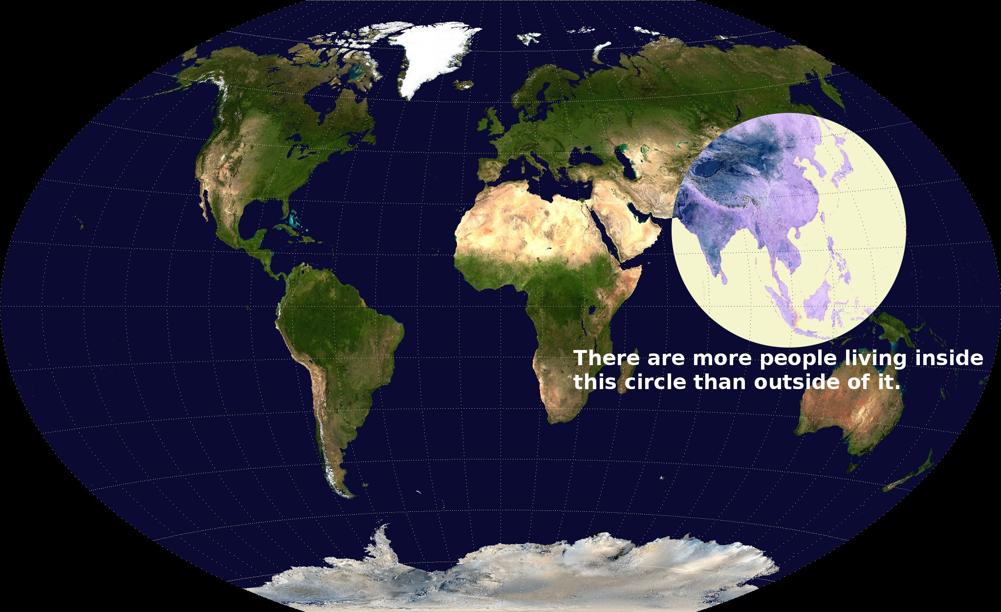
During the past several years, the continued increase in population has been becoming a serious problem throughout the world. With the increase in population and rapid use of limited natural resources, it is becoming very hard to sustain life in certain parts of the world. The world population, according to the U.S Census Bureau, is roughly 7,083,460,000. This map, which was featured in the Washington Post’s 40 Maps That Explain the World, shows that there are more people living in the white circle than outside it. China has the largest population with 1,349,585,838 people and India comes in a close second with 1,220,800,359. These are astonishing numbers that are only predicted to increase. Although with these populations being so high, many of the countries located inside the circle are developing countries. These countries do not have the technology and capability to support the populations; many people are forced to live in horrendous conditions. To try and control population, some governments use unethical methods to try and stop the skyrocketing population. Developed nations are put in a hard position because they want to help countries that are struggling, but they also need resources for their own people.
Because countries outside the circle have different political views on how to fix this population problem, there has been tension with countries inside the circle and outside the circle. After World War II, many of the countries in the circle were decolonized and faced with joining the American system, Soviet system, or go their own way. Most countries outside the circle are more developed than the countries inside the circle and are faced with more opportunities to expand their economy. Countries that do not have this luxury face the task of finding another way to support their economy and often have a hard time doing so. If these developing countries do not do something to control and support their populations, eventually earth will not be able to sustain the huge population and people throughout the world will be forced to change their lifestyle.
When viewing a map, perspective is a huge component in trying to understand what the cartographer is trying to get across. Usually when talking about population people use numbers to compare because numbers tend to be easier to understand. This cartographer does something out of the ordinary and uses a map to split the world into two parts. The area inside the circle is one part and all the area outside the circle is another part. By splitting the world into two parts, the map becomes very simple. It emphasizes the fact that there are more people inside the circle even though there are a lot more countries and land outside the circle. This shows how condense the population is in the area inside the circle.
Although this map brings up many good points by splitting the world into two parts, there is one problem with this approach that tarnishes the map. By being split into two groups, the map becomes very general and does not give country names, borders, or the population for any country. By doing so, this becomes a map of the haves and have-nots. The viewer of the map is forced to have knowledge on where each country is located and how big it is. Since the map does not give populations for any country it blends all the populations together. With all the populations being blended together, the map doesn’t allow you to make any individual national comparisons or interpretations of how different countries’ populations are, it simply splits the world into two different areas.
Overall, this is a very fascinating map that shows a very different approach on the population of the world. Although it is eye opening to see that more people live in 2/3 of Asia than the rest of the world, there are a lot of concerns that are brought up by this fact. Governments need to start implementing policies before the populations get so far out of hand that it cannot get fixed.
References
Denis Wood, The Power of Maps (New York: Guilford Press, 1992), 110.
Dewey, Caitlin. “Map: More than Half of Humanity Lives within This Circle.” The
Washington Post 7 May 2013: n. page. Web. 30 Mar. 2014.
<http://www.washingtonpost.com/blogs/worldviews/wp/2013/05/07/map-more-
than-half-of-humanity-lives-within-this-circle.
First, the author (no name is ever given) does a great job analyzing the map. This is a truly fascinating map. His or her discussion on the division of the map is rather enlightening and does a great job summarizing much of what we learned in class. I would have liked to see future population projections and efforts by these Governments to control population growth discussed though. China’s one-child policy is of course the most famous effort to control population growth; however many other countries in the circle have been successfully implementing efforts of their own. India has lead a successful attempts at raising contraceptive rates through education and limiting government job access to people with two children or less. Singapore also went through measures to limit birth rates. It is also worth mentioning that this circle will continue to hold a larger and larger part of the population as Indonesia, Pakistan and India all see drastic population growths (China’s is supposed to reach a max and then slowly decline. It will create tensions and issues over resources in the region. Who knows maybe the next World War will be fought over water instead of ideologies?
–Brenden Carol
This map is very interesting and Brendan does a great job critiquing this map. I really enjoyed how Brendan explains the background history of what he thinks this map is about. Without knowing this background information a reader might not have any idea what this map could be about. I also enjoyed how Brendan explains the separation, and what it means in the map. Brendan also gives a good description of the countries that are located inside and outside of the map. Overall I really enjoyed reading and looking at this map and I like the insight that Brendan offers.
This critique of one of the “40 Maps That Explain The World”, as determined by the Washington Post, provides its readers with a fantastic analysis of the rhetoric behind this interesting map. I believe the author does a great job of placing the map in context with the current problem of over populated areas in Asia and other developing countries. More importantly, the author also provides great information at the interests of the map and the rhetorical devices, like over simplification (division of the world into two parts: inside and outside of the circle), through which the map accomplishes to make a bold statement. However, I believe that there are a couple of arguments the author could consider to enhance his already insightful critique. One of these important arguments is the influence of massive data sets required to complete such a map. With advancements in technology, cartography has begun to rely heavily on these technologies to simplify more complex topics, such as over population in the case of this map, and making them accessible to most of the population. I think it is worth while to delve or at least acknowledge the influence that these new technologies have in the production and rhetoric of this map. I also believe it would be beneficial to talk about the bold statement that the map actually makes and the power of that statement. Even the isolation of the area of interest with a circle and changing the color of the map within the circle demands the map’s audience to focus and realize the issue of over population in this region. The power of this map is incredible, and I believe that a further discussion of the potential rhetorical use of this map at the policy making stage is an essential element of the critique of this map.
Best,
Santi
Brendan-
I thought your interpretation of this map was very thorough and provided a complete synopsis. I liked how you used some background information to provide the readers with some real numbers since the map failed to do so. As you pointed out, the map takes on a very simple appearance because of the two halves the cartographer chose to represent. Additionally, I was very interested in how you pointed out how the “way of life” of certain countries would have to change if this population rate continues. Lastly, I find it very helpful that your critic brought in references to the “American system” and “Soviet system” that occurred after World War II. I find it interesting that these two major systems of running a country are almost completely disregarded and categorized in the half of the map outside the circle. Great Job!