
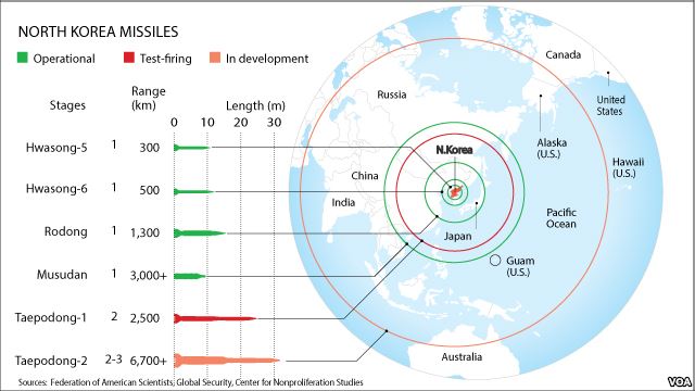
The Federation of American Scientists (FAS) was founded in 1945 by a group of scientists, who were heavily involved in the Manhattan Project and development of the first atomic bomb. Their mission in forming the Federation was to educate the public on important science and technology that dealt with nuclear power and its potential uses. Within the FAS, the Military Analysis Network provides information on specific countries and their military equipment. The expertise of the FAS provides a sense of credibility to the scientific reports presented, meaning the information is very accurate. This map of North Korea and its missile count provided by the FAS serves to educate the public in a manner they see as adequate.
At first glance, the map of North Korean missiles looks rather shocking. The zoomed in portion of Asia and parts of Canada and the United States seem to all be in range of certain missiles. During further review of the map, it is clear through the use of the key, that not all of the missiles are operational. More specifically, the Taepodong-2, which has the capability to reach United States soil, is still in a developmental stage. Taking a step back, it is clear that North Korea is the focal point of this depiction of propaganda. Propaganda in the form of a map is very common and in some cases has a bigger impact due to its visual effects. This North Korean missile map appeared in an article from the website Voice of America this past year. Within that article, there were comments regarding Presidents Obama’s intentions to stop North Korean missile testing. The President strengthens his arguments by putting North Korea on a pedestal and explaining how other countries would reciprocate their positive behavior.[i]
As an earthquake has an epicenter with waves radiating from it, this map has North Korea with potential missile ranges radiating from it. Centered on the country of North Korea, this map takes a very small portion of the world and puts it under a magnify glass. The circle cut out portion of the map resembles a magnify glass itself and hints that, this is what is important and needs to be closely studied. The propaganda map is clearly used to put North Korea in a bad light but it is important to understand that this technique of showing nuclear capacity, could be used to represent any other country in the “Nuclear Club”. This synopsis of the map just briefly outlines the appearance and possible intentions, yet it does not describe the importance of what is missing.
The obvious aspects of the map are clearly stated and easy to follow. The name of the missile, its range, stage in development, length and quantity are all presented in a user-friendly manner. This layout does not busy the eye in a distracting way but provides a tremendous amount of useful information to take in. Additionally, the most important countries according to this association are labeled to better orient the audience. To understand what is missing from the map, the observation of what is presented must be acknowledged first. Without any prior knowledge of missiles and their uses, it is very troubling to see the projected ranges and not know what their capability is.
A silence, when referring to a map, represents what a cartographer has left out. Most of the time each silence is intentional and has a specific reason for its absence. In some cases, an aspect must be left out in order to include another piece of the map. Upon reevaluation of the map, the capabilities of the missiles are clearly missing. This valuable information leaves the audience guessing whether the ground missiles have nuclear abilities or are effective in any way. This sense of unknowing is exactly what the FAS wants to create. In an article written by Dr. Timothy James Barney, the description of William Bunge’s Nuclear War Atlas is as follows, “By arguing for a new language of what proximity comes to mean on the surface of maps, the Nuclear War Atlas uses the ultimate fear of annihilation ironically as a catalyst for social change.”[ii] In a much less radical way, the North Korean missile map almost requests the initiation for change by the way of instilling fear. Of course, the rest of the world is left out intentionally to focus on the information that is being presented. The other continents not in the field of vision are irrelevant, as North Korea does not have the means of reaching them by missile.
As every map should do, this map prompts the further research of its subject matter. By leaving out the specifics of each missile, the FAS is daring the audience to research their potentials. While continuing the synopsis of the map and further researching the intentions, the “threat” of theses missiles disintegrates rapidly. The two longest-range missiles, the Taepodong-1 and Taepodong-2 are both non-operational according to the map, but also do not have nuclear intentions according to outside research. The Taepodong-1 is used as a space launcher and is not a production missile. This means that not only is there a long assembly time but the expense is extreme for an impoverished North Korea. The Taepodong-2 is a supposed improved version of is predecessor, but disintegrated after forty seconds in its only launch attempt. All of these facts are not attached with the map, yet they provide an enormously different emotion to the map.
A map of propaganda, illustrating the “threatening” potential of North Korea and their missiles may not be as intimidating as it seems. With additional information revealing the capabilities of the missiles that threaten U.S. soil, the intensity of the map is lessened substantially. This map may seem alarming with the information provided, which is rather extensive but missing some elements, yet its intention may be unclear. The real intention of the map is designed to show the current nuclear capabilities of North Korea and provides the spark to light the fire of imagination of what capabilities North Korea could hold in the future. However, the propaganda losses a great deal of power when the real nuclear potentials are revealed with additional knowledge.
Sources:
1.) Anonymous post to Voice of America newsgroup, “Obama Urges Pyongyang to End Nuclear, Missile Testing,” March 13, 2013. Accessed April 10, 2014. http://www.voanews.com/content/obama-urges-pyongyang-to-end-nuclear-missile-testing/1620868.html.
2.) Barney, Timothy James. “‘Missels as Missives’: The Radical Cartography of William Bunge’s Nuclear War Atlas.” blackboard.com. Accessed April 10, 2014. https://blackboard.richmond.edu/bbcswebdav/pid-1030844-dt-content-rid-1172302_1/courses/201320_24900/Barney%20on%20Bunge.pdf.
A.J.,
You present this map at a particularly relevant time for our class; this map’s endorsement of social change correlates well with the radical mapping we discussed in class. In terms of your post, your critique is particularly powerful because it exposes this map’s deceit. Initially, this map facilitated fear and anxiety, and I caught myself thinking “oh great, another reason I need to fall asleep stressed”. However, with further research, you revealed that this map, to be blunt, is lying. The Taepodong-1 and Taepodon-2 missiles are not realistic threats to the United States because of the costs associated with them. Before you revealed that crucial information, I wanted the United States to initiate defensive action, but after learning the truth, I no longer worry about my existence. Furthermore, I would now require more information before I support United States military action. Your post highlights how maps are often believed to be authoritative and accurate; however, a map’s audience should approach this belief with caution.
Great post!
Robert Nogay
I like how you identified the map as user friendly with its combination of cartography and graphing. The simplicity of the map is underscored by its powerful message which you have clearly identified and analyzed. The silences and analysis of Dr. Barney’s paper on William Bunge are funny as well as insightful. This map begins as a simple, informational map and ends calling for social change. I think you did a great job.
Coleman
A.J.,
I was really impressed by both the amount of information that you provided as well as the depth of that information. You gave a great background to the reader that led well into your main argument. In conjunction with this, I could also tell that you went “nerd-deep” when you talked about the article that this map was featured in and even some of the intentions that could be seen in that article. I also thought you addressed some of the main points about the map nicely. You talked about the bias, intention, projection, selectivity, and choices in great detail which really enhanced your argument about this being a radical propaganda map about the dangers of North Korean nuclear missiles. All in all, I found this to be a very eloquently written and intelligent analysis that addresses all of the key aspects of the map.
Well-done!
Brian Dowd
AJ,
This piece is clearly very well thought out and that’s apparent in its eloquence. I liked how you broke down the map in a Denis Wood-esque manner; your highlighting of bias, silences, and selectivity is fluid and intelligently written. I found the projection of the map most interesting because it obviously means to intimidate based on the (unrealized) size of the nuclear rings. In addition to covering these aspects of the map, you did a great job in providing your analysis especially at the end. I liked your take on the interests of this propaganda and how it inspires further thought and research, which subsequently dispels the intent of the map. It is a perfect example of a map that promotes an exaggerated sense of fear or caution, and your critique of this mapping format was refreshing.
Awesome work!
– Pete