Map of the Week: “Tea Revives the World”

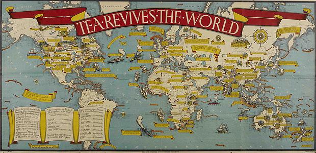
          From the late 1500s onward, the British Empire became one of the most dominating and powerful empires in world history. It stretched from the British Isles to Australia, and the Americas to India. Certain statistics even show that throughout the course of its history, the empire had invaded roughly 90 percent of all modern day countries at one point or another[1]. Without a doubt, it is one of the most astonishing empires ever studied in history due to its expansive influence. Following World War II, however, the empire began its decline in the form of decolonization and ceding of power to new forces such as the USSR and United States. In more modern times, the “empire” of Great Britain is often, jokingly, synonymous with soccer (football if you’re from the eastern side of the Pond), high class (think fancy British accents and monocles), and of course, tea. Rather comically, tea is considered to be a staple of the British diet but, in fact, it was also a staple of the British economy for hundreds of years as tea, in addition to textiles, predicated British dominion over colonies such as India, and facilitated trade with other colonies and territories, like the American Colonies. Though eventually a combination of tea trade and taxation cost the British Empire dearly as the American Colonies declared their freedom in 1776, tea nonetheless remained integral to British economy, culture, and society. According to British architect MacDonald Gill’s poster titled “Tea Revives the World,” published in 1940, Gill shows just how important tea was to the English people.[2] Created upon this poster is an interconnected web of tea trade and history throughout the world that captures the nostalgic British spirit of imperialism regarding the Empire’s past glory within a timeframe of the 1940s. In this way, tea is more than just a commodity to the British in the eyes of Gill; it is an economic, cultural, and political symbol to the British people of a time, before the horrors of World War II, when the British Empire was truly an empire, in every sense of the word.

             At first glance at this poster, the eye of a reader is immediately drawn to the outstretched title reading “TEA REVIVES THE WORLD.” This blood red banner injects vibrant color into an otherwise dull map, attracting viewers to its message. The banner, which offers a rather bold statement, actually holds great historical context.[3] During World War II, tea was used by the British Empire on the war fronts to “revive” the spirits of the empire’s soldiers in order to boost morale on the field of battle. In this way, British soldiers were given the comforts of home and were reminded just what they were fighting for: life, country, family, and friends, as well as soccer, monocles, and tea. By using this statement as his title, Gill stakes the claim that tea is more than just a tasty, hot drink, but it is a cultural commodity that holds therapeutic value to those who drink it and has the ability to alter the outcomes of even the largest wars. Furthermore, the word choice of Gill in the title stating that tea “revives” the world, leads to a political assumption that while the British Empire was by no means its former self, it still believed itself to be the standard of class, civilization, and order in the world. Gill implies through the title of the poster, that the world may in fact need “reviving” or a re-civilization by the British given the context of World War II that was ravaging Europe, North Africa, and the Far East during this time. The title suggests that Great Britain will save the world from the darkness of Socialism and oppression that had consumed Europe in the 1940s—certainly a bold assumption and political statement.

         The visual nature of the title, being that it is so large and drapes across the entire map, holds a second value too, as it pulls the globe together into a small, tightly knit community of countries woven together by tea trade. Through this projection, oceans seem like mere rivers and continents seem like leaves resting on the surface of a pond. By using a very distant view of the world, Gill is able to bind together the corners of the British Empire, as well as the world, with images of hugely enlarged steam ships and trade vessels carrying tea. These drawings help to cramp the seven seas and emphasize just how small the world is. The use of ships and other ocean going vessels is questionable, however, due to the fact that when this poster was crafted during the 1940s, the world was at the peak of the “air age.” Strangely, in a time when technological advancements led man to take to the skies in aircrafts, there are only a handful of planes that appear on the map. Instead of noting the changing trend from sea travel to air travel, Gill focuses on the oceans and naval power which was traditionally the British Empire’s greatest strength. Furthermore, the use of the Mercator projection (which was becoming increasingly outdated at this time) only adds to the very traditional nature and appearance of this map that harkens back to the strength of Great Britain in centuries past. This all occurs while the word “TEA” hovers above Earth, further stressing its effect on the world as a commodity that the entire globe desires – and as a commodity that Great Britain provides to the world.

          Again in an attempt by Gill to alter the viewer’s conception of the world, the British Isles are drastically oversized in comparison to their true proportions towards Europe. This holds to the intent of the poster in showing the measurable impact that Great Britain has on the world. The proportioning of countries may also hold a significance to the fact that this poster was made during the height of World War II and was distributed to supporters of the Allied powers. In a time when maps of the world were becoming much more accessible to people, this poster could be used as a reference for the common man in understanding where the action in World War II was taking place without being overwhelmed by the many serious and intellectual wartime maps that were widely available at this time. By showing the major Allied Powers (United States, Great Britain, and the Soviet Union) as augmented in size, Gill perhaps intended to subliminally convey a hope to his audience that Allied nations held the advantage in the war when compared to the major Axis Powers (Germany and Japan), which are virtually unrecognized or shoved off the farthest edges of the poster, respectively.

          In this artistically designed poster, Gill acknowledges the vast nature of Great Britain’s “tea empire,” in a number of ways, one of which is the use of a multitude of note scrolls adorning the map in several locations. Each scroll indicates either an event, or cultural connection with tea that is unique to the region it lies near on the poster. This information is presented in a very traditional fashion, complete with old-style fonts, scrolls, and ocean vessels which greatly contrasted many of the rigid and factual maps of war time strategy that were prominent in cartography of this time period.  For instance, near Nova Scotia, Canada, there is a note scroll reading “Famous TEA clippers were built at Halifax (the capital of the province of Nova Scotia),” which shows the historical and industrial impact that tea created on Nova Scotia. Each note scroll shows how tea, as both an export and import, had a very formidable effect on the society in which traveled to and from. However, by focusing on a quaint and charming history of the world, the poster leaves many notable “silences,” or omissions, in its content by not highlighting the rampant industrialization and militarization present in a world that was emerged in the deadly conflict of World War II.

          Though times have changed since the publication of this poster in 1940, its message remains the same in three distinct ideas: tea is important, Great Britain controls tea, and Great Britain is still “great” in comparison with the rest of Europe and the world (though ironically, Great Britain was more in debt to a foreign country than ever thanks to the military aid provided by the United States through the Lend Lease policy). Despite the events of World War II, including the bombing of London and German dominance over France and Great Britain on the mainland of Europe,[4] this poster seeks to argue the historical and economic preeminence that Great Britain held over Europe and the whole world, despite the country being badly affected by the traumas of World War II and a declining empire. Gill uses tea to show the belief that the British Empire still holds the level of excellence and dominance that it had always had over the past four centuries. In a time when the once mighty British Empire was seeing the sun set upon its former glory, Gill created this poster to give the British people a tangible item that displayed the greatness and power that the empire still had, and to reinforce the British morale during the dark days of the Second World War. 


Bibliography


Laycock, Stuart. All the Countries We’ve Ever Invaded: And the Few We Never Got around to.  

Gloucestershire, UK: History Press, 2012.


Tea in England, “Tea Revives the World–An Illustrated Poster from the 1940s,” blog post,   

January 30, 2014, http://teainengland.com/2014/01/tea-revives-the-world-an-

illustrated-poster-from-the-1940s/


War Birds, “Introduction to the Air War During WWII” blog post, March 7, 2005,

               http://warbirdsofww2.tripod.com/intro.htm


[1] Laycock, Stuart. All the Countries We’ve Ever Invaded: And the Few We Never Got around to. Gloucestershire, UK: History Press, 2012.


[2]Tea in England, “Tea Revives the World–An Illustrated Poster from the 1940s,” blog post,   

January 30, 2014,  http://teainengland.com/2014/01/tea-revives-the-world-an-illustrated-poster-from-the-1940s/

[3] http://teainengland.com/2014/01/tea-revives-the-world-an-illustrated-poster-from-the-1940s/

[4]War Birds, “Introduction to the Air War During WWII” blog post, March 7, 2005,

 http://warbirdsofww2.tripod.com/intro.htm

Posted in Uncategorized | Comments Off on Map of the Week: “Tea Revives the World”

“National System of Interstate and Defense Highways” Class Discussion

  The first highway act was envisioned by Roosevelt. The project could not begin due to WW2 and all resources were focused towards the war. The Federal Aid Highway Act actually passed in 1938 but only 6500 out of 40,000 miles were completed by 1953. After the war had ended, during Eisenhower’s time in office, funding issues still remained. Not until 1956 the Federal Aid Highway Act of 1956 was finally passed. This act stated that 41,000 miles of highways were to be completed with $25 billion authorized for the construction. The project began rolling in 1957 and continued up until 1969.

In class we talked about the many unique qualities the map has. The Cold War was occurring while these highways were being built (also, the second Red Scare occurred a few years before the act was finally passed). Not only does the map literally depict the predictions of interstate highways by 1971, it has many underlying meanings. The United states is worried that it may or may not be attacked by Russia or some other communist country at the time (notice how the map is titled “national interstate and defense highways”). The highways could be used for escape routes in case a city or town is attacked (probably by an atomic or nuclear bomb) or transporting goods to a city or town that is in need. Another interesting fact is that the highways physically connect the United States, making the citizens “closer” not only in a physical sense but join the country closer together, somewhat as a family. The map itself looks as if the highways are “veins” and the country is a body.

“National Interstate and Defense Highways Act (1956).” Our Documents -. N.p., n.d. Web. 24 Oct. 2014.

Posted in Uncategorized | Comments Off on “National System of Interstate and Defense Highways” Class Discussion

Atlas of the Week: Atlas of Global Christianity

This atlas breaks down one hundred years of Christian history.  Looking at Christianity around the world from 1910 to 2010, this atlas maps the different forms of the religion throughout each country.  It also goes through and highlights where religious freedom and diversity is more prevalent. The Christian traditions that have been practiced for the past 100 years are looked at in depth through each country.  The atlas is broken down into five parts: “Religion,” “Global Christianity,” “Christianity by Continent and Region,” “Peoples, Languages and Cities,” and “Christian Mission.”  This atlas is able to spread Christianity even more so by emphasizing its dominance throughout the world.

http://www.atlasofglobalchristianity.org

Posted in Uncategorized | Comments Off on Atlas of the Week: Atlas of Global Christianity

Map of the Week: “Market Size By Gross Domestic Product, 1995”

This map, at first glance, looks like an unfinished map of the world. In fact, this map, “Market Size By Gross Domestic Product, 1995,” is complete and was published in 1996 in The Handbook of International Economic Statistics.  Coming from a textbook it was used by students to study the world at an economic view. With its simplicity, the map is able to clearly break down the world in terms of each country’s total value. By having each country’s size relative to its GDP, the world as it was in 1995 can be seen through an economic lens. While looking at this map, it is important to keep in mind that not all countries shown are labeled and, even more importantly, countries with too small of a GDP are not even on the map.  By physically manifesting the world GDP on a map, the cartographer gives a better understanding of the world economy in 1995 and inevitably  makes the United States and Japan the same size, shrinks Russia, conceals most of Africa, and entirely changes the realistic scale of the world.

What clearly draws the eye when first looking at this map are the larger countries, as those that are visible seem to jump off the map. The United States and Japan emerge from the edges of the map, consuming most of the space; this signifies the countries’ economic power and influence on the rest of the world. These two countries had the largest GDP in 1995, followed by China and Germany. The booming economies, from trade and advanced technology, of these countries at that time gave them the biggest spots on the map. For instance, it is no surprise that the United States is able to provide aid throughout the world as they continue to have the highest GDP in the world, just as they did in 1995.

If this map was made relative to size, the United States would look proportionate to the other countries, but when compared to Russia or the other shrunken countries it looks massive. The cartographer is able to portray the United States as the most powerful economically but also socially and politically with its huge physical presence on the map. This perspective of the world alters the proportions that the viewer would assume, yet it still portrays the exact GDP for these countries. For instance, when economics students are looking at this map, this is how they are learning to interpret the world, through the view of an economist. In addition, Germany, France, Spain, the United Kingdom, and Italy seem to fill all of Europe by taking the “spots” of the smaller countries that are not shown on the map. The first world countries of this time are not only expanded in size but seem to shrink the rest of the world. Similar to the way these countries take over Europe, India stretches in size across Asia along with China. Other noticeably large countries are South Korea, Taiwan, and Hong Kong. South Korea is expanded so intensely it makes North Korea almost unnoticeable. In the view of politicians or military specialists, North Korea is often a country to keep an eye on but from an economists perspective it appears almost irrelevant. The size of Hong Kong and Taiwan are eye-catching because on a scaled map of the world, these countries are barely seen due to their small-scale size. However, the size of the richer countries are able to highlight the world “superpowers” as this map emphasizes their wealth.

While the countries blown out of proportion are easy to spot, there are also the countries that aren’t visible that can make you question why they aren’t as visible on the map. What happened to most of Africa? What is going on with Russia? Why is most of the Middle East gone? The countries with little technology, low education, and lack of health care will not be seen because all these factors cause them to have a low GDP. Many countries in Africa are not shown on the map due to the fact that their GDPs are so low in comparison to the rest of the world. These countries that are shrunken and the ones that are not even shown are overlooked. The poorer countries are silenced on this map, therefore not only does this map give the wealthier countries a stronger economic voice but it is also able to enhance their political power by emphasizing the different sizes of the countries. Even the countries that are shown in Africa are minuscule in relationship to the rest of the world on the map. This is similar to the situation in the Middle East. The smaller countries are not shown due to lack of GDP, highlighting their status as third world countries. The absence of these countries is clear as India, China, Iran, and Pakistan take up the space of the Middle East while everywhere is empty space. By physically hiding these countries on the map, the cartographer is able to make the poor countries appear homeless, taking away their economic power but also their social and political power.

As opposed to Russia, the country which on an average map is always the biggest, here it is represented to be smaller than South Korea. This is a clear sign of the economic crisis in Russia which followed the fall of the Soviet Union. Before the 1990s, Russia had some of the greatest power and economic value as it controlled all of Eastern Europe as well. This map shows how much power Russia lost after the fall of the Soviet Union. Although it is important to remember this map was made almost ten years ago and Russia’s GDP is currently en route to being one of the highest.  Many of the countries whose GDP is not substantial enough to be included on the map are still underdeveloped and wouldn’t be on a present day version of this GDP map.  While looking at the world relative to GDPs the poorer countries are easily excluded. Does this make these countries less important or the people irrelevant? While this map may be useful to study the world economy it can cause the countries with small GDPs to be viewed as little worth, especially when they can’t even be seen on the map. This shows that while accurate, this map excludes part of the world and gives a stronger perspective on the wealthier countries.

Overall a map of GDP values is the only map that can make the continent of Europe the largest continent, Africa practically disappear, Japan essentially equal in size to the United States, and Russia shrink down to almost nothing. It is no surprise that the first world countries are quickly developing countries in 1990s and the ones with the greatest span on the map. The third world countries are the ones which appear microscopic, or do not even appear at all. When the world is not mapped relative to size and borders, but relative to wealth, the view of the world becomes distorted and the wealthier countries seem to take over the world.

Posted in Uncategorized | 1 Comment

Atlas of the Week: The American Civil War

This atlas was compiled by the Department of History at The United States Military Academy, and it consist of a collection of Civil War battlefield maps ranging from 1861-1865. Consequently, this atlas shows us how maps have  a practical purpose for the military and it also tells a behind the scenes story of the Civil War by shining light on the military strategies that were used in each battle.

http://www.westpoint.edu/history/SitePages/American%20Civil%20War.aspx

Posted in Atlases of the Week | Tagged , | Comments Off on Atlas of the Week: The American Civil War

Map of The Week: “Army Map Of The Seat Of War In Virginia”

Have you ever thought of maps as a vehicle to sway opinion? What if I told you cartographers of The Civil War used maps in order to gain support for the war and boost morale? “The Army Map of the Seat of War in Virginia” was created by JG Bruff of Washington D.C. in 1862. The map portrays positions, battlefields, railroads, and a plethora of other landmarks in a detailed scientific manner. It includes major battles such as The Battle of Bull Run and also includes a list of 34 U.S. forts in the vicinity of Washington D.C. If we look carefully at Bruff’s work, we realize it is prone to having political interest beyond that of reporting the war; his map strives to influence the social and economic opinion of the public in order to favor the war. The map provides a textbook example of how maps can be used in a rhetorical context to shape the thoughts and identities of its audience.

We can begin to expect political interest to be prevalent due to the fact the map is created by a cartographer who works for the United States government as opposed to that of a neutral party. The political interests are first seen when analyzing the legend of the map. Bruff provided two different symbols for United States Positions as well as Confederate Positions. Although at first sight this small difference appears to be meaningless, if we look at the map from afar we may assume that only the United States had positions due to the proud flag blowing in the wind that represents their positions. In contrast, to mark Confederate positions the cartographer used a much smaller, less proud, dilapidated flag that is not as easily seen as that of the United States. Therefore we can infer that the cartographer chose to draw the audience’s attention to only the United State’s’ positions in order to gain support and hope for the ongoing war, which was just in its infancy. This tactic results in unity and backing for the goals of the government, which increases the government’s odds of achieving their goals.

    Furthermore, the cartographer made the choice to showcase Washington, D.C., the Union capital, by encompassing it in a large blue diamond. By doing this the cartographer made Washington D.C. the center of attention, as well as, the fortifications surrounding it. The cartographer goes as far to include a note in the bottom right hand corner stating: “48 Works of Defense around Wash and The District of C. mounting 300 Guns”. We could infer this is another ploy to shape the opinion of the audience by making them believe that Washington D.C. is the mecca of the country and is well- protected against its Confederate enemies. In addition, Bruff only included a list of Union forts rather than mentioning the Confederate forts as well. Therefore Bruff portrays the Union Army to his audience as a significantly stronger force than the Confederate Army for the goal of gaining Union support for the war.

    In order to help hide these political interest the cartographer employed a scientific style when drawing the map by adding a significant amount of detail. By articulating his work in this fashion the cartographer is able to convince the audience they are viewing a work of science and fact as opposed to a government made map. Most people are unaware of any rhetorical strategies due to the fact that they use maps as a window into reality and overlook the fact that there is someone who creates this tool of social construction and someone who chooses what to reveal and what to conceal. The cartographer’s use of concealment is arguably their most important tactic. This is because the map claims to encompass the war in Virginia, which was at this point part of the Confederacy, but Bruff only included a zoomed in portion of the state strategically not including the southern half of the state where the new Confederate capital of Richmond was. From this we could infer that the cartographer chose not to include this portion of the state due to the fact that the Confederate troops had a stronghold near their capital as well.

Evidently, “The Army Map of The Seat of War in Virginia” includes multiple political goals that are not apparent to the audience at first glance, given the cartographer employs a method of concealment to disguise his creation as a work of science. Therefore this map illustrates how a work of cartography can be used in a rhetorical manner to shape the identity of its audience.

Posted in Maps of the Week | Tagged , , | 3 Comments

Atlas of the Week: Atlas of Cities

http://press.princeton.edu/titles/10307.html

This atlas charts the diversity of the world’s cities over time, by processes of urbanization. It’s broken up into various chapters based on distinct types of cities, such as foundational cities (Athens and Rome), industrial cities (Manchester and a range of US and European industrial cities), rational cities (Paris and others including Vienna, New York and Washington DC), etc. Vibrant color maps, charts, and illustrations enrich this atlas and make it exciting for readers, which ties in perfectly with Odra Noel’s Map of Health, that also uses color as a tool to draw the audience.  The central theme of this atlas is that in every geographic context and historical period, cities have always been engines of economic innovation and centers of cultural expansion, social transformation and political change.

Posted in Atlases of the Week | Comments Off on Atlas of the Week: Atlas of Cities

Map of the Week: The Map of Health


North America is wasting away due to its outstanding obesity rates. Ironic is it not? Has it ever occurred to you what the leading causes of death were around the globe? This world map of mortality gives insight as to what factors are responsible on each continent, by providing a microscopic-level view of human tissue most associated with any of the particular causes of death.

North America is represented by adipose tissues, eluding to its obesity epidemic, where more than 1 in 3 Americans are obese. Europe, stretching deep into Russia, is portrayed as a slice of brain tissue, representing the neurodegenerative disease affecting its expanding ageing population. The Pacific and East Asia are shown as pancreatic acinar tissue, linking them to diabetes, which is increasing quickly in the developing nations of East Asia. Africa, the only continent where infections are the leading cause of death, is represented by red blood cells, which indicate the risk of transmittable disease such as malaria and HIV. South America and a part of Central America are shown as pulmonary tissue, representing lung cancer and respiratory functions, the leading causes of death. The Middle East and a large part of Central Asia are colored in as cardiac tissues due to large incidences of hypertension and other causes of heart failure. Lastly, Greenland is marked by sperm cells that represent infertility.

Through the abundance of these human tissues, the cartographer showcases the political and social implications associated with the map. The map not only makes us more conscious about our health, it also speak to the economical statuses of each country. Africa for example is linked to AIDS, objectifying it to themes of poverty, infection, and lack of sanitation. The problem this creates is that it reduces areas and continents to sites of disease, and has the reader comparing very diverse groups of people and classifying them to particular diseases.

At first glance, this map looks more like it should be hanging in MOMA than being used as a reference of the world. It is important to note that this map was made by Odra Noel, who is both a doctor and painter. The cartographer applies both her medical and artistic background in her work. In doing so she merges a dichotomy of topics that have traditionally been in contention with each other, and allows people to get an authentic, diverse view of the map. She proves that the tissues that form our organs and body parts can be artistically expressed through vibrant colors and patterns. Her approach to creating this map was as if she was painting a picture. She even goes as far as signing her name on the map, like an artist does when he or she completes a piece of work.

The mapmaker’s interest in scientific art is heavily embodied throughout the map. Noel attempts to promote values of progress by showcasing the morbid diseases and illnesses that are to blame for worldwide fatalities. The message she hopes to put forth emphasizes that many of these preventable diseases/illnesses can be combatted in time. We as humans have a responsibility to take care of our health, as well as the health of others. These diseases are not only present to warn us of potential harm, but showcase a Westernized view, which critiques third world countries with social narratives. For instance, South America, is associated with lung cancer, and therefore, general assumptions might be drawn that there are high levels of tobacco or polluted airways spread across the whole continent.

Noel plays an active role in the map by using these beautiful tissues to ironically show death and disease. She is imploring the reader to understand that many of these diseases are preventable, making the audience aware of the causes of their own death. The map’s rhetorical messages transform into activist documents and raise the reader’s awareness. While Noel emphasizes the rhetorical messages of the map, her projection is somewhat distorted. The world is divided into very broad continents on this map. Instead of categorizing it by nation or ethnic group, broadly diverse areas like the Middle East and Central Asia are brought into similar tissue groups, which may not be the most accurate. This leaves the map to become more about the art than factuality.

As much as Odra Noel wants the map-readers to comprehend her message, she places just as much responsibility in their laps. The shapes of all of the continents on this map are simplified, almost to an extent where they are just general outlines. She understands that the “geographic imagination” of an audience can be shaped and molded and uses that to her advantage, spreading the notion of disease, which allows readers to correlate global areas with particular types of illness and mortality on the map. Noel forces individuals to take the information provided and draw their own conclusions, therefore giving it more authenticity and value.

This map is a culmination of scientific and artistic components, making the author’s voice an active and central component feature. Although the map does include scientific facts, there are silences present, leaving the audience to draw their own interpretation. Odra Noel’s map builds the case that no map should be taken literally, and that there will always be partiality buried within.

Posted in Maps of the Week | 4 Comments

Illustrated Atlas Of The City Of Richmond, VA


F. W. Beer’s Illustrated Atlas of the City of Richmond, VA, was published in 1877 and is an illustrated collection of maps of nineteenth century metropolitan Richmond. Richmond, Virginia was the capital of the Confederacy and after the Civil-War Richmond still remained an important center of commerce and trade in the Reconstruction Era South. This atlas has significance because our university, the University of Richmond, is located in Richmond and this map chronicles Richmond’s vast history through cartographic means.

Link: http://www.loc.gov/item/2005630891/

Posted in Atlases of the Week | Comments Off on Illustrated Atlas Of The City Of Richmond, VA

“How Communists Menace Vital Materials” Class Discussion

The map above was made in 1956 during the height of the Cold War. It was published in a Congressional Report, meaning that the audience was the people who were in charge of the country. The map uses language and symbols to instill fear in the viewers and spur them to take action. The title and other language on the map uses strong words, such as “menace” and “thrust,” to represent how communisms is being forced on the world. The list of “materials” that are being “thrust(ed)” on the world not only include metals and goods, but also include ideas and philosophies. The inclusion of ideologies in the list of materials at the bottom of the map gives the impression that communism is taking over the world both physically by controlling material goods and mentally by controlling people’s thinking. The use of arrows coming out of Russia also shows the idea that communism is spreading and that the policy of Containment will not be effective. The arrows themselves take up the majority of the map, which is important because the author is again representing the reach and influence of communism. Having the arrows come directly out of the hammer and sickle, which is the only symbol on the map, emphasizes that communism is overpowering the world. This map would cause fear in the viewers because they can clearly see the reach of communism and its impact on the world.

In the class discussion we talked about the inclusions and exclusions on the map. One important feature that was mentioned was that the author decided not to include the countries names on the maps. Instead of putting names on each country, the author put the materials that were from that country. The exclusion of a country’s name strips away its identity and simplifies it to a mere word or two. The simplification of the countries shows how the U.S.S.R. sees each country as a supply of resources they need rather than as an equal who a unique identity. The reach of communism is further emphasized because the countries affected by the U.S.S.R. are shaded in gray. The shading in of countries makes the United States more likely to take action because they can see that communism has already spread significantly.  This propaganda map would have urged congress to shift government policy away from the idea of Containment and towards a plan that took actions to combat communism where it was spreading and push it back towards Russia.

Posted in Uncategorized | Comments Off on “How Communists Menace Vital Materials” Class Discussion