
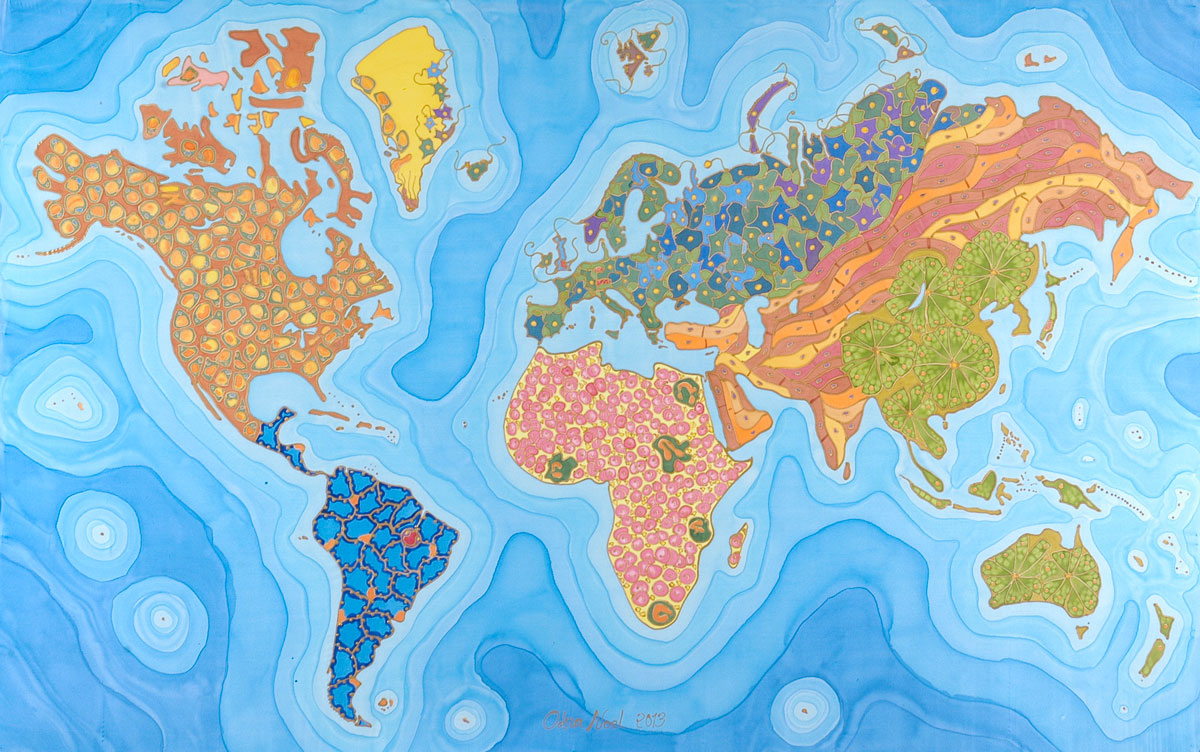
North America is wasting away due to its outstanding obesity rates. Ironic is it not? Has it ever occurred to you what the leading causes of death were around the globe? This world map of mortality gives insight as to what factors are responsible on each continent, by providing a microscopic-level view of human tissue most associated with any of the particular causes of death.
North America is represented by adipose tissues, eluding to its obesity epidemic, where more than 1 in 3 Americans are obese. Europe, stretching deep into Russia, is portrayed as a slice of brain tissue, representing the neurodegenerative disease affecting its expanding ageing population. The Pacific and East Asia are shown as pancreatic acinar tissue, linking them to diabetes, which is increasing quickly in the developing nations of East Asia. Africa, the only continent where infections are the leading cause of death, is represented by red blood cells, which indicate the risk of transmittable disease such as malaria and HIV. South America and a part of Central America are shown as pulmonary tissue, representing lung cancer and respiratory functions, the leading causes of death. The Middle East and a large part of Central Asia are colored in as cardiac tissues due to large incidences of hypertension and other causes of heart failure. Lastly, Greenland is marked by sperm cells that represent infertility.
Through the abundance of these human tissues, the cartographer showcases the political and social implications associated with the map. The map not only makes us more conscious about our health, it also speak to the economical statuses of each country. Africa for example is linked to AIDS, objectifying it to themes of poverty, infection, and lack of sanitation. The problem this creates is that it reduces areas and continents to sites of disease, and has the reader comparing very diverse groups of people and classifying them to particular diseases.
At first glance, this map looks more like it should be hanging in MOMA than being used as a reference of the world. It is important to note that this map was made by Odra Noel, who is both a doctor and painter. The cartographer applies both her medical and artistic background in her work. In doing so she merges a dichotomy of topics that have traditionally been in contention with each other, and allows people to get an authentic, diverse view of the map. She proves that the tissues that form our organs and body parts can be artistically expressed through vibrant colors and patterns. Her approach to creating this map was as if she was painting a picture. She even goes as far as signing her name on the map, like an artist does when he or she completes a piece of work.
The mapmaker’s interest in scientific art is heavily embodied throughout the map. Noel attempts to promote values of progress by showcasing the morbid diseases and illnesses that are to blame for worldwide fatalities. The message she hopes to put forth emphasizes that many of these preventable diseases/illnesses can be combatted in time. We as humans have a responsibility to take care of our health, as well as the health of others. These diseases are not only present to warn us of potential harm, but showcase a Westernized view, which critiques third world countries with social narratives. For instance, South America, is associated with lung cancer, and therefore, general assumptions might be drawn that there are high levels of tobacco or polluted airways spread across the whole continent.
Noel plays an active role in the map by using these beautiful tissues to ironically show death and disease. She is imploring the reader to understand that many of these diseases are preventable, making the audience aware of the causes of their own death. The map’s rhetorical messages transform into activist documents and raise the reader’s awareness. While Noel emphasizes the rhetorical messages of the map, her projection is somewhat distorted. The world is divided into very broad continents on this map. Instead of categorizing it by nation or ethnic group, broadly diverse areas like the Middle East and Central Asia are brought into similar tissue groups, which may not be the most accurate. This leaves the map to become more about the art than factuality.
As much as Odra Noel wants the map-readers to comprehend her message, she places just as much responsibility in their laps. The shapes of all of the continents on this map are simplified, almost to an extent where they are just general outlines. She understands that the “geographic imagination” of an audience can be shaped and molded and uses that to her advantage, spreading the notion of disease, which allows readers to correlate global areas with particular types of illness and mortality on the map. Noel forces individuals to take the information provided and draw their own conclusions, therefore giving it more authenticity and value.
This map is a culmination of scientific and artistic components, making the author’s voice an active and central component feature. Although the map does include scientific facts, there are silences present, leaving the audience to draw their own interpretation. Odra Noel’s map builds the case that no map should be taken literally, and that there will always be partiality buried within.
My favorite thing about this map is definitely its combination of art and science to make an interesting point, while at the same time making an interesting point about the major health issues that various regions around the world are faced with. You did a good job explaining what all of the various textures and colors used actually represent – given that there is no legend on the map, and that other than your critique there is no information on the map, based on appearances I would have thought that this map was actually a piece of art.
I find this map noteworthy and relevant because it communicates a message that relates to issues still analyzed by scientists today. This map can be related to the class theme of the relationship between the map and the cartographer. This cartographer’s experiences are clearly expressed through the maps presentation. Not only is this cartographer a female, but also a painter and doctor. The artistic qualities of the map are seen through the use of color, fluidity, abstractness, and iconography. The grim qualities of the “leading causes of death” are hidden within the different colorful icons on the map. The cartographers background in medical science can be seen through the map’s use of medical symbols such as adipose tissue, cardiac tissue, pancreatic acing tissue, and red blood cells. I agree that this map exemplifies the artistic side of cartography and proves that not all maps need to be scientifically correct to present a persuasive argument.
Cameron,
Awesome map choice! What sticks out most to me is, as you pointed out, the contrast between bright, cheerful colors and the way they represent death and disease. That artistic choice certainly speaks to the interests of the cartographer and influences the way that the viewer perceives the piece. For example, the different shades of blue in the oceans, which even look like they were painted with watercolor, are a stylistic choice that reveals artistic tendencies in a supposedly scientific map. I like how you tied together the types of disease that affect each area and the connotations they carry about the region, as in your discussion of Africa and its portrayal as a poverty-stricken, infected continent. Another important point you touched upon is the generalizations that this map carries. There are no traditionally “scientific” elements, such as a charts and graphs and data series about infection rates or death rates. Instead, the cartographer sweeps a disease across an entire continent, not bounded by country borders but instead the borders of the ocean. Ultimately, this map conveys a sense of artistry over science and is an excellent example of the two mixing in cartography, and I think you did a great job getting that across to your audience. Stellar post!
I think your choice of map is fascinating. I have not seen a map like this that so closely links the science of making maps with the artistic ability needed to create maps. You did an excellent job at explaining what the different cells on each country were and why they were there. I also liked the depth to which you describe the author. The author expresses herself and her views as both a painter and a scientist directly through her choices on the map. Particularly, as you said in paragraph five, Noel is conveying to the reader the amount of diseases in the world that are preventable. By showing the top killing diseases for different areas in the globe Noel reveals her underlying ideology that society as a whole can do more to prevent these deaths. In your conclusion you did an excellent job connecting the artistic factors in the map with the scientific accuracy present, while also pointing out the silences that exist. I really enjoyed reading your analysis of the map!