The Gateways to Space

Patrick Barry                                                                                                               Dr. Barney

5th March 2021                                                                                    The Rhetorical Lives of Maps

Blog Week #2

The Rocket Launch Sites[1] of the world map shows an overview of a varied array of launch sites around the globe and information pertaining to the amount of launches from each. Posted on Internet map forums by an amateur map enthusiast in 2015. It strives to illustrate how launch sites are placed in major countries and uses color coding and a key with explanations to convey information. The map is a standard Mercator  projection of the world and gives special attention to the US and Russia, or as it was at the time the USSR.

The map like any map is fraught with positives and negatives in its bias whether conscious or unconscious and in the experience, it gives the viewer. The map labels spaceports that have flown a rocket more than 1,000,000kg with a gold star surrounded by  a gold circle in the color corresponding to their total amount of launches. The choice of a star used to signify the heaviest rockets launched and most launches at these specifics sites shows a clear bias and social intent as the star while not directly indicated in the key carries with its societal preconceptions that influence the viewers opinion. Only Russia and America have the star. The star denotes excellence in a societal context and that context cannot be forgotten when looking at the map so by making this choice it lessens and fails to recognize the enormity of other countries achievements and frames the world in a Eurocentric nationalistic view. This affects how the viewer comes to know the world of international rocketry as though this  map does show private space ports it does not label them so. There is no private entrepreneurial facilities category or elaboration on success rates of rockets launched, type of rocket technology used, market niche, or limitations of the launch site. It fails to even account for differences in facility scale and or the industries that support it. For instance, the launch site in New Zealand relates to a New Zealand based private space company[2] that specializes in small satellite launches. Whilst the Cape Canaveral base in Florida is run by a government military organization and focuses on issues akin to the national agenda. If not specified, the distinction between governmental and private is unknown. This is problematic as the two are quite different in that private ventures must strive to turn a profit while governments can pursue loftier, less lucrative goals.

The map for all the short comings of being too broad and vague and not showing the unique individuality of each site has its many positives. It gives a better picture of just how the space infrastructure is spread throughout the world in places one would not think it would exist such as Sweden, Kenya, and Peru. So, whilst the map does uphold a Euro American dichotomous view of the US and Russia being the major players it also challenges preconceptions that those are the only two. The map also shows the marks of history and change as many of the sites are defunct and some are going through a period of change or spurring other changes within their nation[3]. The sites do not exist within a bubble and interact with the industries, people, and governments of their nations. Especially when places like the Baikonur Cosmodrome which is operated by the Russians but lies within a different nation. The map shows multiple sites in India and China which outnumber the established sites in the west in number but not, yet quantity of rockets launched or tonnage, but that may change with time. The map raises this question in its function. The map is on one hand a depiction of the old known state of space but on the other hand a snapshot of the future where America might not lead the charge into the next frontier and questions the status quo. It is a factual map of the present but also a visual projection questioning the future of space as private or public led by current leaders or new challengers.

[1] wohVPpF.jpg (3000×1688) (imgur.com)

[2] Rocket Lab | Frequent and reliable access launch is now a reality | Rocket Lab (rocketlabusa.com)

[3] A Brief History of the Congolese Space Program | Mental Floss

Posted in Maps of the Week, Uncategorized | 1 Comment

Map of the Week -William Tune

William Tune/ Blog Entry/ 2/19/21


“And Did Those Feet In Ancient Times…”


One of the most important aspects of maps is their vulnerability to bias. Maps are at all times created and viewed through the mapmaker and the map consumer’s respective worldview. The epitome of this principle is Heinrich Bunting work Itinerarium Sacrae Scripturae. This was a book composed of multiple Christian works and multiple maps. Our “Map of the Week” is one of them. The chosen map is a three leafed map of the world with Jerusalem at its center, which will be referred to as the Hanover map. 

To further understand the significance of the Hanover Map, its history must be investigated, specifically its creator. Heinrich Bunting was born in Hanover, in modern Germany. According to Jacques Keilo of Centrici, the coat of arms of Hanover contained a three leaf clover, thus the shape of the Map and its given name. Its shape is undoubtedly due to the bias of Bunting as the three leafed clover would be a familiar yet applicable means to view Jerusalem. Europe, Asia, and Africa all converge in the Middle East, making Jerusalem a central point in the old world. As previously mentioned, the Hanover Map was part of the book Itinerarium Sacrae Scripturae, which was created in 1581. This date is further supported by the appearance of America in the bottom right corner of the map fraternizing with a leviathan and a ship. The Itinerarium Sacrae Scripturae houses similar works such as a map of the Middle East depicted as a horse. It is important to note that earth had already been accurately mapped at this point. This affirms  that Bunting’s maps were stylized pieces demonstrating a worldview, which has large significance for the history of  cartography.

Bunting’s map disregards established geographical facts and bends them to present a world view. This is significant because Bunting recognizes that maps are a conduit for social energy, according to Wood in Rethinking the Power of Maps, and he uses this social energy to make a present a worldview. Bunting, a Christian, depicts Jerusalem as a Christian city, demonstrated by his placement of  three crosses on Calvary. Calvary was the site of Jesus’ crucifixion, therefore an extremely important place for Christians. If Bunting was presenting this worldview from a Islamic standpoint, he might have displayed the Dome of the Rock instead. Interestingly, each continent has equal access to the Holy Land. This is an interesting detail because a Christian would want to lay claim to the city. As a whole this map is important to Cartography because it uses social energy to display the world as many view it, with the holy land in the center. This effectively illustrates the power religion holds in the perception of space in society and the human mind.

The Hanover Map also has significant connections to the worldview of the United States. The placement of Jerusalem as the center of the world is similar to the American provincialist idea that the United States is the center of the world. Many American maps have the nation centered to display its importance to the world, exactly like the Hanover Map. Another connection to the United States is Jerusalem’s openness to every continent. The United States advertises itself as a Nation of Immigrants exemplified by the inscription on the Statue of Liberty, “ Give me your tired, your poor…”. However, both the United States and Jerusalem are notoriously not open to everyone, depending on whoever is in power, which is another important connection between the two.

The Hanover Map created by Heinrich Bunting deserves to be “Map of the Week” due to its interesting history, significance to cartography through the use of social energy, and its meaningful connections to the contemporary politics of the United States. In studying this map, the significance of Religion in the human experience is highlighted. The focus on Jerusalem demonstrates the social energy that the city holds. In conclusion, this map is the epitome of the use of social energy to argue a worldview.

Works Cited

Jack Keilo ( Jacques Keilo ). “Jerusalem at the Very Centre of the World, Bunting’s Map and Social Construction.” Centrici, 3 July 2016, centrici.hypotheses.org/215.

Posted in Maps of the Week | 1 Comment

Historical Atlas of the United States: With Original Maps

“Historical Atlas of the United States: With Original Maps” by Derek Hayes is the collection of more than five hundred historical maps from around the world. This Atlas book is the first one to tell the history of America’s past from a unique geographical perspective. It is covering from conception to colonization to Hurricane Katrina. The Historical Atlas of the United States highlights the evolution of geographical knowledge at the same time that it presents a fascinating chronicle of the expansion and development of a nation. I think that this is the perfect atlas for our FYS 100 class at the moment as we are just beginning to read, learn, and discuss the expansion of the United States and how maps and geography were a big part of it.

Posted in Atlases of the Week | Comments Off on Historical Atlas of the United States: With Original Maps

The World According to Americans 2012


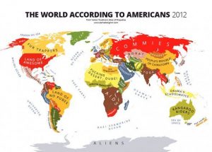
The map we will be discussing in today’s post is the “World According to the Americans, 2012” from the Atlas of Prejudice, a book and a website by artist and writer, Yanko Tsvetkov. This map shows a clear view of how Americans see and identify rest of the world during the modern era. As everyone knows, America is the greatest country of them all and country of “make the dreams come true” and freedom. At least, that is what Americans like to think of themselves, which one can clearly see and conclude from the map where they labeled the USA as the “Land of Awesome.” The map is certainly a bit ignorant; however, the author/artist of this map is not ignorant himself, yet he is challenging American attitudes that are ignorant. The map seems to coincide perfectly with many American’s preconceived notions of places that they know little to nothing about. However, seeing such brazen prejudices laid out, country by country, might even shock them.

To start with, the map is not very detailed, which was the author’s/artist’s final purpose because he doesn’t want geographical details and accuracy to stand out. What he wants is trying to make a clear attempt to simplify the world into these stereotypical categories as seen by the Americans. This is why the map is made as just a plain, simple layout of the world where colors mark different countries, where oceans and seas are not covered with blue. In this way, they do not stand out and take the reader’s eye away from the actual meaning and purpose of the map. All the names are capitalized, which takes away from the meaning of capital key letters and makes the map a bit messy.

Furthermore, as mentioned before, the map shows just a general view with no deeper thinking about those countries, without more knowledge and research from people who view the rest of the world like that. The author/artist Tsvetkov is challenging the close-minded Americans who think that these countries still hold the same values that they used to in the past. They associate each country with what is most popular to them and how they see that population on social and economic levels. Everyone who knows and learned more about world situations and what is happening nowadays and how not just America, but the whole world is improving at a fast pace, probably has different associations towards each country that is labeled on this map.

If anyone who lives in those countries sees this map, they might be shocked at how the Americans still think of and see themselves. They would find it to be rude and offensive with zero respect for those who are not Americans. This map emphasizes the division between how Americans see the world and how others see Americans. Citizens outside America who love their country, and respect where they have been raised, might have their country pride offended. While Tsvetkov is making a very critical argument against America, he is also using a very dark kind of humor. The map is funny, but within that humor is a very sharp critique about American stereotypes of the world.

Personally, coming from Croatia, located in central and southeastern Europe, I find this map very offensive and heartbreaking. This map reveals that the great nation that I was looking up to my whole life and where I wanted to come study and live thinks so little of my birth home and undervalues it. This really makes me sad. Firstly, Balkan countries are similar, but we are still different nations with different traditions and values, and they cannot see us as one country. Secondly, to think of my home as simply “Bombs” in the map shows how little Americans know about not just history but the present day situation there as well. None of us chose to find ourselves in a war or to lose relatives, but that is our past. We have improved a lot since then and are one of the most beautiful and happiest countries if you ask me. Lastly, I am sure that these Americans are not even aware of how much they would like to be spending their holidays right in that area denoted as “bombs.” There are more and more Americans each year traveling to the Balkans and choosing us as one of the top summer destinations.

This map is inescapably and inevitably political. It makes a strong political protest against the simple-minded stereotypes that many Americans perpetuate. We can see such politics through putting America at the center of attention, with the rest of the world not nearly as good as “the land of awesome.” Everyone else on the map has problems and are either there only to serve the American economy and its people, or as an area to avoid because of a nation’s past. This map reminds us that the U.S. government makes all decisions based on what works in its favor and how it can secure themselves or make more money from other countries.

As a conclusion, it can clearly be said that this is a deliberately provocative map and designed to offend. But it also represents how Americans should educate themselves and try to actually learn about other countries and not just think that Americans are the greatest people on earth. For their success, Americans needs the rest of the world, and their resources, people, products, and so on. One nation can be better than another, but there is no the greatest and most ideal nation for anyone because we are all different and prefer various lifestyles that America is maybe unable to offer.  All in all, this map succeeds in carrying the power that represents stereotypes of the world from the American point of view.

Additional Map Blog Link: https://adventuresinmapping.com/page/2/


Posted in Maps of the Week | 1 Comment

Team Map Presentation – “North Korean Prison Camps”

The map of North Korea’s concentrations camps are produced with the help of Google Earth, a highly interactive digital map. The rapid development of these satellite maps has given us the chance to analyze the countries on the other side of the world with stunning details. Some of the concentration camps are recognized in the map since those distinctive characteristics  of the geography are matched with the traits of a typical prison camps we analyze.

Typically, most of those prison camps fall within three categories: the political prison camps, labor re-education camps, and the regional collection and labor training camps. People are abused as the jailers want in those camps. Although they are categorized according their different uses, in essence, they all become a system of extortion to enforce the state’s monopoly and enrich their security forces through the power of life and death.

However, when we disclose the locations of those camps in the Google Earth and display the cruelty in the camps to the world, we haven’t thought about the problem of privacy. When we analyze the highly classified places of other countries  without permissions, is it a kind of invasion of privacy? Even if we are doing something good and trying to save people in desperate situations, we cannot avoid the discussion of such issue.

Posted in Uncategorized | Comments Off on Team Map Presentation – “North Korean Prison Camps”

Wiley/National Geographic College Atlas of the World

This atlas is important specifically to this class because it was created for college students. The atlas is very compact compared to others, while also staying very informative. Much of this class discusses maps and their effect on the viewer and the world. This atlas has 25 themes including topics such as population, health, and politics which all are critical themes discussed in class.

Posted in Atlases of the Week | Comments Off on Wiley/National Geographic College Atlas of the World

Middle East to the Whole World

Map of Incidents related to ISIS.

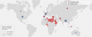
The Islamic State, or ISIS, is a militant organization that emerged as an offshoot of al Qaeda in 2014. The terrorist group quickly took control of large parts of Iraq and Syria, raising its black flag in victory and declaring the creation of a caliphate and imposing strict Islamic rule. This map created by CNN portrays the terrorist activities of ISIS a radical Islamic terrorist group. It shows the attacks around the world—not just the attacks isolated to the Middle East. The map is very simple for a viewer to understand as the red points show attacks influenced directly by ISIS and the blue points represent those that were inspired by ISIS. However, the simplicity of the map is also negative as it leaves out many important details. The reason for leaving important details out could be because the map serves the United States’ foreign political agenda for increased war against terror.

The United States has been a vital acting force in the War on Terror and this map shows the damage done by the largest most active radical group. ISIS has conducted or inspired more than 140 terrorist attacks in over 30 countries. The exact statistics of their attacks are unknown due to the location of many of their attacks but the fatalities have been estimated to be at least 2,043 people and the injured include thousands more. The statistics and detail portrayed in this map is a large concern. The maps records the number of “incidents” within a certain area and the issue with this is that the word incident is very vague. An incident could stem from a stabbing all the way to a mass bombing.

The issues stated with the physical representation of the map on serves to benefit the political agenda of the United States. The lack of detail allows for more “incidents” to be recorded, thus making the impact of ISIS look greater. The maps political purpose is to inform people of the dangers of ISIS. It shows how large of an impact the terrorist organization has so that it justifies and explains the need for the War on Terror. It cartographically displays the need for American forces in the Middle East by showing that terrorism has spread rapidly and now has a tremendous effect on not just the Middle East but the whole world. The map is also made to inspire governments to be more active in ending world terror possibly through policy change and policing as it calls out each country and their statistics individually. 

The actual visual of the map is basic and simple in a zoomed out image. The background and countries are shaded grey with no border lines or country labels. This is to show that terrorism has no borders and is thus a global issue not a national one. The map uses a borderless projection to show that today’s globalized world is much more fluid even in the case of terrorism. The Map also includes a legend that shows that the larger the circle the more incidents per country. This is simple yet problematic because the size of the points are difficult to differentiate when viewing the map from a global perspective. In addition to the vague visual the map does not have any written explanation for the incidents portrayed.  The color scheme of the map is very important to notice—especially the choice of colors used. The attacks conducted directly by ISIS are in red because they stand out the most especially with the dull grey background. The attacks inspired by ISIS are in blue, a different color. This separation of the conduct of the attacks is important politically because it shows that ISIS is so powerful and dangerous that they can influence normal people to execute attacks in their name. This difference is very simplistic and easy to understand but too vague, it forces the viewer to make unnecessary assumptions. This separation could also be viewed politically because the areas in red are places the United States would like to deploy troops. The red points help the agenda because it shows that the United States wants to beat the “roots” of ISIS. 

In conclusion, this map is a political map created to inform the general public that terrorism has spread globally, enforcing the ideology that the United States needs to remain active in fighting the War on Terror in the Middle East, the stem of most terrorist organizations. The simplest yet vague portrayal of this projection make it an easy map to understand while steering the viewer in a political direction. The lack of details allows for more points which helps the United States war effort.

The interactive map is available in the source below.

Sources:

https://www.cnn.com/2015/12/17/world/mapping-isis-attacks-around-the-world/index.html

Posted in Maps of the Week | 2 Comments

The World Median Ages

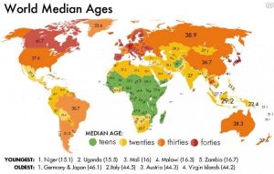
The map that I chose is a map of the world median ages from every major country across the continent. I found that this map is much easier to understand than previous maps my peers have studied this semester and maps that we have discussed as a class throughout the semester. It is much easier to understand because it is very simple and universal to everyone around the world that can read numbers. Another difference I saw is that this map has zero propaganda in it. In previous maps that my peers chose, there was a prevalent amount of propaganda shown through the creation of the map. The map I selected was created to obstruct any bias because the focus of the map was to present the facts on a blue print of the Mercator projection. You are unable to find any bias in this map because you cannot use the median age factor as a bias due to the fact that there was no evidence to back up any claim for a lower median age rate or a higher rate.

The median age maps data was gathered in 2014 by the Central Intelligence Agency and the map was finalized at the end of that year. Some of the data gathered shows that there are 7.5 billion people in the world today and of those, “There are 1.2 billion people between the ages of 15 and 24 in the world today–200 million of whom are in Africa – about 75 million are looking for work” (Guardian). This quote from the Guardian shows that not only are there a majority of young people around the world today, but that there is a huge chunk of them living in Africa. There has to be a reason for the high numbers of young people living in Africa. My hypothesis is that the people in Africa do not have the schooling that other major countries have, which would cause people to have a lower level of education.. This could result in a higher birth rate because they may not be educated on sex education, birth control, and they may not realize the responsibilities that parenting requires. Another quote from the Guardian gives insight on how many people there are in this young age group. “Nearly 300 million people in sub-Saharan Africa are aged between 10 and 24, and that number is expected to climb to about 561 million by the middle of this century. Africa has the highest concentration of young people anywhere on the planet”(Guardian). Some of the other data shows that the world’s youngest country is Niger, with a median age of 15.1, and Uganda comes in at a close second at 15.5. Another reason why these countries have such a lower median age is because their life expectancy is much lower then countries like the U.S, which have a median age that is double of the one for Africa. Africa’s life expectancy is 64, while the U.S is 78 (Statista).

On the flip side, an aging population presents a different set of problems: Japan and Germany are tied for the world’s oldest countries, with median ages of 46.1. This is relevant when you look at the reason for these countries having a median age 30 years older than Africa. The reason that they are much higher is because these countries have a much more stable economy, and a much better education system along with being more developed nations overall. This is very important to note because having a higher median age rate directly correlates to the state of the nations economy and development. The other thing that this demonstrates is that the older median age countries tend to have a much higher life expectancy rate. This shows that they have a much healthier society than the other countries with a lower age.

Just because one country’s median age is higher, doesn’t always mean their economy is better off. For example, the U.S has a median age rate of 37.6 while Russia has a median age rate of 38.9. Even though their ages are pretty similar, there is a huge difference between these two countries. Russia has a GDP of 1.3 trillion while the US has a GDP of 18.6 trillion. This just shows that the US has a much better economy and is a wealthier nation than Russia. As a whole, I think this map taught me a lot through a greater understanding of the meaning behind the varying median age ranges in different countries. This map gave me deeper insight of a new map to look at the country we live in and the countries that surround us.

http://www.africaneconomicoutlook.org/en/in-

depth/youth_employment/http://www.prb.org/Articles/2013/youth-unemployment-africa.aspx

https://www.statista.com/statistics/262884/countries-with-the-highest-fertility-rates/

Posted in Uncategorized | Comments Off on The World Median Ages

Blog of the Week: Maps Mania

Maps Mania is a unique blog that allows its readers to interact with maps of many categories in order to gain a better perspective. Maps Mania is dedicated in finding the “best digital interactive maps on the internet and the tools used to create them.” The blog is extremely diverse, with maps ranging from “Mapping the Worst Bus Stop in London,” to “Mapping the Industrial Revolution.” If you are interested in working with maps and gaining the power of being your own mapmaker, this is the blog for you.

http://googlemapsmania.blogspot.com/

Posted in Uncategorized | Comments Off on Blog of the Week: Maps Mania

Atlas of the Week: Concise Atlas of the World


This atlas provides a deeper look into the superbly designed cartography of informative maps. The atlas contains stunning graphics in order to “portray unique physical geography and highlights the sprawling extent of major cities.” Furthermore, the Concise Atlas of the World has incorporated beautiful and accurate satellite images which cover the whole world. 

27 Best World Atlases For Map Lovers In 2017

Posted in Uncategorized | Comments Off on Atlas of the Week: Concise Atlas of the World