
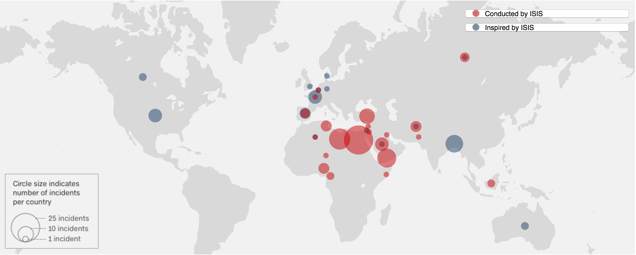
Map of Incidents related to ISIS.
The Islamic State, or ISIS, is a militant organization that emerged as an offshoot of al Qaeda in 2014. The terrorist group quickly took control of large parts of Iraq and Syria, raising its black flag in victory and declaring the creation of a caliphate and imposing strict Islamic rule. This map created by CNN portrays the terrorist activities of ISIS a radical Islamic terrorist group. It shows the attacks around the world—not just the attacks isolated to the Middle East. The map is very simple for a viewer to understand as the red points show attacks influenced directly by ISIS and the blue points represent those that were inspired by ISIS. However, the simplicity of the map is also negative as it leaves out many important details. The reason for leaving important details out could be because the map serves the United States’ foreign political agenda for increased war against terror.
The United States has been a vital acting force in the War on Terror and this map shows the damage done by the largest most active radical group. ISIS has conducted or inspired more than 140 terrorist attacks in over 30 countries. The exact statistics of their attacks are unknown due to the location of many of their attacks but the fatalities have been estimated to be at least 2,043 people and the injured include thousands more. The statistics and detail portrayed in this map is a large concern. The maps records the number of “incidents” within a certain area and the issue with this is that the word incident is very vague. An incident could stem from a stabbing all the way to a mass bombing.
The issues stated with the physical representation of the map on serves to benefit the political agenda of the United States. The lack of detail allows for more “incidents” to be recorded, thus making the impact of ISIS look greater. The maps political purpose is to inform people of the dangers of ISIS. It shows how large of an impact the terrorist organization has so that it justifies and explains the need for the War on Terror. It cartographically displays the need for American forces in the Middle East by showing that terrorism has spread rapidly and now has a tremendous effect on not just the Middle East but the whole world. The map is also made to inspire governments to be more active in ending world terror possibly through policy change and policing as it calls out each country and their statistics individually.
The actual visual of the map is basic and simple in a zoomed out image. The background and countries are shaded grey with no border lines or country labels. This is to show that terrorism has no borders and is thus a global issue not a national one. The map uses a borderless projection to show that today’s globalized world is much more fluid even in the case of terrorism. The Map also includes a legend that shows that the larger the circle the more incidents per country. This is simple yet problematic because the size of the points are difficult to differentiate when viewing the map from a global perspective. In addition to the vague visual the map does not have any written explanation for the incidents portrayed. The color scheme of the map is very important to notice—especially the choice of colors used. The attacks conducted directly by ISIS are in red because they stand out the most especially with the dull grey background. The attacks inspired by ISIS are in blue, a different color. This separation of the conduct of the attacks is important politically because it shows that ISIS is so powerful and dangerous that they can influence normal people to execute attacks in their name. This difference is very simplistic and easy to understand but too vague, it forces the viewer to make unnecessary assumptions. This separation could also be viewed politically because the areas in red are places the United States would like to deploy troops. The red points help the agenda because it shows that the United States wants to beat the “roots” of ISIS.
In conclusion, this map is a political map created to inform the general public that terrorism has spread globally, enforcing the ideology that the United States needs to remain active in fighting the War on Terror in the Middle East, the stem of most terrorist organizations. The simplest yet vague portrayal of this projection make it an easy map to understand while steering the viewer in a political direction. The lack of details allows for more points which helps the United States war effort.
The interactive map is available in the source below.
Sources:
https://www.cnn.com/2015/12/17/world/mapping-isis-attacks-around-the-world/index.html
Akil, your map choice was excellent and it has real world implications for all of us today. I liked your statement of “terrorism has no borders.” That’s one of the underlying messages of your map. You validate this by explaining that no borders are displayed between countries to show this is a global problem.
Another section of your blog post I liked was your examination of the legend. You explain how the circles represent terrorist attacks and how they could range from a single person stabbing to mass killing. You expand on this and point out how this makes the circles cover a large portion of the map and gives a political mandate to governments to continue the combat terrorism in the Middle East. This is a strong point of your post and good takeaway that cartography can politically manipulate the public.
I really like how this map and the explanation of how the map puts together the political agenda and visual presentation. You have illustrated well your main idea from the general introduction of ISIS to the specific points on the map. Also, you relate your contents back to what we have talked about in class. It is fairly easy for the readers to grasp the key points! Wonderful work!