Africa is Bigger Than We Realize

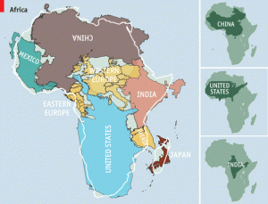
Africa is much bigger than we think, hence the title. The map was created by designer Kai Krause. To start off you must know that most maps we see are based on the “Mercator Projection” that came up in 1569. As seen from the map you can put all these places together to replicate the complete size of Africa. There are two meanings in this map that we must come to understand. Africa is greatly underestimated in size due to the Mercator Projection and Africa is the motherland for every place in the world.

Why is Africa never portrayed in its actual size? The “Mercator Projection” is the reason why. The Mercator projection, is the type of map projection introduced by Gerardus Mercator. This projection is widely used for navigation charts, because any straight line on a Mercator projection map is a line of constant true bearing that enables a navigator to plot a straight-line course. The “Mercator Projection” is terrible for estimating the size of large masses of land. Under the “Mercator Projection” Africa looks about the same size of Greenland but Africa is actually 13 to 14 times larger. Flat maps also contribute to this distortion as the landmasses towards the pole are extremely exaggerated. It is also mentioned that European imperialism is to blame as well. As Africa did decolonize and become independent imperialism did not go away. Europeans continued to make maps with Africa disoriented to express their power. Ancient and modern conquerors chose to make Africa look much smaller to exert their power and authority. As we can see from the map, Africa is bigger than China, the U.S, Western & Eastern Europe, Japan, Mexico, and India. That’s not it either—Africa is also bigger than Russia, Canada, Brazil and many more countries. We all consider size equals power. Map makers know this and a high percentage of people have never been to Africa. We know Africa from what we see on social media. For example, we see these commercials about “25 cents a day to save a child’s life in Africa.” From commercials like this we assume that Africa is really poor. In reality, that’s only in a few places in Africa, as I’ve heard from people that have actually been to Africa. It’s the same thing with maps. We think Africa is not as big as other places on the map and in terms of imperialism we don’t think it’s that powerful at all. That’s the real power of maps.

Besides the issue of size, I also want to think of a deeper meaning for this map. I want to think of a deeper meaning this map can represent: the idea that everyone descended from Africa, and that Africa is the motherland for all people, no matter their race. Scientists believe all homo sapiens are from Africa as the earliest remains are all found in present day Botswana. Scientists have found a genetic string that researchers were able to figure that every person today descended from a woman who lived in present day Botswana about 200,000 years ago. The question is: did Kai Krause think about this idea when representing Africa on his map? I think this is possibly one, but also important, meaning of Krause’s map. Krause’s underlying meaning is represented, while the obvious is right in front of us that Africa is misrepresented in ancient and modern maps due to European imperialism and the Mercator Projection.

Finally, One thing I was thinking about is that you could tie this to the idea of “counter-mapping” that we’ve discussed in class. In other words, this map is clearly meant to provoke discussion and debate and especially to challenge the usual ways like the Mercator that I previously discussed that we see maps.

SOURCES:

https://theculturetrip.com/africa/articles/this-graphic-shows-just-how-massive-africa-really-is/

https://www.britannica.com/science/Mercator-projection

https://www.businessinsider.com/origin-of-modern-humans-botswana-africa-2019-10

Posted in Maps of the Week | 6 Comments

The Atlas of Sports

The Atlas of Sports is an atlas that consists of who plays what, where, and why. Sports are a main hobby for many people in the world and there are others that don’t feel the same way. The atlas of sports can show the differences in all the different sports, how they can bring people together across the globe, and what sports do for people. Sports bring out the idea of competition and there is no way to get better in life if there is no competition. Along with sports is the idea of winning and losing and there is no one who ever wants to be the loser. This atlas will help to show how people see that in sports and why we love them in our society.

Posted in Uncategorized | Comments Off on The Atlas of Sports

The Price of a Beer Around the World

With this map made as up to date as February 2021, there’s not much that would have changed from then to now. This map consists of the average price of a beer in each country. All of the prices are converted to U.S. dollars to be able to make all of the prices comparable to each other. This map was posted in the food and drink category on a travel website emphasizing the differences across the globe of something as simple as a beer. 

Looking at the map the most eye-catching part of the map has to be the color scheme they used to speak for their data. They use the scale from the least price being a light yellow color and then as the average price goes up the darker the yellow gets until it is turned into a red which displays the countries with the highest average price. The map also presents the readers with a scale to show the difference between the prices and colors. This scale also labels the color with a price so it can be seen when looking at the map of the world. One thing that is interesting is that in the map the colors around each other are usually alike. If there are a group of countries near each other they will have a similar color because of the way that they price their beer. Sadly there wasn’t information received from every country and going along with color all of those countries that there are no numbers for are discolored. 

When traveling many people will indulge themselves in an iced cold beer if it’s on vacation, meeting up with friends, or maybe even meeting up for work. These trips could be changed based on the amount of money people will have to spend when they are there. The map could even explain where certain places around the world are more expensive to live. While looking at the map I can see a trend with the prices. It appears that the countries in the northern hemisphere tend to have a higher average price per beer while the countries in the southern hemisphere have much lower prices and looking at the map have all the lighter colors. It is also interesting to see that the quality of beer doesn’t have to do with the cost across the globe. Also there is probably a much higher rate of consumption in some countries rather than others. This could lead to a beer being cheaper because the demand for them would be higher. This should also be our “Map of the Week” because it is cool to see the differences between certain countries. Looking at the map I was surprised to see that some countries like Qatar have an average price that is at least two times higher than the price of a beer here in the United States. 

Maps are made by creators, and those creators are doing this to have people believe in the completeness of the information and sometimes even to persuade. In this case here the creator made this map to relay information to the typical person about information that they have found. This information could be used by all types of people for all different reasons. If it has to do with vacation one could look at this to determine where they might be able to find a cheaper place to go where they can enjoy cheaper drinks that won’t hurt their pockets. We talk in class about how maps can speak to the readers and this map talks to the people in a way to avoid the places where it is so expensive and makes the cheaper places look lighter in color and more inviting. Even on the map it displays a sentence and it states, “To find the cheapest beers you have to go to South Africa.” This sentence is emphasizing the idea to go to South Africa where you can find cheap beers. The best part about this map is that no matter how much it cost people of age can always sit down and enjoy the beer of their choice. 


Posted in Maps of the Week | 5 Comments

Atlas of the Week-Atlas of World War II

The Atlas of the Week is a solid and necessary choice for study in our class The Rhetorical Lives of Maps. My pick is the National Geographic Atlas of World War II: History’s Greatest Conflict Revealed Through Rare Wartime Maps and New Cartography. While the title is certainly long, I believe that this Atlas is vital due to its context in history and its ramifications on the Cold War. Its context is vital because of the change of borders and the large effects caused by the global war on nations and states. It also allows our class to have more insight into Cold War maps because we would understand contested areas and battlefields better. This would allow us to understand the Soviet Bloc in western Europe, which is so often represented. Overall, this Atlas, while it is certainly basic, is an essential piece of context for our class.

Link: Atlas of World War II


Posted in Uncategorized | Comments Off on Atlas of the Week-Atlas of World War II

Atlas and Blog Link of the Week

Both the David Rumsey Historical Map Collection and The Map as History website have large collections of atlases and maps. The David Rumsey Collection is a great resource for both maps and atlases, some of which date back all the way to 1837. It includes national atlases, school atlases, and text from all of them too. The Map as History, on the other hand, is more modern. It is a collection of animated maps that it promotes as being made for students, teachers, and history buffs. The website has 20 different collections, all of which contain up to 24 animated maps. They have a wide variety of maps covering all sorts of different topics, such as Ancient Greece, the Cold War, and the Age of Discovery. Both the David Rumsey Collection and The Map as History website have maps covering a wide range of topics from throughout history.


https://www.davidrumsey.com/luna/servlet/view/search;JSESSIONID=04ff236c-f55a-46f6-92e4-f8f97d3a7e74?search=Search&q=5956.000&QuickSearchA=QuickSearchA&pgs=50&res=1&sort=Pub_List_No_InitialSort%2CPub_Date%2CPub_List_No%2CSeries_No

https://www.the-map-as-history.com/

Posted in Atlases of the Week | Comments Off on Atlas and Blog Link of the Week

Mercator Map of the World United


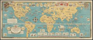
Do you know what the longest airline flight in the world is? Well, in 1944, it was roughly 40 hours. This fact runs across the middle of my Map of the Week. I chose a map called Mercator Map of the World United: A Pictorial History of Transport and Communications and Paths to Permanent Peace. The map was designed by Oliver Whiting in the year 1944 in London, England. The goal of the map is to show how connected the world’s countries have been and can be. The base map is a Mercator projection of the world, but that is not the interesting part. Included on the map are depictions of cultures, civilizations, scientific achievements, and various transportation routes between countries. At the top of the map sits a group of flags from some major countries, with the words, “Peace on Earth and goodwill to all men. Bound by a code of international friendship, law and order. United we stand – divided we fall.” The map puts forth the message that humanity is stronger when we are unified, and this unification will come through science. 

This argument – that science is Earth’s main connector – is front and center on the map. Towards the middle of the map, in the Atlantic Ocean, sits a compass. Alongside it is the phrase, “The march of science shrinks the earth.” This seems to be echoed through the other images on the map. There are boats in the Atlantic Ocean, such as the Queen Mary, with the caption “81,000 tons crossing – 4 days, 11 hours.” In West Africa there is a picture of a camel caravan with the description, “Caravans are older than civilization. They took three months to cross Africa. Today the same trip takes 13 hours.” This part was particularly intriguing to me. Africa sits in the exact center of the map. This is interesting because, in many maps that we have looked at, Africa has been an afterthought – oftentimes it is one of the main silences. It happens so often that, for a map made by a man from England, it felt almost expected that Africa would be forgotten. This is not to say, however, that there are no other issues with the map. The caricatures of both African and Asian civilizations are stereotypical, although they are not nearly as bad as some of the maps we’ve looked at. In the end, though, this map is similar to many others we have looked at – Europeans giving their perspective of the world. 

This map, despite being made in 1944, includes almost no reference to World War II. This is a pretty blatant silence of the map. The closest it gets is labeling Pearl Harbor, but there is no reference to the bombing. Almost all of Europe is ignored too. England has a couple of labels about their technological advancements, but that is it. The rest of Europe is left blank other than the labels of its countries. Having conflict being the main silence on a map about peace and unity makes sense, however, I was still surprised. Given that World War II was obviously the major world event at the time the map was made, I feel like there should be some sort of reference to it on the map. 

After writing the previous paragraph, I realized I was partially wrong. There are a couple of references to World War II, they are just tucked away on the edges of the map. This, to me, is pretty symbolic of the map in general. It has a lot going on, to the point where even though I had examined it pretty closely before I started writing, I still missed some stuff. On the far left side of the map, there is a circle with two tanks pointed at each other. Above and below them are the words, “A Broken Theory. Peace by balance of power, has always been broken.” On the other side of the map, surrounding symbols for World War I and World War II, are the words, “Another Exploded Theory: Security by Isolation.” These symbols feel a bit propaganda-y to me. The point of the map is promoting world unity, so downplaying current methods of peace, especially while in the middle of a World War, makes sense. However, Whiting’s opinions were probably swayed by the current events in the world. Furthermore, isolationism as a political practice was becoming substantially more difficult at this time. As the map points out, science is bringing everyone closer together; it is no longer easy, nor beneficial, for a country to isolate itself. This has only become more true over time. As I said before, in 1944, one could fly from any one country to another in forty hours or less, and – to answer my own question – the longest flight in the world today is roughly 18 hours and 30 minutes, New Jersey to Singapore.

Another interesting part of the map is how it displays levels of civilization. Across the very top of the map are depictions of different “units of peace”. It starts with a “Cave Man Family” and ends on the far right with “The Unity of All Nations.” Interestingly, the second to last unit is the “League of Nations”. This sends the message that humanity is one step away from world peace. This is a particularly bold argument to make considering that at the time this map was made, a second world war was being fought in Europe. This was a time when peace felt anything but close, and the fear of one’s enemies was constant. Despite how scientific advancements were effectively “shrinking” the Earth, it was not a time of unity when this map was made. 

The League of Nations was founded in 1920, after the conclusion of World War I. The goal of the League of Nations was to maintain world peace. It was the first multinational organization of its kind and it lasted until 1946, about a year after the United Nations came together. Therefore, it was in full swing when this map was made in 1944. Having the League of Nations be the second to last step, directly before “The Unity of All Nations”, sends a positive message about the future of the world. It feels very optimistic to send that message when a second world war is raging but, as it says along the top of the map, “The Unit of Peace has Grown Through the Ages, Tomorrow it Will Embrace the Whole Earth.”


Peace, Mercator. “Mercator Map Of The World United – Norman B. Leventhal Map & Education Center”. Collections.Leventhalmap.Org, 2021, https://collections.leventhalmap.org/search/commonwealth:q524n371p. Accessed 5 Apr 2021.

Posted in Maps of the Week | Comments Off on Mercator Map of the World United

Historical Virginia Maps Atlas

MapofUS.org houses thousands of atlases and maps. One that it particularly interesting and relevant is is the State and County Maps of Virginia Collection. This historical atlas compiles many maps dating as far back as the 18th Century. Taking a look at some of the maps within the collection gives a great look at how Virginia has evolved as both a colony and a commonwealth. The maps included in this atlas shows how the state both views it views itself and its relationships with its bordering states.

Posted in Atlases of the Week | Comments Off on Historical Virginia Maps Atlas

Satirical Crimean War Map

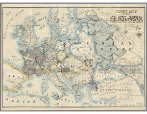
In 1854, Thomas Onwhyn brilliantly brought the caricatures of European nations to life on the Comic Map of the Seat of War with Entirely New Features. On his map Onwhyn, takes a look at the tumultuous political environment of Europe at the time. He chooses a satirical approach to the conflict by depicting most of the countries on the map as animals and is filled with many other cultural references and cartoons.

Between 1853 and 1856, most of Europe was engulfed in war, namely, the Crimean War. This often-forgotten war was primarily caused by Russia’s desire to expand their territory to the Bosporus Strait. The Bosporus Straight was a crucial strategic geographic and military location, which was controlled by the declining Ottoman Empire at the time. Fearing this would make Russia too powerful, England, France, and Sardinia allied with the Ottoman Empire to thwart their efforts. On the top right of the map this is represented in many areas. First, the top right of the map shows the “balance of power” between the Allied Powers and Russia, with the “scale” tilting in favor of the Allied Powers—the eventual winner of the war. Second, Russia, depicted by Onwhyn as a bear, has its paw stepping on Crimea, where many of the battles were fought. These battles are represented by English and French ships in the Black Sea clipping the bear’s claws. Third, the Balkans, a part of the Ottoman Empire, is grasping a bottle in its talons over the Bosporus Strait. This represents both the Bosporus being a global bottleneck and the fact that it was still controlled by the Ottomans.

Many other conflicts, both internal and external are noted on the map. While these depictions are important historically, the map places less emphasis on them. The Caucasus region is referred to as “Cork As Us Mountains” and appears as a volcano. This is representative of a shaken-up bottle about to burst as the result of regional instability. Additionally, Poland is spelled in bones and is depicted by a woman on the floor in shackles, representing the Partitions of Poland that divided the territory between Russia, Austria, and Prussia. Finally, France, depicted as a gallic rooster, is protecting Emperor Napoleon III, which is why Austria, depicted as a two-headed eagle, has a broken shield reading “Treaty Vienna.” This is an obvious reference to the 1815 Treaty of Vienna, which sought to end Napoleon I’s European conquest and established a lasting peace in Europe (The Editors of Encyclopaedia, 2020). Now that a Napoleon was emperor again and war was waging again in Europe, Austria was being smart by keeping one head on France and the other on the ongoing Crimean War.

Taking a critical approach to Onwhyn’s map, there are a few errors. The biggest error is that Poland is not partitioned between Russia, Austria, and Prussia. For example, Galicia should be within Austria’s yellow borders. Simply put, Poland should not exist on this map. Onwhyn, however, cannot be faulted for altering the borders of most of the map’s island, as he does so for a satirical effect. However, the author’s personal perspective cannot be ignored. Being British, Onwhyn clearly portrays the English and its allies in the Crimean War positively, while looking down on Russia. This is evident as the word “despotism” being written on the Russian bear’s crown and “slavery, oppression, tyranny, bigotry, treachery, falsehood,” and “ignorance” are scribed throughout the bear.

Onwhyn’s choice to create a satirical map has several key implications. A satirical map allows him to convey more than strictly spatial information. Essentially, he creates a map with a narrative. Meanwhile, Onwhyn is still able to instill objectivity into the map by keeping the borders proportional. The combination of satire and objectivity enables Onwhyn to convey more information to the viewer than a stand-alone scientific map or political cartoon.

Several silences also occur on this map. The lack of a key makes it difficult for posterity to interpret the conflicts on this map. Many of the cultural references throughout the map were unique to the time, making it hard, without significant research, to decipher some of the cartoons Onwhyn chose to include. Furthermore, other than the aforementioned scale in the top right, this map does nothing to show the political alliances between the European powers. It makes sense, however, that Onwhyn had silences on the map; he wanted to simplify the map to highlight the Crimean War. Including additional information on the map would simply detract from Onwhyn’s focus on the Crimean War.

I hope the readers of Mappenstance will take some time to dissect this map for themselves. There are hundreds of intriguing elements on this map, which can pull you in for hours. If there are any important drawings that I left out, please point them out and describe them down in the comments.


Britannica, The Editors of Encyclopaedia. “Congress of Vienna”. Encyclopedia Britannica, 2 Jun. 2020, https://www.britannica.com/event/Congress-of-Vienna. Accessed 26 March 2021.


Posted in Maps of the Week | Comments Off on Satirical Crimean War Map

Atlas of the Week – David Rumsey Map Collection


The David Rumsey Map Collection contains maps, pictures, globes, and manuscripts. It has many categories of maps or other sorts of representations and is housed in the Stanford University Library. It contains over 100,000 images from as far back as the 16th century. It frequently highlights unique works and the context and history behind them. It is a great tool that allows users to sort and filter through countless interesting maps.

Posted in Atlases of the Week | Comments Off on Atlas of the Week – David Rumsey Map Collection

Die Haupt Reichstagswahlen 1871, 1881, 1890, 1903, 1912


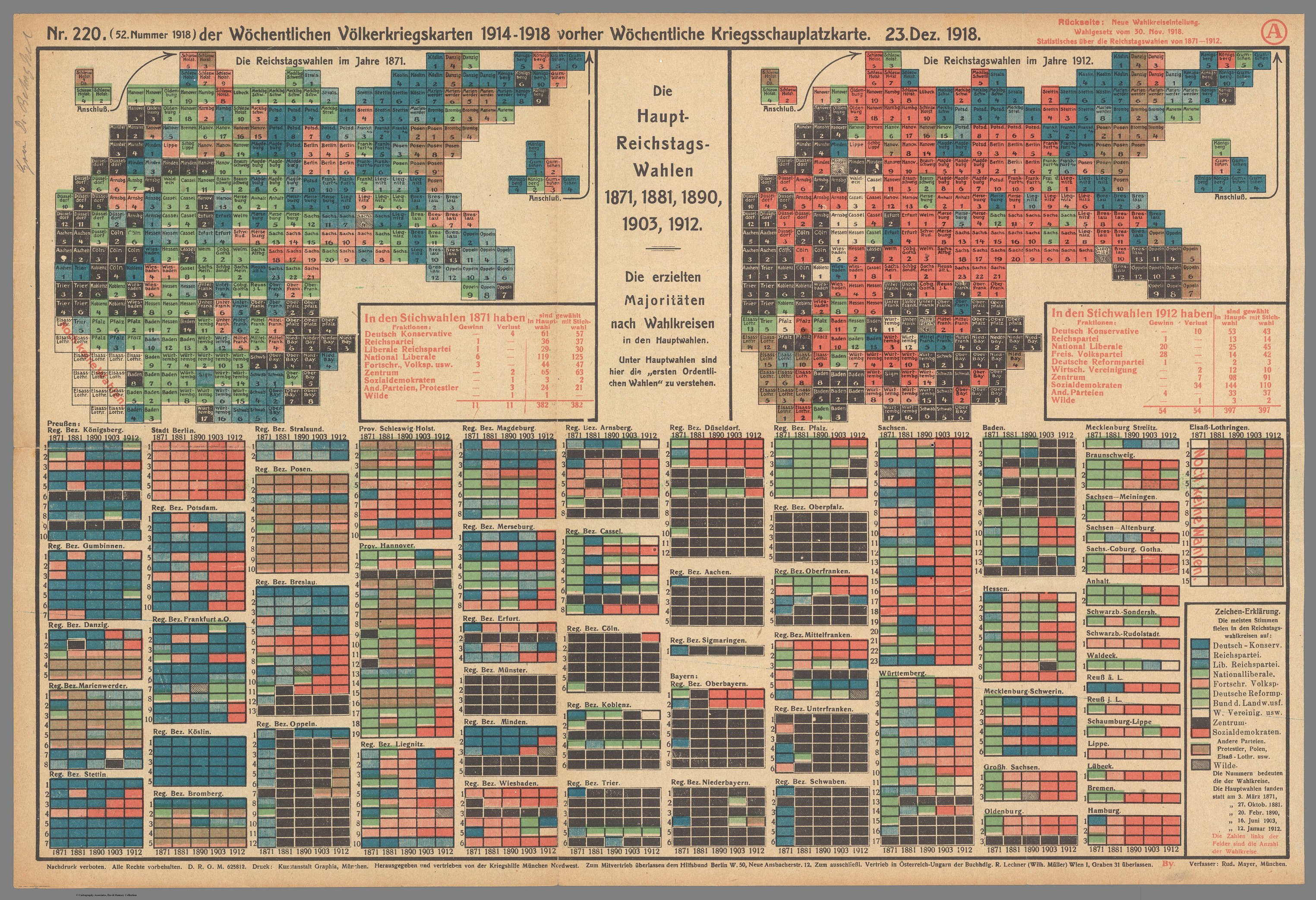
Forged in 1871 under the Iron Chancellor, Otto von Bismarck, the German Empire established a federal legislative body. The “Main Reichstag Elections” maps depict the votes of those German constituencies and the number of deputies. It was published in 1918 by Rudolf Mayer in a Munich newspaper. It was distributed as the 52nd issue (1918) of the weekly war maps 1914-1918 by the Munich War Aid program.

After doing a double-take to make sure this is not a periodic table of elements, the viewer can see the rigid boxes form the shape of the German Empire. Distant border regions such as Ostpreußen (East Prussia) and Schleswig-Holstein have been cut off from the Vaterland. They are shown as Hawaii and Alaska would be shown on a map of the US, however, they are still contiguous parts of Germany. This is most likely due to the distorted map of Germany being placed on a square piece of paper. The overwhelming amount of color and data almost drowns out some of the finer details. The newly annexed western region of Elsass-Lothringen (Alsace Lorraine) is stamped with the text Noch Keine Wählen, indicating this Imperial Territory had not yet had any elections after being seized in the Franco-Prussian war. Aside from this brief historical context, a plethora of German political parties are represented. Although the Kaiser ruled the Empire, the Bundesrat (Federal Council) acted as an elected legislative body. We can see the clear support for the Social Democrats, red, and the National Liberal party, green.

I find the lack of political borders between the German states, which still held power and had kings, such as Bavaria, to be a major silence. Additionally, the population of the Empire is not shown. This makes it difficult to understand how much of the popular vote each party received. The success of regional parties helps compensate for the lack of demographics shown as we can still see where parties such as the Polish Party have influence. This representation of the constituencies still represents what we could consider a map. The relationship between the distant parts of the country show unity in the Bundesrat. The largest parties are not confined to a single region, but instead stretch across the country. This presented unity tries to persuade the reader that Germany is one, as a whole, not a conglomerate of states and kingdoms.

Although present, the message of this insignificant author, Rudolf Mayer, is not noticeable. Mayer wrote a statement simply stating the main elections are here to be understood. This does not tell the reader much, however, considering the war aid program distributed this, it was probably trying to build support for the government in 1918. Germany was being embarrassed by defeat, hit by the Spanish flu, and fighting unrest and needed any public support it could get. The audience of the map was the general population but considering how discontent they were, especially with events such as the Spartacist uprising (BBC), I doubt the map changed anyone’s opinions. The collage of colors in little squares fails to make any impactful statement for the reader.

The chart and map do not tell us much about the social upheaval and strife happening in Germany because it only shows us maps from 1871 and 1912. We also do not get to learn much about the German people that the map represents. The legend and maps neglect to tell us about why the German political climate and parties shifted in so many regions between 1871 and 1912. This map covers up all of the chaos in Germany and imposes a weak statement over it.  We have been left to only make assumptions about data in which the reader could discern any message. I believe this means the author failed to convey a sense of unity to the people.


Works Cited

The End of World War One, 1918-1919 – Weimar Germany, 1918-1924 – Aqa GCSE History Revision – Aqa – BBC BITESIZE. www.bbc.co.uk/bitesize/guides/z8vt9qt/revision/1.

Posted in Maps of the Week | 2 Comments