
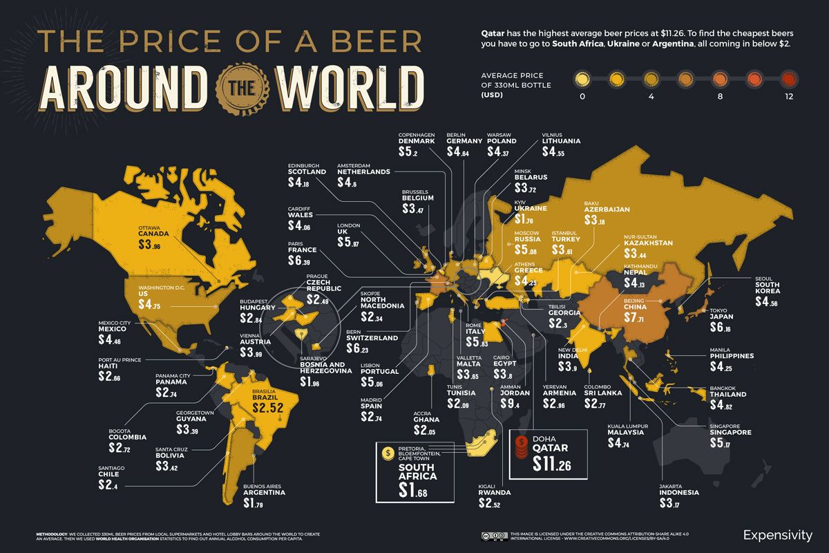
With this map made as up to date as February 2021, there’s not much that would have changed from then to now. This map consists of the average price of a beer in each country. All of the prices are converted to U.S. dollars to be able to make all of the prices comparable to each other. This map was posted in the food and drink category on a travel website emphasizing the differences across the globe of something as simple as a beer.
Looking at the map the most eye-catching part of the map has to be the color scheme they used to speak for their data. They use the scale from the least price being a light yellow color and then as the average price goes up the darker the yellow gets until it is turned into a red which displays the countries with the highest average price. The map also presents the readers with a scale to show the difference between the prices and colors. This scale also labels the color with a price so it can be seen when looking at the map of the world. One thing that is interesting is that in the map the colors around each other are usually alike. If there are a group of countries near each other they will have a similar color because of the way that they price their beer. Sadly there wasn’t information received from every country and going along with color all of those countries that there are no numbers for are discolored.
When traveling many people will indulge themselves in an iced cold beer if it’s on vacation, meeting up with friends, or maybe even meeting up for work. These trips could be changed based on the amount of money people will have to spend when they are there. The map could even explain where certain places around the world are more expensive to live. While looking at the map I can see a trend with the prices. It appears that the countries in the northern hemisphere tend to have a higher average price per beer while the countries in the southern hemisphere have much lower prices and looking at the map have all the lighter colors. It is also interesting to see that the quality of beer doesn’t have to do with the cost across the globe. Also there is probably a much higher rate of consumption in some countries rather than others. This could lead to a beer being cheaper because the demand for them would be higher. This should also be our “Map of the Week” because it is cool to see the differences between certain countries. Looking at the map I was surprised to see that some countries like Qatar have an average price that is at least two times higher than the price of a beer here in the United States.
Maps are made by creators, and those creators are doing this to have people believe in the completeness of the information and sometimes even to persuade. In this case here the creator made this map to relay information to the typical person about information that they have found. This information could be used by all types of people for all different reasons. If it has to do with vacation one could look at this to determine where they might be able to find a cheaper place to go where they can enjoy cheaper drinks that won’t hurt their pockets. We talk in class about how maps can speak to the readers and this map talks to the people in a way to avoid the places where it is so expensive and makes the cheaper places look lighter in color and more inviting. Even on the map it displays a sentence and it states, “To find the cheapest beers you have to go to South Africa.” This sentence is emphasizing the idea to go to South Africa where you can find cheap beers. The best part about this map is that no matter how much it cost people of age can always sit down and enjoy the beer of their choice.
I like how unique this map is and how it visualizes data. I think Jeff does a good job highlighting the drastic differences in prices between countries. One thing I personally find interesting about the map is that fact there is data in Islamic countries where beer is considered haram, or sinful. I think the point Jeff makes about the creator’s message is funny, as it states that someone should go to South Africa just so they can get cheap beer.
Wow, I really like this map! Very interesting how the data is presented, as you touched on. I wonder why countries like Belgium and Turkey have such lower prices compared to their neighbors. I liked your comment on the color choice making cheaper countries more appealing. I also appreciated your comment on how we don’t know the consumption of beer in the countries listed. Maybe different drinks are more popular and take the place of beer. Taxes and regulations, along with drinking age, culture, and religion could also play a heavy role but are omitted. The price of beer in America shocked me, I can’t drink yet but I always assumed beer was a lot cheaper due to its popularity alone. The quality of beer is also not accounted for, what are the health regulations that may make production more expensive? And are different types of beer in other countries more costly to produce? Overall a very intriguing map that’s inciteful and fun!
I like this map because of how out-of-the-box it is. I never would have thought to make a map about something like food or drink prices around the world, nor have I seen one before. It also reminds me of the Fragile States Index map a little bit because of how it shows its information for every country with a color scale. I thought it was fun to zoom in and look at the prices in different countries. I also found it interesting how there wasn’t enough information for some countries so there was no average price for them.
To start off this map was a eye catcher as Jeff mentioned with in his post, the colors really drew my attetion while scrolling thorugh the blog. Its really interesting to see how the price of beer differentiates across the North and Southern Hemisphere. Jeff did a good job explaining and making that clear. This is also my first time looking at a map that main purpose was to illustrate the average price of beer in different ares which is quite funny.
Jeff, an excellent choice. I think this map perfectly represents another aspect of mapping than what we have studied in class. This Beer Map, and others like it, add a fun yet informational twist on mapping. This is relatable to average everyday life and provides useful information for those trying to lower expenses. In addition, you eloquently analyzed this map through your reading of the data portrayed to gain further information about other countries. I think you observations in the differences between hemisphere and countries were skillfully articulated as well. Great job Jeff!