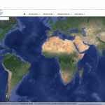
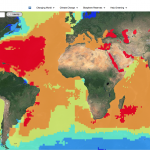
The website that I chose is an interactive tour of the world. The purpose of the website is to visually show how climate change has affected or will affect the Earth and its systems. It’s also provides a good visual summary of how much humans have impacted these systems. It offers 4 categories to choose from: Changing World, Climate Change, Biosphere reserves, and Help greening. In changing world, users can choose from one of Earth’s 4 systems: Lithosphere, Hydrosphere, Atmosphere, and Biosphere as well as a 5th one, Antroposphere. Within each system, users can choose a variety of topics that are associated with each system and can visually see the distribution or levels of each topic around the world. Climate change category is of course all about climate change and it’s causes. Users can visually see all the changes that occur with climate change and where on the planet will be most affected. Biosphere reserves category shows the many reserves and world heritage sites on the planet today and their boundaries. Finally the last category, Help greening, talks about how humans can help to slow down climate change and make a contribution to the healthiness of the Earth.
This is a really good website in which it isn’t just about giving facts and information but provide visually appealing graphs/data/pictures, allowing users to quickly determine where on the Earth each topic is occurring. It provides a sense of scale. I really liked the website because instead of actually reading about what’s going on in the planet, I get to actually see how much damage is occurring to the world and where. And so this website relates to everything that we have been learning in class.
http://www.biospheresmart.org/#


Great website! I have been reading most posts in the blog and it seems we all come to the conclusion that presenting results and information in interactive ways is one of the most efficient actions we can take. I like the combination of interaction and maps to help visualize information.
I really like interactive websites! They add a new element to understanding global warming. It’s better for people who learn through seeing instead of reading, and it makes observing the effects of human activity on this planet seem more real and demanding than reading a fact about it. I also like all the categories and subcategories so you can narrow down the topic to damage done in a specific Earth system. The use of technology to supplement facts really goes well with the focus of this generation, and the incredible scientific technology that individuals can have at their fingertips simply by using their computer. Since I’m a hands-on learner, this website definitely appealed to me.