Map of the Week: Concentration of Slavery

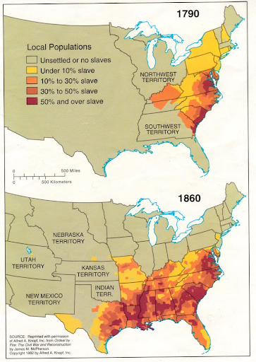
This map gives some insight on the increased concentration of slaves in the United States throughout the years 1790-1860’s. The swift growth in the increased numbers of the amount of slaves there kind of gives you a sense of just how intertwined slavery was in our previous history. The first slave voyage that went from Africa to the Americas sailed sometime around the year 1526. Afterwards the majority of the enslaved Africans brought to British North America were transported throughout the years 1720-1780’s. It’s very important to note the role slavery played in the development of the United States. With the increased demand for the New World cash crops like sugar, tobacco, rice, as well as cotton, farmers in the newfound British colonies quickly came to favor enslaved Africans for the need of labor in order to cultivate these crops (Lumen).

One of the more primary ways Europeans would obtain slaves would be via the Atlantic Slave Trade. The vast majority of the slaves that were transported to the New World were the Africans from the central and western parts of the continent. Some African tribes would pillage and raid other rival tribes as a means to sell them to European slave traders, who would then transport them to the colonies in North and South America for distribution. Many different tribes played a key role in the development of the slave trade by selling their captives or prisoners of war to the European buyers. At the time this was a common practice on the continent. The captives who were sold to the Europeans were usually from neighboring or enemy ethnic groups (Lumen).

I think this map is pretty interesting and should be showcased as the map of the week. Because I think it kind of gives you a visual understanding of just how important the enslavement of the African race was for the upbringing of this country. The Atlantic slave trade was primarily shaped by the desire of cheap labor in the attempted to produce raw goods for European consumption. Many of the American crops were not able to grow inside of Europe, so the process of importing crops from the New World proved to be far more profitable than producing them on the European mainland (Lumen). Needless to say a vast amount of labor was needed to be able to create and sustain plantations that would eventually become economically profitable. Western Africa had become a gold mine in a sense by becoming the primary source for Europeans to acquire newly found enslaved peoples. All this was in order to meet the desire for free labor in the American colonies, with the end goal of producing a steady flow of profitable cash crops for the near future.

Denis Wood in our readings talks about how maps work by serving certain interests. That means that every map pushes forth a narrative that almost puts everything into the now or the real. Wood writes, “And this, essentially, is what maps give us, reality, a reality that exceeds our vision, our reach, the span of our days, a reality we achieve no other way.” I thought this map connected with our class readings because it kind of gives you a new viewpoint. I don’t believe anyone in our contemporary society, could even fathom slavery still happening inside of our country today. I do believe that maps give you a new outlook in a sense of putting you inside of a reality of something that did take place during a certain time period. Maps give you the ability to be able to look back at the past and acknowledge the events that occurred, while also giving you the ability to look at the reasons behind why certain things were documented. I think if you look back and think about how the rights of those people were taken away, you kind of get a sense of gratitude. In a way of just acknowledging just how far we have come as a country.

References

  • Mintz, S. (n.d.). The Gilder Lehrman Institute of american history. Historical Context: Facts about the Slave Trade and Slavery | Gilder Lehrman Institute of American History. Retrieved April 4, 2022, from https://www.gilderlehrman.org/history-resources/teaching-resource/historical-context-facts-about-slave-trade-and-slavery#:~:text=The%20volume%20of%20slaves%20carried,leaving%20Africa%20in%20slave%20ships. 
  • Boundless. (n.d.). Boundless US history. Lumen. Retrieved April 4, 2022, from https://courses.lumenlearning.com/boundless-ushistory/chapter/slavery-in-the-colonies/#:~:text=The%20rapid%20expansion%20of%20large,backbone%20of%20the%20British%20colonies. 
  • Wood, D., Fels, J., & Thomas Leiper Kane Collection (Library of Congress. Hebraic Section). (1992). The power of maps. New York: Guilford Press.


Posted in Uncategorized | Comments Off on Map of the Week: Concentration of Slavery

Atlas of the Week: Middle Eastern Affairs

https://www.worldhistory.biz/download567/AnAtlasofMiddleEasternAffairs.pdf

In the Atlas I chose for the blog curation assignment it has a series of maps of the region come to be known as the Middle East in the contemporary. This atlas first puts the Middle East into context around the other nations of the world from around the years of 1200 B.C. It later gives examples of Middle Eastern maps which depict the geographical features of the region and later talks about the Middle East in terms of historical significance in conflicts from the 20th century such as the world wars. This atlas is especially noteworthy to our class in that I believe this atlas stands aligned with contemporary norms within cartography and it would be interesting to see in what ways our class could critique these maps.

Posted in Atlases of the Week | Comments Off on Atlas of the Week: Middle Eastern Affairs

Map of the Week: Climate Change in Coming Decades

https://projects.propublica.org/climate-migration/

This map is an interactive map which charts the United States through the next century with our current climate change situation. This map supposes that on our current trajectory of climate change the United States’ suitable climate which humans have been living in the past 6,000 years will move towards the northern and midwestern parts of North America. This will have drastic impacts on the agricultural region in terms of where they can find areas suitable to grow crops. With the drastic increase in global temperature staying steady it will continually melt more of the polar ice caps, therefore making sea levels rise effectively driving back coastlines.

In a study done by the National Academy of Sciences they labeled the human climate niche to be much of the southeast and Midwest ending at northern Texas and Nevada, also including the Californian coast within the United States. This area is where the temperature and precipitation rates are the most optimal for humans. This map claims that by the year 2070 with moderate carbon emissions into the future, this human niche will have moved more northwest nearing the Canadian border. In the case of increased carbon emissions from which are dispensed in the contemporary the suitable niche for humans shifts much more drastically by the year 2070. This projection shows the niche as being on top of the United States and Canadian border, showing an even more drastic shift in the human niche within the United States. This has tremendous implications on where crops can be sold and where most Americans will live. This projection supposes that much of the southern part of the United States will be unsuitable to perform agriculture and predicts a large migration of the population to the northwestern parts of the country because of the severity of heat and drought that will wrought the southern region of America. This heat is described as being very extreme, in that in states like Louisiana and Texas the heat coupled with the humidity will be so severe that the body will not be able to properly cool itself. The map supposes that this could happen approximately 1 out of every 20 days in the year which will drastically change where humans choose to live in America. This Article supposes that these effects of climate change could have profound economic effects on the broader portions of the country in that people will have to move and the agricultural industry will not be able to grow crops in a much smaller portion of the country.

In this map it seems to me the cartographers are attempting to challenge the dominant media producers in that most media are that of popular culture which cover things like celebrity activities and other useless things to the population. By drawing attention on this pressing issue of climate change it is an attempt to shift the focus of society on something that is more important in terms of significance. Throughout much of social discourse most of society see climate change as an insignificant issue due to its lack of circulation in the media. In Harley’s “Deconstructing the Map,” the author talks about the silences in maps throughout the discipline of cartography and this discipline’s often implied omnipotence on the nature of the state of our world. “Deconstruction urges us to read between the lines of the map – ‘in the margins of the text’ – and through its tropes discover the silences and contradictions that challenge the apparent honesty of the image,” (Harley, 3). Although this map is trying to shine light on an issue in the world, I believe it has rhetorics of fear in its presentation. Through showing someone these images, it can cause much discomfort is seeing that the southern part of the United States will be virtually unlivable having catastrophic impacts on the economies of these regions. I believe this map silences the potential of climate change not being the severity that the map claims. It does not consider the possibility of America lowering its carbon outputs in the ensuing century and assumes our carbon emissions will increase over time especially in the of the extreme warming prediction map.

Additional blog link: http://psychocartography.blogspot.com/index.html

Posted in Maps of the Week | 2 Comments

Link of the Week: Map Room Blog

The Map Room Blog: http://www.maproomblog.com

Posted in Uncategorized | Comments Off on Link of the Week: Map Room Blog

Atlas of the Week: Revolution Dignity Project

This atlas aims to spread information on the Russia and Ukraine conflict. The atlas includes maps of why the conflict began. Some of the maps include the early history of Ukraine and its separation from Russia, the language issue, and the transfer of Ukrainian parishes. These explain why Russia would want to invade and why Ukraine would be hesitant to rejoin Russia. These maps are helpful in spreading information that otherwise is not being shared or is hard to understand just by reading. This semester we have learned how maps can be useful in creating a visual representation and can evoke emotion in those reading to help whatever issue the map is about.

revolution-dignity-project


Posted in Uncategorized | Comments Off on Atlas of the Week: Revolution Dignity Project

Map of the Week: War on Ukraine

Just a few weeks ago, Vladimir Putin and the Russian army invaded the innocent country of Ukraine. Ukraine has many historical and cultural ties to Russia. Putin would like to claim Ukraine back as a part of the motherland. But this was not the first time Russia invaded Ukraine. It happened back in 2014 after they lost their influence in Ukraine and were taunted by Ukrainian parades. The map shows that the primary attack took place on Ukraine’s eastern border. It shows the parts of Ukraine that have been liberated from the Russian troops along with the parts that are under Russian control. Other parts of the battle that are mapped out are combat areas and the direction of both Russian and Ukrainian advances. The border is also sectioned off by the part that is controlled by Ukraine and by Russia. The map also shows boats protecting the southern border along with where Russia had military units stationed. The last set of markings on the map is civilian airports. It is important that these locations are marked because it shows how innocent people are being hurt and unable to evacuate.


To make this map more relevant, it can be compared to maps from Russia’s 2022 invasion. This can give insight into similarities in the two attacks and possibly predict future moves. The comparison of these maps will also show differences that Ukraine made in their defenses and Russia made in their attacks. The map of the 2022 attack depicts Ukraine and the western part of Russia. It shows what areas are being held by Russian and separatist troops and which major cities are being attacked. It also shows the direction of Russian advances and Ukrainian defenses. All of Ukraine’s defenses start in Kyiv and work to the northeast of the country. Similar to 2014, Russia is attacking primarily on the Southeastern border of Ukraine with a large portion of the attacks coming from the sea at the southern border. One difference in the two maps is that in the newer attacks, Russia is performing more air raids and bombardments throughout the entire country and more into the western half of Ukraine.


The map provides the chance for people who may not fully know what is going on, to get a better understanding of the conflict and where it is affecting them.  It cannot give a first-hand look at the fighting like pictures or videos can however, it does offer a view of how widespread the fighting is. Maps offer us the opportunity to experience and understand places all over the world that we may never visit in person. Because of maps, we can understand the geographies and both current and historical events of countries all over the world. Our experience of Ukraine in the western world is mediated through maps, and although this offers us insight into the conflict, it inevitably simplifies it to a point that one could not understand without being there.

http://https://i.insider.com/54117f3decad04927b25dd3f?width=960

http://https://en.wikipedia.org/wiki/List_of_military_engagements_during_the_2022_Russian_invasion_of_Ukraine#/media/File:2022_Russian_invasion_of_Ukraine.svg

Posted in Uncategorized | 2 Comments

Map of the Week: American Deforestation Over The Years


https://www.awesomestories.com/asset/view/AMERICAN-DEFORESTATION-The-Lorax

______________________________________________________________

My map of the week showcases American deforestation from 1620 to 1920. This illustration consists of three separate maps that showcase the amount of forest and/or wooded areas across the United States during the years 1620, 1850, and 1920. The title of the map site is “The Lorax- American Deforestation”, and although this topic resembles the well-known Dr. Seuss book, this issue is much deeper and darker. 

The root of deforestation stems from colonization and population spikes. As commonly known, Native Americans were already inhabiting North American territory and cherished nature as their main tool of survival. When European settlers came to America, the idea of “living off the land” was taken and warped into a less preserving measure, meaning that the settlers were thinking more economically and less about a healthy environment. The more people that came, the more space needed to live and settle down. The land was a necessity to grow crops, raise livestock, and build housing to provide for one another, and to do that people started cutting down trees to make that space sufficient (Bos). 

Colonization serves as a key contextual element in the understanding of the different maps. In 1620, America was far more green than it is in 1920. In 1620, forests covered most of the United States during the time of the 13 colonies (Bos). In 1850, around the time of the Civil War, America’s trees have greatly diminished, especially around the coasts since that area is the most populated (Bos). By 1920, America’s virgin forests were nearly gone and they have decreased even more since then (Bos). These map comparisons show how American progressivism comes with a cost. As Americans, our culture is obsessed with advancement and consumed with the idea that bigger is better. One day reach our capacity of advancement because the land cannot sustain the level needed to continue, let alone be fruitful for survival. Deforestation is a much-needed conversation and issue to be resolved. Attention needs to be brought to the rapid decrease of wooded areas and The Lorax- American Deforestation maps shed light on the catastrophe. 

Since environmental crises are nothing to take lightly, the structure of this map can be analyzed with a rhetorical lens. The simplicity of this map can be appreciated because it limits any mess that can cause the message of the project to be lost. With the visuals used, there is no mistaking that the main purpose of this map is to showcase the loss of wooded areas. The green color contrasts perfectly with the grey undertone and it is clear that the amount of green diminishes over time. The shape shown is also a political/traditional-styled map of the United States, which looks fairly accurate to scale at first glance, making the message more believable to the audience. This map would be perfect to use to show the loss of trees to an audience, especially one that is younger, because it does not take much knowledge or analytical skills to recognize the message. 

Although the simplicity of the map can be applauded, the use of borders can be critiqued. As noted by Wood in In Wood’s Power of Maps, maps make the past and future present (Wood 7). The use of borders in the showcasing of deforestation can be both critiqued and understood by Wood. In 1620, America was merely the 13 colonies and the 13 colonies only. During the 1850s, America was more defined on the east coast but the West was not fully claimed as American soil. The Lousiana Purchase was still fresh along with the Mexican-American War and Missouri Compromise. States like Oregon, Missouri, Utah, and Texas were not mapped out as the areas we know today. The Lorax- American Deforestation map, however, uses the same borders that construct America today to showcase deforestation, which is historically inaccurate. Critiques, especially political critiques, would note this as a huge fault in the mapping project and could even argue considering this source “unreliable”. However, Wood along with other rhetorical scholars could argue the opposite. This project epitomizes the idea of “making the past and future present” through its use of borders. Examining the United States in the body we know today drives home the idea of making the past present because it allows the audience to see the message of deforestation through a lens in which they understand. For instance, being from Virginia, seeing the deforestation decline within the modern border of Virginia allows me to measure the full impact of deforestation where I live. And the beauty of the use of borders is that the deforestation data would still remain the same if they were not there on the map. The use of borders in this project shows how meaningless they are in a way, and merely are used for social context and nothing more. For instance, people can live 20 miles away from each other but within that distance there can be borders for different states. Different states help identify and group people for structural reasons, especially politically and socially, yet the environment and the deforestation happening around it is not limited to borders. 

The Lorax- American Deforestation map can be cartographically analyzed through its simplistic style and use/misuse of borders. Maps help us understand our own reality and as Harley would say, “how it makes the past present”. The more we study them, the more we find out about the world around us, which can help us understand how progressive and degressive we can be as a society. The Lorax-American Deforestation map exemplifies how maps can help raise awareness and provide evidence for all types of concerns within society from environmental to social issues. 


MAP LINK: https://www.awesomestories.com/asset/view/AMERICAN-DEFORESTATION-The-Lorax


Works cited

Bos, Carole “AMERICAN DEFORESTATION” AwesomeStories.com. Mar 01, 2012. Mar 20, 2022. <http://www.awesomestories.com/asset/view/AMERICAN-DEFORESTATION-The-Lorax>.

Wood, Denis, and John Fels. The Power of Maps. Routledge, 1993.

Posted in Uncategorized | 1 Comment

Map of the Week: Russian Military Control in Ukraine

***please note this was written a few weeks ago and pertains to the maps posted then**

How would you react if your hometown was bombed?

Yes, that was a shocking question that, hopefully, brought up some sort of emotion. Rage? Sadness? Fear? It is easy for us to be able to continue on with our daily lives and never fully be able to understand the horrors that other countries go through on a daily basis. We wake up, go to school or work, see our friends and family, eat good meals, and go to bed. Yes, some of us hit the daily bump in the road or have a particularly stressful workload one week, but we are never fearing for our lives.

In Ukraine, however, the people’s daily routines have been turned into a constant state of fear as Russia invades them from all sides. Since the start of the conflict, maps have been popping up everywhere. So, when it came to finding a map for this week’s blog post, I found myself drawn to not one, but a series of maps that depict the ongoing struggle in Ukraine. I found these maps on BBC’s website and they were complimented by an article that provided further background to the maps. The source for these maps was BBC’s visual journalism team, who worked to put them the maps together with the article. What is the most fascinating about this collection of maps is that they are ongoing in terms of not only being updated in real time as the conflict continues, but also, we live in a world where technology allows for the continuous updating of maps, making them different from pervious wars where this was not an option. We are on day 34 of the Russian invasion of Ukraine. When I started writing this post a few days ago, the real time updates were vastly different than the ones I am about to tell you. As of today, Ukrainian forces have been able to retake key areas to the north-west of Kyiv. Russians advances around Chernihiv, Sumy, or Kharkiv stall, but port city of Mariupol looks likely to fall to

This deserves status of “Map of the Week,” or rather “Maps of the Week” not only because of their prevalence in society right now as a conflict but also because of how they are able to present the ongoing conflict. In understanding these maps from the perspective of the rhetoric of cartography and how it can tie into social issues, the first thing one must understand is how all maps are rhetorical. In Hartley’s Deconstructing of the Map, he makes the point that all maps create an argument when it comes to social and political issues.

What strikes me the most interesting about these maps is how simple and straightforward they are. There is no excessive key or too much detail in the maps – they all provide a visual to the struggle in Ukraine. The maps on BBC’s page have shown the Russian advances over the past few days, and there are individual maps that each depict Russian advances from each side of its attack on Ukraine. Because these maps are journalistic by nature, they have a need for being simple and straightforward. All journalistic maps serve a different purpose than, say, a scientific or geographical map. They are not done by trained cartographers; they are made by graphic artists who are making them based on the facts they are receiving from their reporters. It is not a bad thing that the maps I am discussing aren’t made by trained cartographic professionals, it allows us to see a different side of the mapping story. Not only is mapping just as much of an art form as a science, it also can be derived from the facts found from the world to paint a picture for those around them to gain a better grasp of the conflict.

One critique I have of these maps is that while I like how they have one or two very clear and direct arguments, they don’t really manage to encapsulate the true nature of this conflict. These maps don’t allow for us to get a sense of Ukraine’s response or fighting tactics and you can’t get a sense of how the communities are being affected or what struggles they are facing through the attacks. While we still need maps like this, they can’t give us a sense of what the people of Ukrainians are going through in terms of their resistance or how they are being treated on the ground. The maps are simple and easy to read but they also in a sense almost dehumanize the conflict and make it seem like a black and white issue. For example, one map has white, gray, and red used to depict the current situation of Russian progress slowing in the south. Areas shaded in red are areas under Russian military control. Areas shaded in with red lines symbolize the Russian advances. It has red arrows to demonstrate the direction of Russian advances in the south of Ukraine. Another map shows how Mauripool is surrounded by Russian forces. It is a zoomed in view of the city with shaded red areas meaning Russian Control and areas shaded in white lines depict where the Russian advances are. There are only four locations highlighted on the map: mass grave sites, the maternity hospital, the theatre, and the port. These two maps, while depicting a straightforward version of the conflict, fail to show us the underlying issues and struggles of the Ukrainian people. However, I will add that the maps are further explained in the article, so they are not standing alone. This does allow for readers to gain a better sense of understanding for the conflict as the maps work to supplement the article, but if the maps were to stand alone one would likely not get the same understanding.

            So, how would you want the world to depict your hometown if it was in the middle of a conflict? Would you like the simplistic maps? Or would you want everyone to feel the same fear you’re feeling?


Team, The Visual Journalism. “Ukraine War in Maps: Tracking the Russian Invasion.” BBC News, BBC, 13 Apr. 2022, www.bbc.com/news/world-europe-60506682.


Posted in Uncategorized | 3 Comments

Map of the Week: Nuclear Warheads

The Map I chose is closely related to events occurring around the world today. As many know, tensions are rising as Russia is becoming a global threat. As they have clearly shown with their intentions to invade Ukraine, they’ll wage war and continue to ravage anyone who gets in their way. The idea of a future war is much more realistic than many would like to envision. The map I found represents Nuclear Forces all around the globe. Not only is this relevant, it is very relevant and scary to imagine. The map shows the estimated global nuclear warhead inventories as of 2022. Nuclear weapons consist of very dangerous missles and bombs that cause huge explosions. Nuclear weapons are capable of destroying and killing hundreds of people.

The source I found the map from is the Federation of American Scientists (FAS). The FAS is a nonprofit group that uses science to try and make the world as safe as possible. This credible source was first founded in 1945 by scientist who helped develop the first atomic bombs.

There are a couple of alarming facts to note as you look at the map from a quick glance. First, Russia has more nuclear weapons than anyone, including the United States. Secondly, nuclear weapons in multiple western countries such as Russia, China, North Korea, India, United Kingdom, and Pakistan are increasing in number. This is shown by the up arrow next to the countries. One good point to note is that the United States has the second most right under Russia. This map shows that countries have been increasing their nuclear weapons to pose a threat to other countries as well as to feel more comfortable and protected.

The map is estimated because the exact number of nuclear weapons held by each country is a secret in most cases. With that said, this map does not display the data with 100% accuracy. In this case, I believe not having the exact numbers does not make a huge difference, because it still accurately gives you an idea of who has a lot and who does not. When people look at this map they do not care as much about the exact number of nuclear weapons each country has, they just want to be able to look and see which countries have them and whether or not they have an abundance. Continuing with this point, I think this map is well done because it is simple and easy to read. The visual makes it very easy to see which countries are big nuclear threats and which are not.

A couple of questions came to mind while analyzing the map. Only nine countries are shown within the map having nuclear weapons. Does that mean that none of the other countries even have 1 nuclear weapon? I was unaware that only nine countries have nuclear weapons as of now. If so, is this expected to change in the near future?

The idea of this map showing estimated data made me think of the Turnbull reading from early on in the semester. Turnbull discussed the relationship between maps and theories and compared them to each other. The truth found in maps may be from what we believe in our heads or may contain objective facts. Regardless, we must have some type of theoretical knowledge to understand maps. Although the numbers from the nuclear weapon map may be estimated, viewers still use the theories they are aware of to explain and interpret what they see being displayed. It is interesting to me how maps like this one have a unique way of making a huge issue like nuclear weapons into a spatial perspective so that we as viewers are able to compare and contrast weapons all over the world.


WORKS CITED:

Fas. “Status of World Nuclear Forces.” Federation Of American Scientists, https://fas.org/issues/nuclear-weapons/status-world-nuclear-forces/.

Fas. “Striving for a Safer World since 1945.” Federation Of American Scientists, https://fas.org/.

Turnbull, David. “Maps Are Territories: Science Is an Atlas ; a Portfolio of Exhibits.” Amazon, Amazon, 1997, https://www.amazon.com/Maps-Are-Territories-Science-Atlas/dp/0730006883.


Posted in Uncategorized | 2 Comments

Atlas of the Week: Election 2020 Results

Figure 1: 2020 Election Results By County (Bump, “Let’s Get Ahead of It: A Map of the Early 2020 Results by Population, Not Acreage”)

This atlas is a map that shows the 2020 election between Donald Trump and Joe Biden. I chose this for two reasons: (1) It utilizes the special benefits of a classic map visualization while trying to convey a greater statistical representation of the election results. By doing so, it effectively communicates the rhetorical weight of cartography on the election without distorting the representation of the populous vote. (2) This map is directly correlated to my blog post by showing an alternative solution to some of the issues brought up in my analysis, in which there is a lesser emphasis placed on acreage portrayal.


References

Bump, Philip. “Let’s Get Ahead of It: A Map of the Early 2020 Results by Population, Not Acreage.” Washington Post, n.d. https://www.washingtonpost.com/politics/2020/11/05/lets-get-ahead-it-map-early-2020-results-by-population-not-acreage/.

Posted in Uncategorized | Comments Off on Atlas of the Week: Election 2020 Results